Mubasic Minimalist Landing Page Template
A clean, high-contrast landing page featuring a centered hero section, custom typography, and a mobile-responsive navigation menu.

Overview
This landing page is a masterclass in minimalist, high-contrast digital product presentation, designed to funnel users toward a specific call-to-action with zero distractions. It serves as a strong reference for builders looking to implement a "less is more" aesthetic that relies on bold typography and generous whitespace rather than heavy imagery.
Design System
- Color Palette & Visual Hierarchy: The system uses a stark monochrome palette (black and white) with deep dark backgrounds for high-impact sections. Hierarchy is established through extreme font sizing and negative space around primary CTAs.
- Typography System: The design features a premium sans-serif typeface. It uses a "giant" heading scale for the hero section to command attention, paired with a smaller, wide-tracked secondary type for eyebrows and supplementary information.
- Page Structure & Flow: The layout follows a centered vertical flow. It begins with a mobile-responsive navigation bar, transitions into a centered hero header with a single primary button, and flows into structured informational blocks.
- Reusable Components:
- Navigation: A clean, left-aligned logo container with right-aligned simplified links.
- Hero Section: A centered stack of eyebrow text, H1 headline, and a high-contrast button.
- Interactive Buttons: Minimalist button styles with high padding and border-radius configurations suited for modern SaaS.
- Responsive Behavior: The layout is built on a flexible grid that centers content on the x-axis, ensuring that high-contrast text remains readable and centered as the viewport narrows for mobile devices.
Use Cases
- Who should clone this: Developers building single-purpose landing pages, waitlist signups, or early-stage SaaS mvps where brand authority is built through design sophistication.
- Effective Remixes: This pattern works perfectly for digital agencies, creative portfolios, or high-end fintech apps.
- Remix Directions:
- Swap the monochrome palette for a vibrant brand color while maintaining the high contrast ratio.
- Adapt the info architecture by inserting a grid of feature cards beneath the main hero section.
- Reuse the hero section independently as an entry point for a larger multi-page site.
- Suggested Clone Scope: A full-page clone is recommended to capture the specific spacing and pacing of the typography, though the navigation menu is a versatile standalone component for any minimalist project.
Related Inspirations

Slite SaaS Knowledge Base Landing Page
A clean SaaS hero section with a conversational headline, secondary call-to-action buttons, and a structured software interface preview featuring user testimonials.
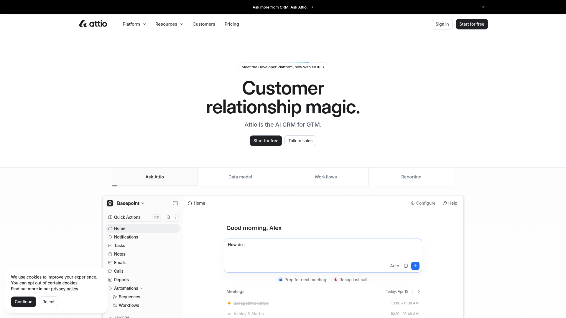
Attio AI CRM Landing Page
A clean SaaS landing page featuring a tiered navigation bar, a centered hero section with twin CTAs, and a detailed interactive dashboard preview.

Koa Health Mental Care Landing Page
A clean healthcare landing page featuring a centered hero section, scroll-based fade-in animations, overlapping mobile mockups, and a multi-column feature grid with accent borders.
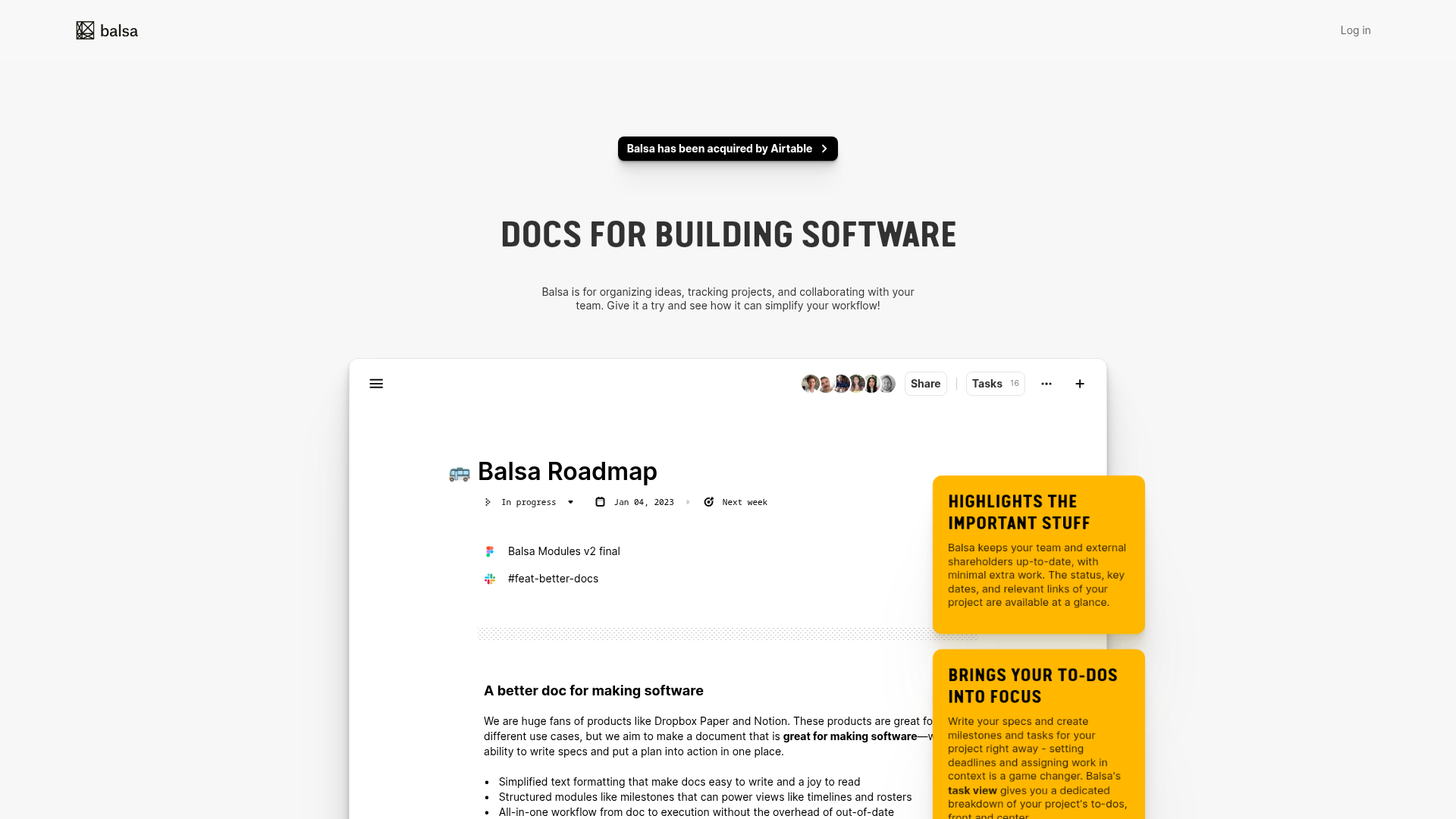
Balsa Software Documentation Landing Page
A clean document-centric layout featuring a centered hero section, high-contrast callout boxes, and a nested dashboard UI preview for collaborative tool showcases.
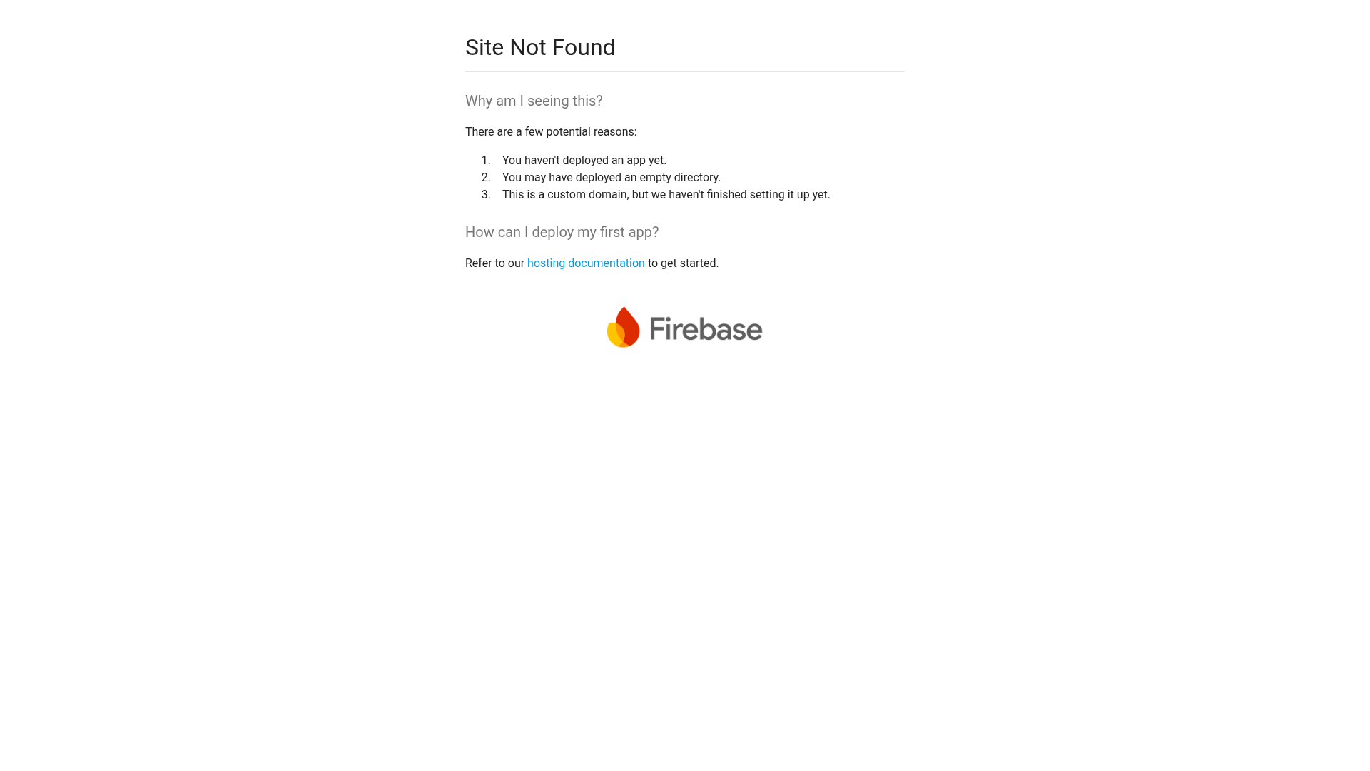
Firebase Hosting Site Not Found
A minimal placeholder layout for 404 error states including a centered logo, numbered troubleshooting guide, and linked utility text.
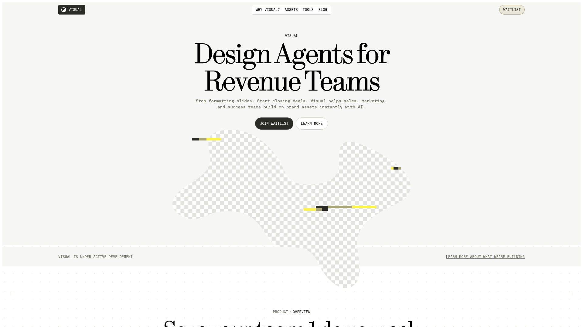
Visual AI Landing Page Templates
A high-end SaaS layout featuring a serif-heavy typography system, bento-style product showcase grids, accordion-style feature blocks, and minimalist wireframe UI components.
