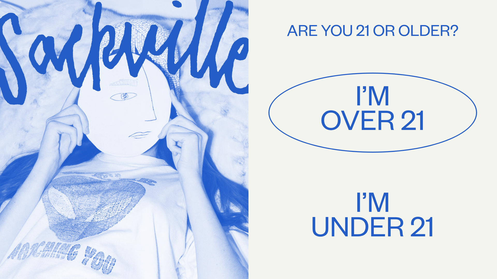
Sackville E-commerce Store and Age Gate
A lifestyle retail layout featuring a full-screen age verification modal, marquee announcement bar, product grid with hover states, and press logo sections.
Overview
Sackville.co is a high-end lifestyle e-commerce site utilizing a bold, high-contrast age gate and a modular product grid. It is an excellent reference for builders because it demonstrates how to combine strict regulatory requirements (age verification) with a cohesive, editorial-inspired brand identity.
Design System
- Color Palette & Visual Hierarchy: The site uses a high-contrast 'Electric Blue' (#2E5BFF or similar) on a 'Soft Off-White' (#F3F4EE) background. The hierarchy is driven by large, bold typography and monochromatic image filters that reinforce the brand's aesthetic before a user even enters the store.
- Typography: The design features a mix of a custom, organic script logo ('Sackville') and a clean, wide Sans-Serif (likely a variant of Poppins or similar) for UI elements. Button text uses heavy weights with generous letter spacing to command attention.
- Page Structure: The site follows a vertical flow starting with a full-screen age gate modal, leading to a looping marquee announcement bar, a hero slider, and a tiered product grid (3-column, 4-column, and 2-column sections) interspersed with lifestyle media.
- Reusable Components:
- The Age Gate: A split-screen modal with a large image on the left and oversized, pill-shaped/elliptical buttons on the right.
- Marquee Bar: A CSS-driven scrolling text banner for promotions.
- Product Cards: Image-heavy tiles with absolute-positioned 'Sale' badges and distinct hover states that swap images (revealed in the HTML structure using
opacity: 0toopacity: 1transitions). - Press Slider: A centered carousel featuring editorial quotes paired with publication logos (Vogue, GQ, etc.).
- Interaction & Motion: The site utilizes
slick-sliderfor carousels and smooth opacity transitions for product image hovers. The age gate uses a simple overlay removal once the 'Over 21' state is triggered. - Implementation Clues: Built using
Next.jsandStyled Components(evidenced bysc-class prefixes), with content managed viaPrismic CMSand commerce handled byShopify(indicated by asset URLs).
Use Cases
- Who should clone this: Brands in regulated industries (CBD, alcohol, tobacco) needing an integrated age verification system that feels like a natural part of the brand rather than a generic pop-up.
- Effective Remixes: High-fashion retailers can swap the loud blue for classic black/white; local dispensaries can adapt the product grid to highlight seasonal 'vibes' or 'strains' using the existing metadata labels.
- Remix Directions: Reuse the 'Press Carousel' section to build social proof for any SaaS or D2C brand. The age gate layout can be easily repurposed into a sign-up/lead capture 'Welcome' modal.
- Clone Scope: A 'quick section clone' of the age gate and marquee bar is ideal for existing sites. For new builds, a full-page clone provides a robust framework for an editorial-style landing page.
Related Inspirations

Context Gallery High-End Furniture Landing Page
A minimal editorial layout featuring a multi-column product carousel, designer biographies with image-text pairings, and a magazine-style content grid for curated design stories.

Glein Minimalistic Bento Grid eCommerce
A clean, modular layout using a bento-style responsive grid of text teasers and large-scale product imagery for lookbooks and collection browsing.

Basic.Space E-commerce Gallery Clone
A minimalist product marketplace featuring a clean sticky navigation bar, nested flyout menus, and a horizontally scrollable product carousel with hover-state image switching.

Ashley & Co Lifestyle E-commerce
An elegant Shopify-based storefront featuring a split-screen animated hero, horizontal ticker-tape collection carousel, and dynamic mega-menus with scent-specific color switching and image previews.
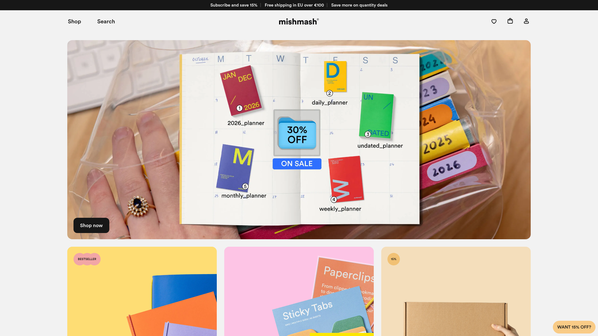
Mishmash Stationery E-commerce Layout
A clean retail template featuring rounded image grids, a multi-column comparison section with custom iconography, and a responsive products carousel.
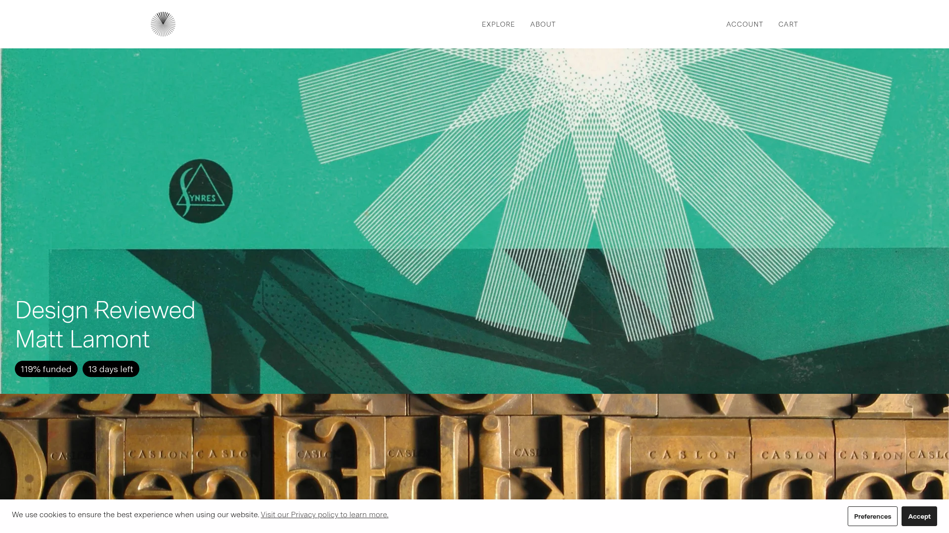
Volume Crowdfunding Book Gallery
A minimalist editorial storefront featuring full-width high-resolution image cards, status pills for campaign progress, and a clean typography-focused navigation layout.
