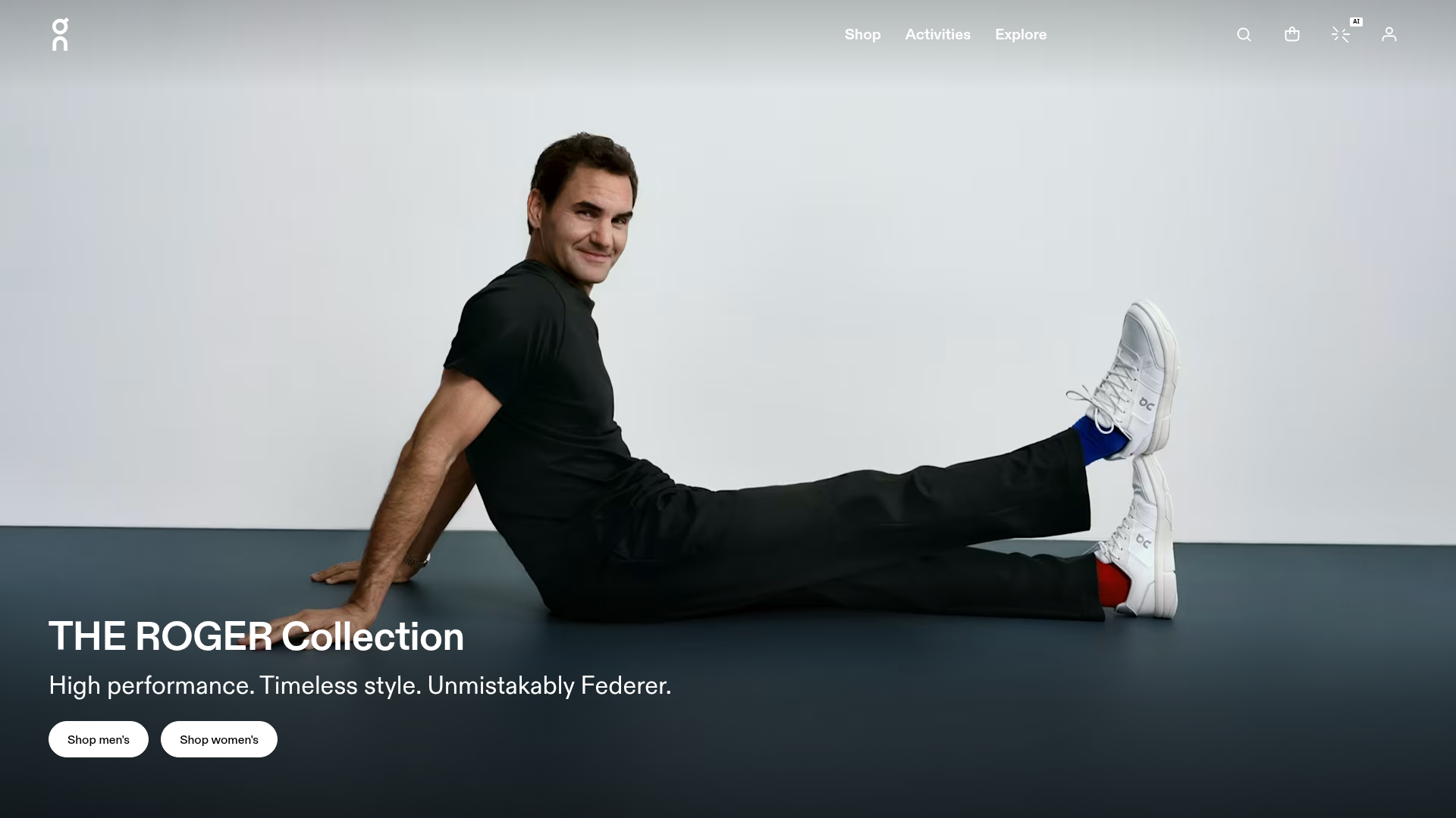
On Shoes Roger Federer Collection Landing Page
A minimalist lifestyle brand landing page featuring a full-bleed cinematic hero section, high-contrast typography, and CTA-focused navigation for a premium e-commerce experience.
Overview
This landing page is a masterclass in premium lifestyle branding, using a high-impact, full-bleed hero section to showcase a collaboration between On and Roger Federer. It effectively balances minimalist UI elements with high-quality photography to prioritize brand storytelling over high-density information. This is a strong clone reference for creators looking to build high-end e-commerce entry points that require an immediate sense of prestige.
Design System
- Color Palette & Visual Hierarchy: The design uses a sophisticated high-contrast monochrome scheme. A neutral white-to-gray background in the photography allows the vivid white CTA buttons and secondary red/blue accents (on the socks) to pop. The hierarchy is dominated by the subject, with text positioned in the lower-left quadrant to maintain visual balance.
- Typography: Features a clean, geometric sans-serif (On's custom typeface style). The headline "THE ROGER Collection" uses a bold weight and large scale, while the sub-headline uses a medium weight with generous leading for readability against a dark gradient overlay.
- Page Structure: The layout follows a classic hero pattern: a sticky, transparent navigation bar at the top, a cinematic center-fold image, and localized primary actions (CTAs) anchored at the bottom-left to lead the user into the shop.
- Reusable Components:
- Pill Buttons: Rounded, high-contrast white buttons with black text define the primary CTA style.
- Minimalist Navigation: Thin-stroke icons (search, bag, account) and a simple text menu (Shop, Activities, Explore) provide a lightweight footprint.
- Dynamic Header: The transparent top nav is designed to overlay various photographic backgrounds without clashing.
- Technical Implementation: The structure utilizes a semantic
<header>and<main>setup, with a clear separation between global navigation and the hero section (sectionwithclass="hero"). The use of SVGs for branding and iconography ensures sharpness at any screen resolution.
Use Cases
- Who should clone this: Small-to-medium luxury brands, boutique fashion labels, and athlete/influencer collaboration portals that need a "wow factor" landing page.
- Effective Remixes: This pattern works exceptionally well for high-ticket items like premium electronics, architectural services, or designer furniture where the product's visual aesthetic speaks louder than technical specifications.
- Practical Remix Directions:
- Style Swap: Replace the monochrome palette with vibrant, saturated colors for a younger streetwear brand.
- Information Architecture: Add a scroll-triggered "Sticky Add to Cart" or a social proof carousel below the hero for more direct conversion.
- Selective Reuse: Clone just the responsive navigation bar and the footer icon set for a consistent minimalist UI across a multi-page site.
- Suggested Clone Scope: A full-page clone is recommended for promotional campaigns or "Drop" events where a single focused message is required. For existing sites, cloning the specific pill-button and icon header style offers a quick way to modernize a legacy UI.
Related Inspirations

Isla Beauty Skincare E-commerce Store
A clean Shopify-based storefront featuring a split-hero landing page, a step-by-step product system carousel, and a split-screen testimonial section with localized product image sidebars.
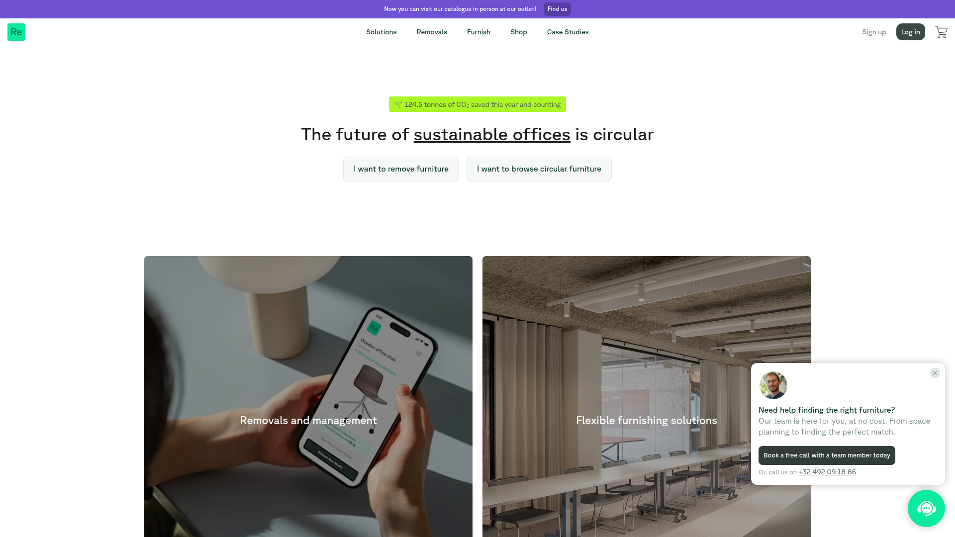
Relieve Furniture Sustainable Marketplace Landing Page
A clean sustainability-focused landing page featuring a hero with environmental impact stats, two-column visual category grid, horizontal logo slider, and a testimonial carousel.
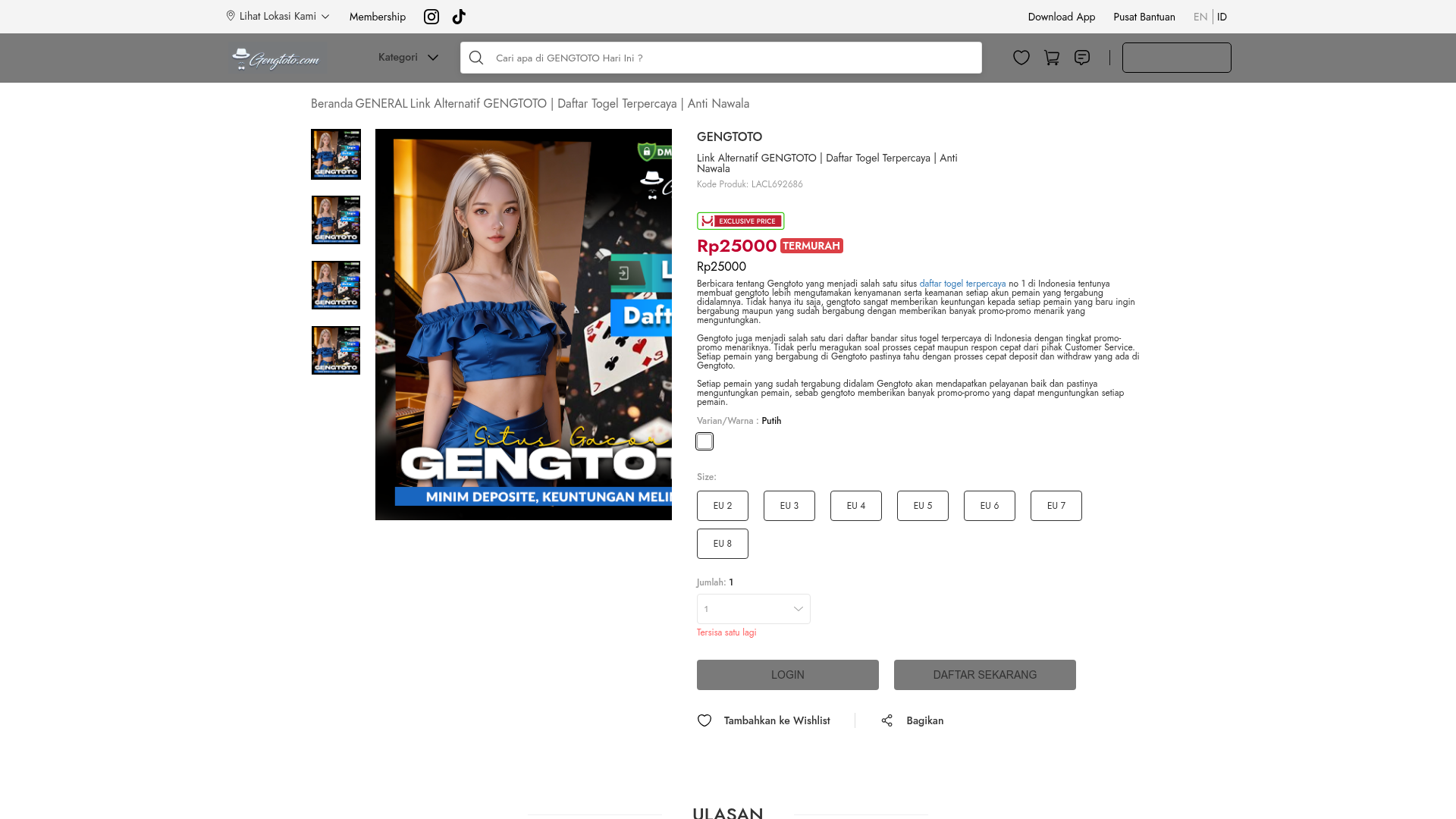
GENGTOTO Product Detail E-commerce Layout
A comprehensive product page featuring a vertical image gallery, detailed item specifications, color/size selection modules, and integrated user review and FAQ components.
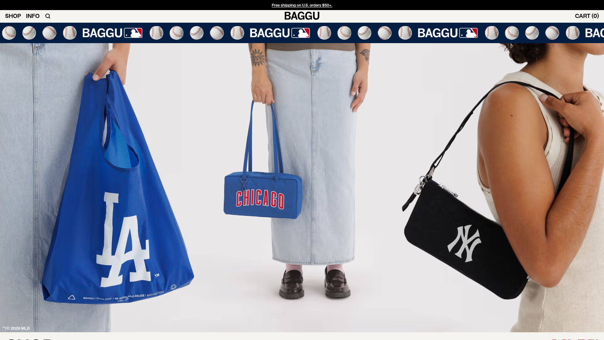
BAGGU Minimalist E-commerce Hero Template
A clean retail landing page layout featuring a full-width high-impact hero section, a sticky integrated banner, and a minimalist navigation header optimized for product launches.
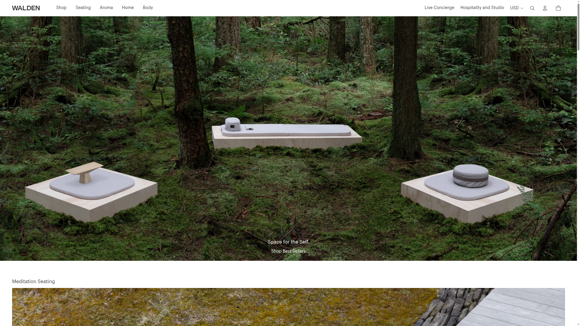
Walden Meditation E-commerce Product Gallery
A minimalist e-commerce layout featuring a high-impact full-width hero image with integrated commerce links and a vertically stacked category grid for niche lifestyle products.
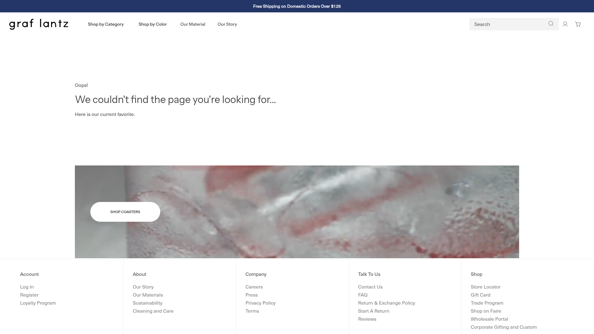
Graf Lantz Minimalist E-commerce 404
A clean Shopify-based error page featuring a full-width video hero with a CTA button, a detailed multi-column footer, and a sophisticated slide-out cart drawer.
