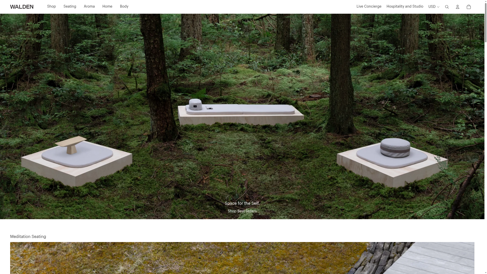
Walden Meditation E-commerce Product Gallery
A minimalist e-commerce layout featuring a high-impact full-width hero image with integrated commerce links and a vertically stacked category grid for niche lifestyle products.
Overview
Walden is a premium meditation and wellness e-commerce site that excels at blending high-fidelity editorial photography with a clean, functional shop layout. It is an excellent reference for high-ticket niche products because it prioritizes an immersive brand experience and spatial composition over dense product grids.
Design System
- Color Palette & Visual Hierarchy: The design uses a sophisticated earthy palette. The hero section leverages deep forest greens (from the image) balanced with the primary brand color #1C3B00 in the top utility bar. Text is predominantly high-contrast black or white (#ffffff for text-on-image) against neutral backgrounds (#scheme-1), emphasizing negative space and product prominence.
- Typography: The system relies on a clean, sans-serif stack (predominantly Helvetica as seen in the banner styles) using variable weight and tight letter-spacing for headers. Section titles (e.g., "Meditation Seating") use smaller, all-caps or lead-text styling to maintain a modern, boutique feel.
- Page Structure: The layout follows a vertical product storytelling flow:
- Utility Banner: Sticky promotional bar for site-wide offers.
- Immersive Hero: 80vh full-width imagery with centered typography and ghost-link calls to action.
- Section Grid: Vertically stacked categories containing a large featured landscape image followed by a 3-column product grid.
- Reusable Components:
- The Hero Link: A single-anchor overlay that covers the entire hero image as a clickable zone.
- Category Cards: Image-first cards where the title is an overlay on the bottom of the image, utilizing CSS variables (e.g.,
--custom-heading-color) to adapt text color based on specific product imagery. - Predictive Search Modal: A clean full-screen overlay (dialog-component) that provides instant visual product results and price comparisons.
- Response Behavior: The HTML indicates a liquid-responsive approach using
hero-only-desktopandhero-only-mobileimage classes to swap assets based on aspect ratio (e.g., shifting from 1.77:1 desktop to mobile-optimized crops) while maintaining the central text alignment.
Use Cases
- Who Should Clone This: Designers building lifestyle and home-goods shops that want to look like a premium gallery rather than a generic marketplace.
- Effective Remixes: Perfect for artisanal furniture, high-end skincare, or architectural lighting. Any product where "vibes" and environmental context are just as important as technical specs.
- Remix Directions:
- Architecture Adaption: Reuse the "Featured Section" pattern (1 Horizontal Image + 3 Small Cards) to create a visual rhythm for long-form landing pages.
- Brand Swap: Replace the forest imagery with urban/industrial aesthetics for a tech-wear brand while keeping the minimalist UI buttons and high-contrast navigation.
- Clone Scope: A quick section clone of the "Sound and Time" grid pattern is highly valuable for adding a curated feel to an existing Shopify or Webflow site without a full redesign.
Related Inspirations

Isla Beauty Skincare E-commerce Store
A clean Shopify-based storefront featuring a split-hero landing page, a step-by-step product system carousel, and a split-screen testimonial section with localized product image sidebars.
Relieve Furniture Sustainable Marketplace Landing Page
A clean sustainability-focused landing page featuring a hero with environmental impact stats, two-column visual category grid, horizontal logo slider, and a testimonial carousel.
Graf Lantz Minimalist E-commerce 404
A clean Shopify-based error page featuring a full-width video hero with a CTA button, a detailed multi-column footer, and a sophisticated slide-out cart drawer.
Makr Minimalist Design Goods Store
A clean e-commerce layout featuring an asymmetric image grid, drawer-based navigation categories with hover previews, and a sophisticated minimalist aesthetic.
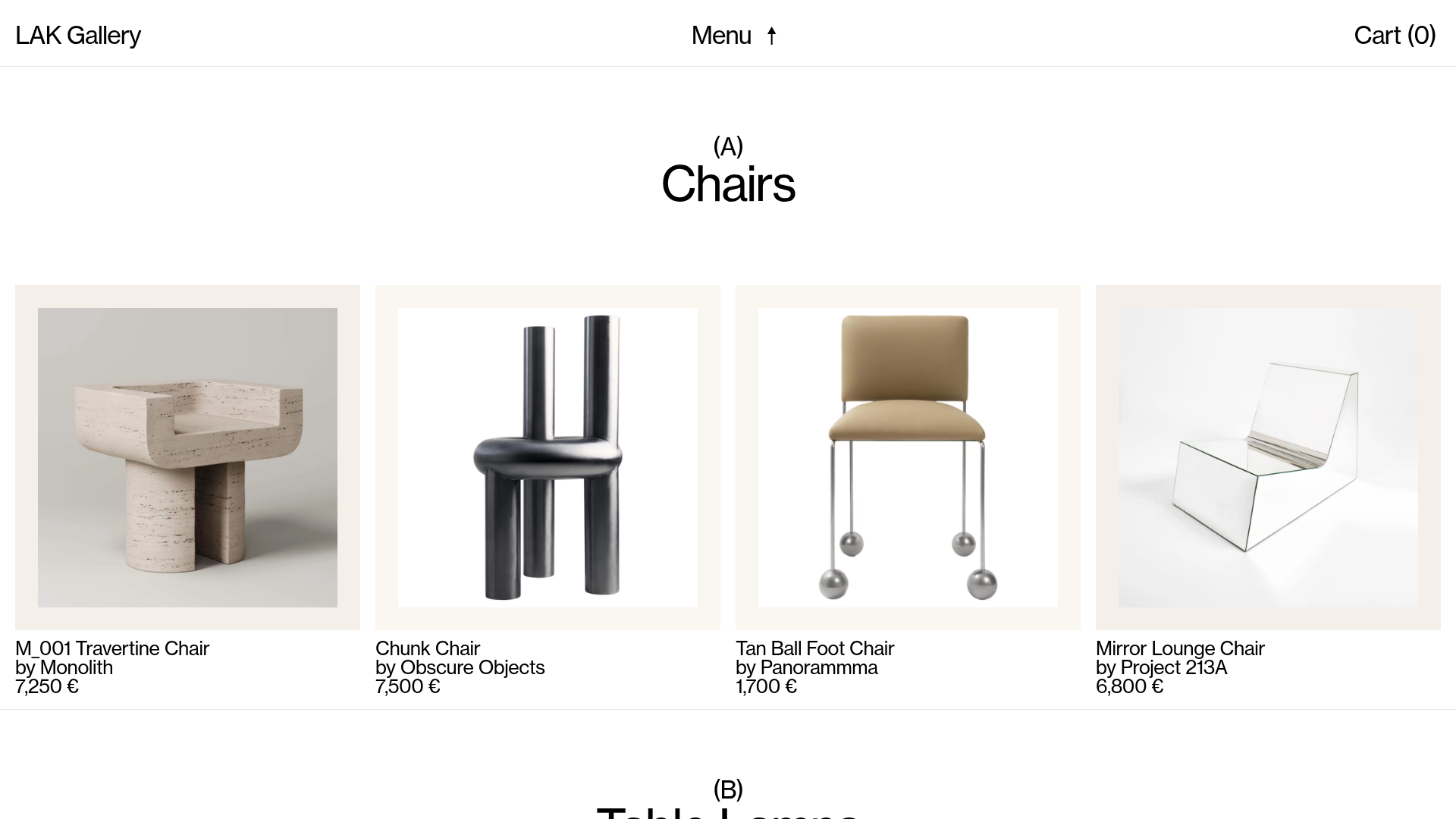
LAK Gallery Minimalist E-commerce Showcase
A clean collectible design shop featuring an alphabetical grid layout, category-driven horizontal scrolls, and high-contrast typography for luxury product catalogs.
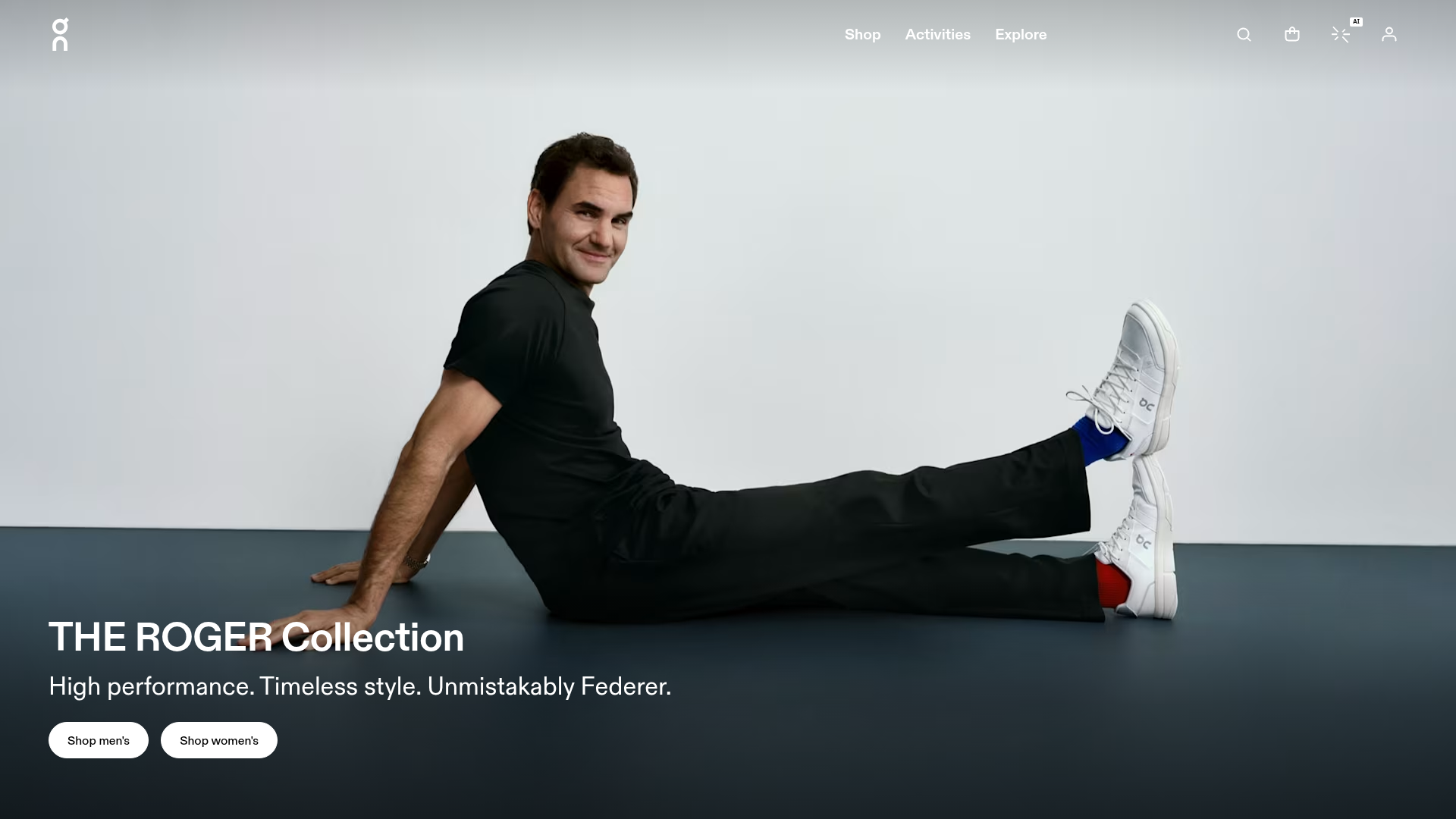
On Shoes Roger Federer Collection Landing Page
A minimalist lifestyle brand landing page featuring a full-bleed cinematic hero section, high-contrast typography, and CTA-focused navigation for a premium e-commerce experience.
