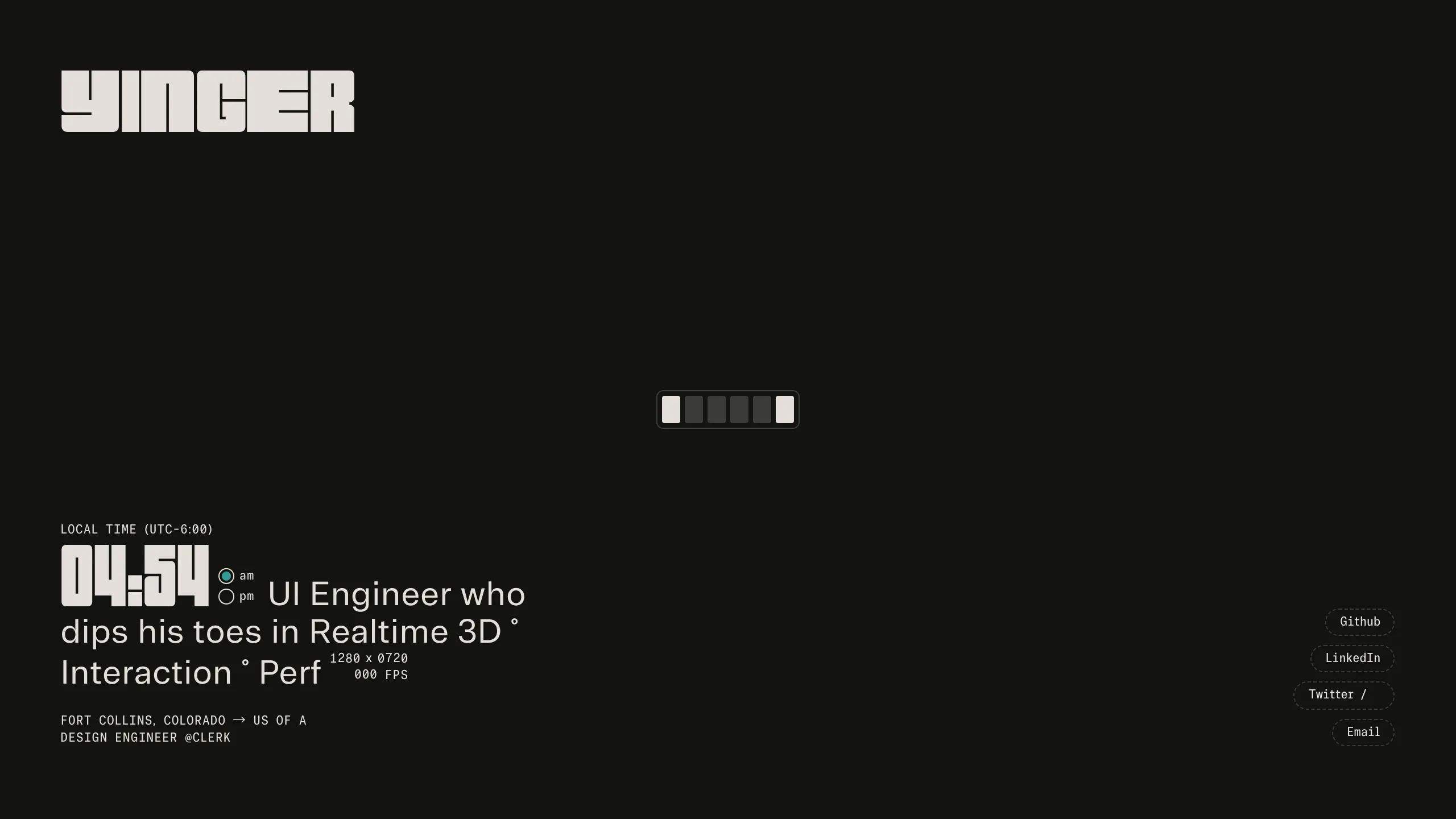
Max Yinger Developer Portfolio Landing
A dark-themed developer landing page featuring a digital clock, live viewport resolution display, and animated retro-styled social link buttons.
Overview
This developer portfolio is a minimalist, single-page terminal-inspired landing page that emphasizes technical metadata and typography over traditional imagery. It serves as a strong clone reference for builders looking to create a high-impact, "developer-first" aesthetic that utilizes real-time data like clocks, viewport dimensions, and frame rates to demonstrate technical proficiency.
Design System
- Color Palette & Visual Hierarchy: The site uses a high-contrast monochromatic dark theme (off-black background with off-white/light-grey text). The primary visual hierarchy is driven by font size and stroke weight, using a small selection of "accent" colors for active states, such as a blinking indicator for AM/PM settings.
- Typography: The system relies on a mix of a bold, blocky display font for the header and wordmark ("YINGER", "04:55") and a tabular-spaced, monospace font for metadata and body copy. This ensures alignment in the real-time updating numbers for time and FPS.
- Page Structure: The layout is a fixed-height, full-screen (h-dvh) container. The brand wordmark is anchored at the top-left, the primary bio and real-time stats are at the bottom-left, and social links are vertically stacked at the bottom-right on desktop (and horizontally on mobile).
- Reusable Components:
- Digital Clock & Performance HUD: A complex component using
tabular-numsand CSSgridtracks (styles_digitTrack__wFQjH) to animate shifting numbers for time, resolution, and FPS. - Animated Social Buttons: Pill-shaped buttons with dashed borders that transition to solid on hover, featuring a vertical sliding text animation (
styles_animate__L0dy1). - Progress/Loading Bar: A retro-style segmented bar in the center-page utilized for initial state representation.
- Digital Clock & Performance HUD: A complex component using
- Interaction Patterns: Uses CSS variables (e.g.,
--digit,--f-w) to drive animations. Elements feature staggered fade-ins and hover-induced translations. The wordmark uses a mouse-tracking character effect (mouse-char) where font-weight and opacity may shift based on interaction. - Mobile Behavior: The layout is highly responsive; social links move from a vertical stack on the right to a horizontal row at the bottom. The HTML indicates a
scrimclass is applied to the background on mobile to maintain text legibility over any 3D canvas content. - Implementation Clues: Built with Next.js (indicated by
next-route-announcer) and Tailwind CSS (utility classes likeh-dvh,flex,absolute). Three.js is used for a background canvas element to handle realtime 3D rendering.
Use Cases
- Who should clone this: Creative developers, UI/UX engineers, and technical artists who want a portfolio that feels like a "command center" or a software tool rather than a document.
- Product Remixing: This layout is effective for "Coming Soon" pages, developer tool landing pages, or technical dashboards where status monitoring is a core theme.
- Practical Remix Directions:
- Brand Swap: Replace the blocky display font with a sleek neo-grotesque for a more corporate "Minimalist Tech" look.
- Data Integration: Replace the FPS counter with live API data, such as GitHub commit activity or server status.
- Background: Swap the Three.js canvas for a CSS grain filter or a static SVG mesh for lower performance overhead.
- Suggested Clone Scope: The Digital Clock/HUD block is the most valuable individual component to clone for reuse in other projects. A full-page clone is recommended for those wanting to maintain the specific spatial tension of the minimalist layout.
Related Inspirations
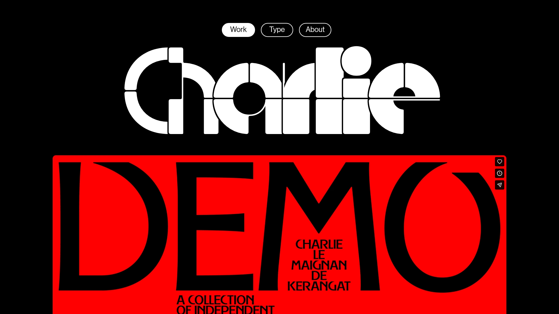
Charlie Le Maignan Portfolio Archive
A minimalist dark-mode portfolio featuring high-contrast typography, a geometric logo header, and an integrated full-width video gallery showcasing independent creative work.
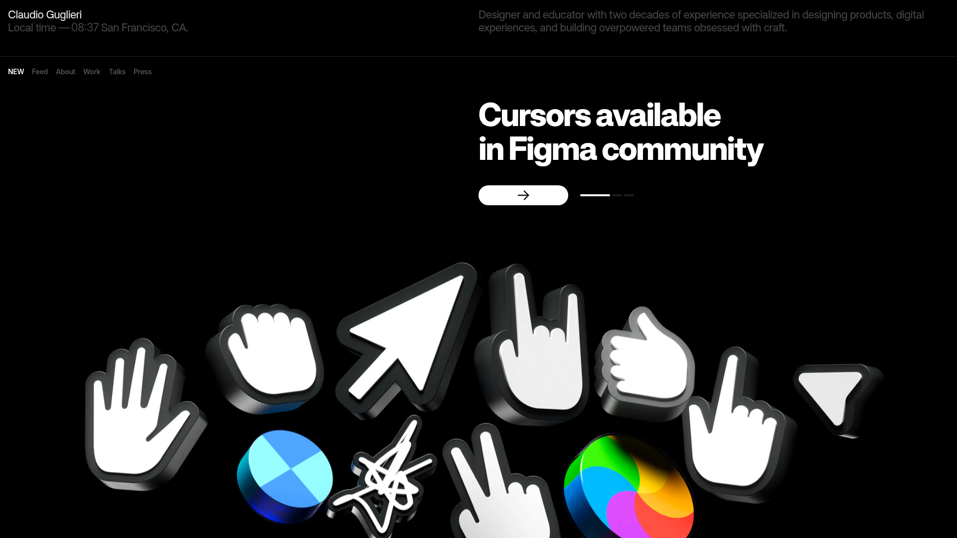
Claudio Guglieri Portfolio Portfolio Hero
A dark-themed designer portfolio featuring a 3D asset hero section, minimal top navigation bar, and integrated visitor message submission form.
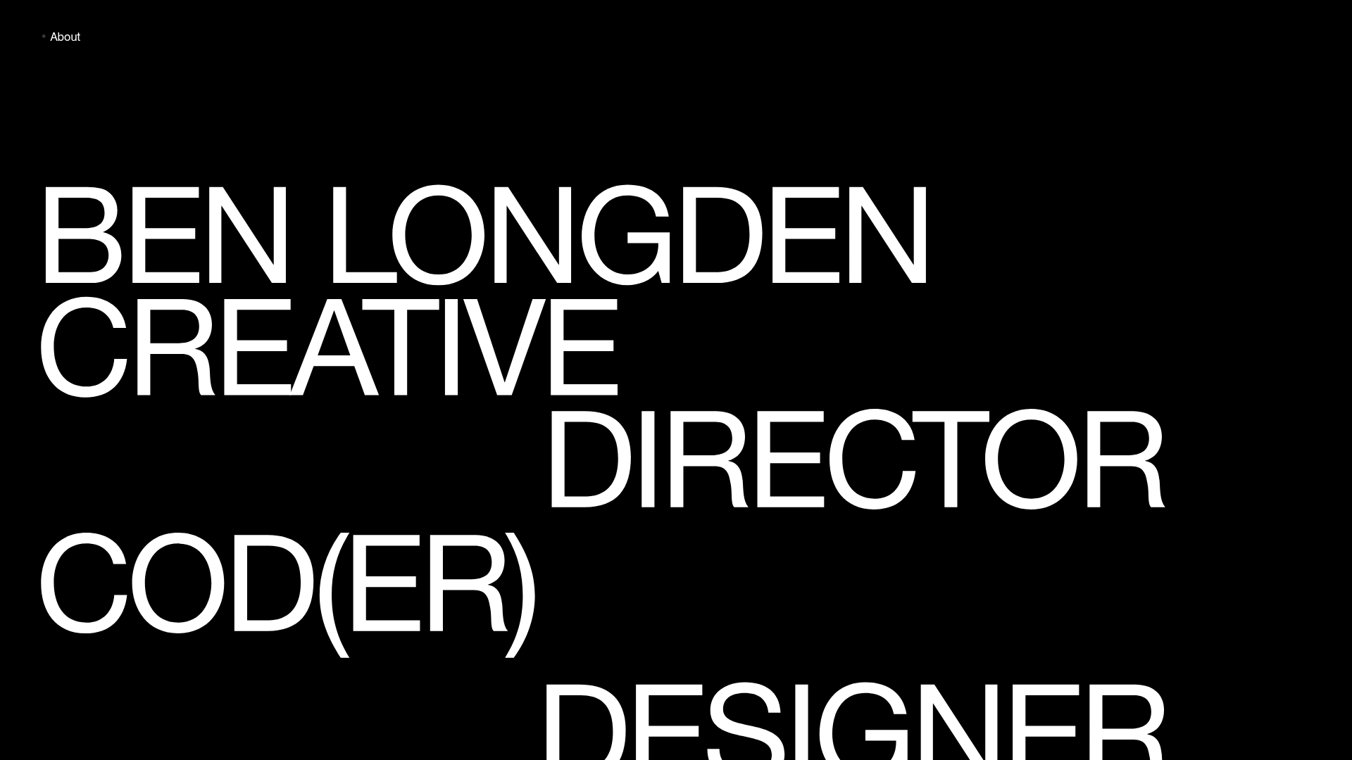
Ben Longden Minimalist Creative Portfolio
A bold typography-focused site featuring a large-scale overlapping hero section, horizontal image carousels for projects, and a scrolling text marquee footer.
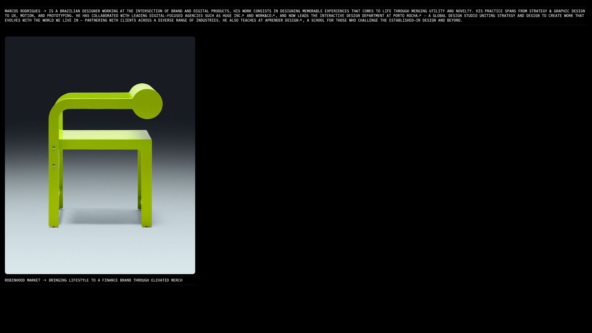
Marcos Rodriguez Minimalist Design Portfolio
A dark-themed personal site featuring a high-contrast monospaced header, a full-height centered image/video slideshow, and minimal thin-rule horizontal dividers.
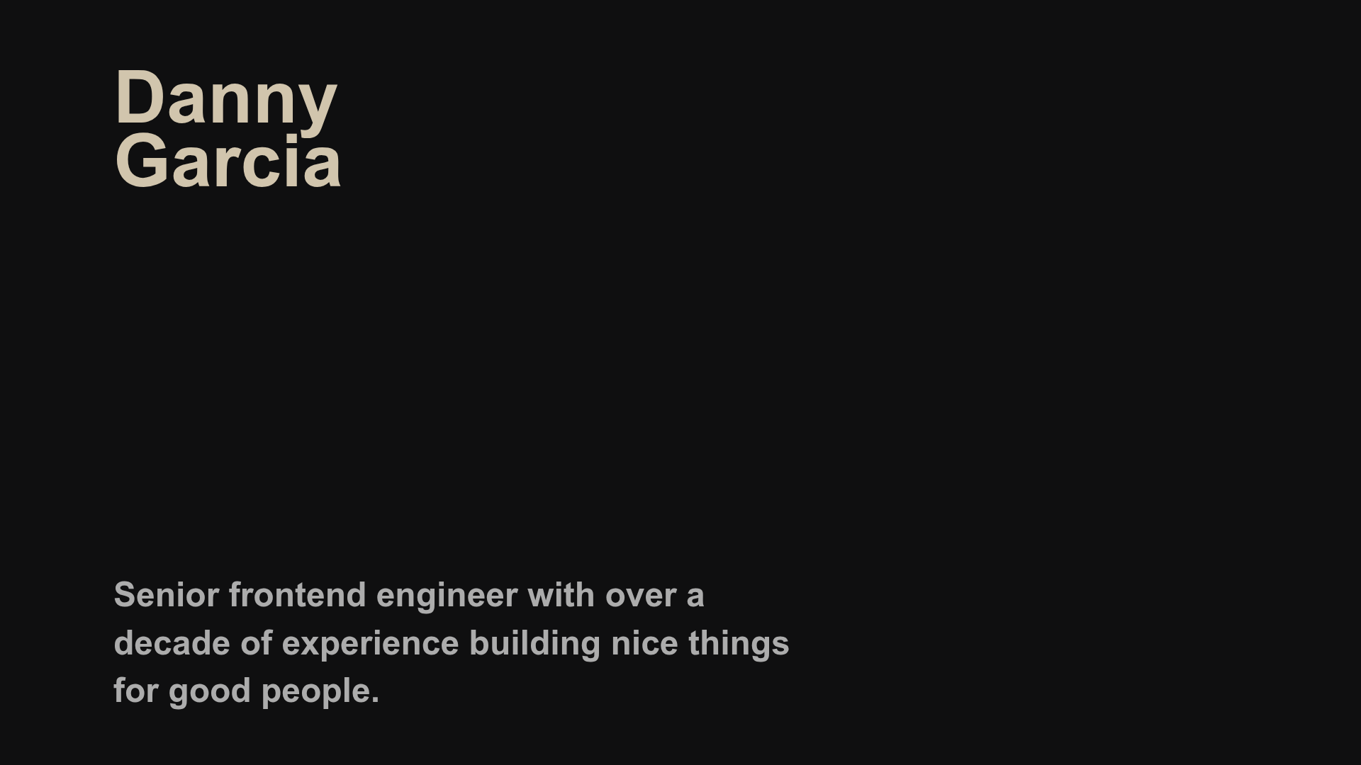
Danny Garcia Portfolio and Blog
A minimalist, typography-focused personal website featuring a dark mode aesthetic, canvas-based hero background, and a structured timeline layout for blog posts and work history.
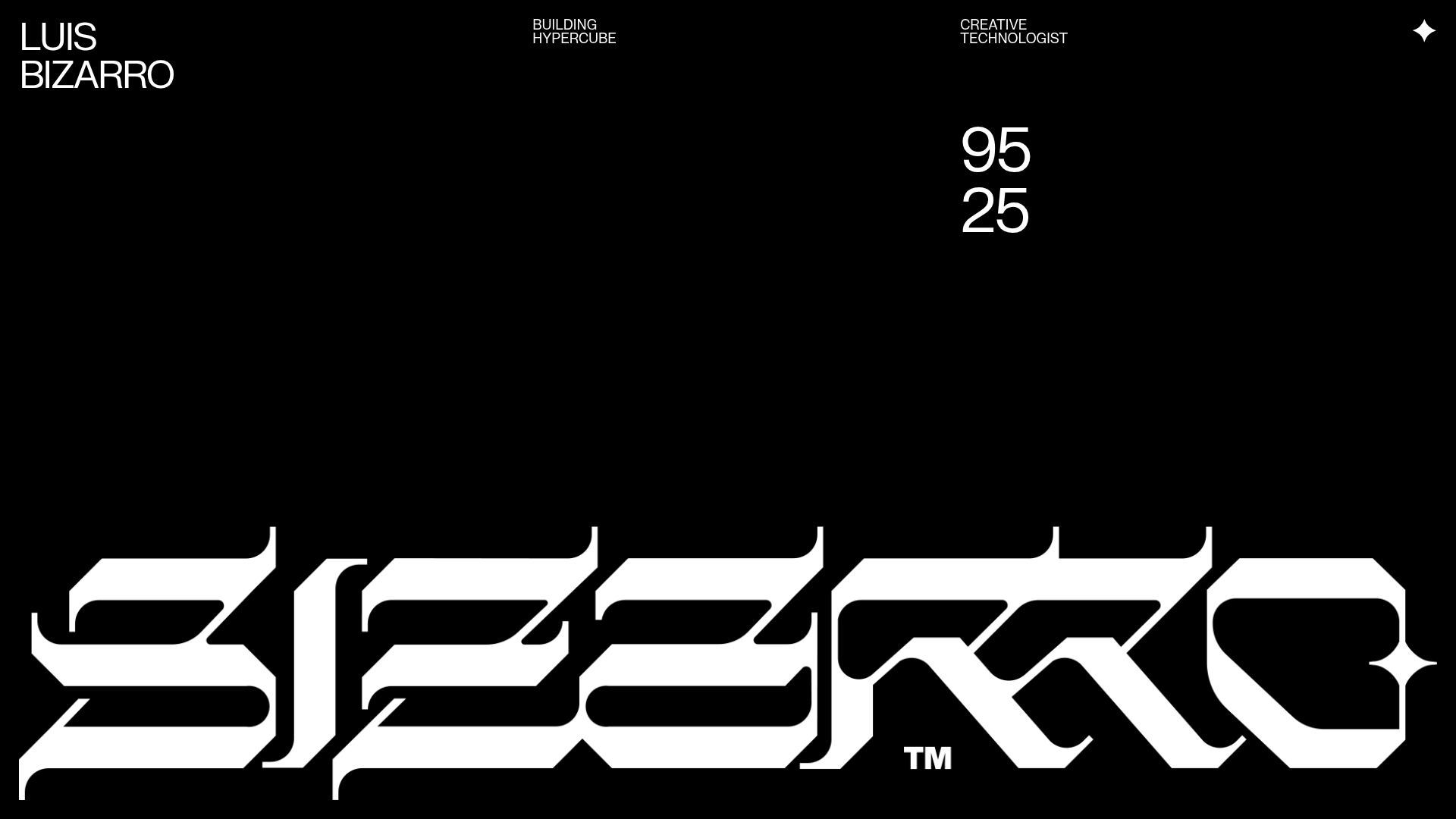
Luis Bizarro Creative Technologist Portfolio
A high-contrast dark mode portfolio featuring a custom blackletter logotype, minimal typography grid, and a video-heavy project showcase using WebGL-based content transitions.
