Emma Backman Portfolio Index Layout
A minimalist, text-heavy directory layout featuring multi-column navigation for categorizing a creative professional's works, clients, and collaborators.
Overview
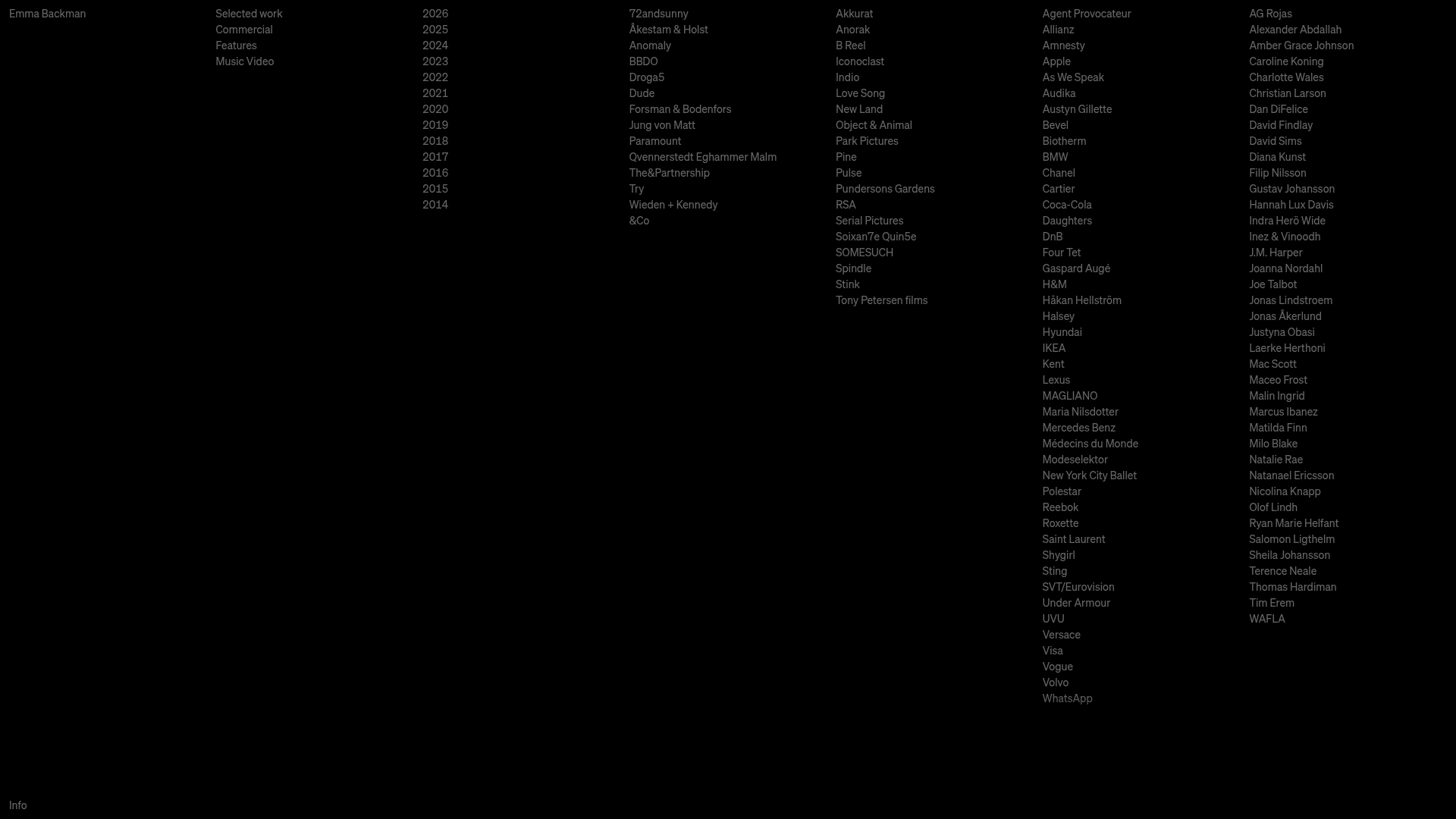
This portfolio for Emma Backman serves as a high-density text directory, functioning as a digital index for a professional's creative body of work. It is a powerful reference for minimalist design because it eschews visual thumbnails in favor of a clean, information-rich multi-column layout that emphasizes professional pedigree and longevity through data categorization.
Design System
- Color Palette & Visual Hierarchy: The design utilizes a high-contrast monochromatic scheme with an absolute black background (#000000) and off-white/light-grey text. Hierarchy is established through column grouping rather than font weight or size variation, creating a strictly utilitarian aesthetic.
- Typography system: A clean, neutral sans-serif (resembling Akzidenz-Grotesk or Helvetica) is used throughout. The scale is consistently small and uniform, with very tight line-heights, evoking the look of a technical ledger or a physical film credit roll.
- Page Structure & Section Flow: The layout is organized into horizontal columns that read from left to right: Name/Identity, Category filter (Selected work, Commercial, etc.), Chronological index (Years), Agency partners, Production companies, and two large columns for Client/Collaborator lists.
- Reusable Components: The core component is the
Vertical List Column. Each column is an independent stream of links. The "Info" link in the bottom-left corner serves as a fixed-position utility element. - Interaction Patterns: Based on the layout, the primary interaction is expected to be a subtle hover state change on text links. The high density suggests a focus on scanning rather than deep diving into single visuals.
- Implementation Clues: The HTML metadata identifies a
Next.jsframework (id="__next") using a CSS-in-JS solution (indicated by hashed class names likec-eDWPhN). This suggests a modern, performant React-based architecture under the minimalist exterior.
Use Cases
- Who should clone this: Creative directors, cinematographers, and production agencies with a massive volume of work that requires a non-visual, archival presentation to highlight the breadth of their portfolio.
- Effective Remixes: This layout is ideal for a "Founders' Reading List," a directory of open-source contributors, or a technical documentation site map where categorization is more important than visual flair.
- Remix Directions: One could adapt this by adding a "hover-to-preview" image functionality that appears in the empty negative space when a text link is moused over. Alternatively, one could use color-coding (e.g., different shades for different years) to add visual depth without breaking the grid.
- Suggested Clone Scope: This is best as a full-page clone. The value lies in the relationship between the 6-7 columns; cloning just a single list would lose the comprehensive, catalog-like impact of the design.
Related Inspirations

Niklas Rosén Designer Portfolio Index
A minimalist, responsive grid-based portfolio index featuring a clean 16-column layout, typographic list components, and a custom dark mode transition.
Minimalist Dark Designer Portfolio Grid
A clean, dark-themed portfolio featuring a bold typography hero section and a staggered two-column image grid with subtle entrance animations.

Jakub Reis Portfolio Case Study Gallery
A dark-themed designer portfolio featuring a typography-focused loading animation and a staggered masonry grid for project case studies.

Break Maiden Agency Portfolio Hero
A high-impact dark mode hero section featuring oversized typography with inline GIF icons and a responsive grid for display-heavy case studies.
Norgram Minimalist Design Portfolio
A high-end, monochrome studio portfolio featuring a brutalist typography-led hero section, a clean asymmetrical masonry grid, and minimalist project navigation.
Marx Design Minimal Portfolio Grid
A high-end design portfolio featuring a synchronized image-hover grid layout, GSAP-powered transitions, and a hidden fullscreen menu with portrait image links.
