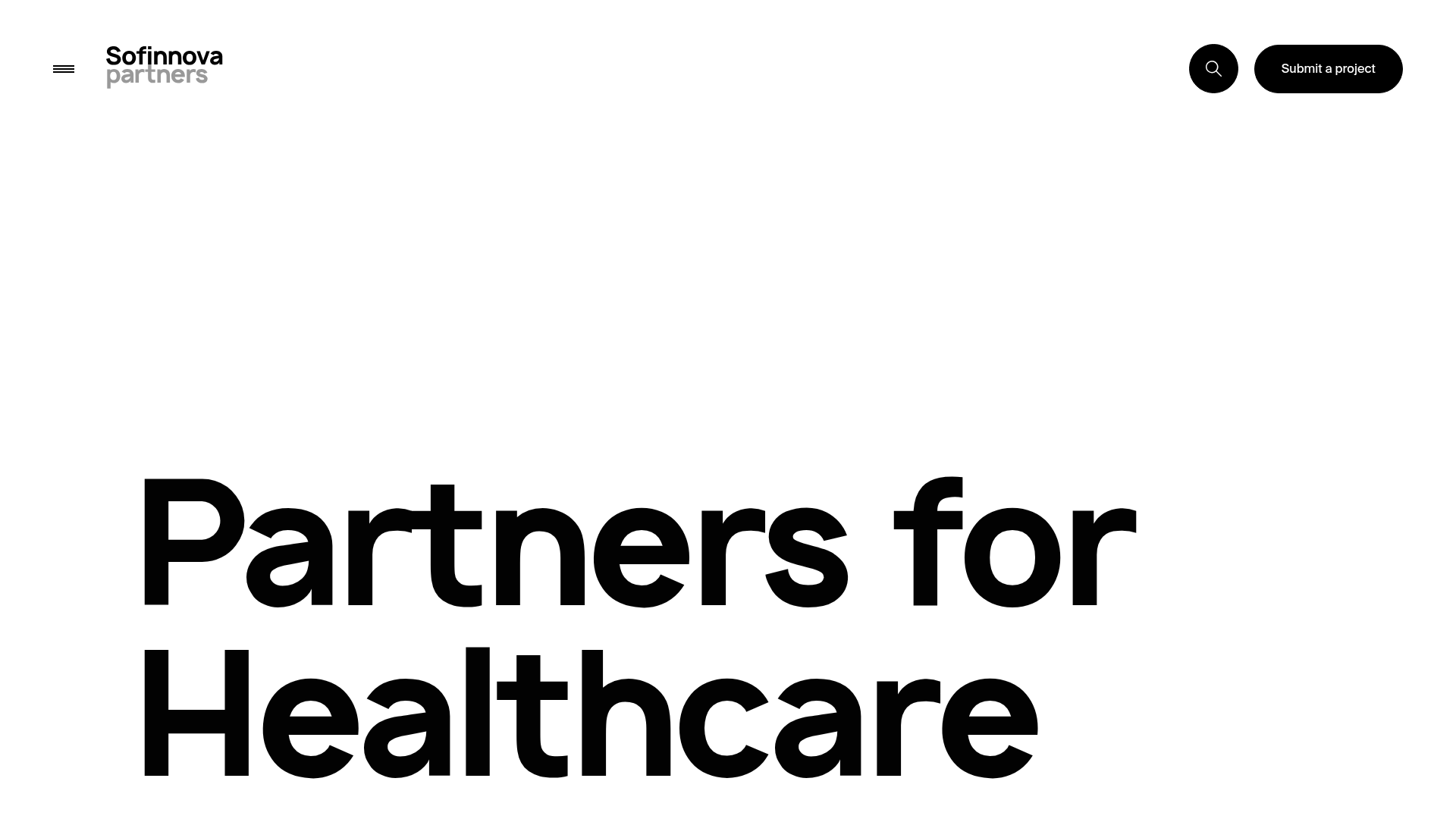
Sofinnova Partners Investment Portfolio Hero
A minimalist investment site featuring a bold typography hero, a horizontal colored-card fund slider, and a clean statistical grid with smooth scroll transitions.
Overview
This site for Sofinnova Partners is a high-end investment portfolio featuring a minimalist aesthetic that prioritizes bold typography and smooth, state-driven transitions. It is an excellent reference for builders wanting to combine professional institutional credibility with modern, interactive motion design, specifically for showcasing diverse investment strategies.
Design System
- Color Palette & Visual Hierarchy: The primary interface is high-contrast monochrome (pure black text on a clean white background). Color is used strategically as a functional identifier: each investment fund is assigned a distinct vibrant hue (purple, blue, orange, green, yellow, teal, and pink) which takes over the full viewport during the horizontal scroll section.
- Typography: A bold, geometric sans-serif (resembling Helvetica or Inter) is the foundation of the brand. Headings use extremely large font sizes with tight letter-spacing for high impact, while body text uses a generous line-height for readability.
- Page Structure & Flow:
- Minimalist Hero: A high-impact text-only intro.
- Horizontal Fund Slider: A fullscreen sectional scroll that transitions through color-coded fund cards.
- Statistical Grid: A minimalist numeric display (e.g., "500+ Companies") for institutional scale.
- Quote Diptych: A split-screen section featuring testimonial text alongside rotating partner imagery.
- News Feed: A clean vertical list of headlines.
- Reusable Components:
- Full-Width Navigation Bar: Features a subtle "hamburger" menu and a high-contrast pill-shaped "Submit a project" CTA.
- Fund Cards: Reusable blocks containing a strategy title, descriptive text, and an animated background canvas pattern.
- Statistical Item: A clean vertical stack combining a large number with a small label.
- Interaction Models: The site utilizes "Smooth Scroll" or "Scroll Jacking" where vertical movement triggers horizontal transitions or text reveal animations. Elements use
translate3dand opacity state changes to create an "entrance" effect as the user scrolls into a section. - Technical Implementation: The HTML reveals a Next.js framework using CSS modules (
index_headerContainer__sYJim). It employs a<canvas>element for complex background patterns and uses custom properties (CSS variables) for animation sequencing (--indexand--number).
Use Cases
- Who should clone this: Venture capital firms, private equity groups, and high-end consultancy firms that need to organize complex sub-divisions or strategies into a cohesive, modern narrative.
- Effective Remixes: Real estate developers can remix the colored fund sections to showcase different property portfolios; creative agencies can adapt the bold typography and diptych quotes for a high-impact team page.
- Remix Directions: Swap the pure black/white base for a dark mode palette to pivot toward a tech/fintech look. Builders can extract just the statistical grid (
index_numberLabel__cJRAO) as a standalone "Impact" section for nonprofit or SaaS landing pages. - Suggested Scope: A full-page clone is recommended for portfolio-heavy brands to capture the integrated scroll-and-color-transition flow, but the "Fund Slides" section (
fundSlides_fundSlides__RX3hL) is the highest-value individual component for reuse.
Related Inspirations

OpenWeb B2B Service Landing Page
A professional landing page layout featuring a central animated hero area, data visualization counters, a client logo grid, testimonial slider, and tabbed lead generation forms.

Pa’lais Plant-Based Product Homepage
A food product landing page featuring an animated video hero, a recipe carousel with filtering icons, organic blob-shaped layout containers, and a parallax-scrolling decorative element system.
Doo App Minimalist Product Landing Page
A clean, centered product showcase featuring a parallax hero image, icon-based feature checklists, horizontal gesture illustrations, and stacked section layouts with ample whitespace.
Miti Navi Luxury Nautical Portfolio
A high-end landing page featuring a curved hero mask, smooth parallax scroll effects, card-based service layouts, and sophisticated serif typography for a premium brand feel.
WE MAKE THINGS Corporate Portfolio
A minimalist corporate site featuring a bold typography-heavy hero section and an accordion-style brand list with integrated image galleries and external links.
403 Forbidden Access Page
A minimalist, centered HTTP 403 error status page layout suitable for clean and simple server-side response templates.
