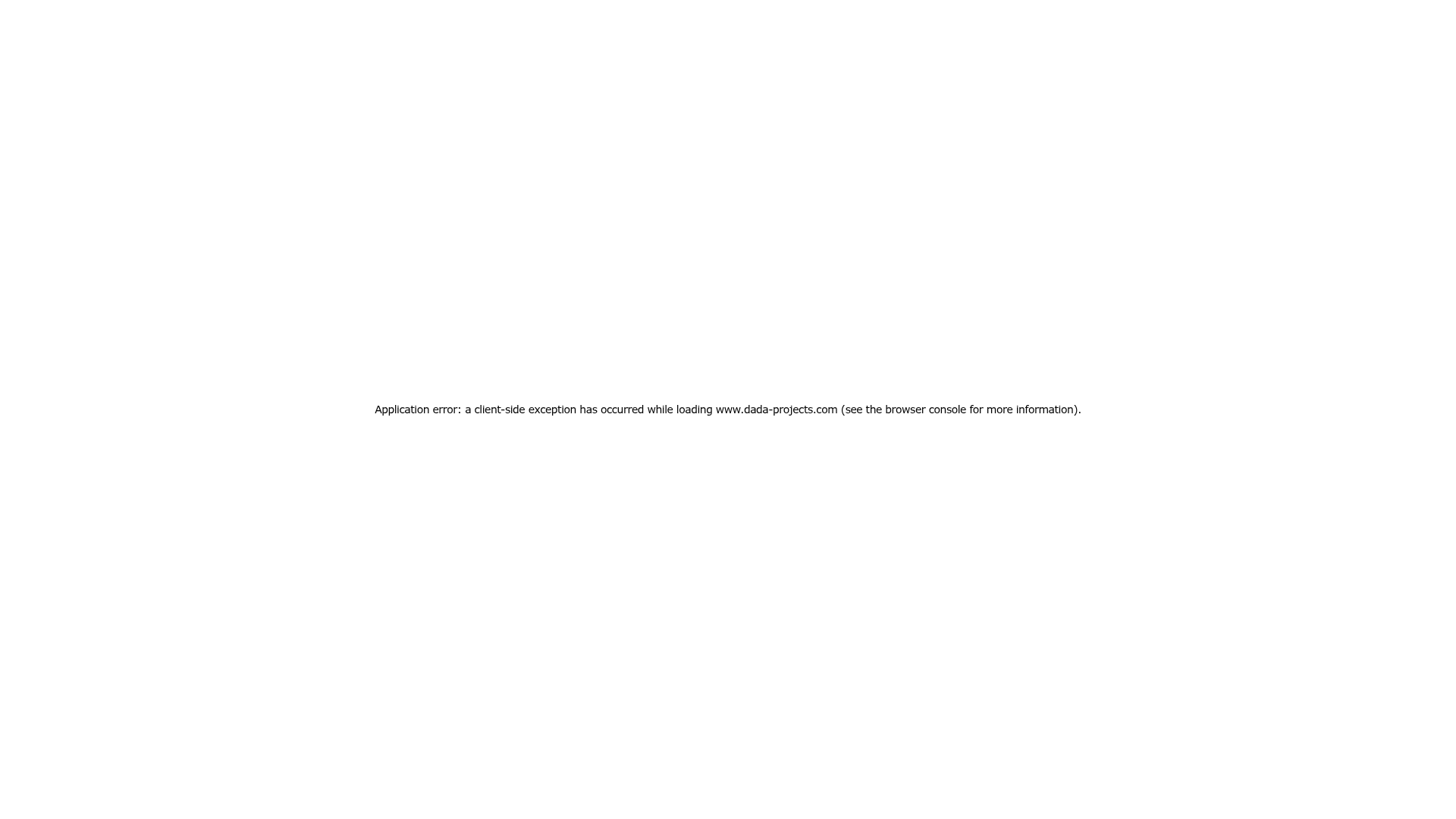
Dada Projects Application Error Page
A minimalist, center-aligned full-height layout featuring a standard system-font error message for Next.js applications.
Overview
This page represents a minimalist, full-screen Next.js application error state. It is a useful clone reference for developers who need to implement high-utility, low-friction fallback layouts that handle client-side exceptions while maintaining a clean, professional aesthetic.
Design System
- Color Palette & Visual Hierarchy: The design provides a stark high-contrast look with black text on a pure white background. The visual hierarchy is extremely flat, focusing entirely on a single line of functional information centered in the viewport.
- Typography System: The layout utilizes a standard system font stack (system-ui, Segoe UI, Roboto, Helvetica, Arial, sans-serif). The error message is set to a small scale (14px) with a normal font weight (400) and a generous line height (28px to 48px) to ensure legibility despite the small size.
- Page Structure: This is a flexbox-based centered layout. It uses a
100vhheight container withdisplay: flex,flex-direction: column,align-items: center, andjustify-content: centerto keep the content perfectly anchored in the dead center of the browser window. - Reusable Components: The core reusable element is the
100vhwrapper. This setup is ideal for "Under Maintenance," "404 Not Found," or primitive empty-state screens. - Implementation Clues: The HTML confirms the use of Next.js (
id="__next"), Tailwind CSS utility classes (flex,flex-col,items-center,text-sm), and inline styles for precise layout control. It also includes an accessibility-focusednext-route-announcerfor screen readers.
Use Cases
- Who should clone this: Developers looking for a quick, robust boilerplate for application error boundaries or loading states.
- Effective Remixes: This pattern can be effectively remixed for minimalist landing pages (as a "Coming Soon" placeholder) or authentication redirect screens.
- Remix Directions: Replace the plain text with a brand logo above the message, swap the system font for a custom brand font, or add a single "Retry" or "Go Home" button below the error text to improve user flow.
- Suggested Scope: A quick single-section clone of the centered flex container is sufficient to replicate this entire layout functionality.
Related Inspirations

Christopher Doyle Agency Portfolio Layout
A minimalist, typography-led portfolio featuring a wide-margin grid system, smooth fade-in animations, and simple image-focused project cards.
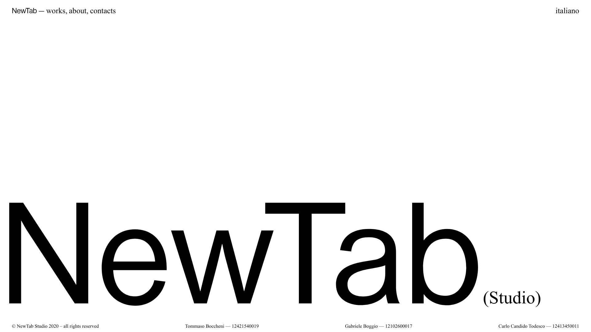
NewTab Studio Minimalist Portfolio Landing Page
A clean, typography-focused landing page featuring an oversized SVG/canvas hero title, a top-aligned navigation bar, and a minimalist footer layout.
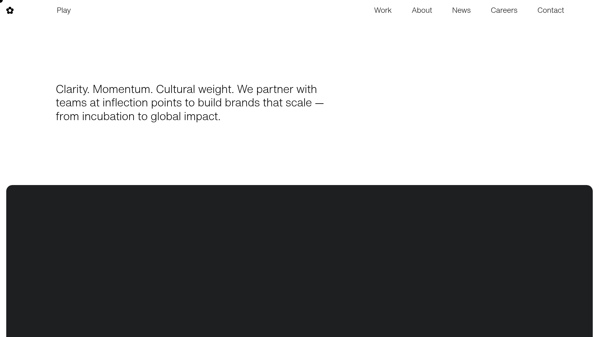
Play Studio Minimalist Portfolio Landing
A high-impact agency layout featuring a oversized typography header, a full-width integrated Vimeo video background, and a unique expandable accordion list for industry showcases.

Baubauwerk Minimal Agency Portfolio Homepage
A clean studio site featuring a centered text hero, scatter-plot filterable project gallery, and full-bleed image sections for case studies.
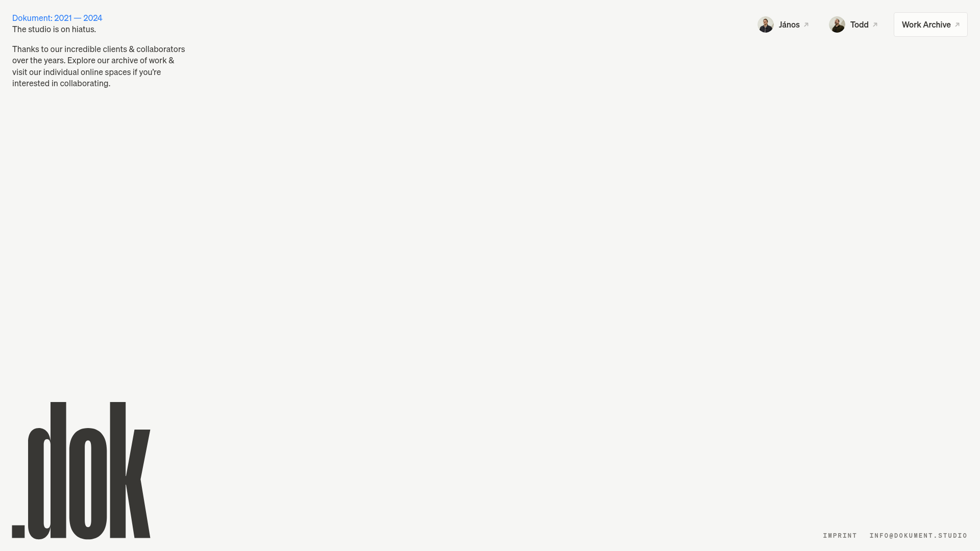
Dokument Studio Minimalist Portfolio Landing
A clean, high-contrast landing page featuring a bottom-aligned oversized logo, top-right profile links, and a minimalist typography-focused layout.
Catherine Peacock Designer Portfolio Home
A minimalist portfolio layout featuring a vertically stacked masonry project grid, sticky navigation with animated icons, and offset typography.
