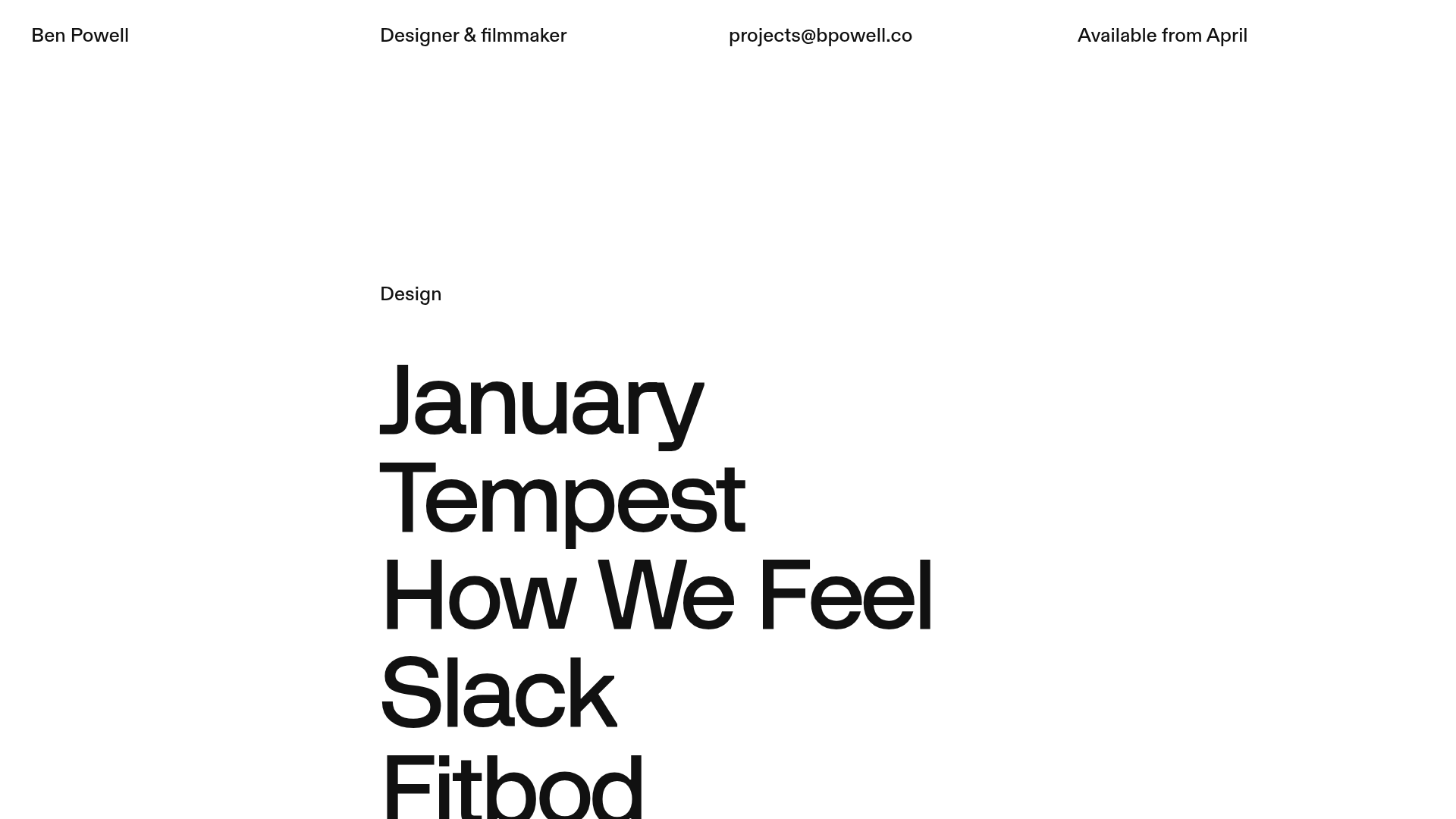
Ben Powell Minimalist Portfolio Showcase
A clean, typography-focused portfolio featuring a vertical project list with sophisticated hover-triggered image transitions and fluid interactions for design and film categories.
Overview
Ben Powell’s portfolio is an exceptional study in minimalist, high-contrast design that leverages large-scale typography as the primary navigation. It serves as a strong reference for creators seeking to build a brand-first portfolio where motion and interaction design take center stage over traditional layouts.
Design System
- Color Palette & Visual Hierarchy: The site uses a neutral off-white or light gray foundation with high-contrast sharp black text (
#000000). Dynamic background colors (e.g.,rgb(232, 232, 221)orrgb(93, 93, 131)) transition smoothly based on project hovers, creating a mood shift for each project without leaving the index. - Typography: The system relies on a bold, sans-serif Grotesk typeface. The project titles use a massive scale (
h1) with tight letter spacing, while the navigation and metadata in the four-column header use a significantly smaller, functional scale to create clear horizontal hierarchy. - Page Structure: The site follows a vertical flow divided into two main categories: Design and Film. A fixed 4-column utility header provides contact info and availability. The body contains a project list followed by a hidden-until-transition details section for professional experience and a bio.
- Reusable Components: The
link-blockcomponent is the core asset, containing project text, hidden Lottie animations for arrows, and multi-layered images designed for hover reveals. - Interaction & Motion: This is a Webflow-based build utilizing detailed IX2 animations. Project links feature
translate3dandopacitytransitions. On hover, images specifically categorized astop-right,bottom-right, orimageslide into view from varying directions (e.g.,30vw), creating a layered depth effect. - Implementation Clues: The HTML reveals a grid-based system (
col-3,col-9) and a reliance on Lottie for iconography. Dynamic project data is pulled viaw-dyn-list, making it easy to scale content once the interaction logic is established.
Use Cases
- Who should clone this: Product designers, art directors, and filmmakers who want to emphasize a selected few "best-in-class" works rather than a dense gallery.
- Effective Remixes: Agencies can adapt this for talent rosters; a studio could use the typography-list approach to showcase services where each hover reveals a case study snapshot.
- Practical Remix Directions: Retain the four-column header structure but swap the project list for a more standard grid if high-resolution horizontal photography is the primary focus. The
transitiondiv can be repurposed as a global overlay for contact forms or about pages. - Suggested Clone Scope: Start with the
projects-blockand its associated hover interactions. The sheer scale of the typography and the CSStransform-style: preserve-3danimations are the most valuable parts to clone for immediate visual impact.
Related Inspirations

Egstad Minimalist Design Portfolio
A refined Nuxt.js portfolio featuring bold variable typography, interactive canvas elements, and a clean grid-based layout for showcasing design work.
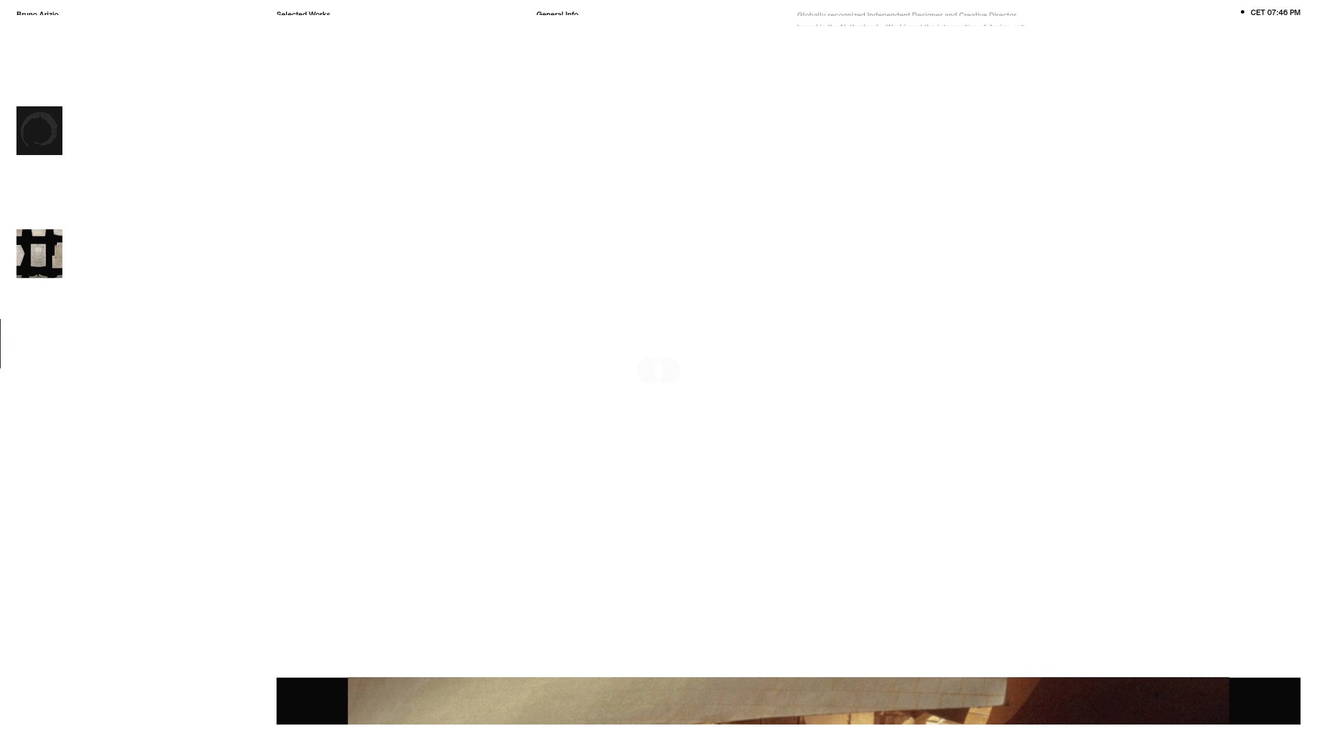
Bruno Arizio Designer Portfolio Website
A minimalist creative director portfolio featuring a clean typographic layout, side-aligned image previews, and high-contrast spacing patterns suitable for luxury or design showcases.

Christopher Doyle Agency Portfolio Layout
A minimalist, typography-led portfolio featuring a wide-margin grid system, smooth fade-in animations, and simple image-focused project cards.
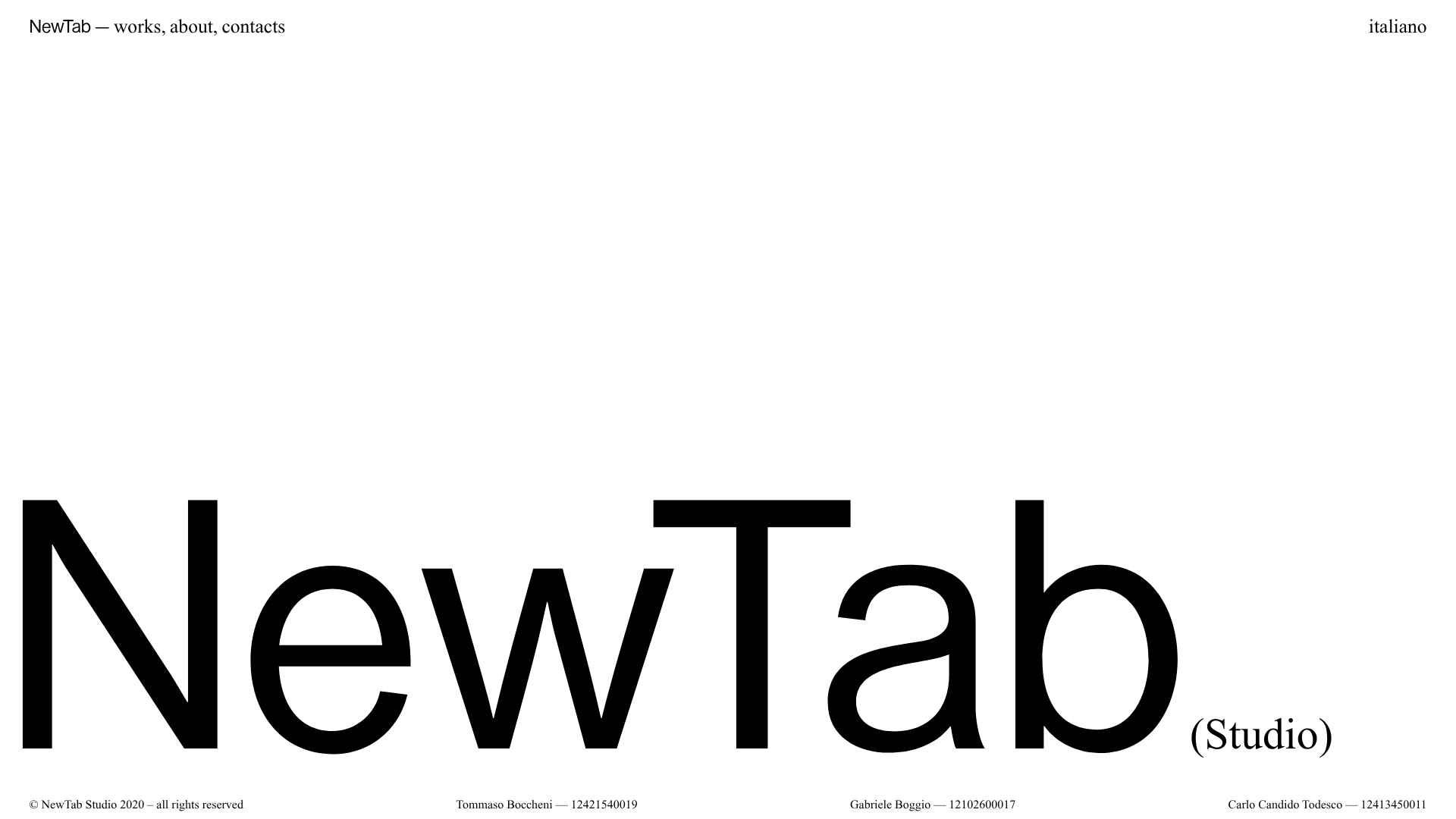
NewTab Studio Minimalist Portfolio Landing Page
A clean, typography-focused landing page featuring an oversized SVG/canvas hero title, a top-aligned navigation bar, and a minimalist footer layout.
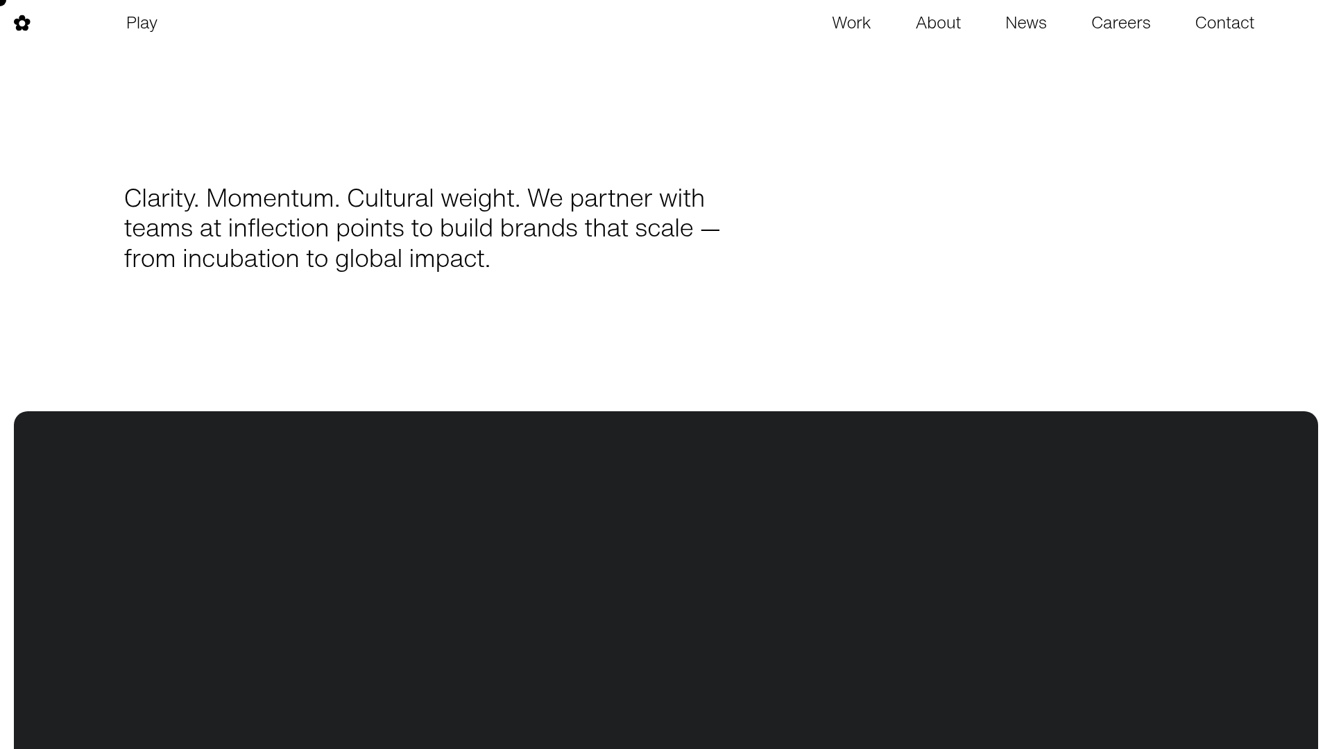
Play Studio Minimalist Portfolio Landing
A high-impact agency layout featuring a oversized typography header, a full-width integrated Vimeo video background, and a unique expandable accordion list for industry showcases.

Vita Architecture Portfolio Landing Page
A minimalist, high-end architecture portfolio featuring a custom canvas-based image gallery, split-text animations, and a project slider with dynamic image masks.
