Symbol Audio Furniture E-Commerce Showcase
A high-end retail layout featuring an ultra-slim sticky header, a typography-heavy hero with overlapping imagery, and a grid of interactive product cards with animated hover states.
Overview
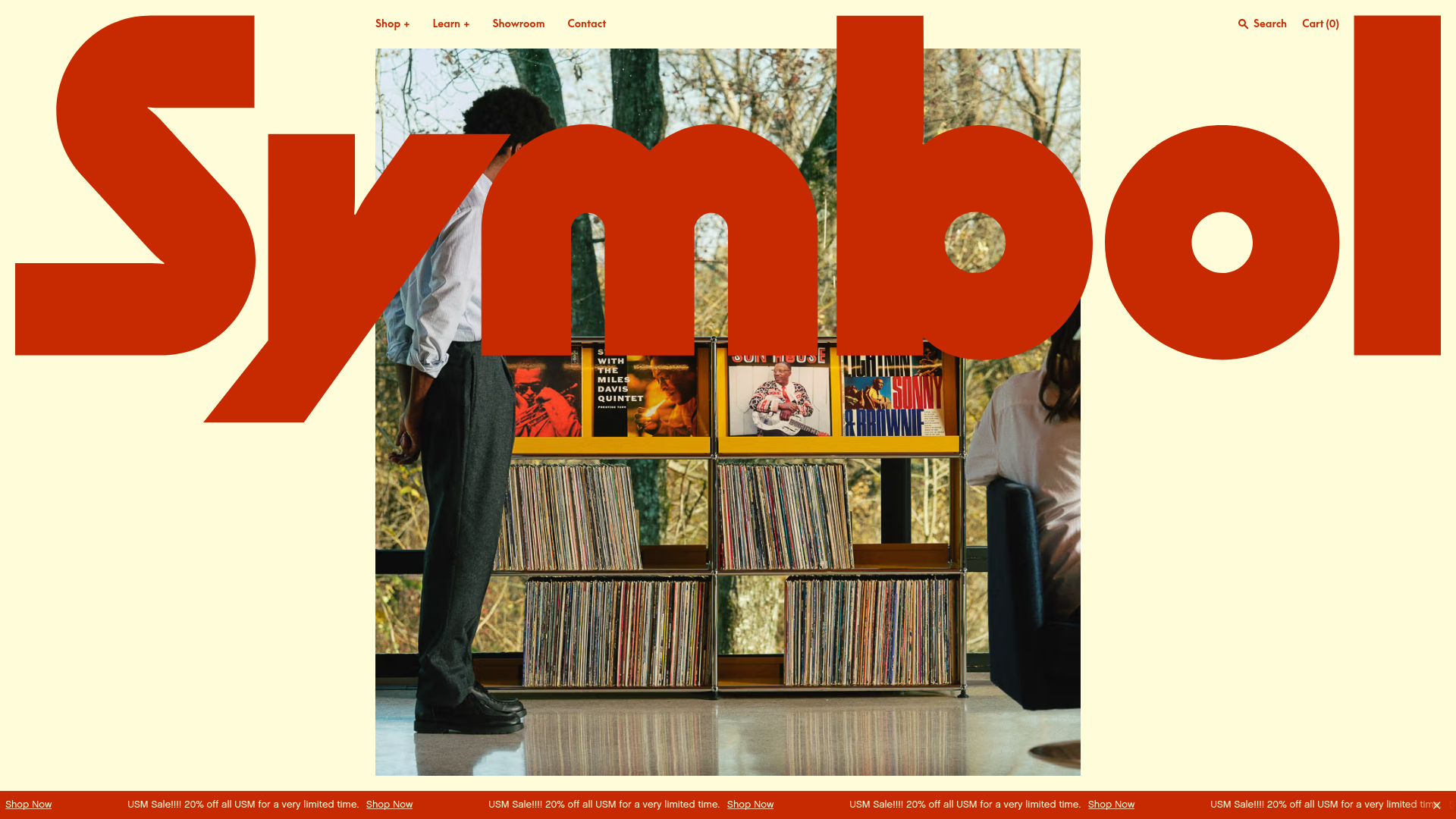
This high-end e-commerce layout for Symbol Audio is a masterclass in combining bold storytelling with retail functionality. It successfully blends oversized, editorial-style typography with a minimalist product grid, making it an excellent reference for brands that want to convey luxury through a modern, high-contrast aesthetic.
Design System
- Color Palette & Visual Hierarchy: The site uses a sophisticated 'Off-white/Red' theme (
data-theme="offwhite--red"). The background is a soft cream (#fcf9f1), while a vibrant primary red acts as the dominant accent color for large-scale typography and call-to-actions. Dark accents are used primarily for secondary text to maintain high legibility. - Typography: The identity is driven by a massive, custom-styled hero wordmark ("Symbol") that overlaps the central image. The system utilizes a hierarchical scale from
is-h1(oversized display) totype--base-xsfor product labels. The font choice is a clean, geometric sans-serif that feels both mid-century and contemporary. - Page Structure:
- Dynamic Header & Promo Bar: A sticky top navigation and a bottom-fixed ticker marquee (
animate-ticker) for announcements. - Hero Section: Overlapping layers where a large image is sandwiched between typography and global UI elements.
- Product Grid: A multi-column grid (
grid-cols-2tolg:grid-cols-4) for merchandise. - Narrative/About: Full-width text blocks for brand storytelling.
- Dynamic Header & Promo Bar: A sticky top navigation and a bottom-fixed ticker marquee (
- Reusable Components:
- Interactive Product Cards: These feature high-resolution imagery that shifts upward on hover (
-translate-y-[12px]) to reveal a row of circular color/material swatches. - The Marquee Ticker: A horizontally scrolling carousel of promo text, ideal for high-impact sales messaging.
- Badges: Small, pill-shaped labels with soft opacity backgrounds (
opacity-10) indicating "Bestseller" or "On Sale."
- Interactive Product Cards: These feature high-resolution imagery that shifts upward on hover (
- Motion Patterns: Subtle Y-axis translations on card hover and smooth grid transitions define the experience. Elements use a custom
duration-sloworduration-fastutility as seen in the HTML classes. - Implementation Clues: Built with Next.js and Tailwind CSS. The usage of CSS variables for heights (e.g.,
--headerHeight) suggests a highly modular layout system that adapts to dynamic content bars.
Use Cases
- Who should clone this: Designers and developers looking to elevate a standard e-commerce store into a premium brand experience. It is specifically suited for furniture, high-end audio, or architecturally-influenced lifestyle products.
- Remixing effectively: The layout is effective for products with strong visual variety; the color swatch component on the cards can be adapted for any attribute (finish, size, or material).
- Practical directions:
- The Quick Clone: Reuse the "Product Card" logic, which handles "On Sale" strikethrough pricing and color swatches elegantly in a small package.
- The Brand Refresh: Swap the bold red and cream palette for a monochromatic "Black/Steel" theme to suit tech-focused gadgets.
- Clone Scope: A full-page clone is ideal for brands with 5–15 flagship products. For larger catalogs, cloning the specific product card interaction and the typography-led hero would be the most effective application.
Related Inspirations

Context Gallery High-End Furniture Landing Page
A minimal editorial layout featuring a multi-column product carousel, designer biographies with image-text pairings, and a magazine-style content grid for curated design stories.

Glein Minimalistic Bento Grid eCommerce
A clean, modular layout using a bento-style responsive grid of text teasers and large-scale product imagery for lookbooks and collection browsing.

Basic.Space E-commerce Gallery Clone
A minimalist product marketplace featuring a clean sticky navigation bar, nested flyout menus, and a horizontally scrollable product carousel with hover-state image switching.

Ashley & Co Lifestyle E-commerce
An elegant Shopify-based storefront featuring a split-screen animated hero, horizontal ticker-tape collection carousel, and dynamic mega-menus with scent-specific color switching and image previews.
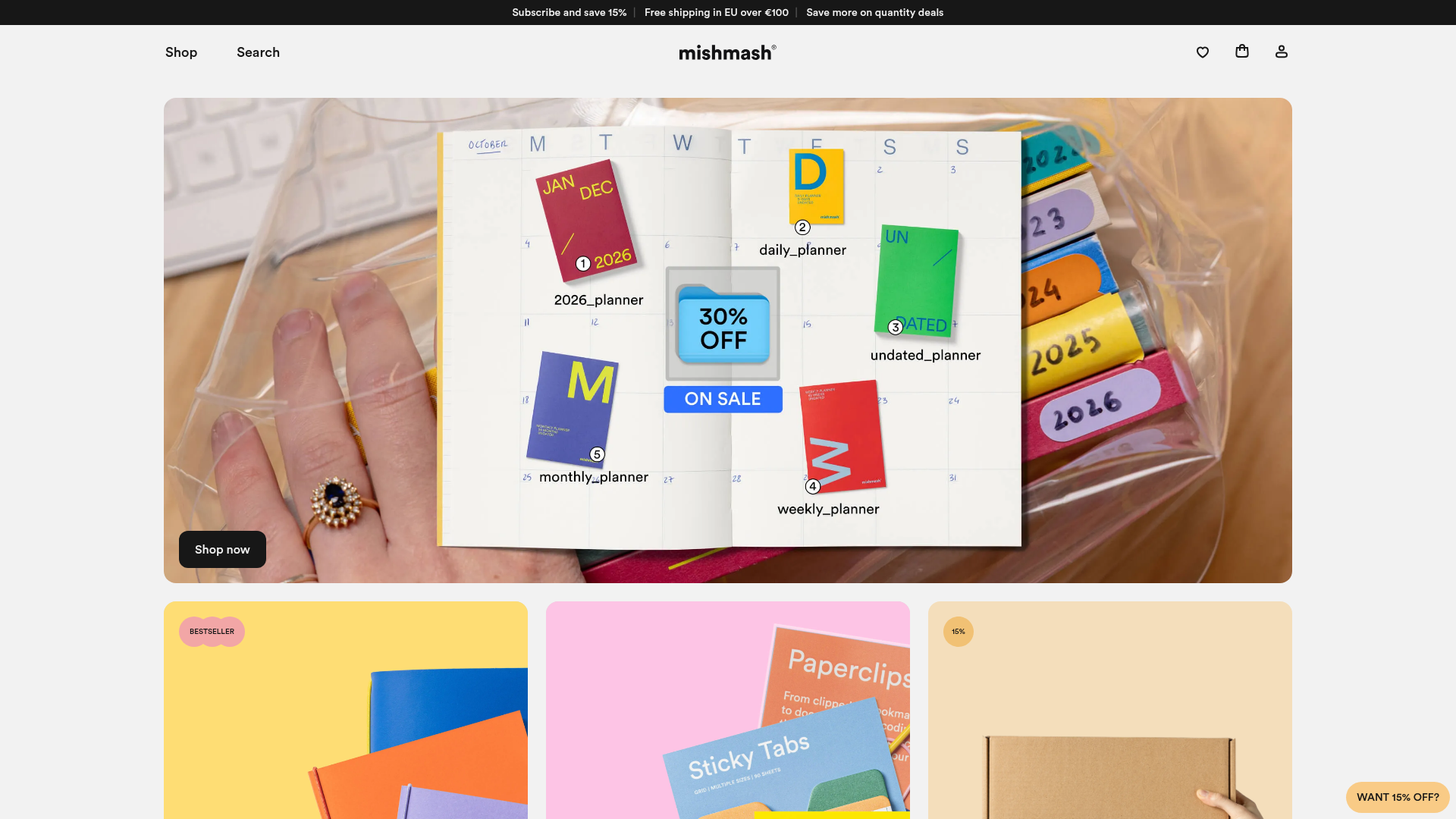
Mishmash Stationery E-commerce Layout
A clean retail template featuring rounded image grids, a multi-column comparison section with custom iconography, and a responsive products carousel.
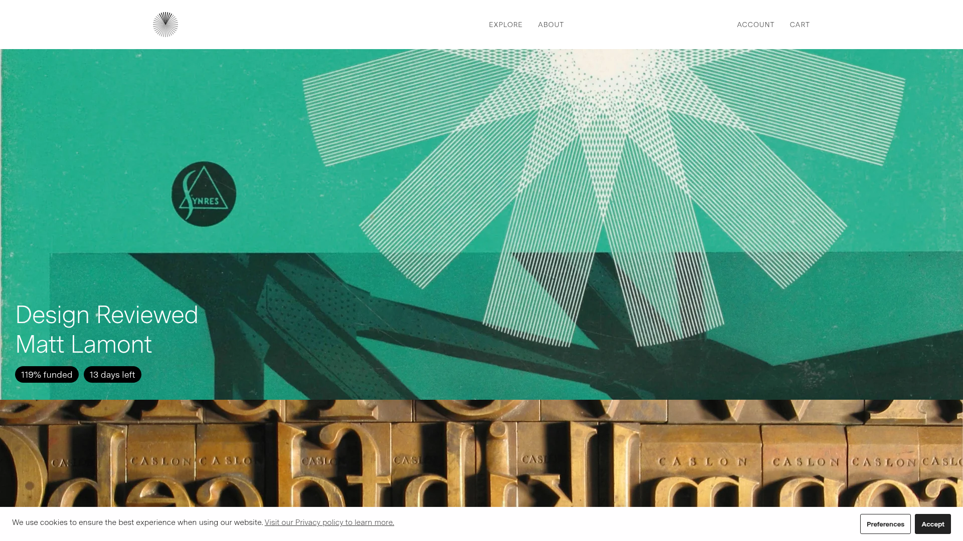
Volume Crowdfunding Book Gallery
A minimalist editorial storefront featuring full-width high-resolution image cards, status pills for campaign progress, and a clean typography-focused navigation layout.
