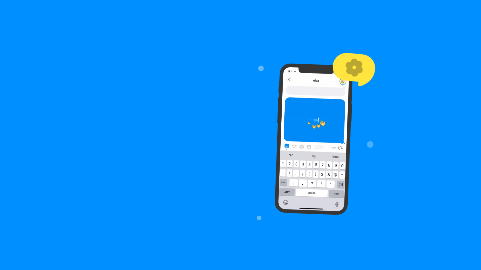
Honk Real-time Messaging Landing Page
A minimalist landing page featuring a vibrant blue background, animated typography, and a central interactive phone-mockup component for mobile interface display.
Overview
This landing page is a minimalist, high-impact showcase for the 'Honk' messaging app, centered around a dynamic phone mockup that demonstrates real-time interaction. It is an excellent clone reference for developers building mobile-first SaaS products or social apps that need to communicate a single, powerful value proposition through motion and bold visuals.
Design System
- Color Palette & Visual Hierarchy: The design is dominated by a vibrant 'Honk Blue' (
rgb(0, 140, 255)) background that creates immediate brand recognition. White text and a high-contrast yellow speech bubble create a clear visual hierarchy, drawing the eye first to the animated headline and then to the central interactive device. - Typography System: The site uses a bold sans-serif display font for headlines (
Really, real-time messaging.). The HTML reveals a sophisticated motion-driven typography system where individual words are transformed and rotated via inline styles to create a playful, energetic entrance. - Page Structure: The layout follows a classic two-column hero structure. The left column contains the text-based value proposition and a 'Sunset' announcement banner, while the right column houses the animated
PhoneGraphiccomponent. - Reusable Components:
- Interactive Phone Mockup: A sophisticated wrapper (
styles__PhoneWrapper) containing a nested video player simulating app usage. - Announcement Banner: A custom card with a distinct icon and status text, useful for alerts or secondary CTAs.
- Floating Elements: Decorative 'dots' and chat bubbles that use absolute positioning and slight transforms to create depth around the phone.
- Interactive Phone Mockup: A sophisticated wrapper (
- Interaction & Motion: The site relies heavily on CSS transforms and Framer Motion/React Spring-style animations. Evidence includes
translateY,rotate, andscaleapplied to headline spans and the phone container, creating a 'floaty' or physics-based feel. - Responsive Behavior: The HTML includes dedicated classes like
pages__OnlyDesktopandpages__OnlyMobile, suggesting a tailored layout where elements are reordered or visibility is toggled based on the viewport. - Implementation Clues: The project is built with Next.js (indicated by
id="__next") and uses Styled Components (seen in the hashed class names likesc-1g5xg0g-0).
Use Cases
- Who should clone this: Mobile app developers needing a 'Coming Soon' or 'Sunset' page that highlights core app mechanics without requiring heavy text content.
- Remix Directions: Swap the blue background for a brand-specific gradient; replace the phone video with a high-fidelity 3D model; or adapt the animated typography system for a creative agency portfolio site.
- Practical Remixes: The 'Real-time' headline animation logic can be reused for any site emphasizing speed or live features. The phone mockup setup is a perfect reusable snippet for any mobile-first SaaS project.
- Suggested Clone Scope: For a quick win, clone the hero section (
TwoColumnlayout) and the phone video container. For a deeper project, replicate the staggered entry animations and the responsive toggling mechanism.
Related Inspirations
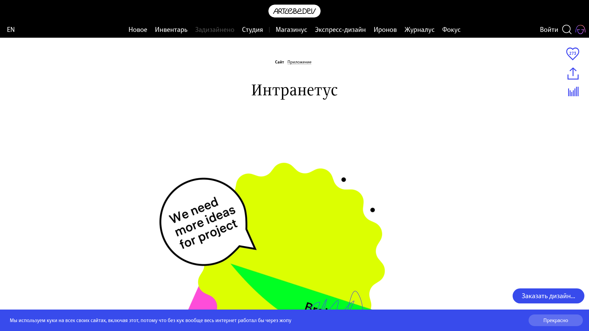
Intranetus Project Showcase Landing Page
A high-concept portfolio page featuring a large-scale video hero, Lottie animations, layered parallax transition effects, and a vertical grid of browser-mockup feature cards.
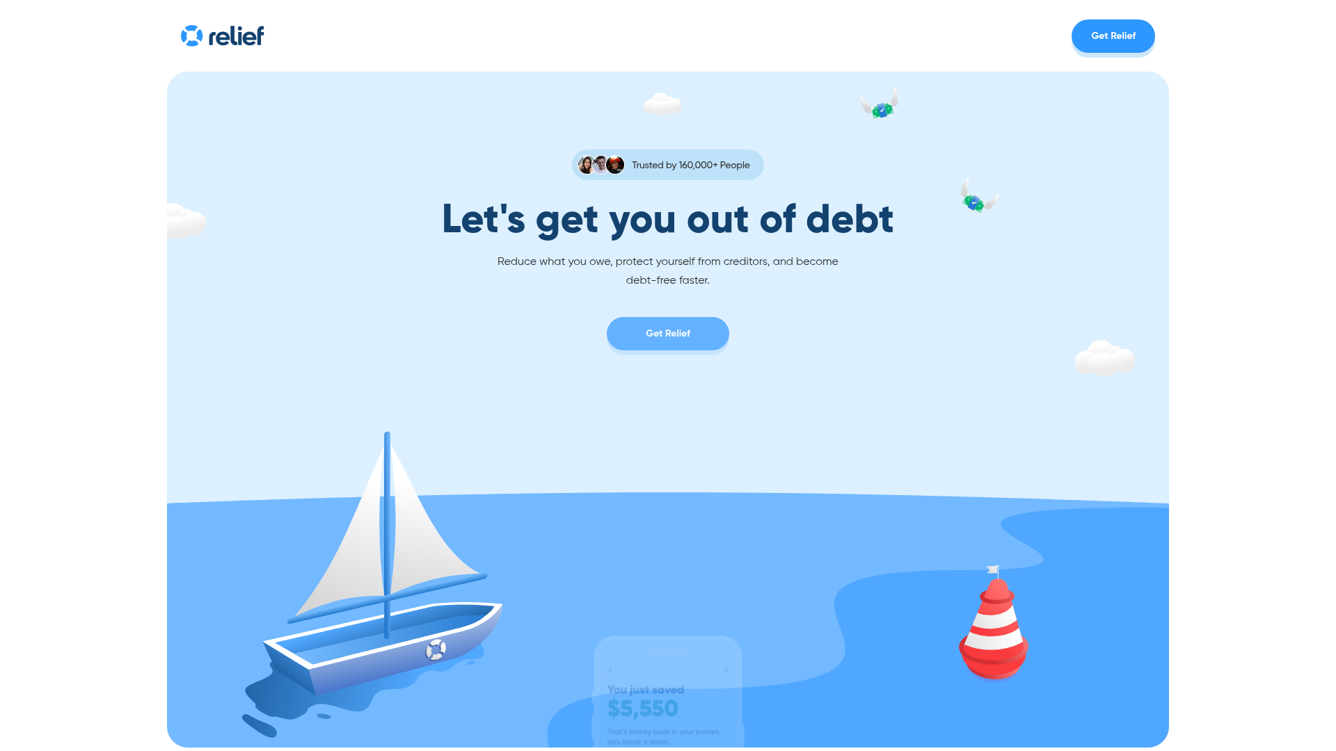
Relief App Debt Management Landing Page
A clean fintech landing page featuring an animated SVG hero, marquee testimonial cards, bento-style feature sections, and a structured FAQ accordion.
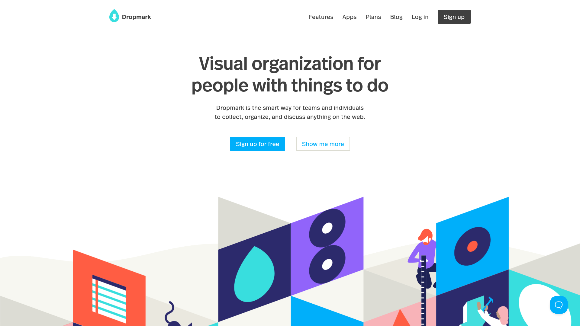
Dropmark Visual Organization Landing Page
Features a clean minimalist hero section with split-action buttons, a vibrant vector illustration footer, and an interactive horizontal flickity carousel for case studies.
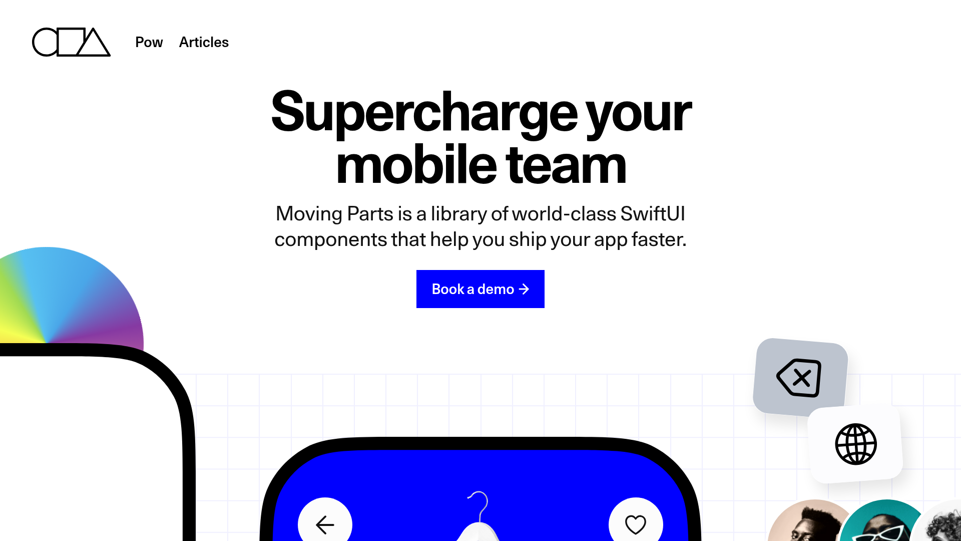
Moving Parts SwiftUI Component Library
A high-performance landing page featuring a interactive code comparison toggle, animated mobile UI previews, and a clean minimalist aesthetic for developer tools.

Slite SaaS Knowledge Base Landing Page
A clean SaaS hero section with a conversational headline, secondary call-to-action buttons, and a structured software interface preview featuring user testimonials.
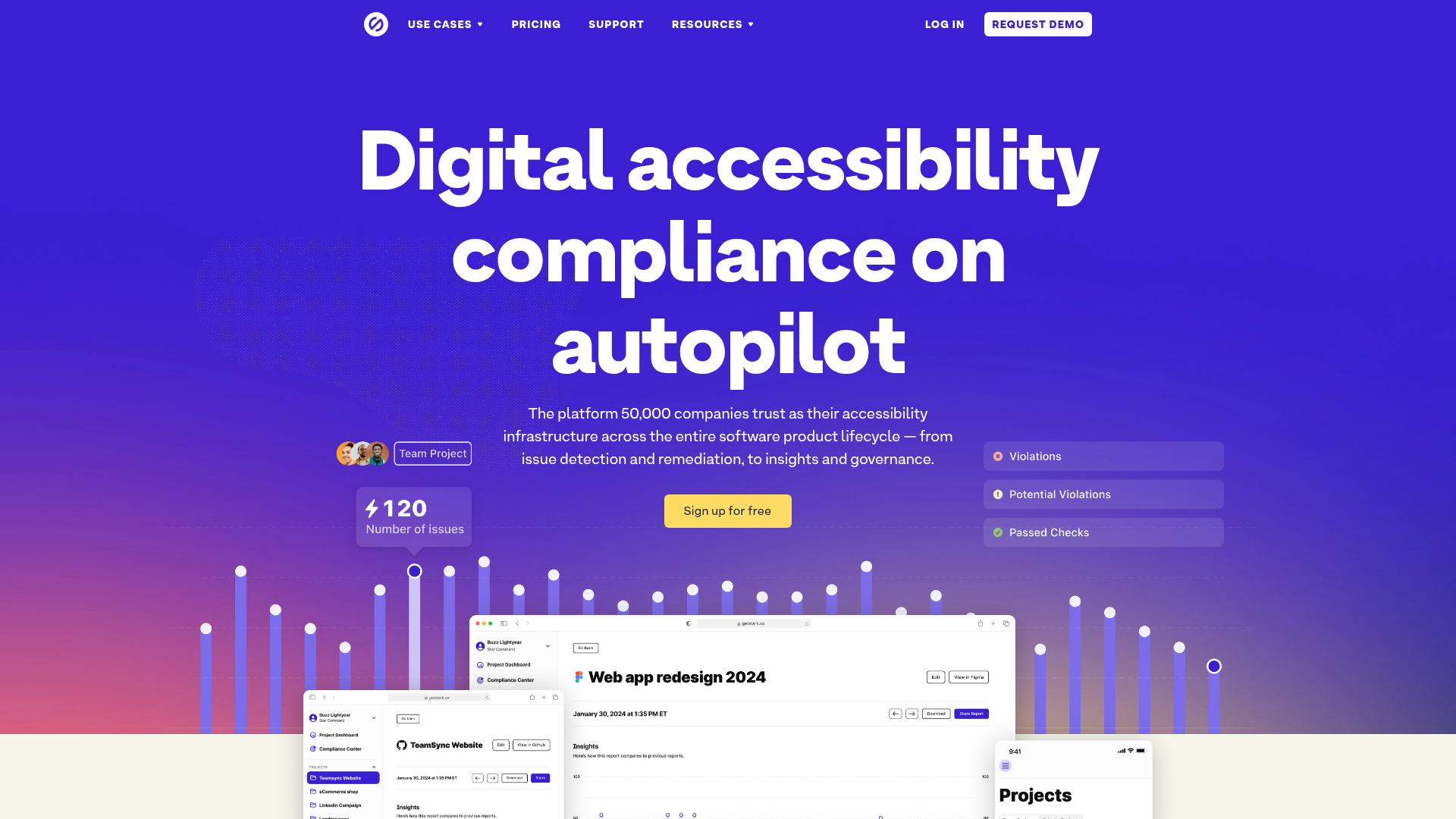
Stark Accessibility Software SaaS Landing Page
A vibrant SaaS landing page featuring a purple gradient hero, layered dashboard mockups, grid-based feature highlights, and segmented user-persona navigation.
