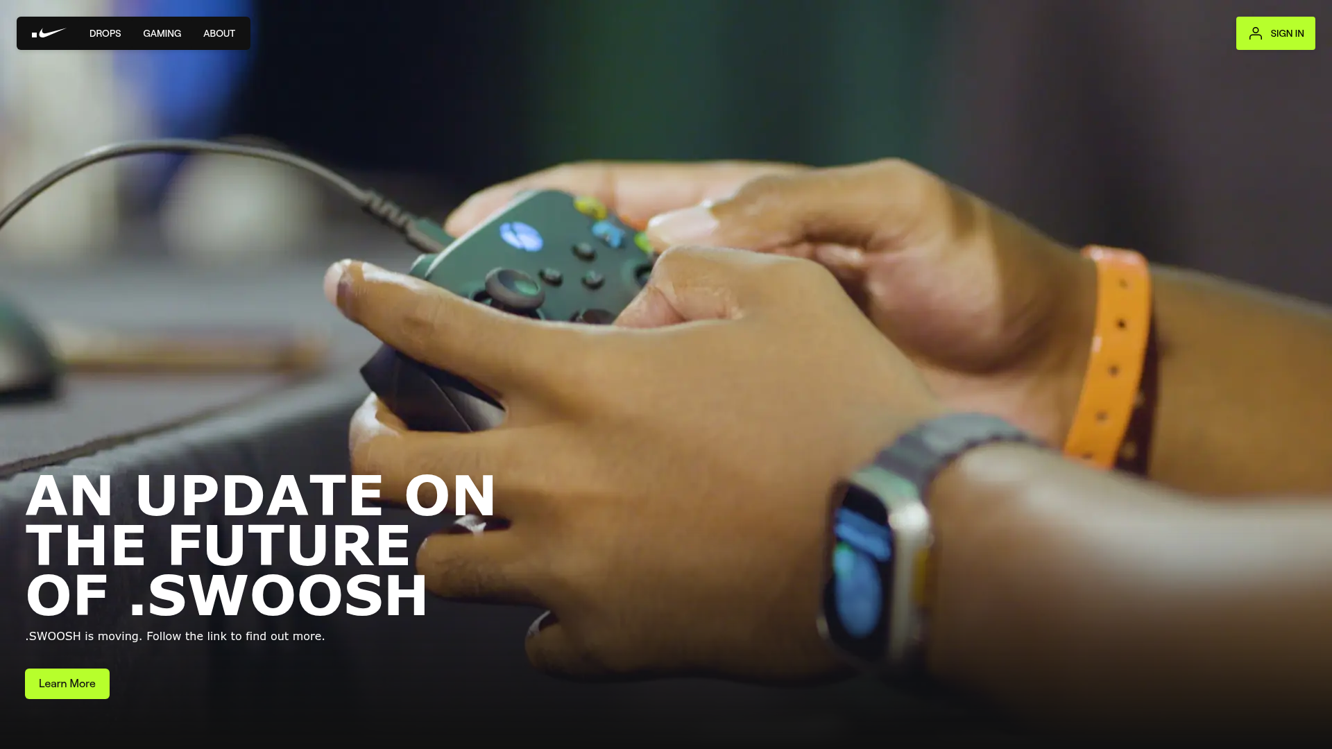
Nike .SWOOSH Gaming Landing Page
A high-impact landing page featuring a full-screen video hero, overlapping media cards with CSS-driven offsets, and a bold typography-heavy bento layout.
Overview
This high-impact landing page for Nike .SWOOSH serves as a masterclass in modern, media-heavy creative production. It uses a bold bento-style layout with overlapping video and image assets to create a dynamic sense of depth, making it an excellent reference for builders wanting to showcase digital products or gaming experiences.
Design System
- Color Palette & Visual Hierarchy: The palette is grounded in a deep dark mode (True Black/Dark Gray) with a vibrant "Volt" green (#A3FF12) used as the primary action color. Hierarchy is established through massive font sizes for headers and a high-contrast relationship between white text and dark backgrounds.
- Typography System: The site uses a heavy sans-serif (Roobert/Helvetica Mono) with wide tracking. Headlines are set in massive scales (up to
text-9xlor6.85rem), often in all-caps for maximum authority. Supporting text is kept small and monospaced to provide a technical, gaming-adjacent feel. - Page Structure & Section Flow:
- Hero: Full-screen video background with bottom-aligned text and a persistent top-navigation bar.
- Narrative Scroll: Overlapping media cards where small video snippets and larger images are offset using negative margins (e.g.,
-mt-base,-ml-sm) to break the rigid grid. - Content Blocks: Text cards (
nvs-card) featuring bold titles and brief paragraphs that float over media assets. - Call to Action: A simplified footer section with repeating large-scale headers and a full-width mobile button.
- Reusable Components: The
nvs-card(a white or black elevated utility box), the glassy navigation bar with nested links, and the responsive video containers withobject-coverstyling are the most valuable pieces to clone. - Interaction & Motion: The design implies a heavy use of scroll-triggered depth. HTML evidence shows
transition-allandduration-300on buttons for smooth hover states, and a "hero fade" class on the primary media layer. - Implementation Clues: The code uses Tailwind CSS for layout (utilizing classes like
flex,gap-sm,z-10, andtext-balance) and Next.js for the framework. Media delivery is optimized viapictureandsourcetags for modern image formats.
Use Cases
- Who should clone this: Creative agencies, Web3 platforms, gaming studios, or high-fashion brands looking for a cinematic, non-traditional web layout.
- Effective Remixes: This structure works well for "drop" based marketing, product launches, or digital lookbooks. Builders could swap the high-energy gaming footage for minimalist architecture or sleek physical product photography.
- Practical Directions:
- Visual Swap: Replace the Volt Green with a different high-contrast accent color to completely shift the brand mood.
- Layout Adaptation: Reuse the "media stack" section where images overlap text boxes to create an editorial feel for blog posts or feature showcases.
- Suggested Scope: A full-page clone is recommended to capture the specific responsive offsets and layering logic, though the hero section alone is a powerful standalone component.
Related Inspirations
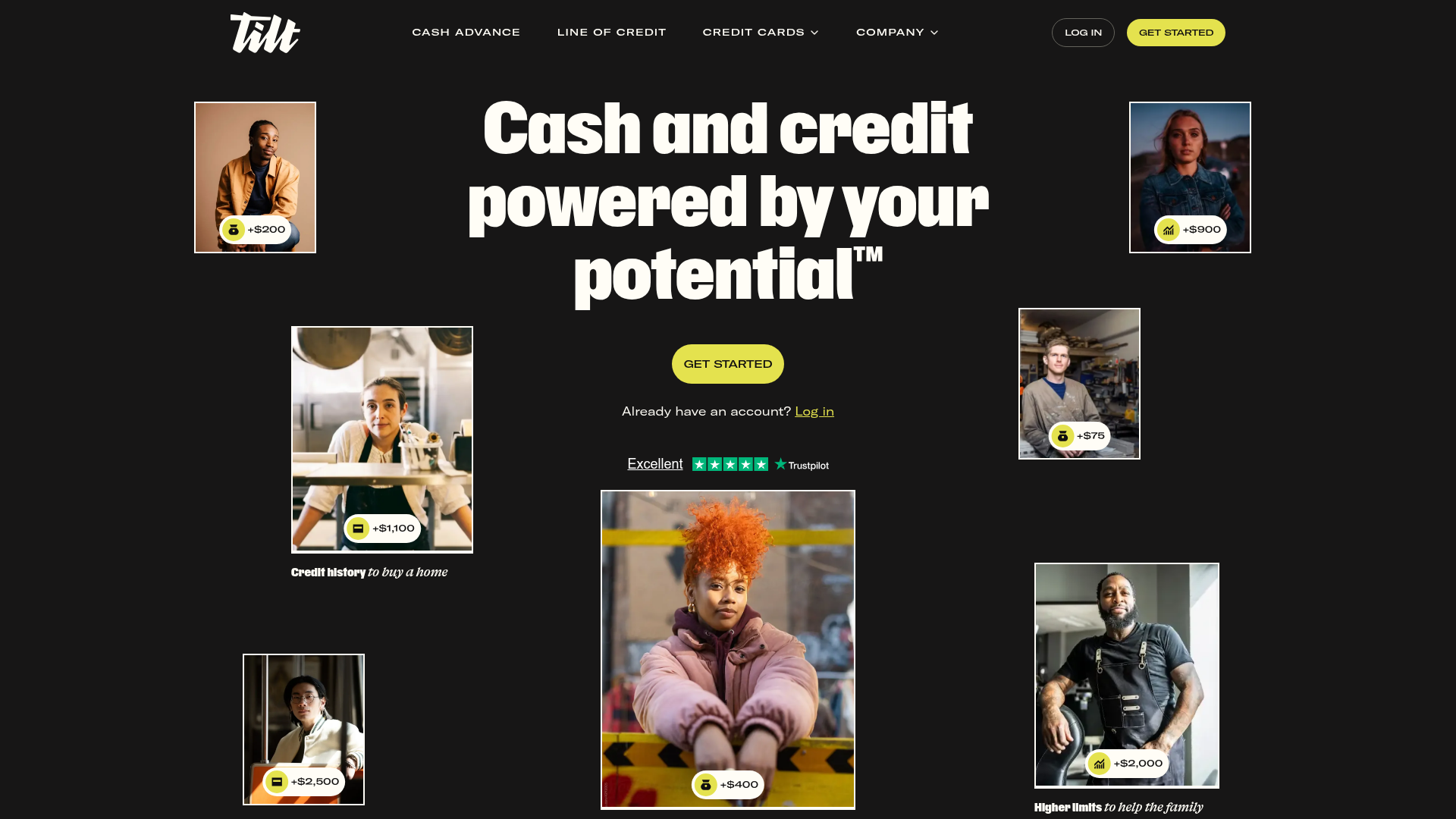
Tilt Financial Services Landing Page
A high-contrast dark mode fintech site featuring an absolute-positioned image collage hero, horizontal scrolling product panels, and bento-style application benefits.
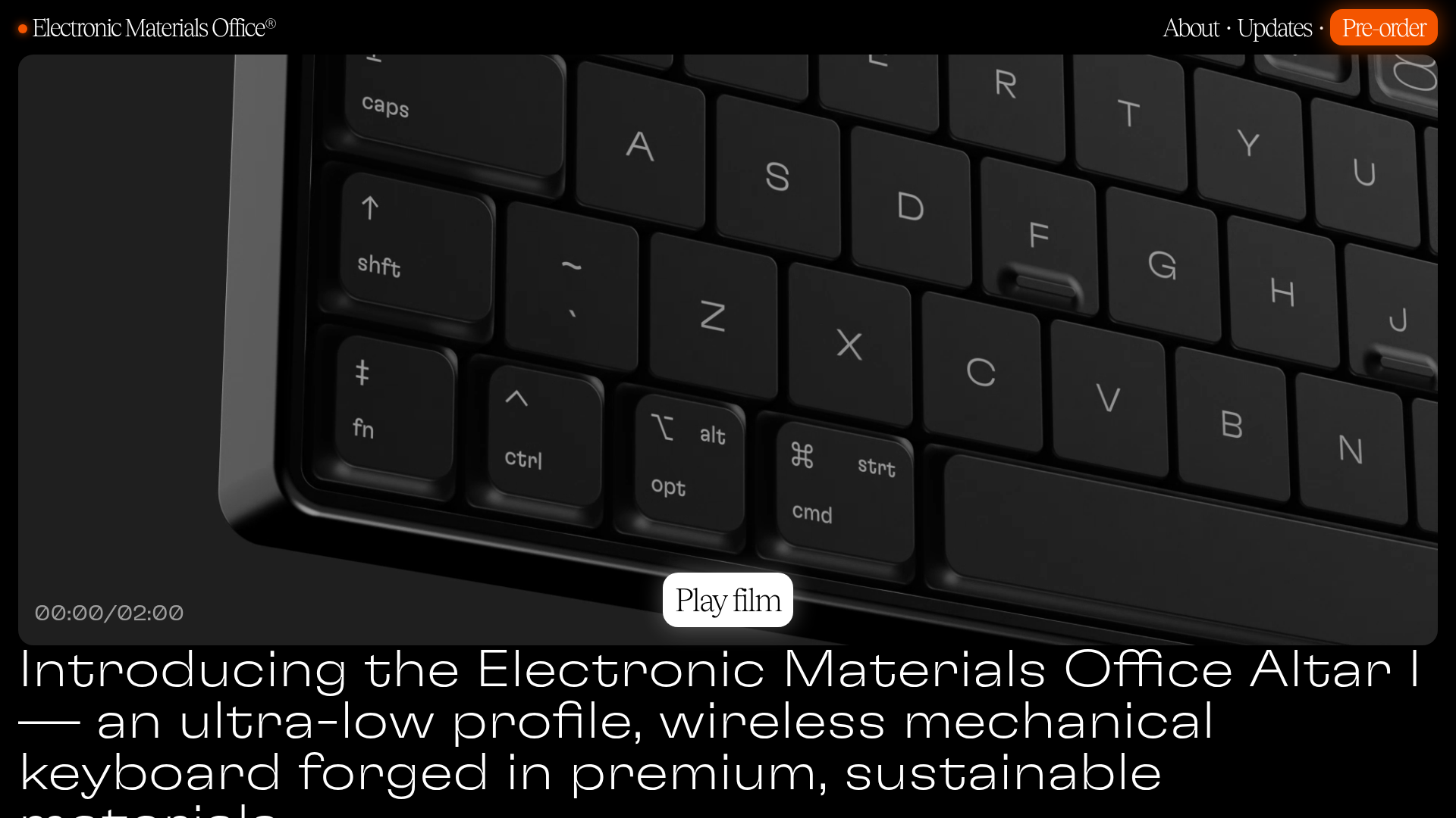
Electronic Materials Office Altar I Showcase
A dark-themed product landing page featuring fullscreen autoplay video, marquee section headers, a photo-heavy bento grid, and a clean technical specification table.
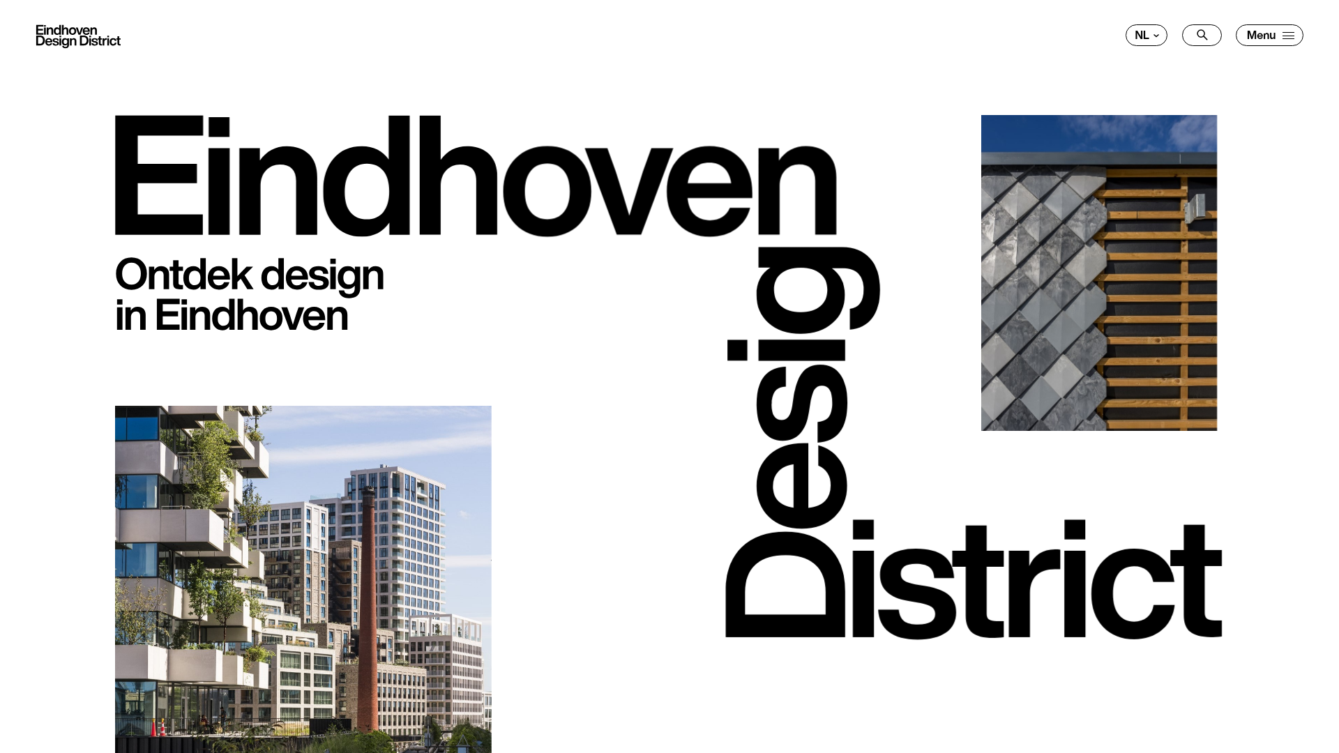
Eindhoven Design District Landing Page
A minimalist, typography-focused showcase featuring a split-screen project gallery with sticky scroll-based animations, horizontal article sliders, and a high-contrast brutalist design.
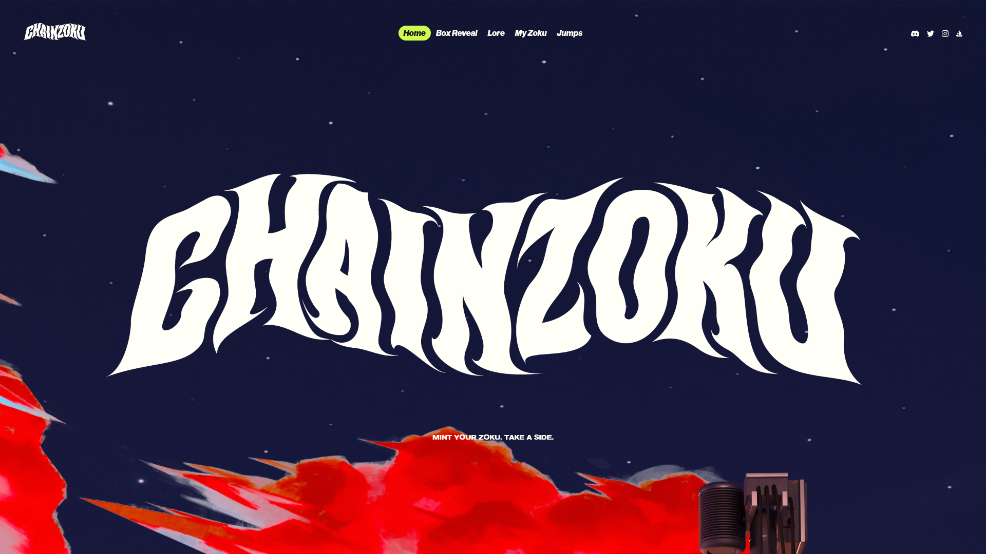
Chainzoku Gaming and NFT Landing Page
A high-impact landing page featuring a wobbly marquee hero logo, parallax cloud layers, sticky background-reveal sections, and a horizontal character faction switcher.
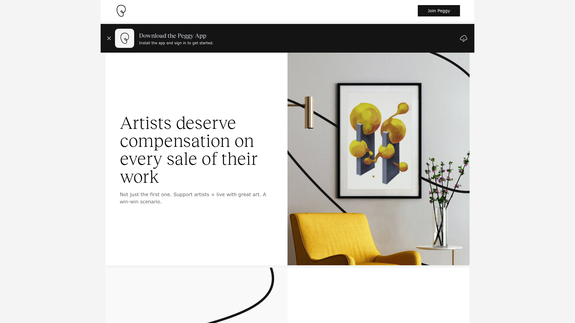
Peggy Art Royalties Pitch Page
A clean storytelling layout featuring alternating image-text sections, a three-column testimonial grid with circular avatars, and a icon-based feature grid for brand values.
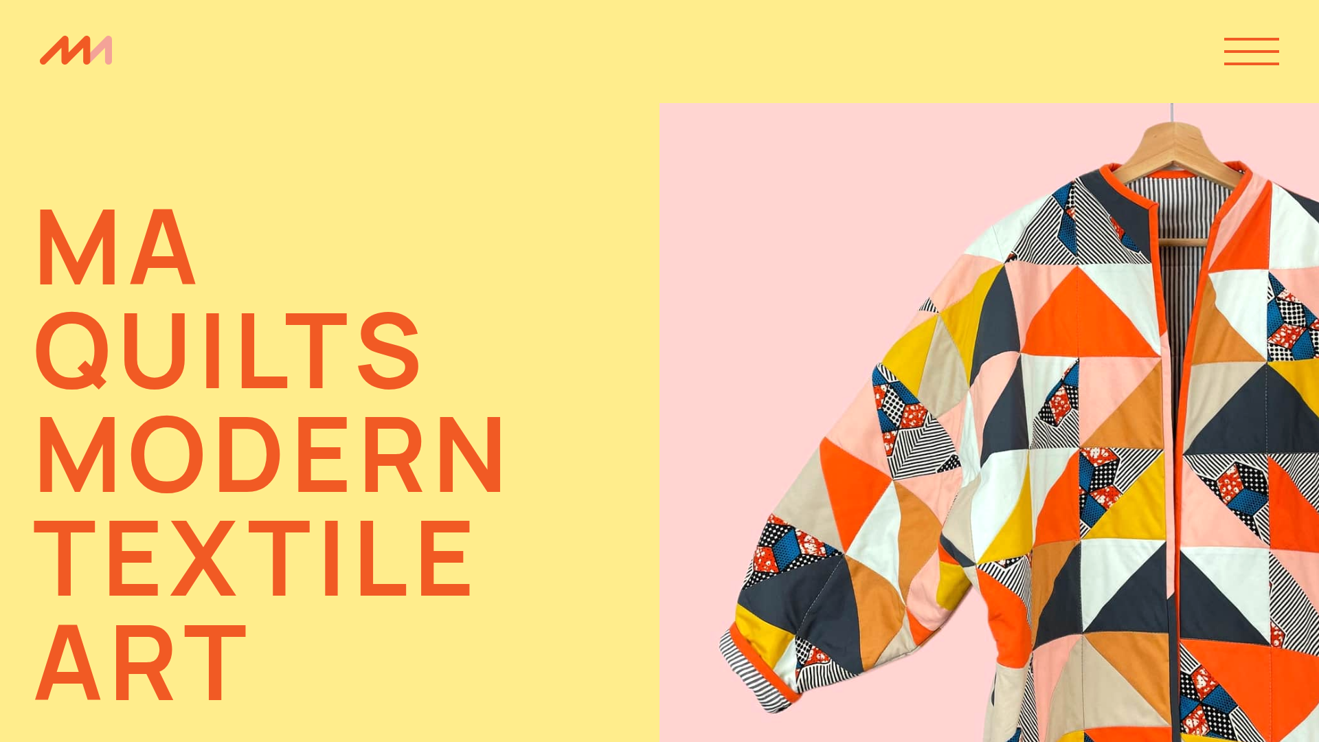
MA Quilts Textile Portfolio Site
A vibrant portfolio layout featuring a two-column animated hero, horizontal marquee text, and dynamic CMS-driven grid galleries for showcasing artistic products and blog posts.
