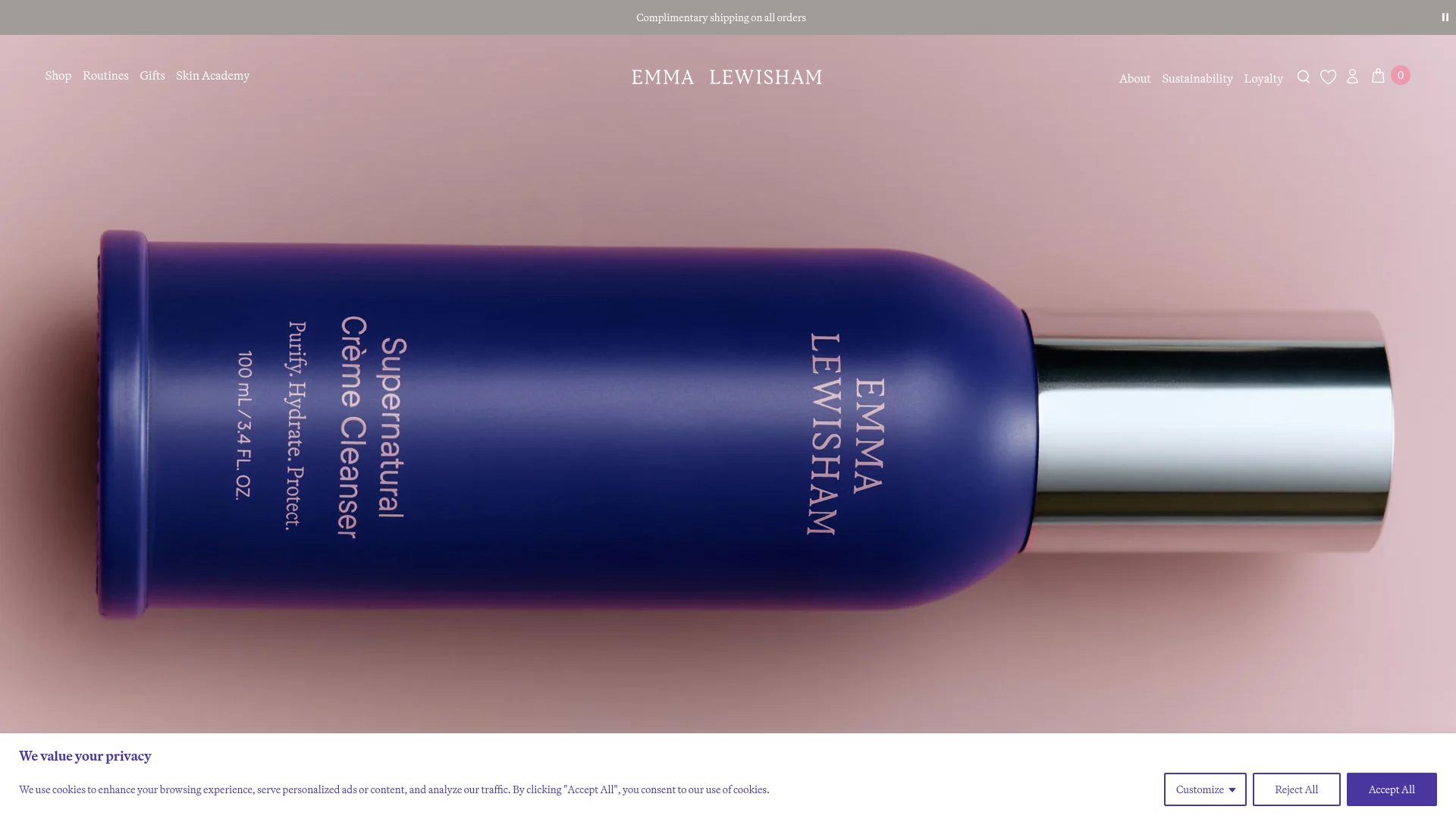
Emma Lewisham Luxury Skincare E-commerce
A refined Shopify-based design featuring a full-width hero, staggered image-and-text narrative blocks, a product carousel, and modular multi-category side drawers.
Overview
Emma Lewisham is a high-end luxury e-commerce experience built on Shopify, characterized by its sophisticated and spacious aesthetic. It serves as an excellent reference for builders wanting to combine brand storytelling with a conversion-focused retail flow, utilizing large-scale imagery and modular layout blocks to convey prestige and science.
Design System
- Color Palette & Visual Hierarchy: The palette is anchored by a deep royal purple (
#49369E) used for typography and UI elements, contrasted against soft, muted background tones like dusty pink, cream, and lavender. This creates a "natural but premium" feel where the high-contrast purple provides clear functional affordances against soft narrative content. - Typography: The system uses a clean, modern serif for headings (conveying editorial luxury) and a highly legible sans-serif for body copy and navigation. Information hierarchy is maintained through variable font weights and generous line-spacing, specifically in the "Fundamental Four Routine" section.
- Page Structure: The site follows a narrative flow: a full-width immersive hero leads into a "Beauty with intelligence" headline, followed by a product routine carousel, then alternating image-and-text story blocks, a secondary hero for sustainability, and finally a press testimonial slider.
- Reusable Components:
- Side-Drawers: Modular drawers for the shopping cart and thematic "Values" (Difference, Sustainability, Carbon Positive) that allow users to explore deep content without leaving the current view.
- Routine Carousel: A specialized product slider that labels items as "Step 01," "Step 02," etc., perfect for educational upselling.
- Narrative Blocks: Staggered
50/50layout sections featuring parallax-enabled images and centered text columns.
- Interactions & Motion: The implementation uses
smooth-scrollanddata-scroll-speedattributes, indicating a heavy reliance on scroll-triggered parallax effects. Buttons feature subtle opacity transitions, and the sticky header remains minimalist to maintain focus on imagery. - Responsive Behavior: On mobile, the
50/50grids stack vertically, and the navigation shifts into a full-screen overlay with nested sub-menus for skin types and concerns.
Use Cases
- Who should clone this: Brands in the skincare, high-end furniture, or artisanal wellness spaces that need to justify a premium price point through education and transparency.
- Remixing effectively: The "Shop by Skin Concern/Ingredient" navigation logic is highly effective for any product line with a deep catalog that requires guided selling (e.g., vitamins, specialty coffee, or performance apparel).
- Remix Directions: Swap the purple accent for a brand-specific primary color; the layout is neutral enough to support organic greens or minimalist monochromes. The "Value Modals" can be repurposed into "Technical Specs" or "Founder Story" sections.
- Clone Scope: Start by cloning the full-width storytelling blocks and the cart drawer for a quick UX upgrade. A full-page clone is best for those migrating from a standard, boxy template to a bespoke-looking narrative site.
Related Inspirations
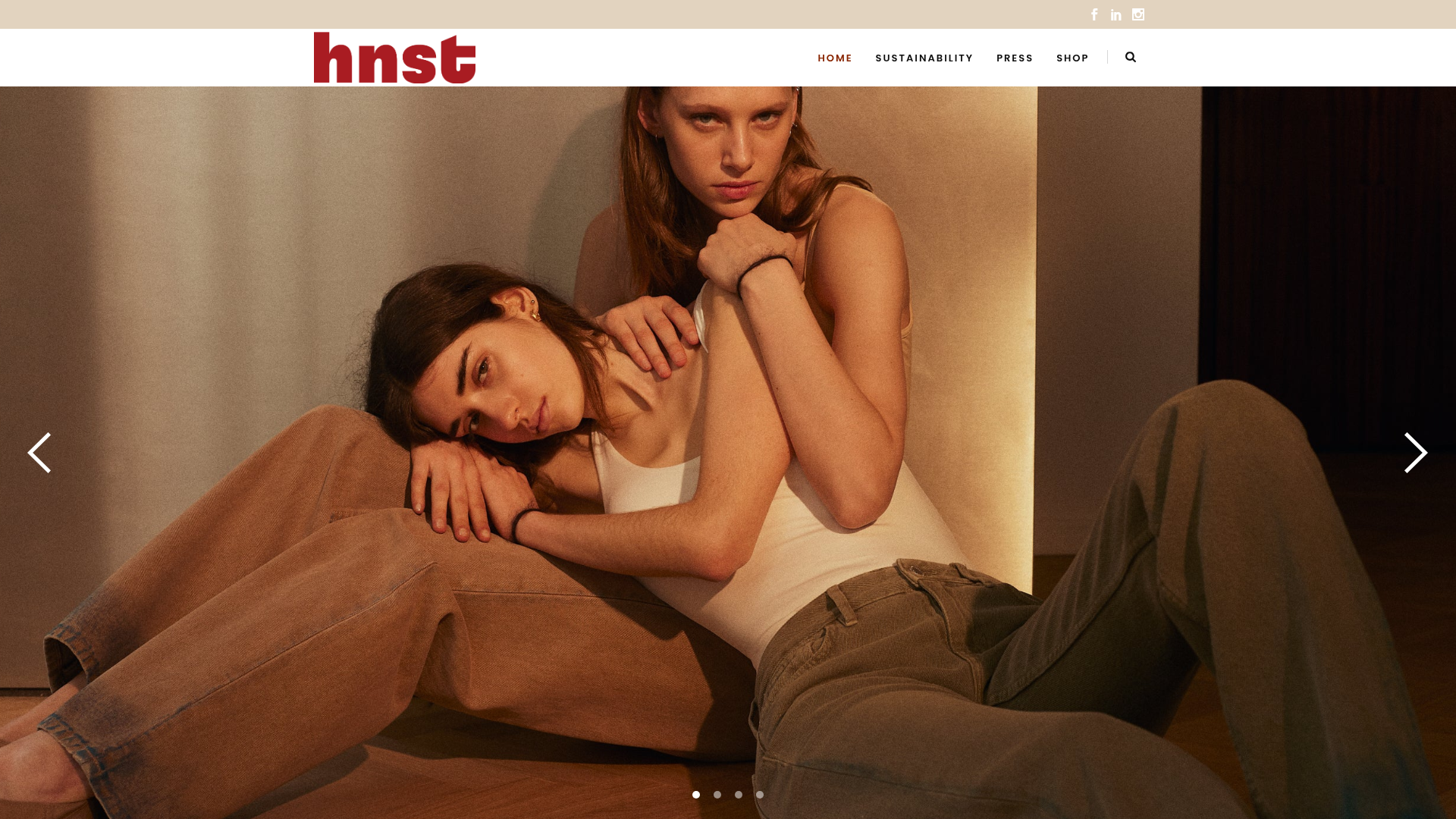
HNST Circular Fashion eCommerce Gallery
A minimalist apparel site featuring a full-screen image slider with parallax effects, grid-based product sections, and a clean typography-focused header for sustainable brand storytelling.
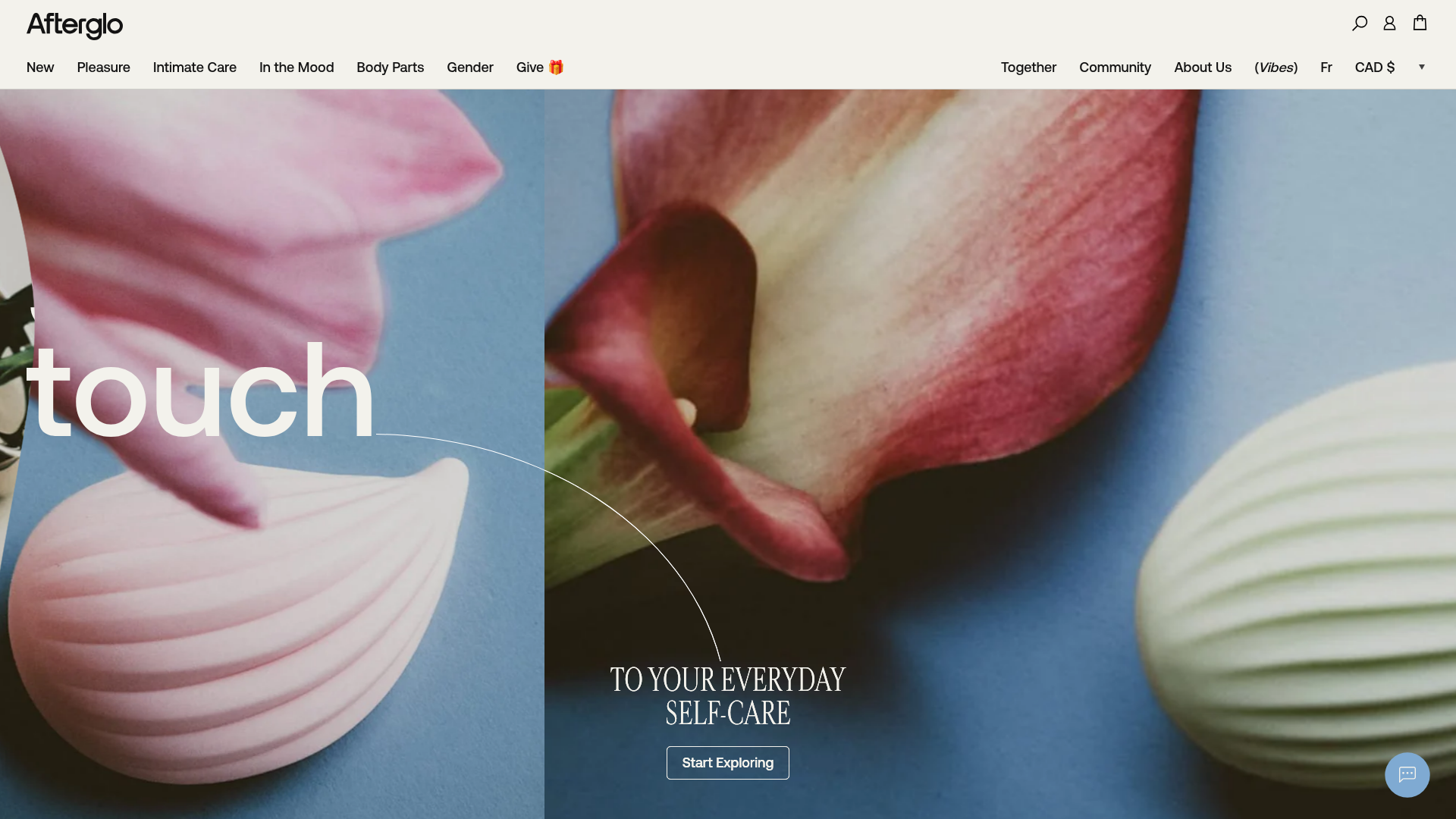
Afterglo Sensual Self-Care Storefront
An elegant e-commerce landing page featuring a split-screen horizontal scrolling hero, kinetic typography with 'vibrating' text animations, and a customized product carousel.
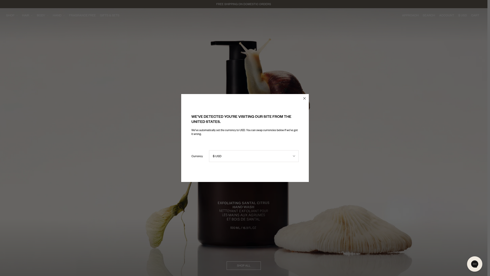
Nature of Things E-Commerce Landing
A high-end skincare storefront featuring a full-viewport hero section, scroll-triggered GSAP text animations, a slide-out mini-cart with product carousels, and minimalist category grids.
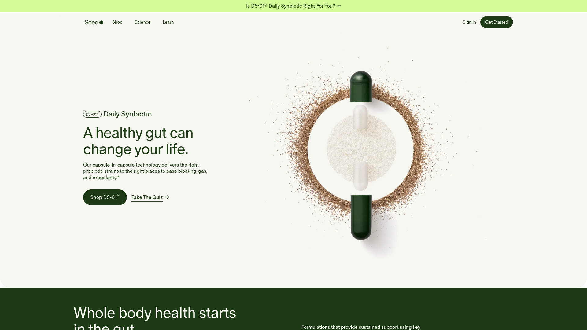
Seed Health Landing Page
An elegant wellness landing page featuring a full-viewport parallax hero, vertical swiper transitions, an interactive product carousel, and a custom video gallery for customer stories.
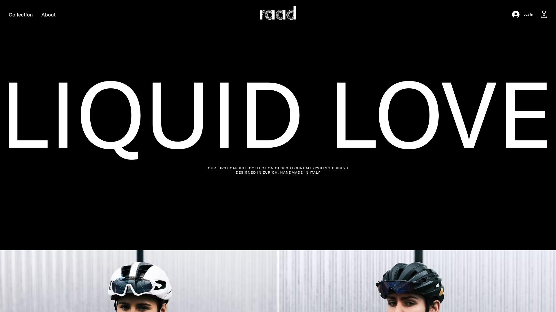
RAAD Cycling Apparel Storefront
A minimalist e-commerce layout featuring large-scale typography, high-contrast black backgrounds, and alternating image-text sections for a premium brand feeling.
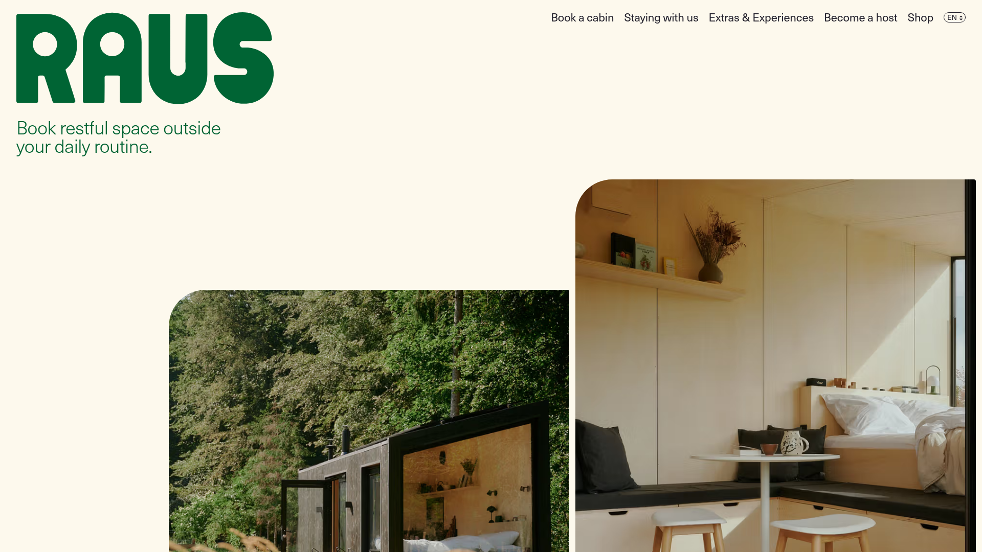
Raus Booking Site with Asymmetric Layout
A nature-focused landing page featuring a floating booking widget, stylized image masks, and an asymmetric animated gallery for showcasing cabin experiences.
