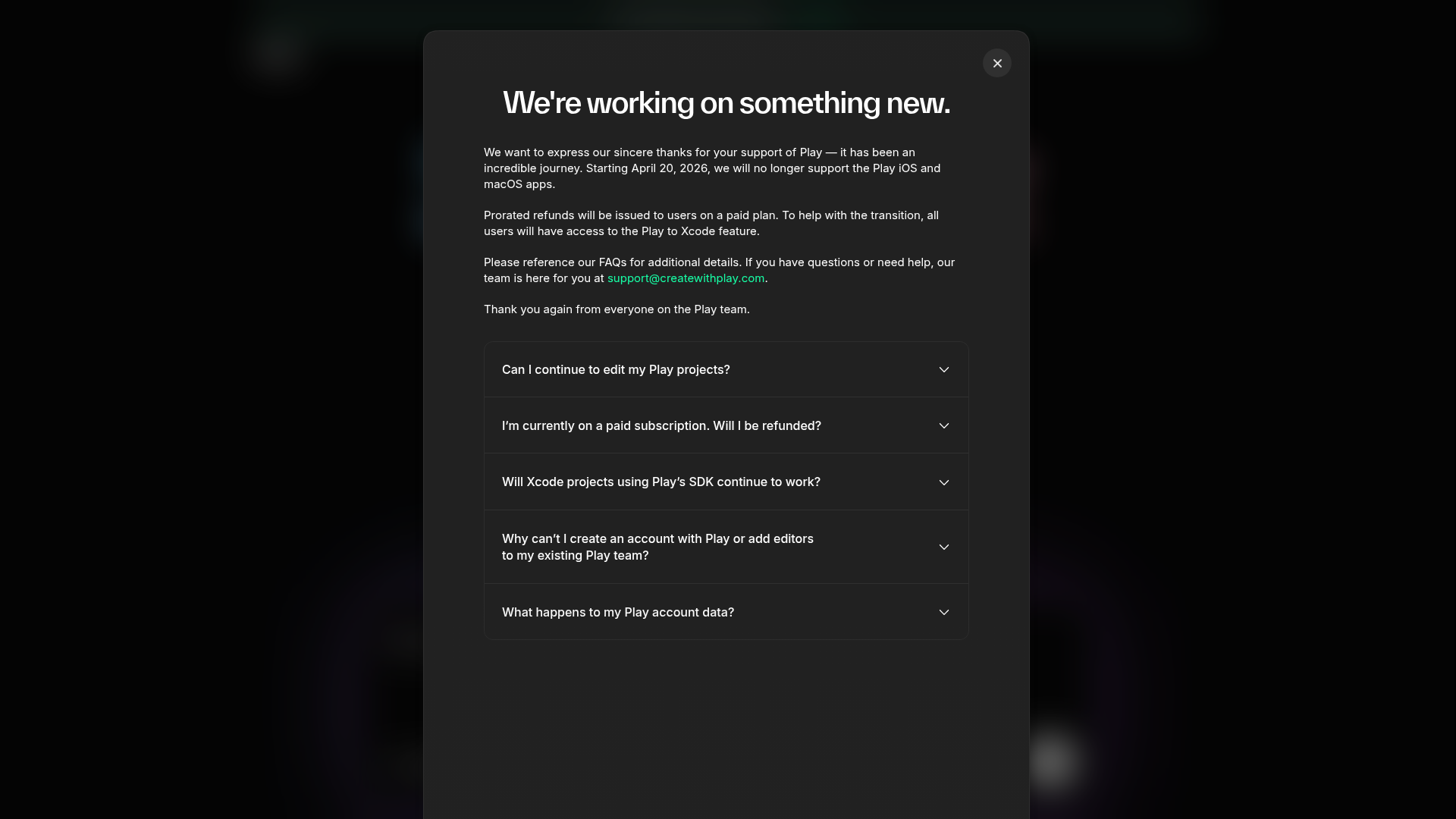
Create with Play FAQ Modal
A dark-themed modal layout featuring structured announcement text, contact links, and a vertical accordion for categorized frequently asked questions.
Overview
This project features a sophisticated dark-themed announcement and FAQ modal designed for service updates or product transitions. It serves as an excellent clone reference for building streamlined, non-intrusive information overlays that balance a clear headline message with detailed, collapsible supporting information.
Design System
- Color Palette & Visual Hierarchy: The UI uses a deep charcoal/black background (
#1A1A1Aappearance) with a high-contrast white heading to establish immediate hierarchy. Body text uses a subtle gray (on-white) for readability, while primary action links (email) are highlighted in a distinct teal/mint accent color. - Typography: The system relies on a clean, sans-serif font family. It utilizes a bold, large-scale heading for the main announcement and a standard body size for the text block. FAQ labels use medium weights to differentiate from the summary text.
- Page Structure: The modal follows a vertical stack: a header area with a close button top-right, followed by prose content paragraphs, and concluding with a structured accordion group for categorized FAQs.
- Reusable Components:
- Accordion Group: A set of five vertically stacked items with thin divider lines and chevron indicators, ideal for managing large amounts of text without overwhelming the user.
- Overlay Container: A rounded-corner modal box with consistent internal padding and a semi-transparent 'glass' backdrop effect behind it.
- Close Button: A circular, high-contrast 'X' button positioned in the top-right corner.
- Interaction Design: The design is built for vertical expansion. The FAQ items indicate an 'expand' state via the chevron icons, suggesting a smooth transition between collapsed and expanded states.
- Implementation Clues: The interface uses structured semantic HTML within a centralized container, suggesting a flexbox or grid-based layout to maintain perfect centering on the screen.
Use Cases
- Who should clone this: Product designers needing a 'Service Update' or 'Maintenance Alert' container that feels premium and integrated rather than like a generic browser popup.
- Effective Remixes: This layout is highly effective for onboarding checklists, legal/privacy policy summaries, or detailed feature release notes.
- Remix Directions: Builders can swap the dark background for a light mode variant, replace the accordion icons with plus/minus toggles, or integrate a 'Call to Action' button (like 'Got it' or 'View Account') at the bottom of the stack.
- Clone Scope: A quick section clone of the FAQ accordion is highly recommended for developers who need a plug-and-play component for support pages or documentation.
Related Inspirations
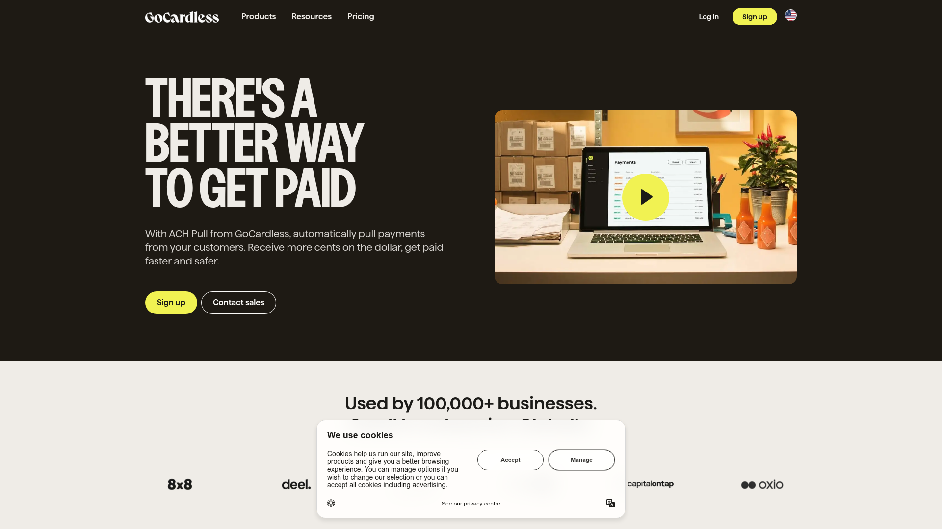
GoCardless Payments Platform Landing Page
A dark-themed fintech landing page featuring a split-screen video hero, bento-style feature cards, a horizontal logo slider, and step-by-step accordion guides.
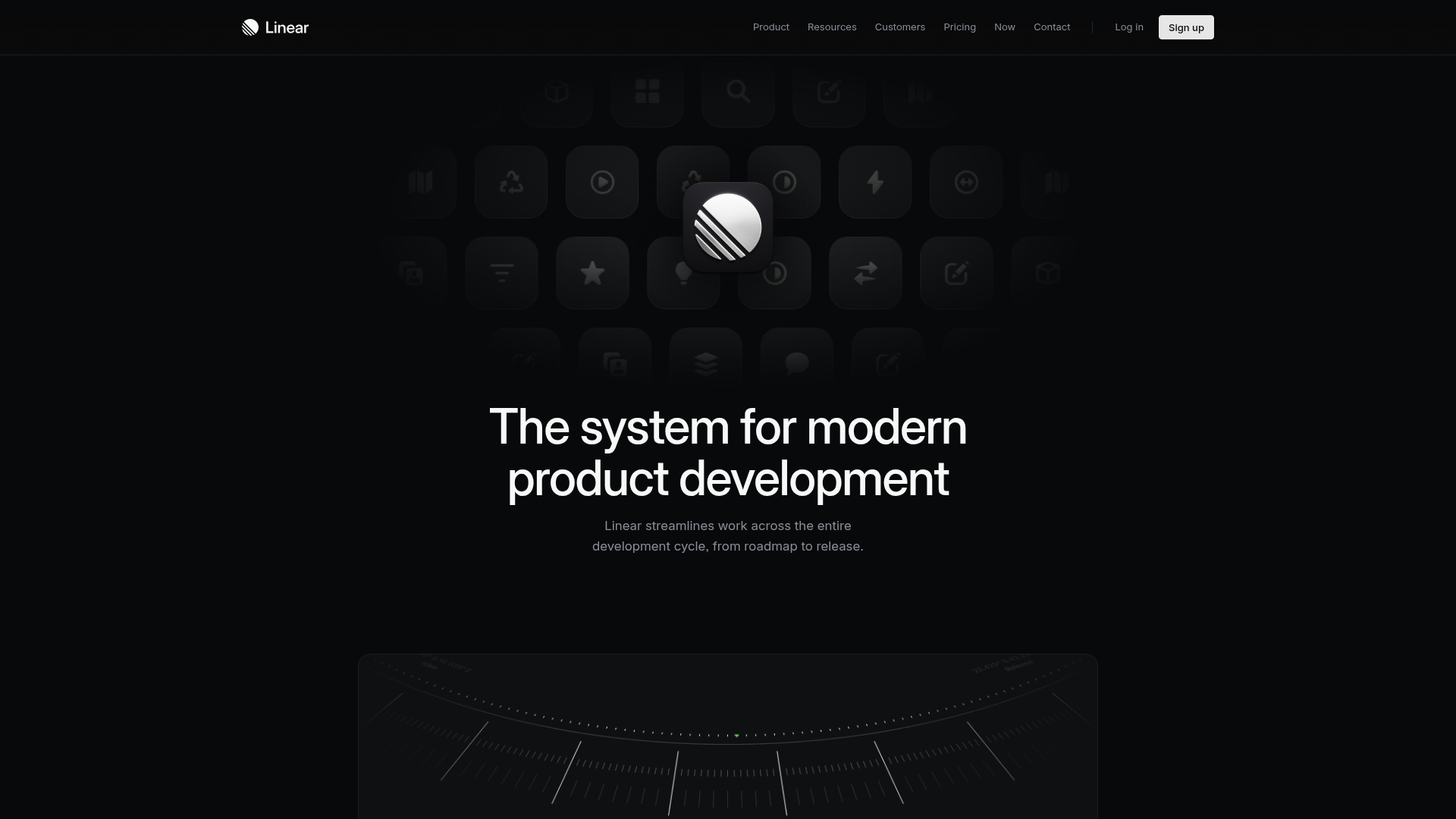
Linear Product Features Landing Page
A premium dark-themed landing page featuring a minimalist aesthetic, bento style icon grids, sleek typography, and high-contrast call-to-action buttons.
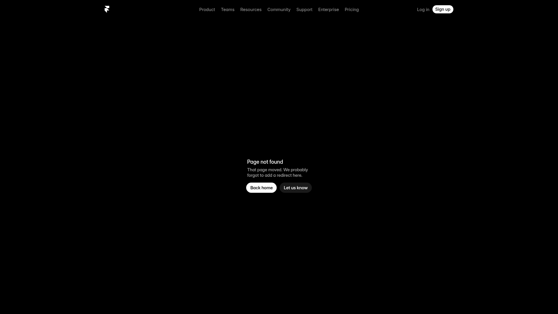
Framer Dark 404 Error Page
A minimalist dark mode error page featuring a clean centered layout, monochromatic navigation, and pill-shaped call-to-action buttons.
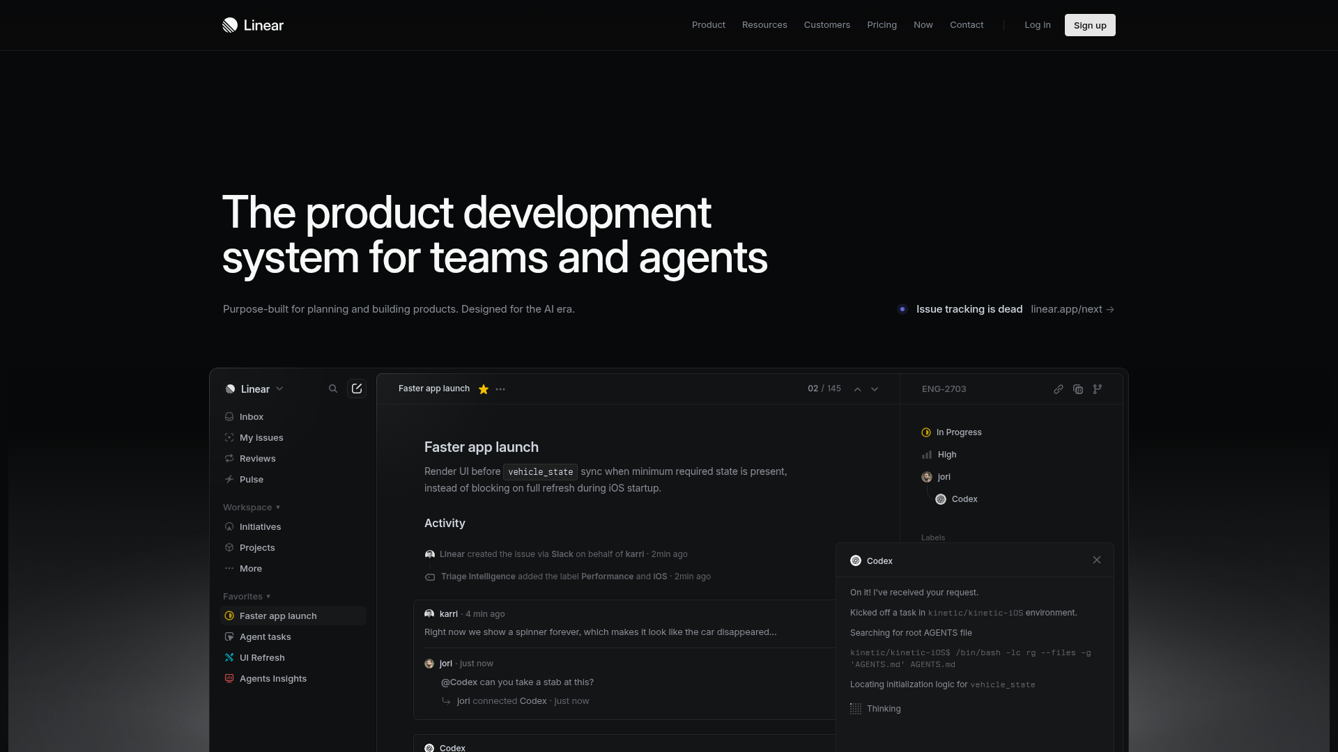
Linear Product Development System Landing Page
A high-fidelity dark-themed landing page featuring a complex dashboard UI mockup, glassmorphism effects, and a sophisticated sidebar navigation layout.
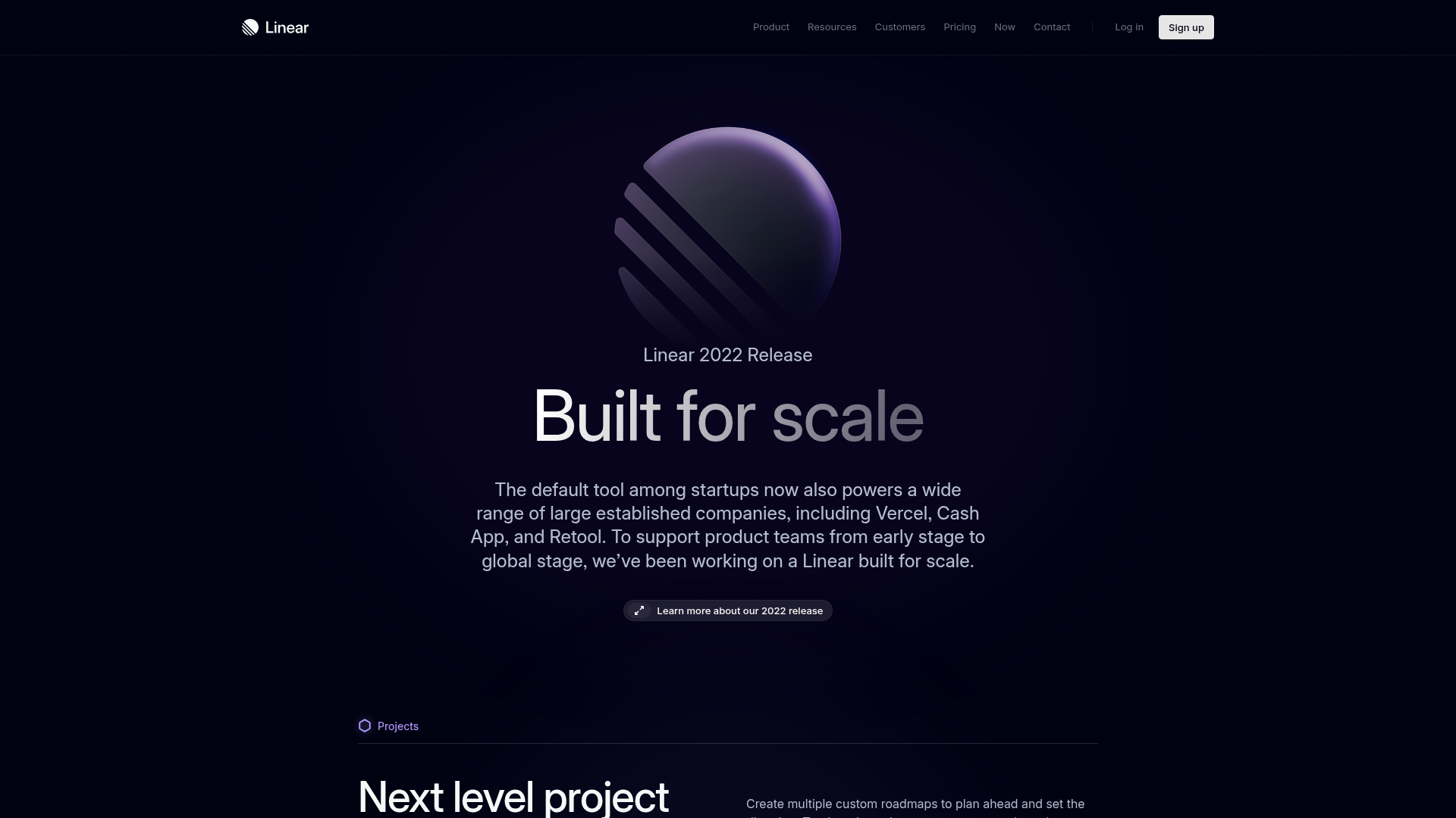
Linear 2022 Product Release Page
A high-end dark mode product launch page featuring a 3D glassmorphic logo, sleek typography, and a structured layout for feature announcements.
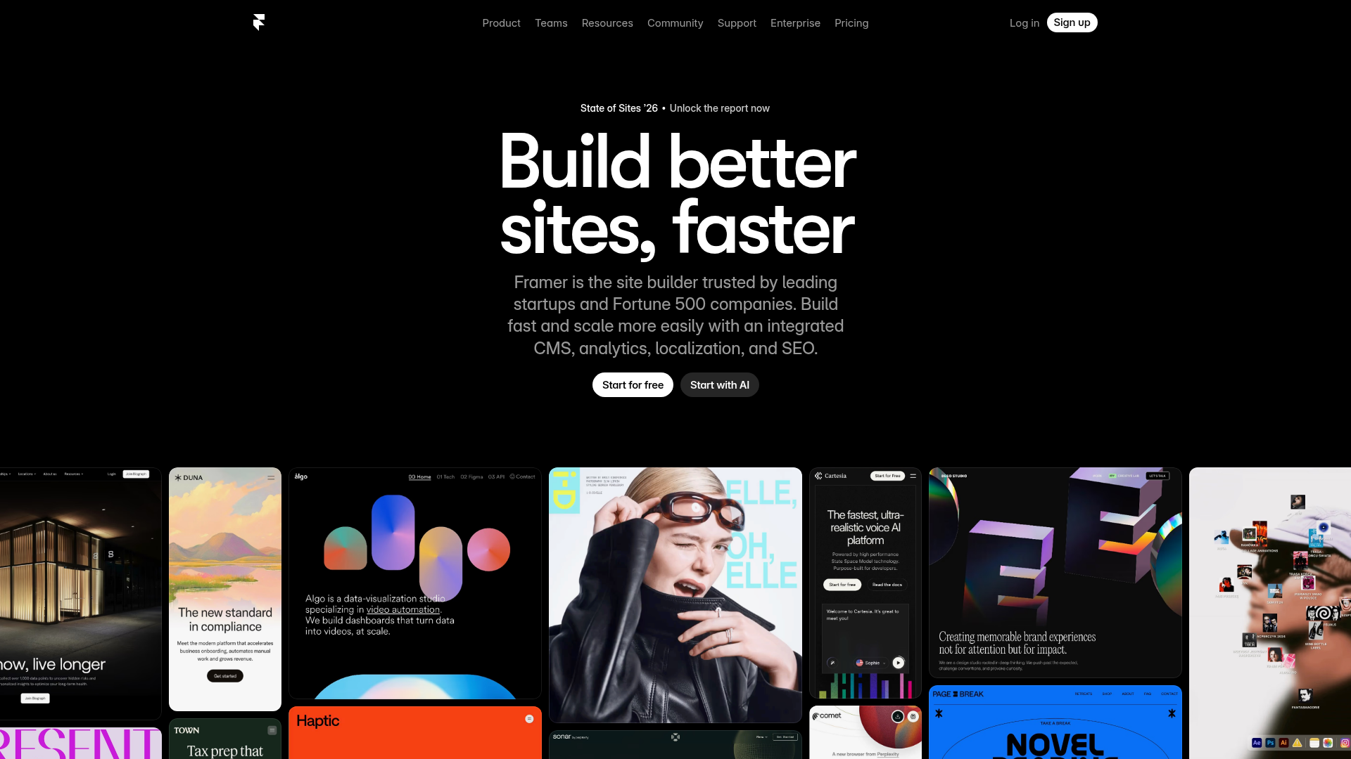
Framer Hero and Showcase Portfolio
A dark-themed landing page featuring a centered typography hero, integrated CMS/AI CTAs, and a horizontal scrollable masonry grid of site previews.
