Apple iPhone Product Catalog Page
A high-end e-commerce layout featuring a horizontal icon-based navigation menu and a clean, responsive card grid for showcasing product lineups.
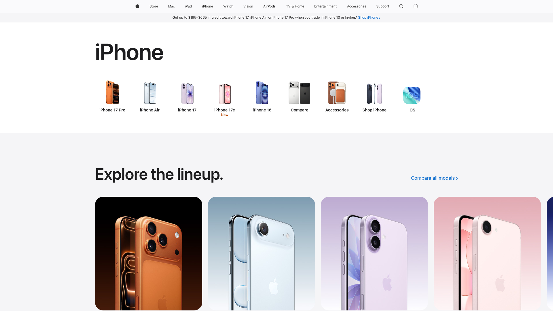
Overview
This page is a premium product catalog layout from Apple, designed to facilitate easy navigation across a vast hardware ecosystem. It serves as an excellent reference for high-end e-commerce sites needing a balance between icon-driven navigation and immersive, visual-heavy product showcases.
Design System
- Color Palette & Visual Hierarchy: The system uses a minimalist "White Space" aesthetic to let high-quality product photography drive the visual interest. The background is a clean white (#FFFFFF) with primary text in near-black, ensuring high contrast. Secondary information, such as the trade-in offer ribbon, uses a subtle light grey background to separate marketing alerts from the main content.
- Typography System: The layout utilizes a clean, sans-serif typeface (SF Pro style). It features a distinct hierarchy: massive display headings for product categories ("iPhone"), medium-weight large headers for section titles ("Explore the lineup"), and small, high-density text for navigation labels and legal disclosures.
- Page Structure & Section Flow: The layout follows a top-down funnel: Global Navigation Bar -> Promotional Alert Strip -> Icon-based Sub-navigation (Product Matrix) -> Visual Product Grid. This flow prioritizes product identification before diving into specific features.
- Reusable Components:
- Icon Nav Rail: A horizontal list of small product renders with centered text labels, ideal for category switching.
- Product Lineup Cards: Large, rounded-corner containers (border-radius approx. 28-32px) that house high-resolution product imagery and use background tinting to match the product color.
- Breadcrumb/Banner Ribbon: A slim, full-width utility bar for secondary calls to action or seasonal promotions.
- Interaction & Responsive Patterns: The sub-navigation is designed for horizontal overflow on smaller screens. Elements like the "Compare all models" link use blue accent colors and chevron icons to indicate interactivity. The layout suggests a containerized grid that stacks vertically as viewport width decreases.
Use Cases
- Who should clone this: Developers building electronics marketplaces, luxury consumer goods catalogs, or brand-direct storefronts where high-fidelity imagery is the primary selling point.
- Effective Remixes: This pattern can be effectively adapted for SaaS feature directories or hardware portfolios. For a remix, swap the product renders for stylized 3D icons to represent software modules while keeping the horizontal navigation.
- Remix Directions: Replace the ultra-wide product grid with a 2-column layout for mobile-first services. Adapt the information architecture by reusing the "Icon Nav" as a persistent sub-menu for different service tiers.
- Suggested Clone Scope: Start with the Icon-based Sub-nav and the Rounded Product Cards as these are the most versatile components for various e-commerce and portfolio use cases.
Related Inspirations

Isla Beauty Skincare E-commerce Store
A clean Shopify-based storefront featuring a split-hero landing page, a step-by-step product system carousel, and a split-screen testimonial section with localized product image sidebars.
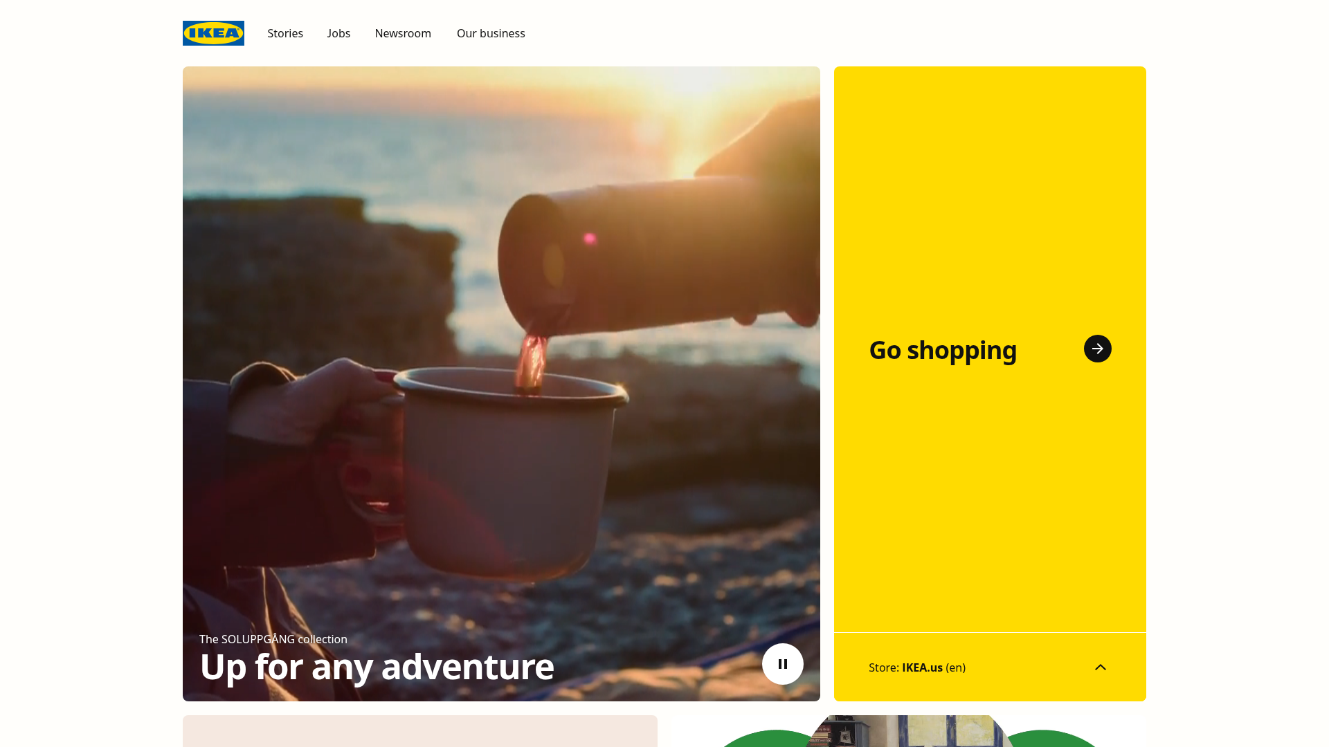
IKEA Corporate Landing Page Layout
A clean corporate portal featuring a large hero hero section with video playback, a split-screen call-to-action block, and a minimalist navigation bar.
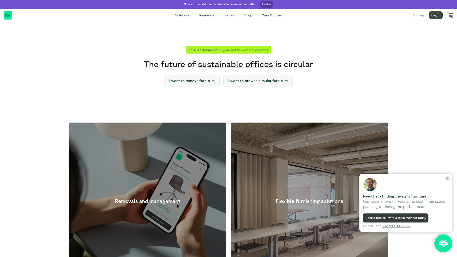
Relieve Furniture Sustainable Marketplace Landing Page
A clean sustainability-focused landing page featuring a hero with environmental impact stats, two-column visual category grid, horizontal logo slider, and a testimonial carousel.
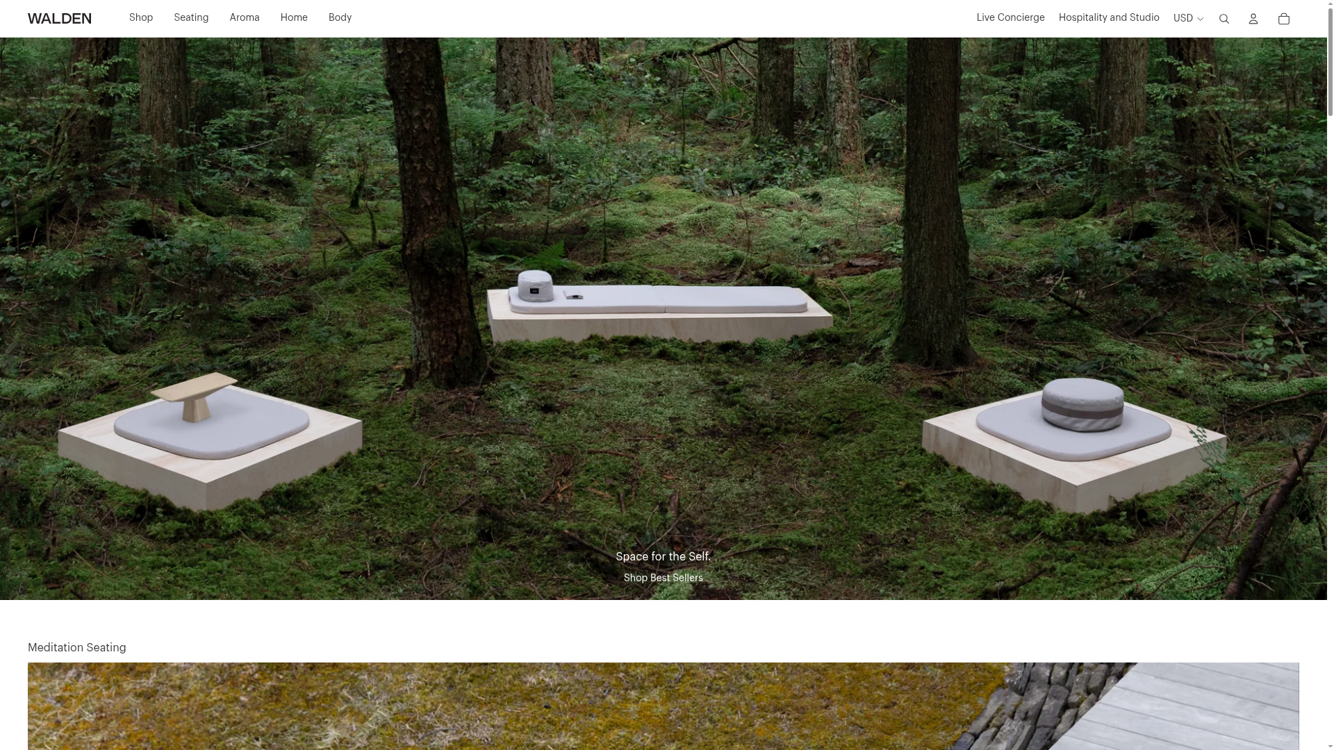
Walden Meditation E-commerce Product Gallery
A minimalist e-commerce layout featuring a high-impact full-width hero image with integrated commerce links and a vertically stacked category grid for niche lifestyle products.
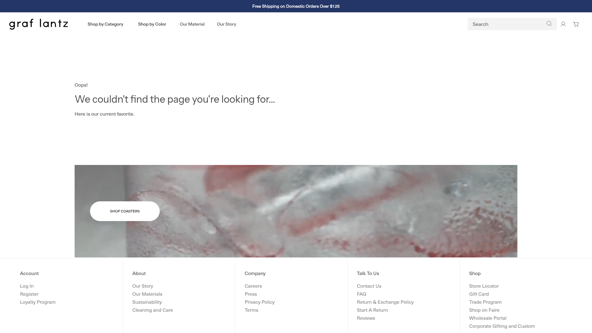
Graf Lantz Minimalist E-commerce 404
A clean Shopify-based error page featuring a full-width video hero with a CTA button, a detailed multi-column footer, and a sophisticated slide-out cart drawer.
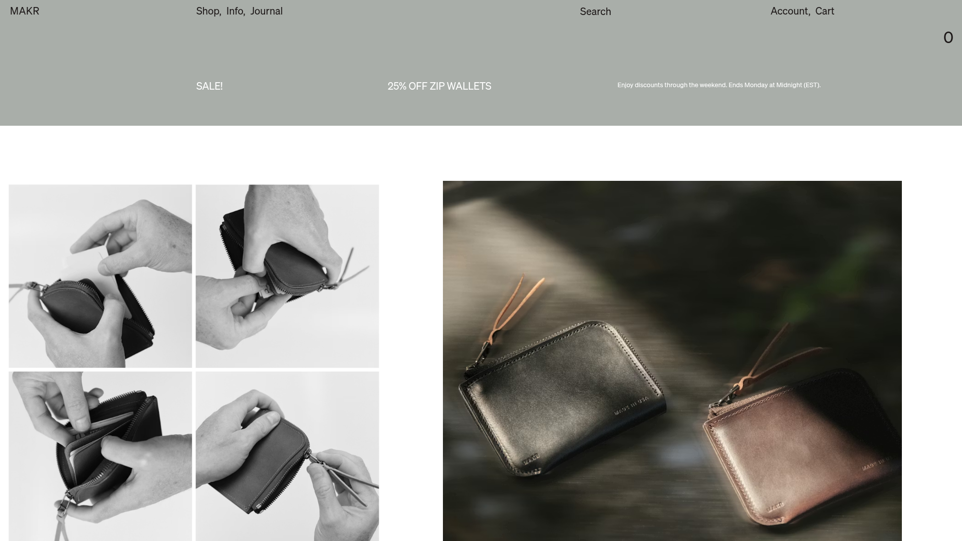
Makr Minimalist Design Goods Store
A clean e-commerce layout featuring an asymmetric image grid, drawer-based navigation categories with hover previews, and a sophisticated minimalist aesthetic.
