AllCaps Typeface Catalog and Store
Minimalist digital storefront featuring a card-based product catalog, interactive animated hero section, and type specimen display grid with quick-buy functionality.
Overview
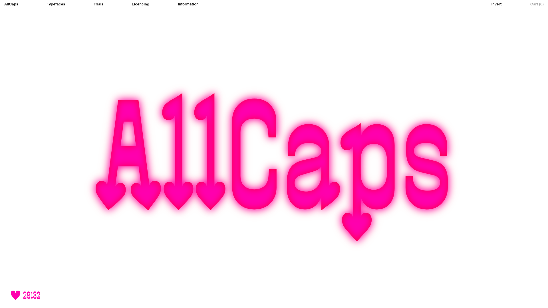
AllCaps is a sophisticated digital storefront for a type foundry that balances brutalist minimalism with high-impact motion design. It is an excellent clone reference for its seamless integration of interactive hero animations and a clean, high-density product grid designed for visual assets.
Design System
- Color Palette & Visual Hierarchy: The site uses a high-contrast foundation of pure white (#FFFFFF) and deep black, punctuated by a monochromatic neon punch (‘Bandit’ magental/pink). This creates a stark, clinical environment where the product—typography—remains the focus.
- Typography System: True to its purpose, the site uses a variety of weights for its typeface families. The navigation and UI elements utilize a clean, sans-serif font at a small scale for a utilitarian feel, while the hero section uses massive, impactful lettering with custom SVG heart injection.
- Page Structure: The layout follows a classic vertical stack: a utility-driven slim top navigation bar, an immersive fullscreen ‘hero’ section with interactive elements, followed immediately by the
homepage-catalogfeaturing a grid of type specimens. - Reusable Components:
- Utility Nav: A minimalist distributed header with categorized links (Typefaces, Trials, Licensing) and a discreet ‘Invert’ feature.
- Catalog Cards (
CatalogCard): A modular grid system containing the font name (rendered as an SVG), style count, and a compact ‘Buy’ button. - Interactive Hero (
BanditLuvHero): A custom container designed for floating CSS animations and dynamic counters (e.g., the ‘total hearts’ counter).
- Interaction & Motion: The hero section uses
BanditLuvHero_heartsContainer__dU6T3to manage high-frequency heart animations. The HTML reveals a custom ‘Toaster’ notification system for user feedback during checkout or interaction. - Implementation Clues: Built with Next.js, as indicated by the
__nextID andnext-route-announcer. It uses CSS Modules for scoping (e.g.,Catalog_section--catalog__p8K8J) and heavily relies on SVG rendering for font previews to ensure crispness without loading every full font file.
Use Cases
- Who should clone this: Independent creators, digital asset boutiques, and photographers who need a portfolio that doubles as a direct-to-consumer store.
- Effective Remixes: This pattern works perfectly for selling presets, icon packs, or digital downloads where the visual preview is the primary sales driver.
- Remix Directions: Swap the neon pink accent for a brand-specific primary color; adapt the heart-click animation to a dynamic ‘save’ or ‘like’ interaction for a gallery; or keep the layout but replace the SVG grid with WebP product images for an e-commerce clothing boutique.
- Clone Scope: A quick section clone of the
Cataloggrid is ideal for existing sites needing a cleaner product list. A full-page clone is recommended for users wanting to replicate the high-end ‘boutique’ feel of a modern digital agency site.
Related Inspirations
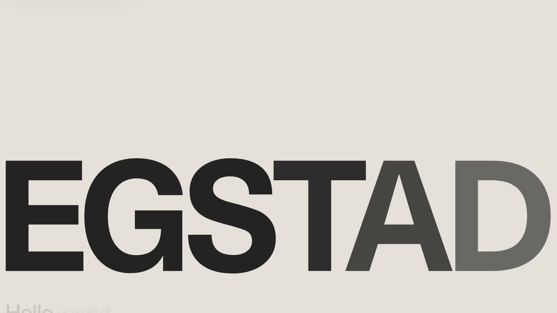
Egstad Minimalist Design Portfolio
A refined Nuxt.js portfolio featuring bold variable typography, interactive canvas elements, and a clean grid-based layout for showcasing design work.
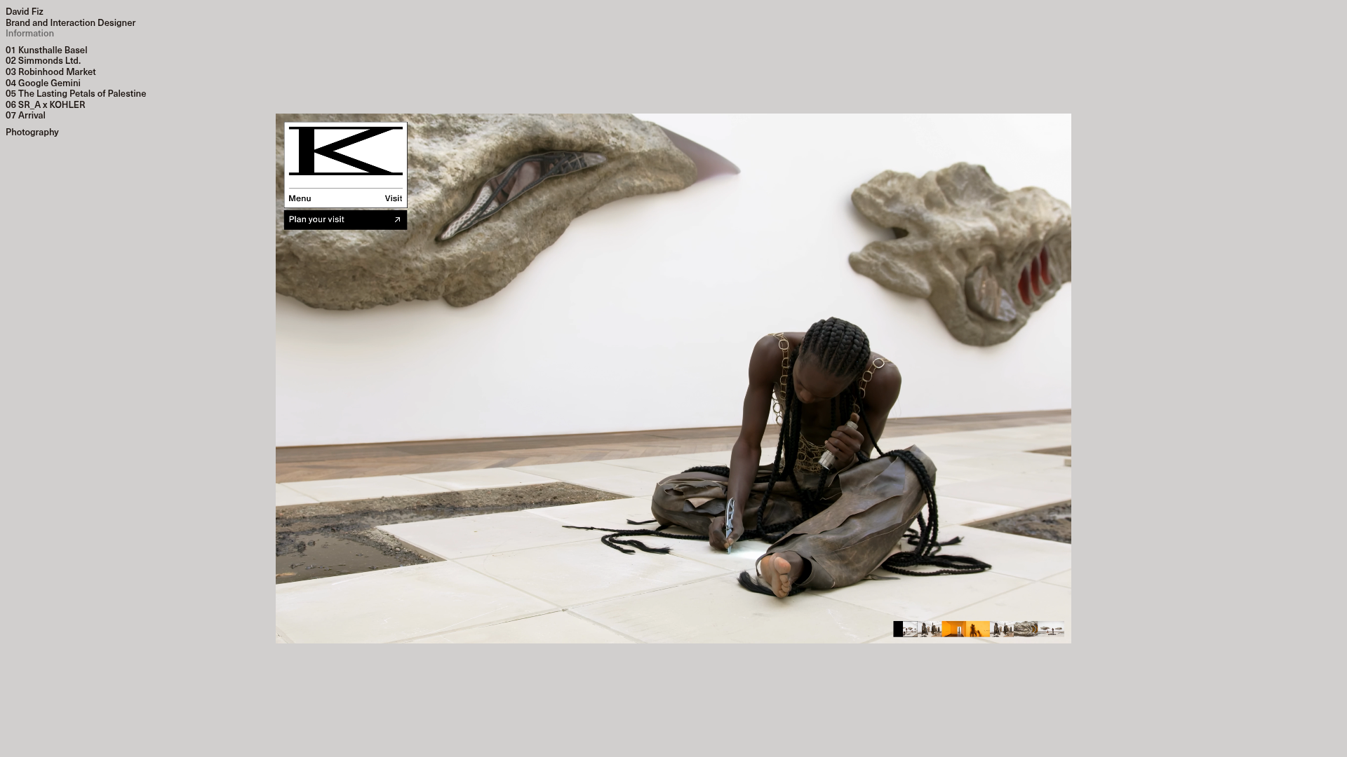
David Fiz Visual Design Portfolio
A minimalist portfolio featuring a fixed sidebar navigation paired with an immersive, full-screen media showcase and interactive project-specific image carousels.
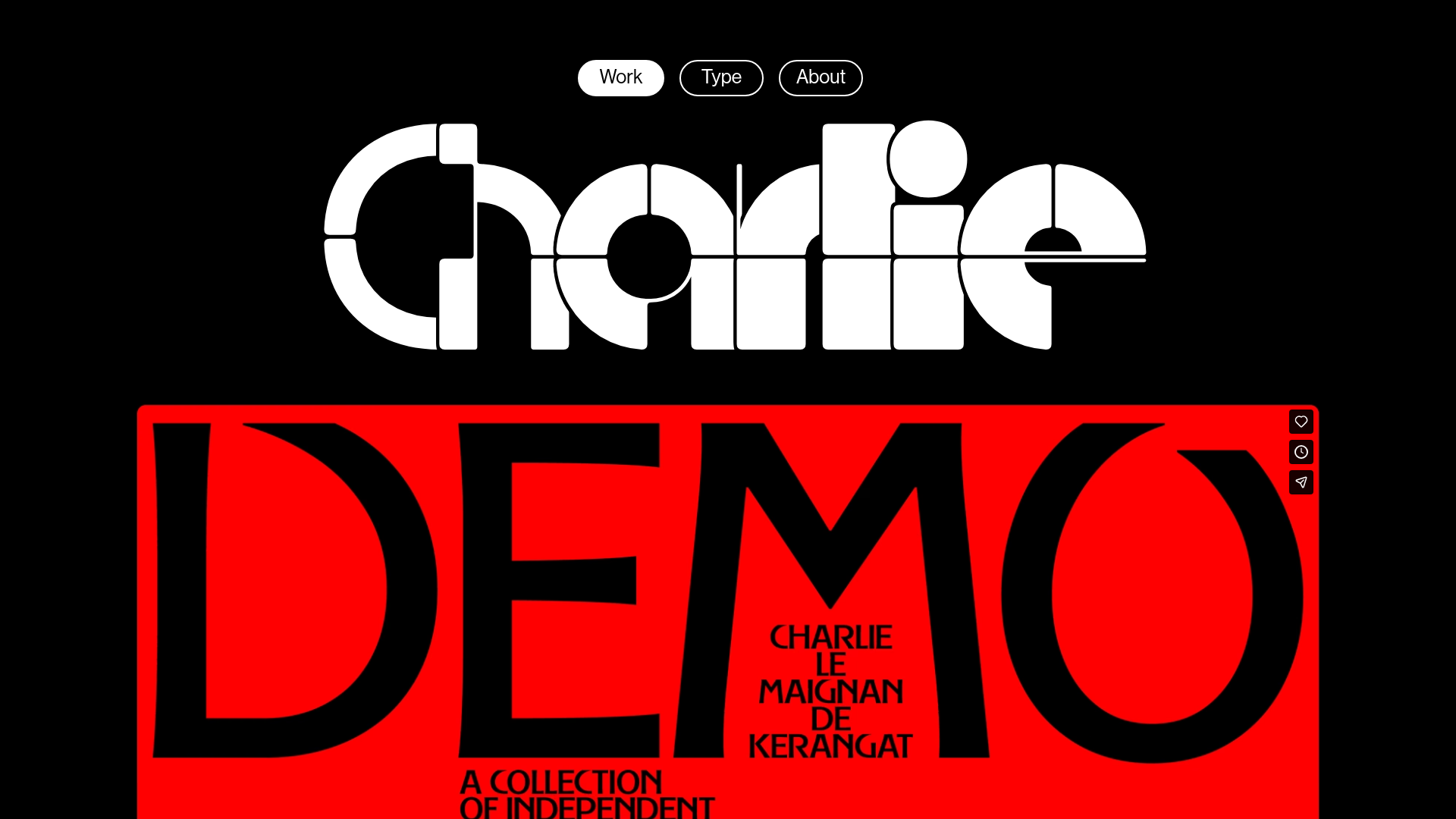
Charlie Le Maignan Portfolio Archive
A minimalist dark-mode portfolio featuring high-contrast typography, a geometric logo header, and an integrated full-width video gallery showcasing independent creative work.
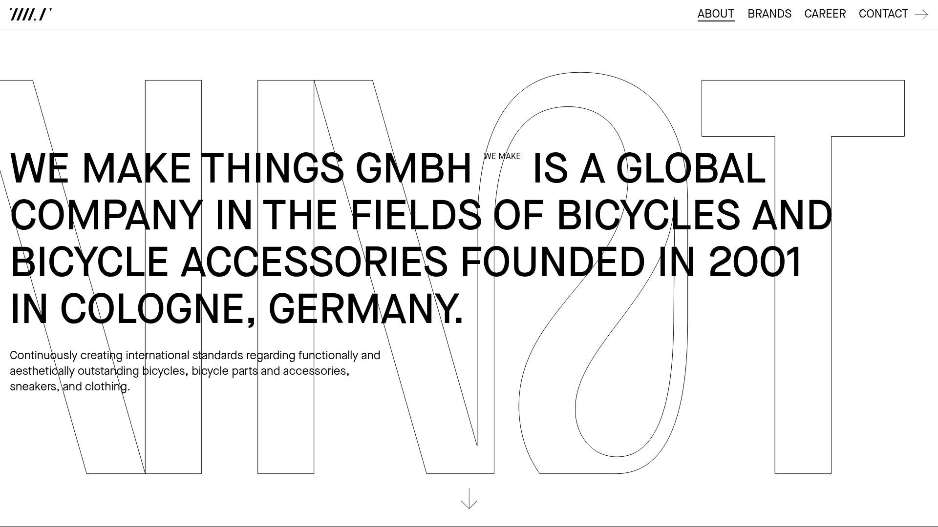
WE MAKE THINGS Corporate Portfolio
A minimalist corporate site featuring a bold typography-heavy hero section and an accordion-style brand list with integrated image galleries and external links.
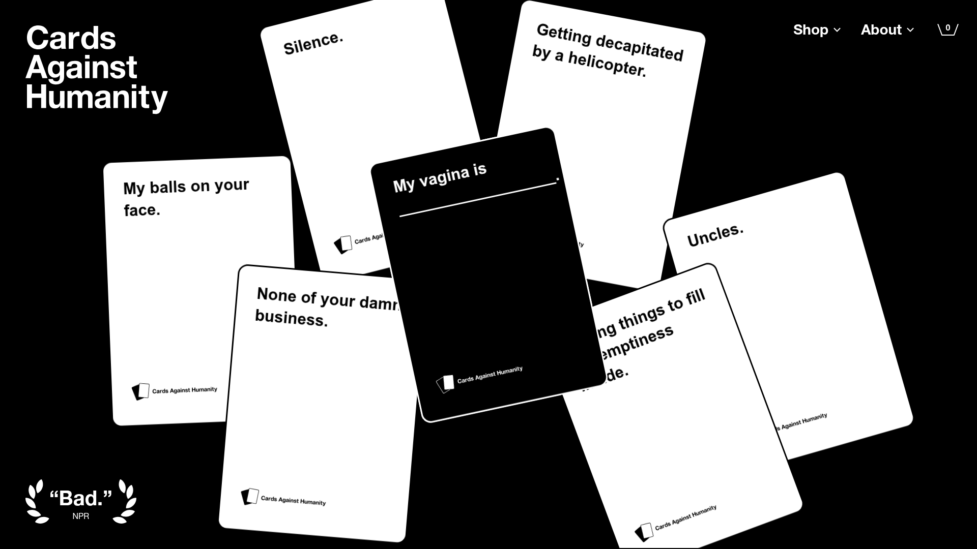
Cards Against Humanity Landing Page
A high-impact landing page featuring a CSS-transformed 3D card hero, color-blocked sections, product carousels, and an accordion-style FAQ with a bold, minimalist aesthetic.
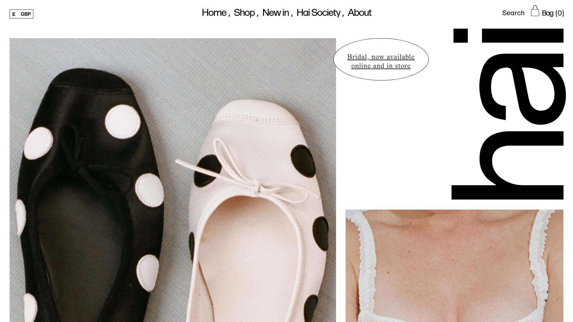
Hai Fashion E-commerce Product Grid
Minimalist boutique layout featuring asymmetrical product imagery, specialized typography, a floating circular call-to-action, and a clean grid for showcasing apparel and accessories.
