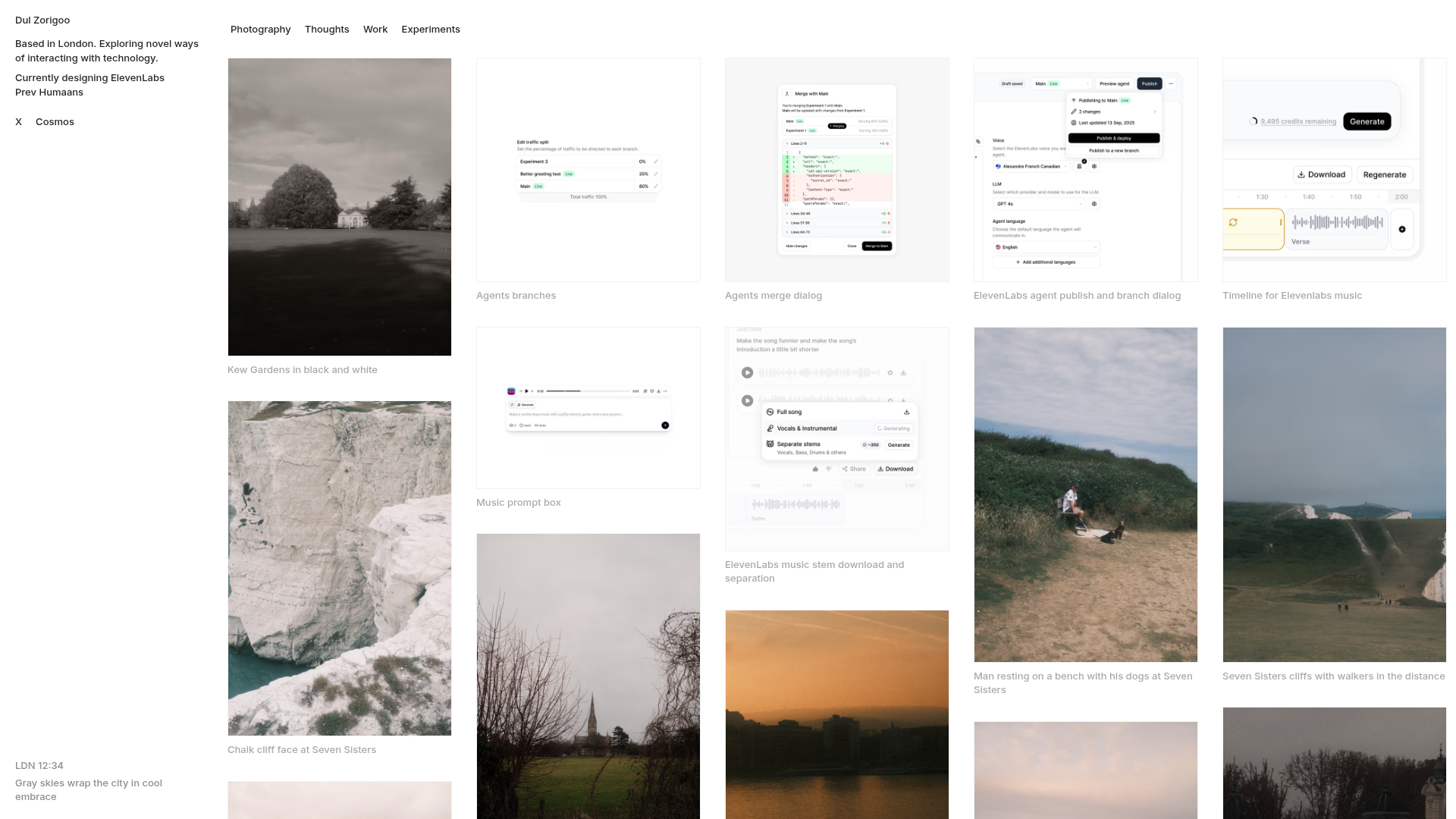
Dul Zorigo Minimalist Portfolio Gallery
A clean masonry grid portfolio featuring a fixed sidebar, category filtering, and subtle hover effects for showcasing photography and UI design work.
Overview
This portfolio follows a minimalist, content-first philosophy, utilizing a wide-span masonry grid to showcase a mix of photography, UI/UX case studies, and short-form writing. It is an excellent clone reference for creatives who need a flexible, multi-column layout that feels orderly despite varying asset aspect ratios. The design prioritizes high-quality imagery and typography over heavy UI decoration, making it a sophisticated choice for visual storytelling.
Design System
- Color Palette & Visual Hierarchy: The site uses a neutral, monochrome palette anchored by a white background and subtle dark-gray text (
text-foreground/40for captions). Hierarchy is achieved through spacing and scale rather than color, with a fixed sidebar providing context while the main content area handles high-contrast visuals. - Typography: Features a clean, sans-serif font system. Navigational items and titles use a small font scale (around 13-14px), often with a medium weight (
font-medium) to maintain readability at smaller sizes. - Structure & Flow:
- Sidebar: A fixed left navigation panel (width 72px on desktop) containing the bio, location data, and social links.
- Content Header: A horizontal filter bar using ghost-style buttons for category switching (Photography, Thoughts, Work, Experiments).
- Masonry Grid: A multi-column responsive grid (shifting from 1 to 5 columns depending on viewport) utilizing Tailwind CSS
gap-8for generous white space between items.
- Reusable Components:
- Ghost Buttons: Minimalist category filters with
bg-black/5hover states. - Media Cards: Interactive
groupcontainers that wrap images or videos, featuring thin borders (border-black/5) and bottom-aligned captions that utilizeline-clamp-2to handle text overflow. - Text Blocks: As seen in the "Thoughts" section, markdown-style text previews within the grid use an
aspect-squarecontainer with a bottom gradient fade (bg-linear-to-t) and a subtle hover-activated blur button.
- Ghost Buttons: Minimalist category filters with
- Interaction Patterns: The layout uses CSS transitions for hover states. Images and buttons feature subtle opacity shifts or background color changes. The navigation uses a
backdrop-blur-smon mobile headers for a modern, glassmorphism effect. - Implementation Clues: Built using Next.js and Tailwind CSS. The HTML reveals utility-first styling (e.g.,
flex-1,shrink-0,gap-[2px]) and optimized image handling via the Next.jsImagecomponent.
Use Cases
- Who should clone this: Photographers, product designers, and visual researchers who want a "journal" or "mood board" style portfolio that combines different media types seamlessly.
- Effective Remixes: Perfect for digital agencies showcasing projects, architecture firms displaying build galleries, or personal blogs that prioritize curated imagery over long-form text.
- Remix Directions:
- E-commerce: Adaptation of the masonry grid into a product catalog where hover states reveal prices or sizes.
- Architecture: Swapping the wide grid for a 2-column layout to allow for larger, more detailed photography.
- Branding: Adjusting the
bg-black/5highlights to a brand's signature accent color across all interactive buttons.
- Clone Scope: A full-page clone is recommended to capture the relationship between the fixed sidebar and the responsive grid, but the filter bar and masonry item components are excellent for quick section reuse.
Related Inspirations
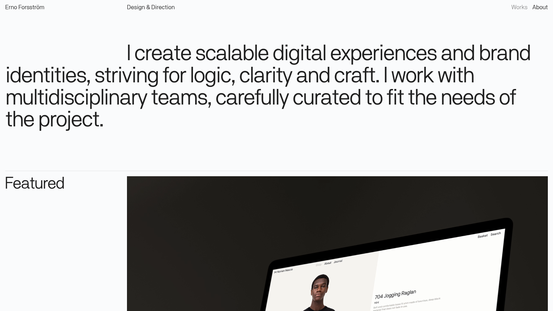
Erno Works Minimalist Design Portfolio
A clean, typography-focused portfolio featuring a sticky grid layout, large editorial headers, and integrated video project thumbnails for dynamic case study previews.
Gio Pandone Minimalist Portfolio Template
A clean, grid-based designer portfolio featuring a sticky minimalist navigation, scroll-triggered entrance animations, and a responsive 12-column work gallery with embedded video previews.
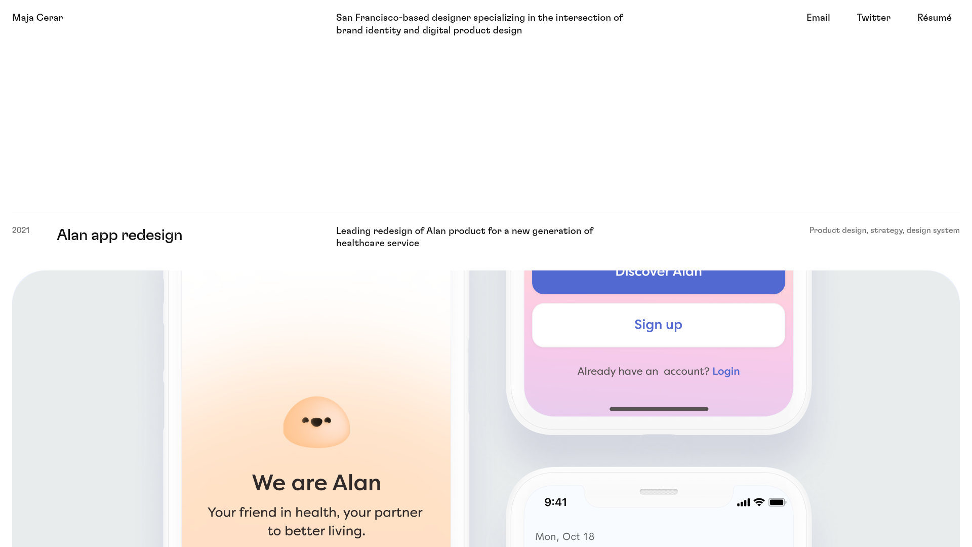
Maja Cerar Minimalist Portfolio Template
A clean, horizontal-grid portfolio featuring a sticky header, structured project metadata, and high-impact full-width imagery for product design case studies.
Ka Ra Studio Design Portfolio
A minimalist design portfolio featuring a centered typography-led layout with interactive image slideshows arranged in a flexible two-column grid.

Isla Beauty Skincare E-commerce Store
A clean Shopify-based storefront featuring a split-hero landing page, a step-by-step product system carousel, and a split-screen testimonial section with localized product image sidebars.

Christopher Doyle Agency Portfolio Layout
A minimalist, typography-led portfolio featuring a wide-margin grid system, smooth fade-in animations, and simple image-focused project cards.
