Maja Cerar Minimalist Portfolio Template
A clean, horizontal-grid portfolio featuring a sticky header, structured project metadata, and high-impact full-width imagery for product design case studies.
Overview
This minimalist portfolio template serves as a high-fidelity reference for digital product designers looking to showcase complex case studies through a stripped-back, content-first interface. It excels at balancing dense metadata with immersive imagery, using a three-column horizontal layout that ensures professional credibility and clear navigation. Builders should clone this to achieve an editorial, "anti-template" aesthetic that prioritizes typography and whitespace.
Design System
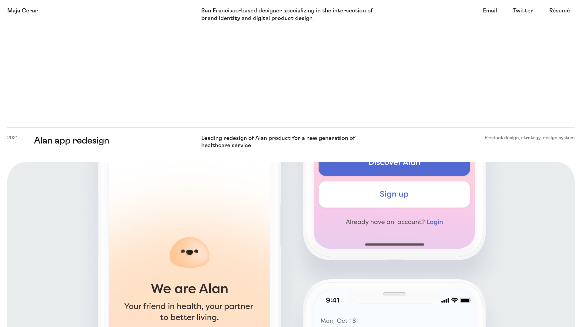
- Color Palette & Visual Hierarchy: The site uses a high-contrast monochromatic base (off-white background and deep black text) to ensure legibility. Color is reserved exclusively for the project thumbnails, allowing the design work to define the brand personality of each section.
- Typography System: A neo-grotesk sans-serif (e.g., Inter or similar) is used throughout. The hierarchy is established through weight and placement rather than size: smaller labels for years and tags (
c-PJLV-gkfbhN-size-description), medium bold for project titles (c-PJLV-bIUxMi-size-header), and regular weights for descriptions. - Page Structure & Section Flow: The layout follows a rigid horizontal grid. A sticky header containing the name, bio, and social links remains fixed. Below, project sections are separated by thin horizontal rules (
c-bkSMdF), each featuring a metadata row (Year, Title, Description, Skills) followed by a full-bleed decorative image or video loop. - Reusable Components:
- The Metadata Row: A highly reusable div (
c-khhbPl) that organizes four distinct data points across a single horizontal line. - Sticky Navigation: A simple, efficient header that distributes brand info and links across the viewport width.
- Media Containers: Huge edge-to-edge images (
c-LWUmL) and auto-playing video blocks (c-gGQkAH) designed for high-impact visual storytelling.
- The Metadata Row: A highly reusable div (
- Interaction & Motion: The template uses a vertical-stack scroll. From the HTML structure, the project links (
c-ldvQce) wrap entire sections, making the full project block an interactive hit area for easy navigation. - Implementation Clues: The CSS class naming convention (
c-qzSne,c-bkSMdF) suggests a CSS-in-JS framework like Stitches or Styled Components, indicating a component-based architecture where layout containers are decoupled from specific content.
Use Cases
- Who should clone this: Product designers, creative directors, and brand strategists who need a sophisticated way to present a small number of high-quality projects.
- Effective Remixes: This pattern works exceptionally well for architectural portfolios, digital agencies, or technical case studies where data (like project year and role) is as important as the visual output.
- Remix Directions:
- IA Adaptation: Swap the "Year" column for "Client Name" or "Industry."
- Style Swap: Apply a dark mode theme by inverting the background and text colors while keeping the rigid grid system intact.
- Partial Extension: Extract the metadata header row to use as a summary block at the top of long-form articles.
- Suggested Clone Scope: A full-page clone is recommended to maintain the integrity of the horizontal alignment and fixed header, which together create the site's distinct editorial feel.
Related Inspirations
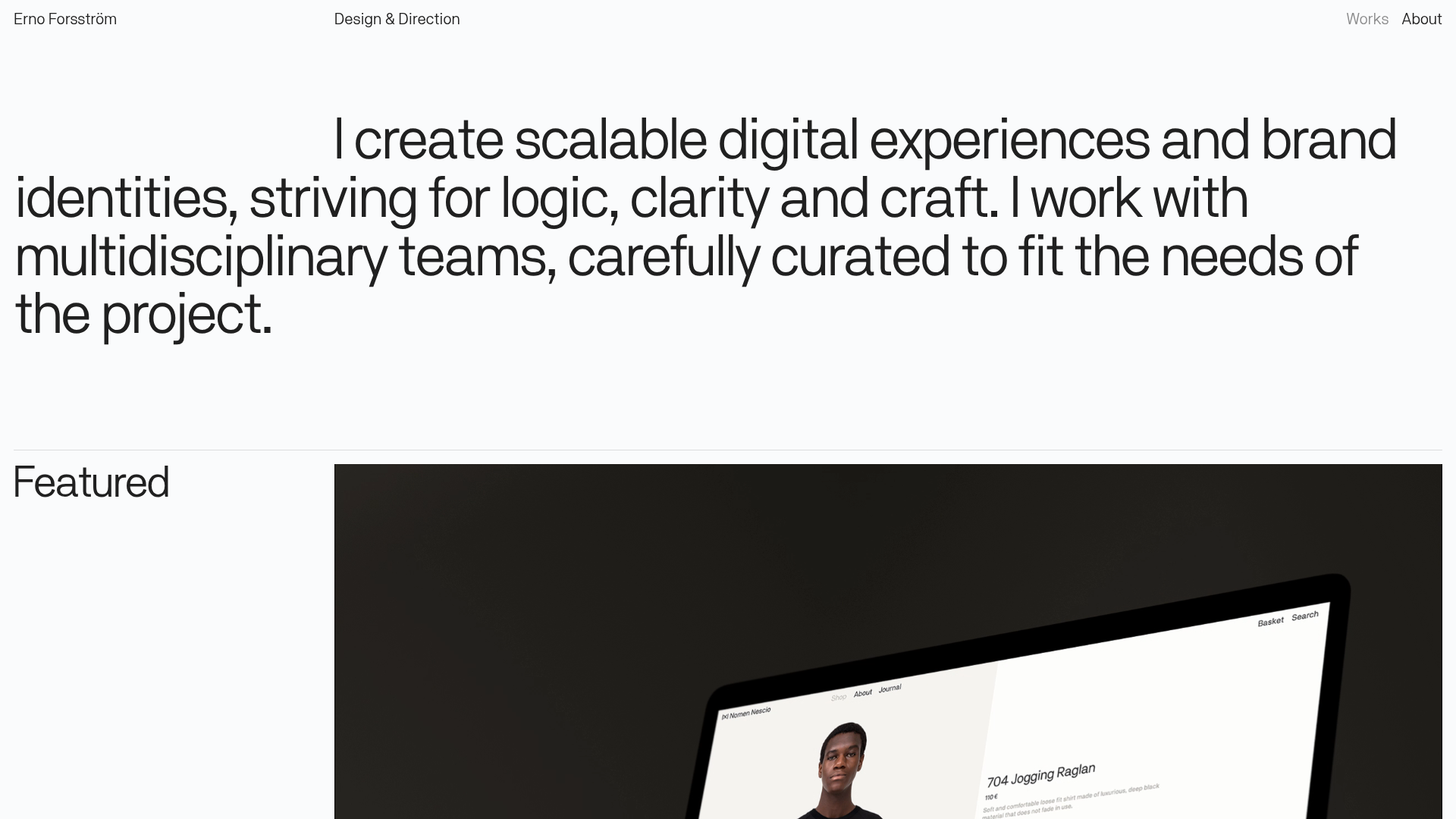
Erno Works Minimalist Design Portfolio
A clean, typography-focused portfolio featuring a sticky grid layout, large editorial headers, and integrated video project thumbnails for dynamic case study previews.
Gio Pandone Minimalist Portfolio Template
A clean, grid-based designer portfolio featuring a sticky minimalist navigation, scroll-triggered entrance animations, and a responsive 12-column work gallery with embedded video previews.
Ka Ra Studio Design Portfolio
A minimalist design portfolio featuring a centered typography-led layout with interactive image slideshows arranged in a flexible two-column grid.

Isla Beauty Skincare E-commerce Store
A clean Shopify-based storefront featuring a split-hero landing page, a step-by-step product system carousel, and a split-screen testimonial section with localized product image sidebars.

Christopher Doyle Agency Portfolio Layout
A minimalist, typography-led portfolio featuring a wide-margin grid system, smooth fade-in animations, and simple image-focused project cards.

Clase Agency Branding Portfolio
A minimalist design agency portfolio featuring a typographic hero section, full-width image articles, sticky title bars, and integrated scrolling text marquees for a clean editorial layout.
