Ka Ra Studio Design Portfolio
A minimalist design portfolio featuring a centered typography-led layout with interactive image slideshows arranged in a flexible two-column grid.
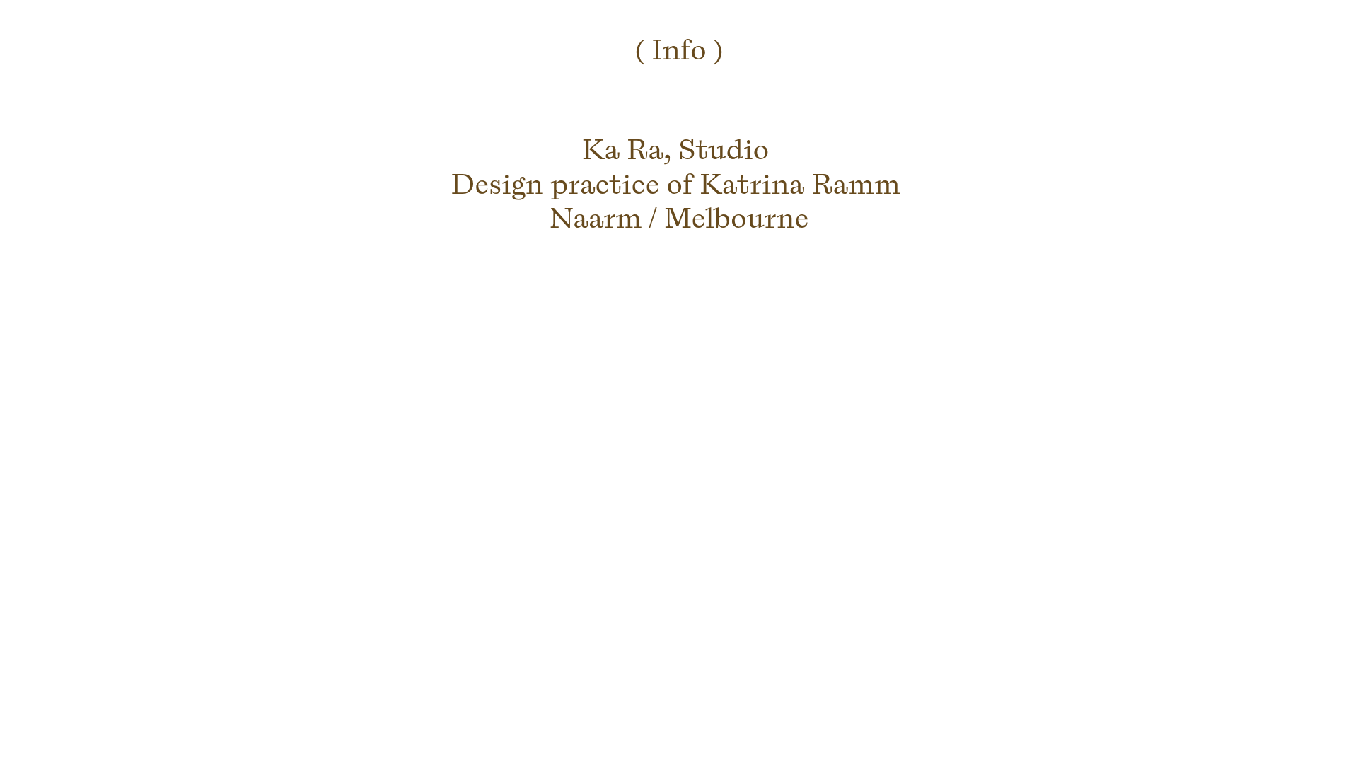
Overview
Ka Ra Studio is a minimalist design portfolio that emphasizes spatial breathing room and high-quality product photography. Its centered, typography-led layout and clean two-column grid make it an excellent reference for creators who want to showcase craft-focused work without visual clutter.
Design System
- Color Palette & Visual Hierarchy: The site uses a high-contrast but soft palette, featuring dark brown (earth-toned) serif text against a stark white background. This creates a gallery-like atmosphere where the furniture photography provides the primary color input.
- Typography: The system relies on an elegant, traditional serif typeface. The hierarchy is centered with consistent line-heights; the header content at the top sets a formal tone, while project titles and descriptions follow a rhythmic scale beneath image blocks.
- Page Structure: The site follows a vertical flow, starting with a pinned navigation link and a central studio introduction. This is followed by a repeating pattern of two-column "Column-Sets" containing interactive product galleries.
- Reusable Components:
- Interactive Slideshow Grid: A flexible
column-setcontaininggallery-slideshowcomponents that allow users to flick through multiple images per project without entering a nested page. - Pinned Navigation: A simple, fixed-top
( Info )link that remains accessible as users scroll. - Acknowledged Footer: A structured text block for studio credits and land acknowledgments, utilizing a wider span (8 columns) within a 12-column grid logic.
- Interactive Slideshow Grid: A flexible
- Interaction Patterns: The slideshows feature manual navigation arrows for browsing. Most images are
zoomable, suggesting a light-box effect on click. Hover states on links are subtly handled via underline text-decoration. - Mobile Behavior: The HTML
mobile-stack="true"attribute reveals that the two-column desktop layout collapses into a single-column vertical stack on smaller screens, while slideshows maintain their interactive functionality.
Use Cases
- Who should clone this: Independent designers, furniture makers, photographers, and architects who need a portfolio that feels editorial and sophisticated.
- Effective Remixes: This pattern works well for small curated catalogs, lookbooks for boutique fashion brands, or an academic/research portfolio where text and imagery need equal weight.
- Remix Directions: Swap the earthy brown text for high-contrast black for a more modern-industrial feel, or adapt the two-column grid into a staggered masonry layout for a more informal look.
- Clone Scope: A full-page clone is ideal to preserve the delicate balance of margins and centered typography, though the specific component of a two-column grid with integrated slideshows is highly transplantable for any existing minimalist site.
Related Inspirations
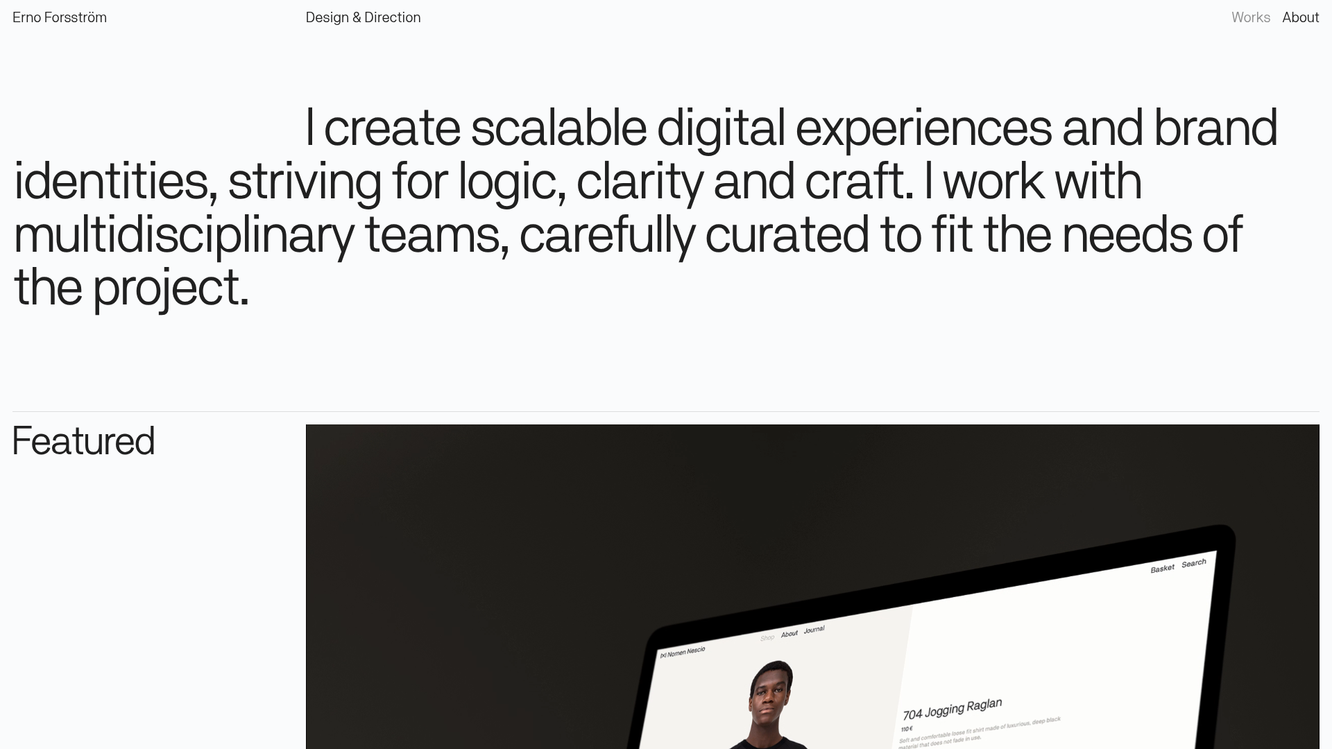
Erno Works Minimalist Design Portfolio
A clean, typography-focused portfolio featuring a sticky grid layout, large editorial headers, and integrated video project thumbnails for dynamic case study previews.
Gio Pandone Minimalist Portfolio Template
A clean, grid-based designer portfolio featuring a sticky minimalist navigation, scroll-triggered entrance animations, and a responsive 12-column work gallery with embedded video previews.
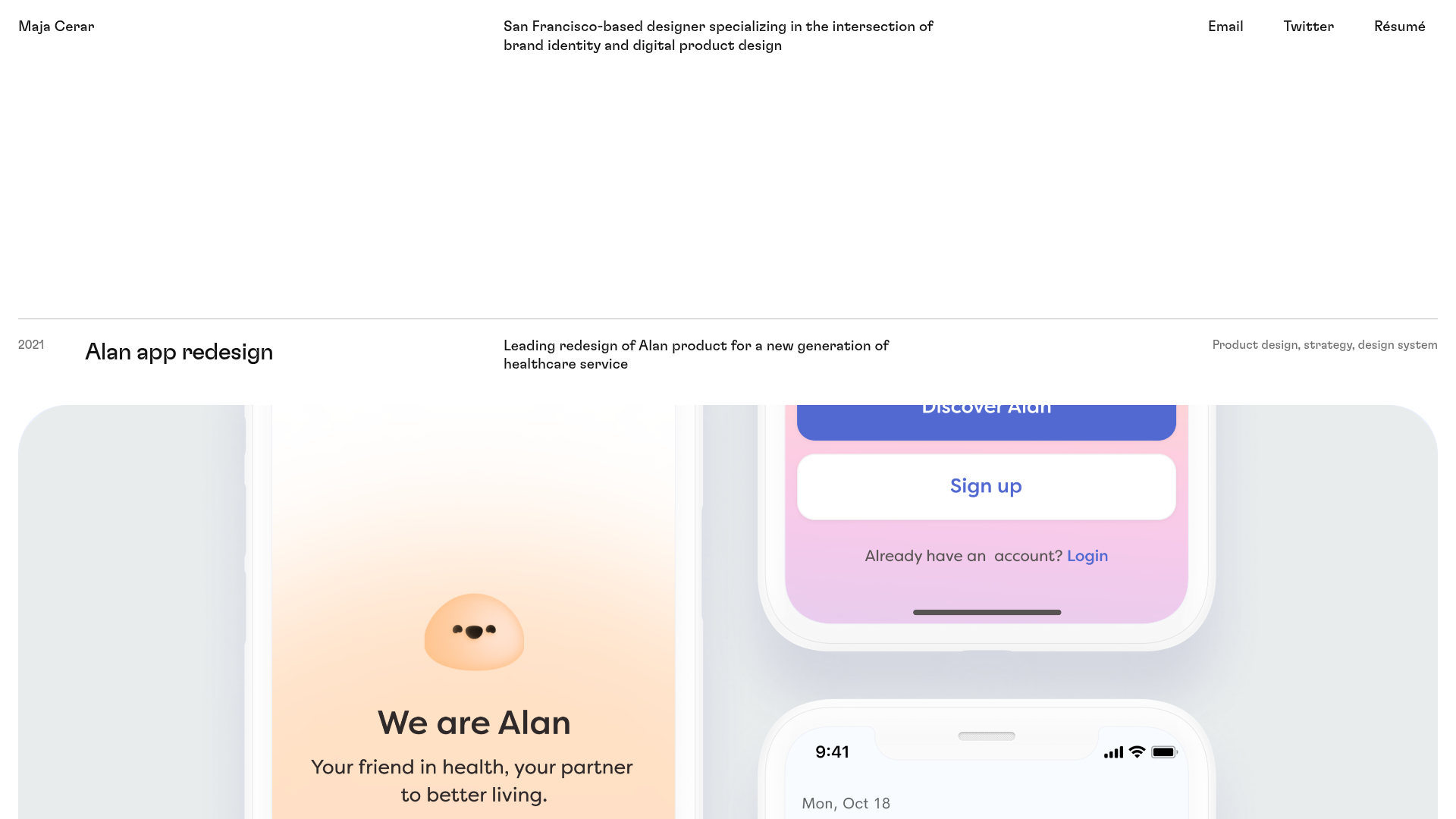
Maja Cerar Minimalist Portfolio Template
A clean, horizontal-grid portfolio featuring a sticky header, structured project metadata, and high-impact full-width imagery for product design case studies.

Isla Beauty Skincare E-commerce Store
A clean Shopify-based storefront featuring a split-hero landing page, a step-by-step product system carousel, and a split-screen testimonial section with localized product image sidebars.

Christopher Doyle Agency Portfolio Layout
A minimalist, typography-led portfolio featuring a wide-margin grid system, smooth fade-in animations, and simple image-focused project cards.

Clase Agency Branding Portfolio
A minimalist design agency portfolio featuring a typographic hero section, full-width image articles, sticky title bars, and integrated scrolling text marquees for a clean editorial layout.
