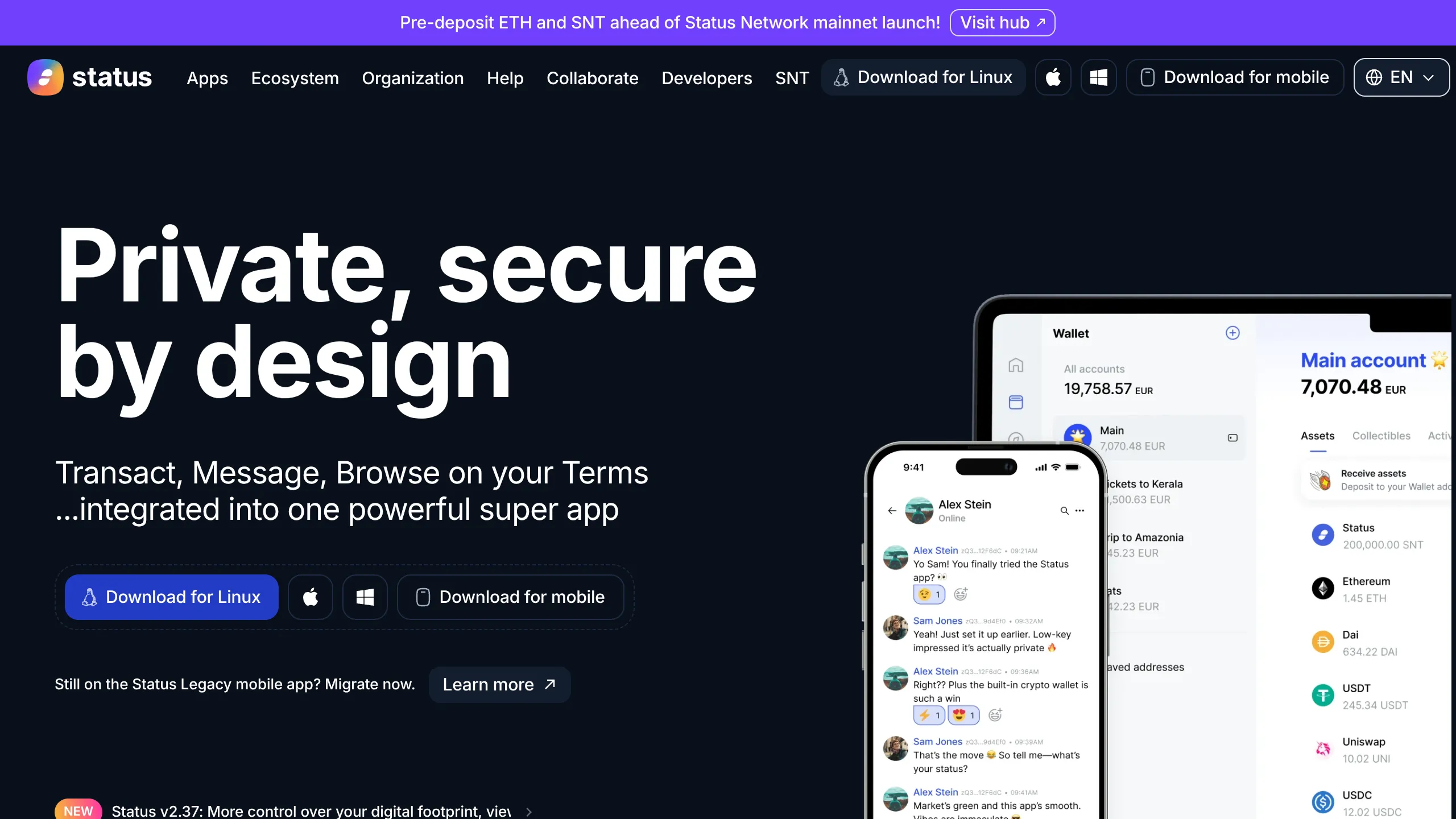
Status App Privacy-Focused Landing Page
A dark-themed crypto landing page featuring an integrated wallet UI, multi-platform download buttons, and a banner-notified sticky header design.
Overview
Status App presents a sophisticated dark-themed landing page designed for a privacy-focused cryptocurrency "super app." It serves as a strong clone reference for its effective use of high-contrast visual hierarchy, seamless multi-platform call-to-actions, and integrated UI mockups that demonstrate product utility before a user even signs up.
Design System
- Color Palette & Visual Hierarchy: The site uses a deep black (#000000) or near-black background that makes the high-contrast white primary headers pop. A vibrant "purple-to-blue" promotional banner at the top provides a focal point for secondary announcements without distracting from the main value proposition.
- Typography System: The design relies on a clean, sans-serif typeface (Inter or similar). Headlines use a heavy weight with tight letter spacing for impact, while body text and navigation items use medium weights for readability against the dark background.
- Page Structure: The flow begins with a global announcement banner, followed by a sticky navigation header, and a massive hero section featuring a split layout: text/buttons on the left and device mockups (mobile and desktop) on the right.
- Reusable Components:
- Multi-platform Buttons: Distinct primary buttons for different OS environments (Linux, macOS, Windows) and a dedicated mobile download button with clear icon usage.
- Sticky Header: A dense nav containing links for Apps, Ecosystem, SNT, and Developers.
- UI Mockups: The high-fidelity wallet and chat interface overlays can be cloned to showcase app internal states.
- Banner Notification: A top-level promotional bar with a "Visit hub" call-to-action.
- Interaction Design: Buttons utilize hover states (background color shifts like the 'Learn more' action) and the layout suggests a smooth transition between desktop and mobile-specific download states. The HTML indicates a structured approach using
divwrappers for specific platform categories.
Use Cases
- Who should clone this: Web3 developers, privacy-focused software teams, and messaging app startups looking for a "pro" aesthetic that balances security with usability.
- Effective Remixes: This pattern works well for developer tools, encrypted storage services, or fintech dashboards.
- Remix Directions:
- Style Swap: Change the dark background to a light/neutral gray for a corporate SaaS feel while keeping the layout logic.
- Information Architecture: Adapt the footer-style navigation in the header for complex sites with many product verticals.
- Section Reuse: Extract the multi-platform download button block for any cross-platform software landing page.
- Suggested Scope: A full-page clone is ideal for those wanting to establish a high-trust, technical brand identity quickly.
Related Inspirations

Vercel AI Cloud Landing Page
A modern landing page featuring a minimalist dark-themed navbar, a grid-overlay hero section with radial color gradients, and high-contrast typography for customer success stories.

GoCardless Payments Platform Landing Page
A dark-themed fintech landing page featuring a split-screen video hero, bento-style feature cards, a horizontal logo slider, and step-by-step accordion guides.
REKKI AI Automation SaaS Landing Page
A high-impact dark-mode landing page featuring a floating label hero section, marquee brand logos, an interactive dashboard UI preview, and card-based testimonial grids.
Dovetail AI SaaS Landing Page
A dark-themed landing page featuring a grid-pattern hero, layered product dashboard previews, feature walkthroughs with sticky scrolling, and integrated logo carousels.
Moderne Creative Landing Page
A high-contrast landing page featuring a dark hero section with an artistic illustration overlay, distinct alternating content blocks, and a visual comparison bar chart component.
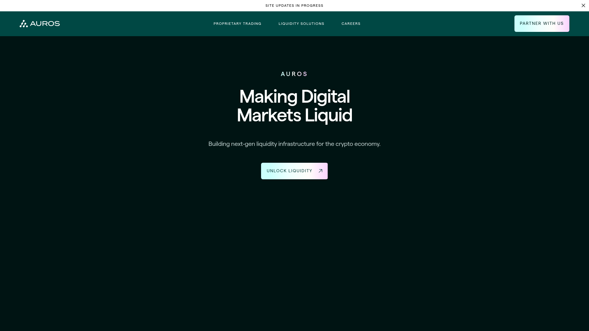
Auros Crypto Liquidity Firm Landing Page
A high-end dark mode site featuring a WebGL gradient background, horizontal text scrolls, bento grid statistics, and interactive video-integrated vertical tabs for service exploration.
