Amazon E-commerce Marketplace Dashboard
A dense retail landing page featuring a searchable navigation header, rotating hero carousel, and a structured bento-style grid of product category cards with quad-image layouts.
Overview
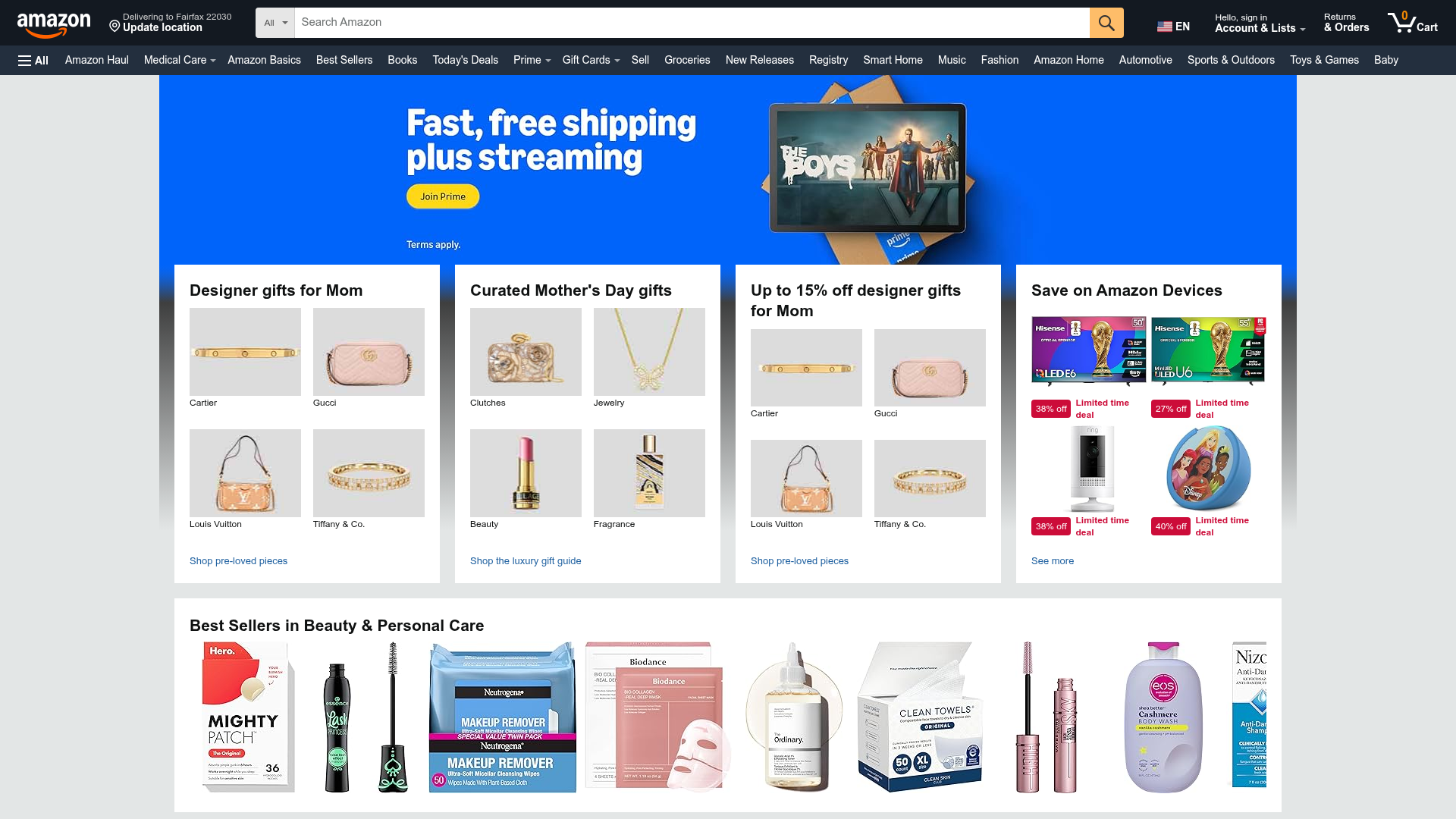
This dashboard is a high-density e-commerce marketplace layout modeled after Amazon’s primary storefront. It is a premier reference for cloning complex information architecture that manages global navigation, dynamic hero carousels, and multi-product promotional grids simultaneously. Builders should look to this for its proven ability to present massive catalogs through structured, "bento-box" style categorization.
Design System
- Color Palette & Visual Hierarchy: The palette uses a high-contrast dark navy (#232f3e) for the primary header, a secondary lighter navy for the sub-nav, and a neutral light gray background (#eaeded) to make white content cards pop. Accent colors are functional: Amazon Orange (#ff9900) for primary CTAs and search actions, and "Deal Red" (#CC0C39) for urgency/discounts.
- Typography: Uses a sans-serif stack focused on readability. Hierarchy is established through weight and color (bold black for headlines, gray for secondary labels) rather than significant size shifts, keeping the interface dense.
- Page Structure: Follows a strict vertical flow: Multi-tier Global Nav -> Bleed Video/Image Hero -> 4-Column Promotional Grid Card Row -> Full-width Horizontal Product Shoveler.
- Reusable Components:
- Search-Centric Header: Integrated category dropdown, input field, and location selector.
- Quad-Image Cards: A bento-style card container that houses four distinct product links with internal labeling and a single "footer" link for the category.
- Deal Badges: Two-part badges (discount percentage + text label) designed for high visibility on white backgrounds.
- Product Shoveler: A horizontal scrolling row (Best Sellers) featuring isolated product photography with high-contrast labels.
- Interaction & Motion: The hero section uses a
gw-desktop-herotatorclass indicating a timed auto-rotation (4000ms delay) with circular slide transitions. Image link containers feature subtle focus states for accessibility. - Responsive Clues: The HTML utilizes a flex-based grid system (
gw-card-layout,gw-col) with breakpoints (ws,sm,xs) to reorder cards into vertical stacks on smaller viewports.
Use Cases
- Who should clone this: Developers building multi-vendor marketplaces, expansive B2B catalogs, or large-scale retail landing pages needing high click-through rates on curated selections.
- Effective Remixes: Perfect for a grocery delivery dashboard, an enterprise software portal with multiple modules, or a high-volume dropshipping storefront.
- Remix Directions: Replace the industrial navy palette with a brand-specific vibrant color; adapt the quad-image cards to house recent user activity or dashboard metrics; simplify the navigation header to a single-tier for smaller catalogs.
- Clone Scope: A full-page clone is recommended for market-entry platforms to leverage familiar UX; however, cloning just the
quad-multi-asin-cardcomponent is a high-value move for any promotional sidebar or footer area.
Related Inspirations

Context Gallery High-End Furniture Landing Page
A minimal editorial layout featuring a multi-column product carousel, designer biographies with image-text pairings, and a magazine-style content grid for curated design stories.

Glein Minimalistic Bento Grid eCommerce
A clean, modular layout using a bento-style responsive grid of text teasers and large-scale product imagery for lookbooks and collection browsing.

Isla Beauty Skincare E-commerce Store
A clean Shopify-based storefront featuring a split-hero landing page, a step-by-step product system carousel, and a split-screen testimonial section with localized product image sidebars.

Stojo Collapsible E-commerce Storefront
A Shopify layout featuring a prominent discount modal, mosaic grid hero sections, and clean product cards with integrated color swatches and quick-buy functionality.

Basic.Space E-commerce Gallery Clone
A minimalist product marketplace featuring a clean sticky navigation bar, nested flyout menus, and a horizontally scrollable product carousel with hover-state image switching.

Ashley & Co Lifestyle E-commerce
An elegant Shopify-based storefront featuring a split-screen animated hero, horizontal ticker-tape collection carousel, and dynamic mega-menus with scent-specific color switching and image previews.
