Redbrick Coffee E-commerce Home Page
A clean Shopify layout featuring a bold typography hero, horizontal product slider sections, and alternating two-column feature blocks for subscriptions and wholesale services.
Overview
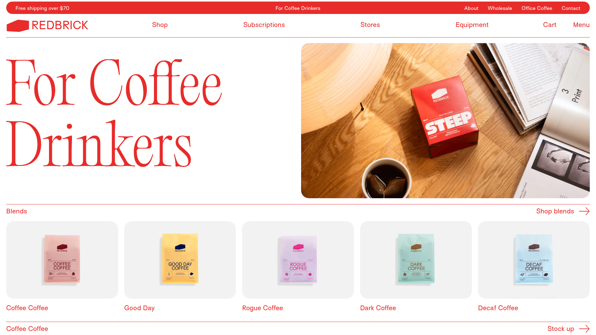
Redbrick Coffee’s e-commerce layout is a masterclass in modern, high-contrast Shopify design. It uses a bold typography-first approach and a clean modular grid to move users through different product categories and services without visual clutter, making it an excellent reference for high-end boutique brands.
Design System
- Color Palette & Visual Hierarchy: The site uses a high-contrast palette of vibrant red (#FF372D) against a stark white background. This "Redbrick Red" is used as a primary brand signal through text, borders, and buttons. Subtle light gray backgrounds help distinguish product cards from the main page body.
- Typography System: The system relies on a mix of a sophisticated serif (likely for the hero and section headings like "For Coffee Drinkers") and a clean, modernist sans-serif for utility links and body text. Large, oversized serif typography creates an editorial feel that elevates the brand.
- Page Structure: The flow consists of a thin utility bar, a minimalist header, a high-impact split hero (text/image), followed by horizontal product sliders (“Blends”, “Singles”). It concludes with alternating two-column feature blocks that utilize a mix of background-image divs and standard image tags for services like Subscriptions and Wholesale.
- Reusable Components:
- Icon-style Buttons: Minimalistic text links paired with SVG arrows (e.g., "Shop blends ->").
- Product Slider Cards: Uniform gray-bordered containers with centered product photography.
- Section Headers: Clean, bordered horizontal rows that act as dividers and category labels simultaneously.
- Email Capture: A full-width "Subscribe to get 10% off" block with a simplified single-field input.
- Interaction & Motion: The presence of
slick-sliderandanimate--slide-inclasses in the HTML indicates smooth horizontal scrolling for products and subtle vertical entrance animations for content blocks as they enter the viewport. - Implementation Clues: This is a customized Shopify theme using standard Bootstrap-style grid columns (
col-12,col-md-6). It utilizes a combination of Shoipfy sections and the Slick library for interactive sliders.
Use Cases
- Who should clone this: Small-to-medium DTC (Direct to Consumer) brands that want a premium, editorial aesthetic without cluttered, heavy graphics.
- Remix Directions:
- Color Swap: Replace the brand red with forest green for an organic brand or deep blue for a tech-focused product.
- Information Architecture: The alternating "Service Blocks" (Subscriptions/Wholesale) can be repurposed for "About Us" storytelling or "Impact Reports."
- Component Reuse: The horizontal product slider is a highly efficient way to display 5+ products on mobile without increasing page depth.
- Clone Scope: A full-page clone is ideal for those needing a complete Shopify homepage framework. Alternatively, the navigation overlay and the horizontal product slider rows are the strongest individual modules to pick for a sectional remix.
Related Inspirations

Context Gallery High-End Furniture Landing Page
A minimal editorial layout featuring a multi-column product carousel, designer biographies with image-text pairings, and a magazine-style content grid for curated design stories.

Glein Minimalistic Bento Grid eCommerce
A clean, modular layout using a bento-style responsive grid of text teasers and large-scale product imagery for lookbooks and collection browsing.

Isla Beauty Skincare E-commerce Store
A clean Shopify-based storefront featuring a split-hero landing page, a step-by-step product system carousel, and a split-screen testimonial section with localized product image sidebars.

Stojo Collapsible E-commerce Storefront
A Shopify layout featuring a prominent discount modal, mosaic grid hero sections, and clean product cards with integrated color swatches and quick-buy functionality.

Basic.Space E-commerce Gallery Clone
A minimalist product marketplace featuring a clean sticky navigation bar, nested flyout menus, and a horizontally scrollable product carousel with hover-state image switching.

Ashley & Co Lifestyle E-commerce
An elegant Shopify-based storefront featuring a split-screen animated hero, horizontal ticker-tape collection carousel, and dynamic mega-menus with scent-specific color switching and image previews.
