Resident Design Minimalist Portfolio E-commerce
Features a high-contrast editorial grid with variable image aspect ratios, hover-triggered product images, a minimalist sidebar navigation, and a text-based logo header.
Overview
This website for Resident is a masterclass in high-end editorial e-commerce, utilizing a modular grid system to blend furniture storytelling with product listings. It is a powerful reference for builders seeking to create a sophisticated, brand-first shopping experience that prioritizes large-scale imagery and architectural white space over loud calls to action.
Design System
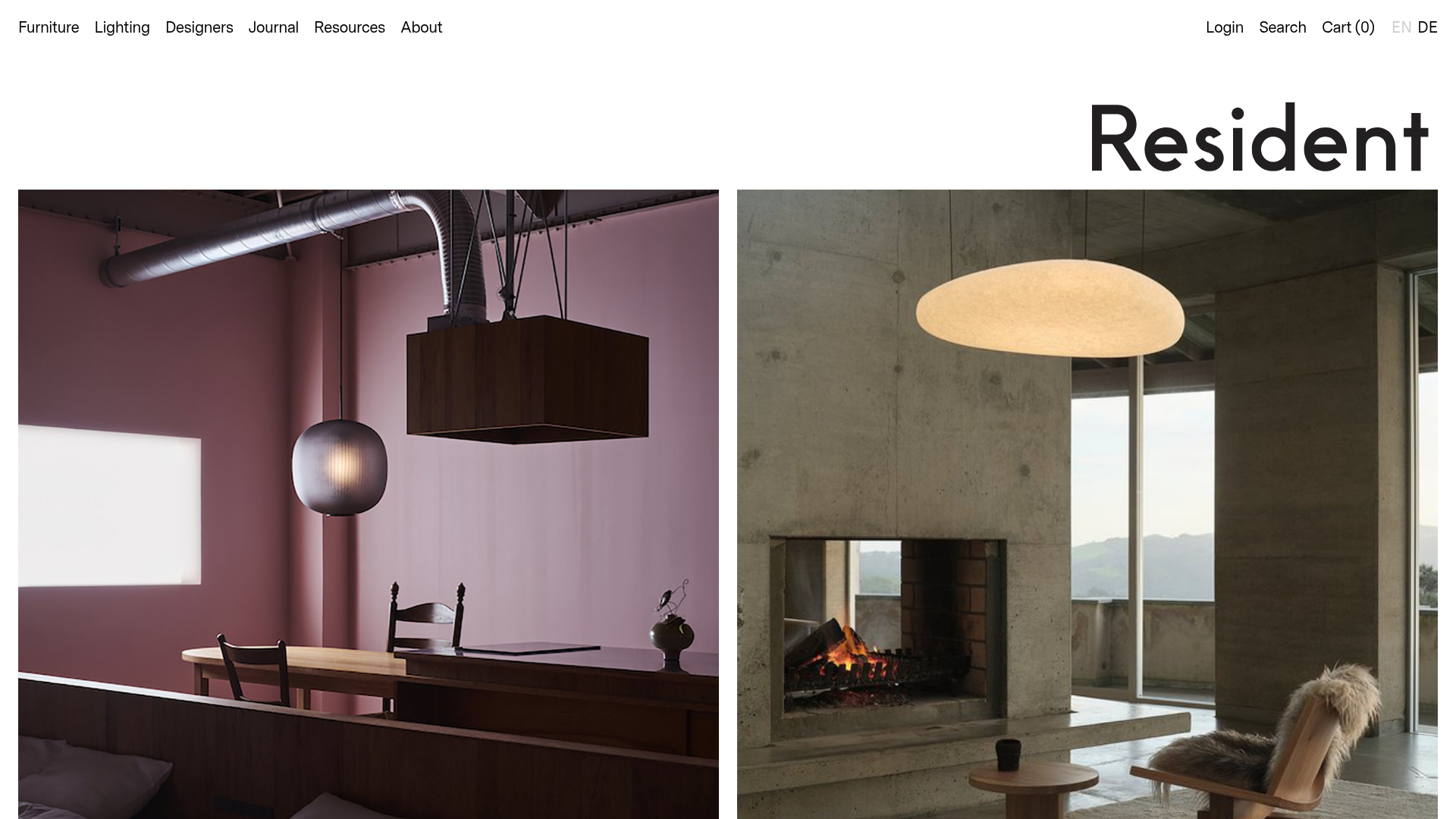
- Color Palette & Visual Hierarchy: The palette is strictly minimalist, featuring a white background, charcoal/black typography, and muted architectural photography. Hierarchy is established through image scale; large hero blocks (typically 1 or 2 images wide) dominate the early scroll, while smaller grid items (3 or 4 images wide) are used for product discovery deeper on the page.
- Typography: A clean, geometric sans-serif (resembling Neuzeit or Futura) is used throughout. The logo is oversized and right-aligned to create an unconventional entry point. Price and designer labels use small-caps or reduced font sizes to maintain a quiet, premium feel.
- Page Structure & Flow: The sequence starts with a dynamic grid of "Journal" entries (editorial content), followed by a section header for "New Releases," and continues into a product grid. It concludes with mixed media sections, including video stop-motions and horizontal carousels.
- Reusable Components:
- Product Cards: A square container containing a two-layered image structure for hover swaps (
image + hover-imageclasses). - Modular Grid Blocks: Reusable containers (
homepage-block) that accept classes likeimages-2,images-4, orcarouselto change the layout while maintaining uniform gutters. - Minimal Sidebar Nav: Mobile-style burger navigation even on desktop, keeping the focus on the content.
- Product Cards: A square container containing a two-layered image structure for hover swaps (
- Interaction & Motion: The primary interaction is the product hover state where the static product shot transitions to a lifestyle or alternate-angle shot. A Flickity-enabled carousel provides horizontal movement for project case studies.
- Implementation Clues: The HTML uses a highly structured class naming convention (e.g.,
homepage-block-heading,block-image landscape). Image containers usepadding-toppercentages (e.g., 66.7% or 100%) to maintain fixed aspect ratios during lazy-loading and prevent layout shifts.
Use Cases
- Who should clone this: Designers of luxury physical goods, architectural firms wanting a project-led shop, or boutique fashion labels requiring a "lookbook-meets-catalog" approach.
- Effective Remixes: This layout effectively handles high-resolution photography; remix it for a digital agency portfolio by swapping products for case studies, or for a high-end apothecary by adapting the 4-column product grid.
- Remix Directions: Replace the rigid monochrome theme with a warm, sandy palette for a Mediterranean travel site, or use the square-grid hover effect to display team bios (headshot to action shot).
- Suggested Scope: A full-page clone is ideal for those who need to balance brand storytelling and sales. For a faster build, the Modular Grid System (the
homepage-blockwrapper) and the Hover Swap Product Cards are the most valuable sections to extract.
Related Inspirations

Context Gallery High-End Furniture Landing Page
A minimal editorial layout featuring a multi-column product carousel, designer biographies with image-text pairings, and a magazine-style content grid for curated design stories.

Glein Minimalistic Bento Grid eCommerce
A clean, modular layout using a bento-style responsive grid of text teasers and large-scale product imagery for lookbooks and collection browsing.

Isla Beauty Skincare E-commerce Store
A clean Shopify-based storefront featuring a split-hero landing page, a step-by-step product system carousel, and a split-screen testimonial section with localized product image sidebars.

Stojo Collapsible E-commerce Storefront
A Shopify layout featuring a prominent discount modal, mosaic grid hero sections, and clean product cards with integrated color swatches and quick-buy functionality.

Basic.Space E-commerce Gallery Clone
A minimalist product marketplace featuring a clean sticky navigation bar, nested flyout menus, and a horizontally scrollable product carousel with hover-state image switching.

Ashley & Co Lifestyle E-commerce
An elegant Shopify-based storefront featuring a split-screen animated hero, horizontal ticker-tape collection carousel, and dynamic mega-menus with scent-specific color switching and image previews.
