Beautiful by Drew E-commerce Storefront
A lifestyle-focused Shopify template featuring a split-screen hero slider, circular category navigation, and a signature-styled text-and-image section.
Overview
Beautiful by Drew is an e-commerce lifestyle storefront built on Shopify that prioritizes soft aesthetics and high-quality product storytelling. Its split-screen hero slider and organic navigation patterns make it an excellent reference for builders wanting to combine brand narrative with a functional shopping experience.
Design System
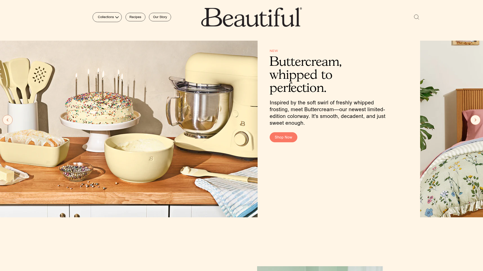
- Color Palette & Visual Hierarchy: The palette uses a warm, ivory/off-white background (#fff5e6) that creates a soft, approachable feel. Accents are primarily "Porcini" coral/peach (#fa7864) for CTAs and status badges ("New"), providing a clear visual hierarchy against dark serif headings.
- Typography: The system leans on high-contrast serifs for headings (approx. 3.25rem), providing a classic editorial feel. Secondary text and body copy use a clean sans-serif (approx. 1.3rem) for legibility, with all-caps styling for label elements.
- Page Structure & Section Flow:
- Dynamic Hero: A split-screen slider where a product image (left) is paired with a content card (right).
- Personal Narrative: A signature-styled 'Text and Image' section featuring a handwritten digital signature and lifestyle photography.
- Product Grid: A standard e-commerce arrivals grid with integrated "Shop Now" CTAs.
- Circular Category Nav: A horizontally flowing row of circular images for quick category discovery.
- Community CTA: A stacked imagery section ending with a high-contrast button for social proof/joining.
- Reusable Components:
- The Split Hero: Highly adaptable for any hero section requiring both image and context.
- Pill Buttons: Rounded-rect buttons with distinct hover states.
- Circular Category Links: A unique alternative to standard grid categories.
- Responsive Behavior: The HTML indicates a mobile-first philosophy with
mobile-navandmobile-featured-sliderclasses, where product grids likely collapse from three columns to a single-row scroll on touch devices. - Implementation Clues: The structure uses standard Shopify Liquid patterns (
shopify-section) and relies onaos(Animate On Scroll) for entry transitions. Utilities indicate the use of the Slick carousel for sliders.
Use Cases
- Who should clone this: Direct-to-consumer (DTC) brands in the home, kitchen, and wellness spaces that want a "brand-first" landing page.
- ** remixed effectively for**: Interior designers, small furniture boutiques, or organic food brands needing an editorial e-commerce vibe.
- Remix Directions: Swap the coral accent color for a cool sage or navy to change the mood while keeping the layout logic. The "Note from the Founder" section can be adapted into a "Why Us" or "Mission Statement" block.
- Clone Scope: For a fast win, clone the Split-Hero Slider and the Circular Category Nav. For a full store launch, the complete Shopify template provides a cohesive bridge between lifestyle content and product conversion.
Related Inspirations

Context Gallery High-End Furniture Landing Page
A minimal editorial layout featuring a multi-column product carousel, designer biographies with image-text pairings, and a magazine-style content grid for curated design stories.

Glein Minimalistic Bento Grid eCommerce
A clean, modular layout using a bento-style responsive grid of text teasers and large-scale product imagery for lookbooks and collection browsing.

Isla Beauty Skincare E-commerce Store
A clean Shopify-based storefront featuring a split-hero landing page, a step-by-step product system carousel, and a split-screen testimonial section with localized product image sidebars.

Stojo Collapsible E-commerce Storefront
A Shopify layout featuring a prominent discount modal, mosaic grid hero sections, and clean product cards with integrated color swatches and quick-buy functionality.

Basic.Space E-commerce Gallery Clone
A minimalist product marketplace featuring a clean sticky navigation bar, nested flyout menus, and a horizontally scrollable product carousel with hover-state image switching.

Ashley & Co Lifestyle E-commerce
An elegant Shopify-based storefront featuring a split-screen animated hero, horizontal ticker-tape collection carousel, and dynamic mega-menus with scent-specific color switching and image previews.
