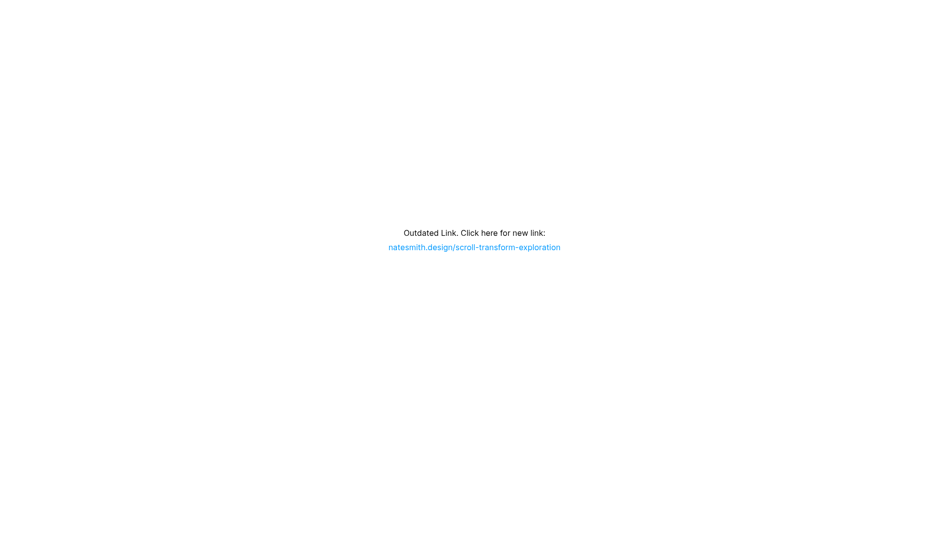
Scroll Transform Exploration Redirect Page
A minimal Framer placeholder page featuring a centered text link designed to redirect users from an outdated URL to a new project site.
Overview
This Framer-built site is a utility-first placeholder designed to manage traffic redirection from an outdated URL to a new domain. It serves as a perfect reference for building minimal landing pages, maintenance screens, or simple link-in-bio style redirects where clarity and performance are prioritized over complex layouts.
Design System
- Color Palette & Visual Hierarchy: The design follows a strict minimalist approach with a pure white background and core black text. Visual hierarchy is achieved through a subtle distinction between standard body text and stylized blue hyperlink text (#009FFF equivalent), drawing the eye immediately to the primary action: the new link.
- Typography: The system utilizes a clean sans-serif typeface with a line height of 180% to ensure readability. Text is centered horizontally and vertically within the viewport, emphasizing the singular purpose of the page.
- Page Structure: The layout is a single-section stack. It uses a
RichTextContainerinside a flexbox wrapper (display: flex; flex-direction: column; justify-content: flex-start) that is centered on the screen using CSS transform-based centering (transform: translate(-50%, -50%)). - Reusable Components: The core component is the
RichTextContainerwhich handles the paragraph and link styles. The simplicity of the layout makes the entire screen a reusable "Redirect Template" component for any project needing a temporary or permanent bridge page. - Motion & Interactions: There are no decorative animations; the focus is on a static, high-visibility state. The only interaction is a standard hover/click state on the hyperlink, which opens in a new tab (
target="_blank") as indicated by the HTML. - Implementation Clues: The site is built with Framer's hydration engine (
data-framer-hydrate-v2). The layout relies on viewport units (min-height: 100vh) to ensure the content remains centered regardless of the device's screen size.
Use Cases
- Who should clone this: Developers or designers who need a quick, professional way to handle domain migrations or "Coming Soon" statuses without spending time on complex UI.
- Remix Directions: Replace the text with a brand logo and a countdown timer for product launches, or swap the background for a subtle grain texture or gradient to align with a specific brand identity.
- Suggested Clone Scope: This is a full-page clone. Given its simplicity, builders should clone the entire structure and use it as a foundational layout for any single-link utility page.
Related Inspirations
Studio Lathe Minimalist Portfolio List
A high-contrast, minimalist portfolio layout featuring a dense list-based project index with flexible category labeling and a full-screen yellow background.

Egstad Minimalist Design Portfolio
A refined Nuxt.js portfolio featuring bold variable typography, interactive canvas elements, and a clean grid-based layout for showcasing design work.
Bruno Arizio Designer Portfolio Website
A minimalist creative director portfolio featuring a clean typographic layout, side-aligned image previews, and high-contrast spacing patterns suitable for luxury or design showcases.
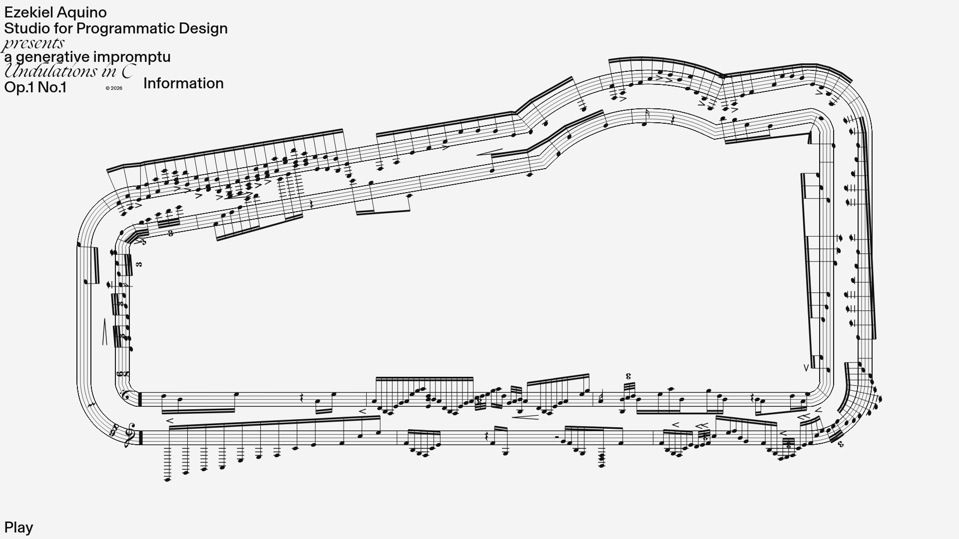
Generative Music Visualization Portfolio Canvas
A creative coding project featuring a generative musical score on a dynamic canvas with a play/pause interaction and custom notation rendering.

Niklas Rosén Designer Portfolio Index
A minimalist, responsive grid-based portfolio index featuring a clean 16-column layout, typographic list components, and a custom dark mode transition.

Christopher Doyle Agency Portfolio Layout
A minimalist, typography-led portfolio featuring a wide-margin grid system, smooth fade-in animations, and simple image-focused project cards.
