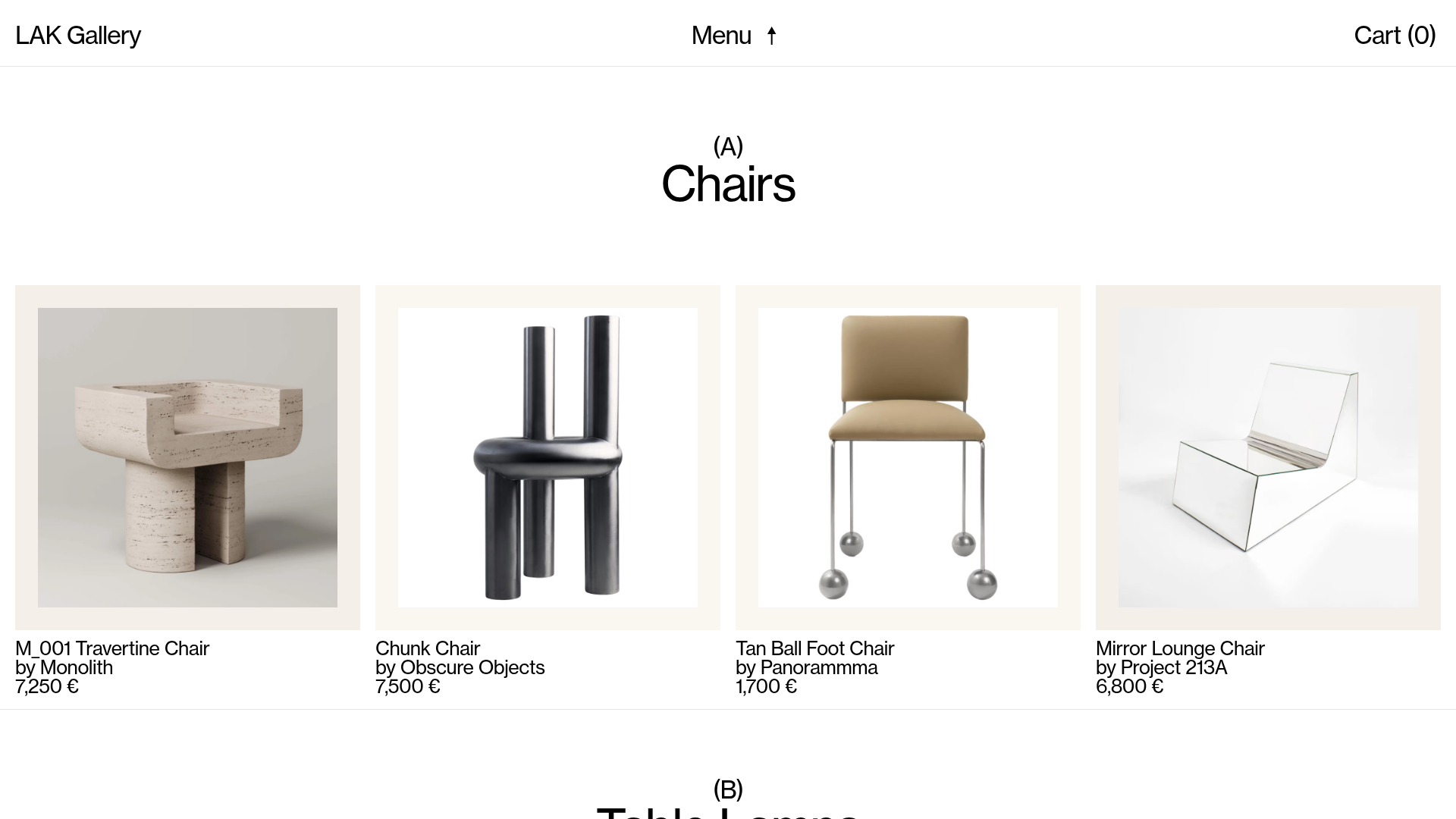
LAK Gallery Minimalist E-commerce Showcase
A clean collectible design shop featuring an alphabetical grid layout, category-driven horizontal scrolls, and high-contrast typography for luxury product catalogs.
Overview
LAK Gallery is a ultra-minimalist e-commerce platform for high-end collectible furniture and design objects. It serves as a superior reference for developers and designers because of its sophisticated alphabetical indexing system, distinct horizontal scroll sections, and its use of negative space to elevate individual product photography to an art-gallery status.
Design System
- Color Palette & Visual Hierarchy: The site uses a high-contrast, monochrome palette (pure white backgrounds with black text). Visual hierarchy is driven by extreme scale differences: large, bold serif-style headings for categories (e.g., "Chairs") contrast with small, capitalized metadata labels (e.g., "(A)").
- Typography: The typography system relies on a clean, sans-serif font (likely Inter or a custom variant) for body text and navigation, and a high-impact, larger-scale font for section headers. It uses multi-line text blocks for product info to maintain a vertical rhythm within cards.
- Page Structure: The site follows an alphabetical flow (A-K). Each section begins with a category identifier followed by a horizontal row of product items. This creates a predictable, catalog-like browsing experience that emphasizes the breadth of the collection.
- Reusable Components:
- Product Cards: Square containers holding centered images with no borders, followed by three lines of text (Title, Designer, Price).
- Hybrid Nav: A fixed top bar with a centered toggle menu and edge-aligned logo/cart links.
- Horizontal Scrollers: Category-specific carousels that allow for dense product display without cluttering the vertical viewport.
- Interactions: Subtle hover states on product cards and text links. The menu uses an arrow-up icon (↑) indicating a vertical overlay or scroll-back behavior.
- Implementation Clues: Built using Next.js (evident from the
__nextID) and Sanity.io for the headless CMS/image delivery. The use ofcss-prefixed classes suggests a CSS-in-JS library like Emotion or Styled Components.
Use Cases
- Who should clone this: Designers building luxury boutique stores, art galleries, architecture portfolios, or independent high-fashion labels.
- Effective Remixes: Perfect for products that require high-quality visual storytelling rather than mass-market volume. Effectively adapted for jewelry catalogs, premium lighting brands, or high-concept home decor.
- Remix Directions:
- Branding: Swap the monochrome for a deep charcoal/cream palette for a more "organic" feel.
- Architecture: Reuse the alphabetical index but replace product categories with yearly archives for a portfolio site.
- Scaling: Adapt the horizontal scrolls into vertical grids for more traditional e-commerce utility while keeping the "gallery" typography.
- Suggested Clone Scope: A full-page clone is recommended to capture the intent of the alphabetical navigation, but the product-card-into-horizontal-scroll component is highly valuable as a standalone module for landing pages.
Related Inspirations

Isla Beauty Skincare E-commerce Store
A clean Shopify-based storefront featuring a split-hero landing page, a step-by-step product system carousel, and a split-screen testimonial section with localized product image sidebars.
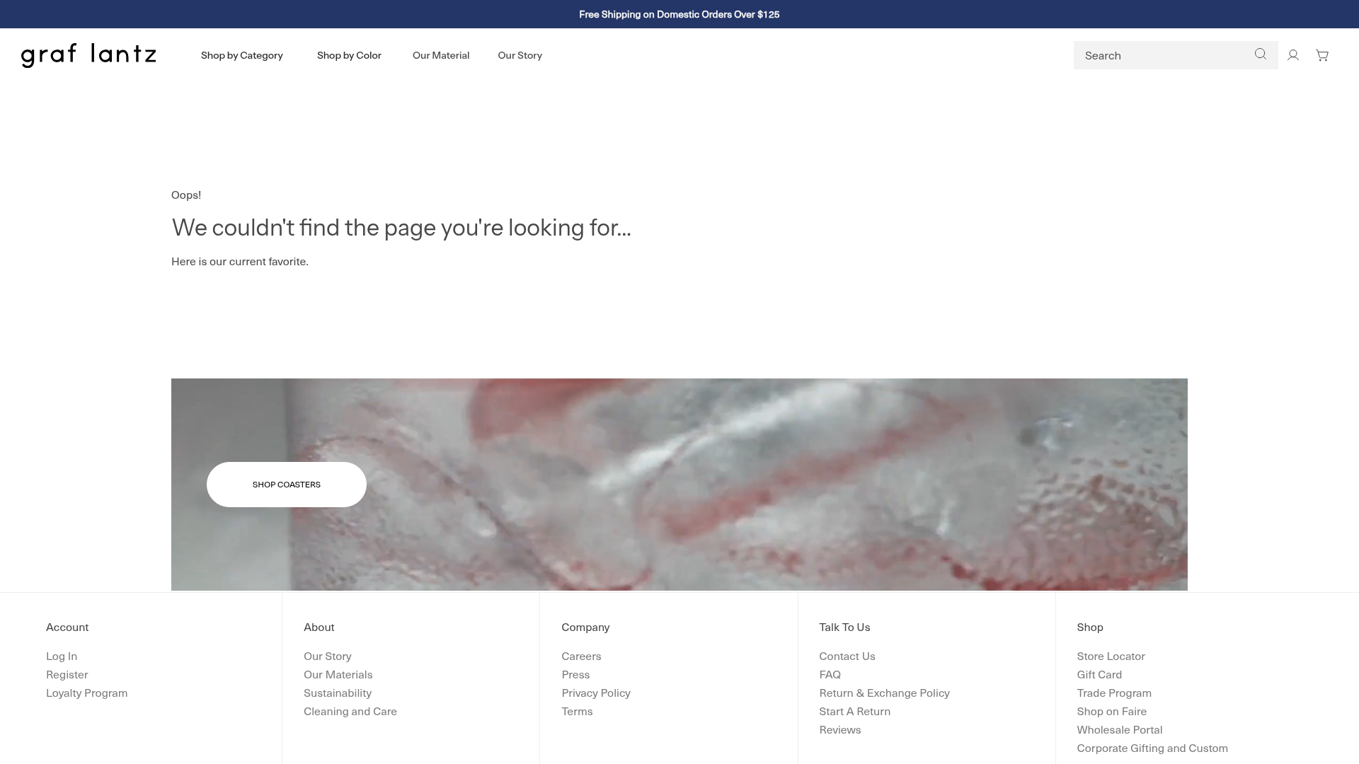
Graf Lantz Minimalist E-commerce 404
A clean Shopify-based error page featuring a full-width video hero with a CTA button, a detailed multi-column footer, and a sophisticated slide-out cart drawer.
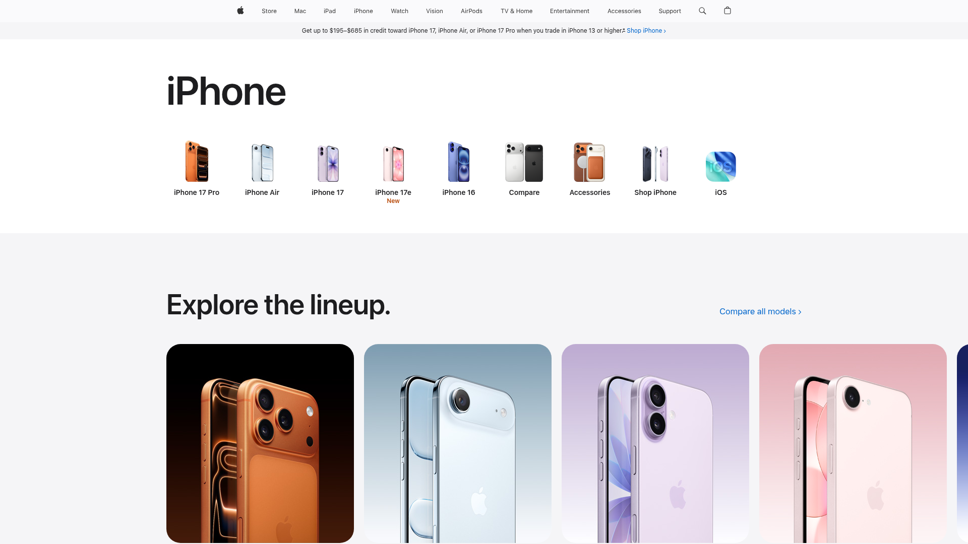
Apple iPhone Product Showcase Landing Page
Minimalist tech storefront featuring a clean icon-based navigation menu, horizontal device lineup cards, and high-quality hero imagery for hardware product marketing.

Context Gallery High-End Furniture Landing Page
A minimal editorial layout featuring a multi-column product carousel, designer biographies with image-text pairings, and a magazine-style content grid for curated design stories.

Glein Minimalistic Bento Grid eCommerce
A clean, modular layout using a bento-style responsive grid of text teasers and large-scale product imagery for lookbooks and collection browsing.

Stojo Collapsible E-commerce Storefront
A Shopify layout featuring a prominent discount modal, mosaic grid hero sections, and clean product cards with integrated color swatches and quick-buy functionality.
