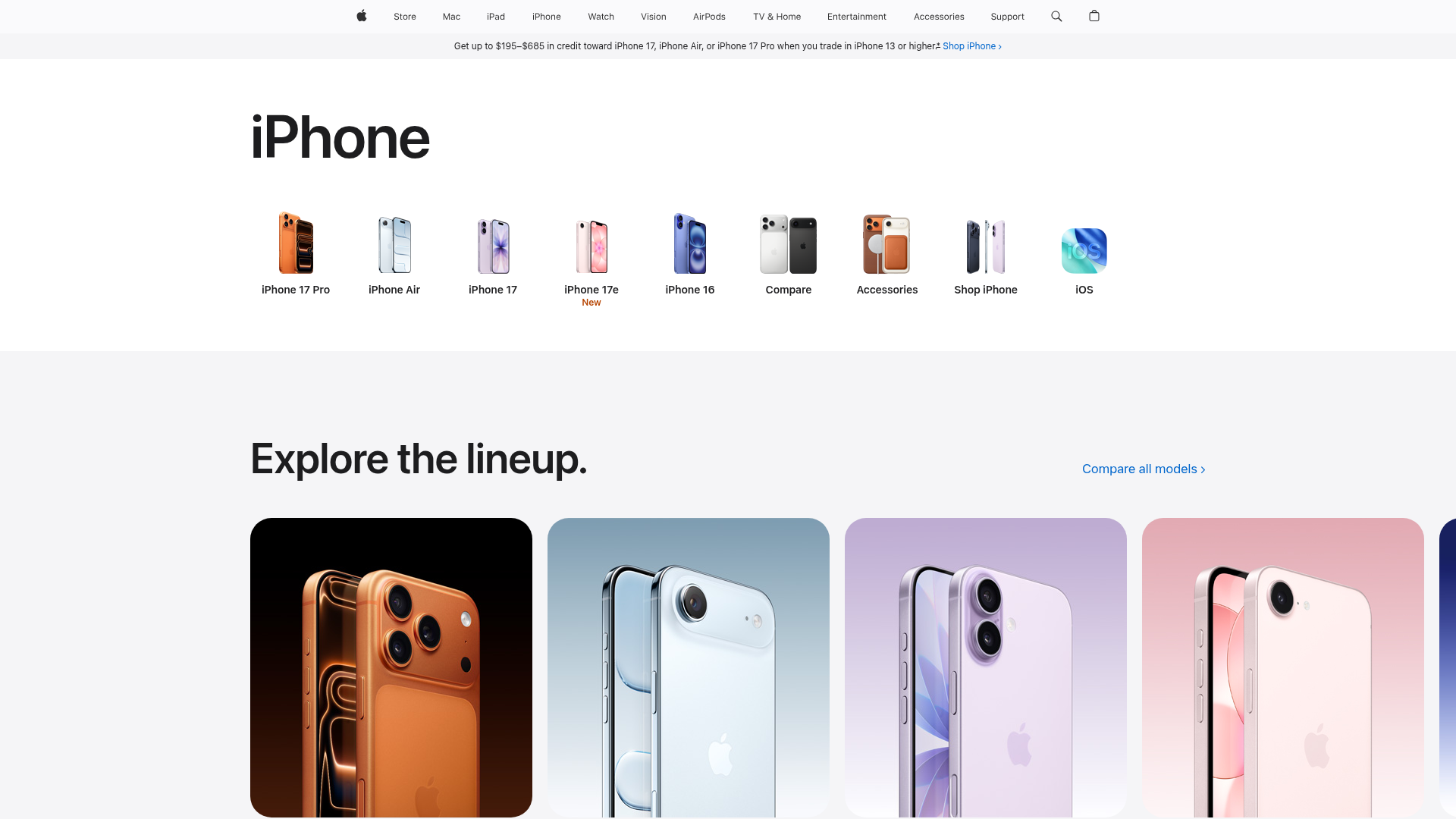
Apple iPhone Product Showcase Landing Page
Minimalist tech storefront featuring a clean icon-based navigation menu, horizontal device lineup cards, and high-quality hero imagery for hardware product marketing.
Overview
This landing page is a masterclass in minimalist product marketing, utilizing high-contrast whitespace and high-fidelity product photography to drive focus toward hardware. It serves as a strong clone reference for developers looking to build a premium e-commerce storefront that prioritizes visual storytelling and effortless navigation through a specialized product lineup.
Design System
- Color Palette & Visual Hierarchy: The design uses a monochromatic foundation of pure white (#FFFFFF) and deep black (#000000) text to ensure readability and high contrast. Visual hierarchy is established through extreme scale—large headers for section titles and immersive, color-coordinated product cards that provide the primary visual interest.
- Typography System: The layout relies on a clean, sans-serif typeface (likely SF Pro). It uses a distinct scale: massive headings (e.g., "iPhone") for primary identity, large titles for section entry points ("Explore the lineup."), and small, center-aligned labels for icon-based navigation.
- Page Structure & Section Flow: The page follows a logical top-down funnel: global utilities (nav and promo bar), an iconic sub-navigation menu for quick selection, a large identity header, and finally a horizontal gallery of product feature cards.
- Reusable Components: Key components to clone include the Iconic Sub-nav (a horizontal list of small images with labels), the Horizontal Card Grid (rounded large-format cards with integrated product imagery), and the persistent Global Navigation Bar at the top.
- Interaction & Motion Patterns: While static in the screenshot, the UI implies a "carousel" or horizontal scroll behavior for the 'Explore the lineup' section. Blue text links with trailing carets (e.g., "Compare all models >") indicate interactive entry points for deeper exploration.
- Responsive Behavior: The layout uses a fluid container system. The icon navigation is designed to overflow horizontally on smaller viewports, a standard mobile pattern for product categories.
Use Cases
- Who should clone this pattern: Hardware startups, consumer electronics brands, and luxury lifestyle retailers who want to elevate their brand perception through a "minimalist premium" aesthetic.
- What products can remix it effectively: It is highly effective for product families with several variations (e.g., different specs or colors) where a side-by-side comparison or tiered exploration is necessary.
- Practical remix directions: Developers can swap the monochromatic theme for a brand-specific accent color, adapt the icon sub-navigation to display software features instead of hardware, or reuse the horizontal card layout as a masonry-style blog feed.
- Suggested clone scope: For a quick win, clone the Iconic Sub-nav section and the Horizontal Product Cards. For a complete brand overhaul, clone the full-page structure to maintain the sophisticated balance of massive whitespace and tight typography.
Related Inspirations

Isla Beauty Skincare E-commerce Store
A clean Shopify-based storefront featuring a split-hero landing page, a step-by-step product system carousel, and a split-screen testimonial section with localized product image sidebars.
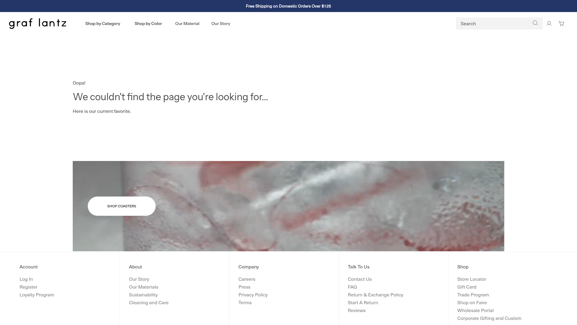
Graf Lantz Minimalist E-commerce 404
A clean Shopify-based error page featuring a full-width video hero with a CTA button, a detailed multi-column footer, and a sophisticated slide-out cart drawer.
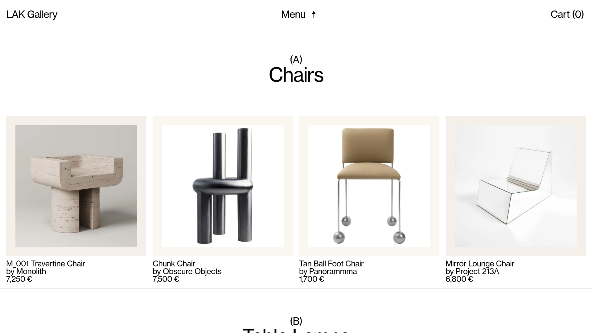
LAK Gallery Minimalist E-commerce Showcase
A clean collectible design shop featuring an alphabetical grid layout, category-driven horizontal scrolls, and high-contrast typography for luxury product catalogs.

Context Gallery High-End Furniture Landing Page
A minimal editorial layout featuring a multi-column product carousel, designer biographies with image-text pairings, and a magazine-style content grid for curated design stories.

Glein Minimalistic Bento Grid eCommerce
A clean, modular layout using a bento-style responsive grid of text teasers and large-scale product imagery for lookbooks and collection browsing.

Stojo Collapsible E-commerce Storefront
A Shopify layout featuring a prominent discount modal, mosaic grid hero sections, and clean product cards with integrated color swatches and quick-buy functionality.
