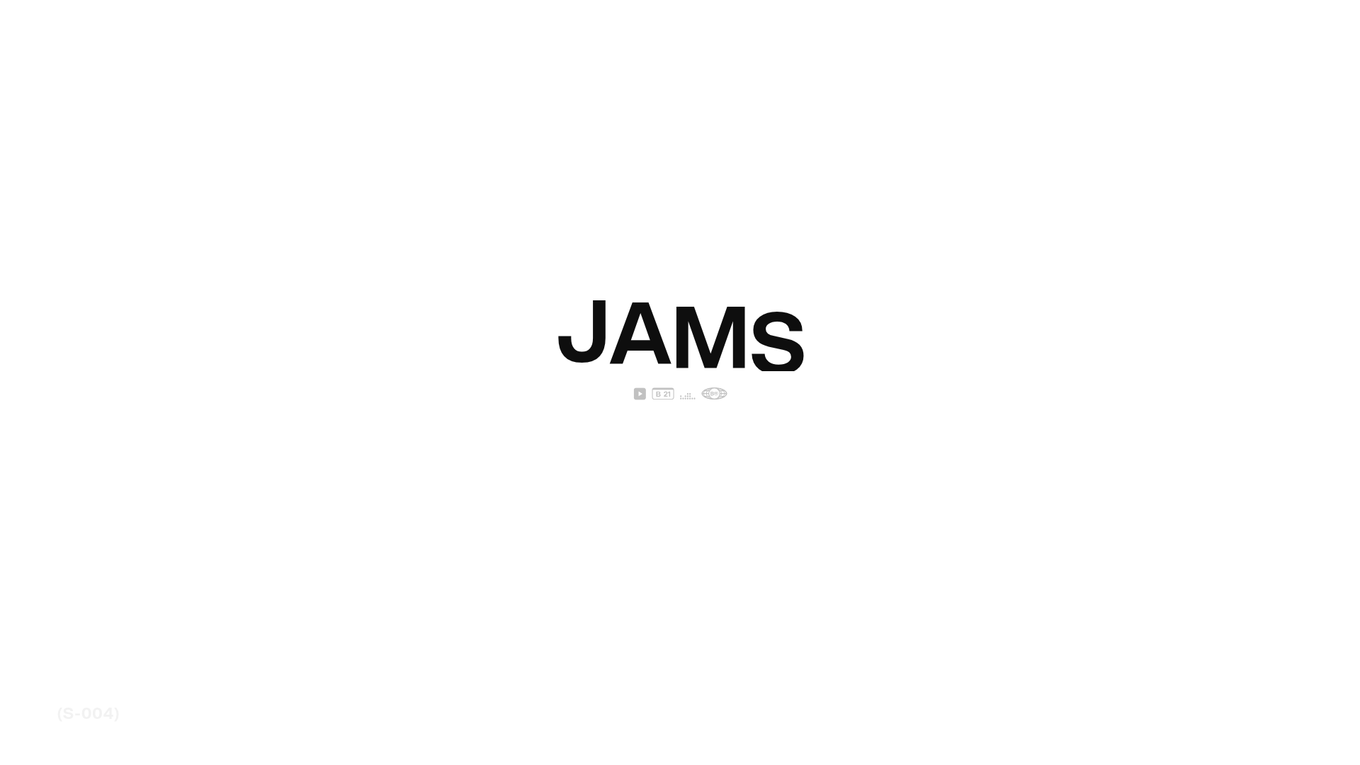
JAMS Agency Landing Page Hero
A minimalist, high-contrast hero section featuring bold typography and clean iconographic navigation over a white canvas.
Overview
This minimalist hero section for the JAMS site showcases a high-impact, typographic-first design approach. It serves as an excellent clone reference for developers looking to master extreme white space, precise font scaling, and ultra-clean navigation patterns for creative agency or portfolio site headers.
Design System
- Color Palette and Visual Hierarchy: The design utilizes a strict monochrome (high-contrast black and white) palette. The visual hierarchy is centralized, using the massive black wordmark as the primary anchor against a sterile white background.
- Typography System: The layout relies on a bold, sans-serif typeface (Inter). The primary headline "JAMS" uses a massive font scale with tight kerning for a monumental feel, while the navigational elements below use much smaller, functional scale points.
- Page Structure and Section Flow: The structure is vertically stacked and perfectly centered. The large brand name dominates the upper middle, followed immediately by a compact row of utility icons and brand identifiers.
- Reusable Components: The core reusable block is the "icon strip" (the navigation cluster below the text), which combines small graphical symbols (a play icon, a 'B 21' badge, and stylized globes) into a unified, lightweight navigation component.
- Interaction and Motion Patterns: The HTML structure suggests a focus on transition-heavy loading sequences. Any implementation should prioritize smooth entries for the bold text to emphasize the sophisticated minimalism.
- Implementation Clues: The reference code indicate a standard semantic container model, likely using CSS Flexbox or Grid to achieve the absolute centering of the header block within the viewport.
Use Cases
- Who should clone this: Creative agencies, freelance graphic designers, and minimalist fashion brands seeking a "less is more" aesthetic.
- Effective Remixes: This pattern can be effectively remixed for digital portfolio landing pages or high-end product launch teasers where the brand name is the primary selling point.
- Remix Directions: Swap the stark white background for a high-grain texture or subtle video loop, but maintain the central typographic proportions. The icon cluster can be adapted to link to social profiles or case study categories.
- Suggested Clone Scope: This is a perfect candidate for a quick section clone—specifically the centered hero container—rather than a full-page architectural clone.
Related Inspirations

Zeus Jones Agency Landing Page
A minimalist, Gatsby-powered brand agency layout featuring a clean typography focus and a blank canvas aesthetic for high-end portfolio builds.
LoveFrom Minimalist Animated Wordmark Landing
A minimalist landing page featuring a center-aligned animated wordmark, a hidden info panel, and a decorative bear animation overlay.
Crown & Conquer Agency Landing Page
A minimalist landing page featuring elegant script typography, a centered hero tagline, and a clean, whitespace-heavy layout for high-end branding.
Matter of Fact Typography Landing Page
A minimalist landing page featuring a vertical scrolling text marquee animation for dynamic hero typography using GSAP or CSS transitions.
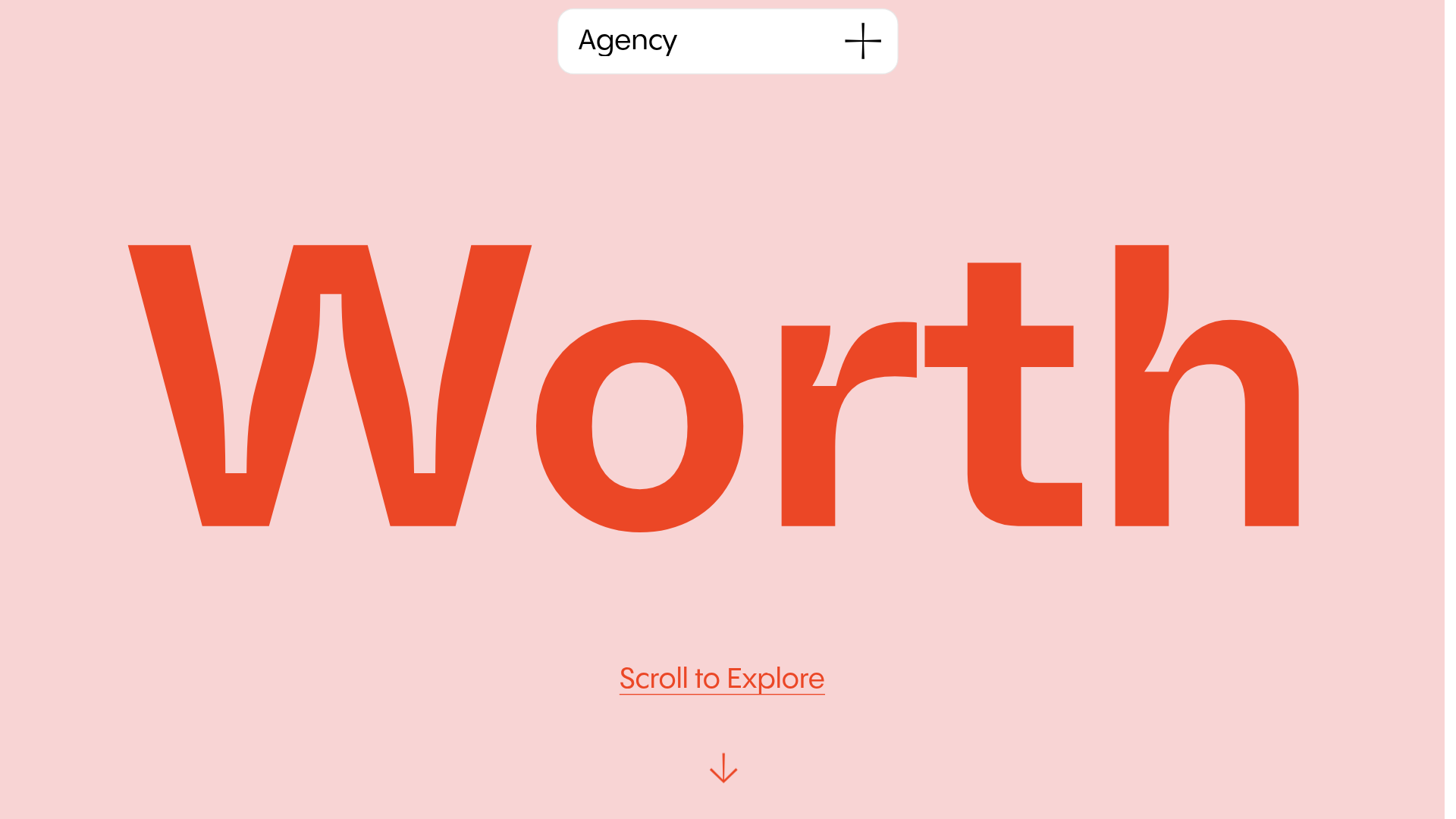
Worth Agency Minimalist Portfolio Landing
A vertical-scroll landing page with large typography, sticky navigation elements, and a clean portfolio grid featuring on-hover image animations and smooth scroll transitions.

Christopher Doyle Agency Portfolio Layout
A minimalist, typography-led portfolio featuring a wide-margin grid system, smooth fade-in animations, and simple image-focused project cards.
