LiteSpeed Web Server Directory Index
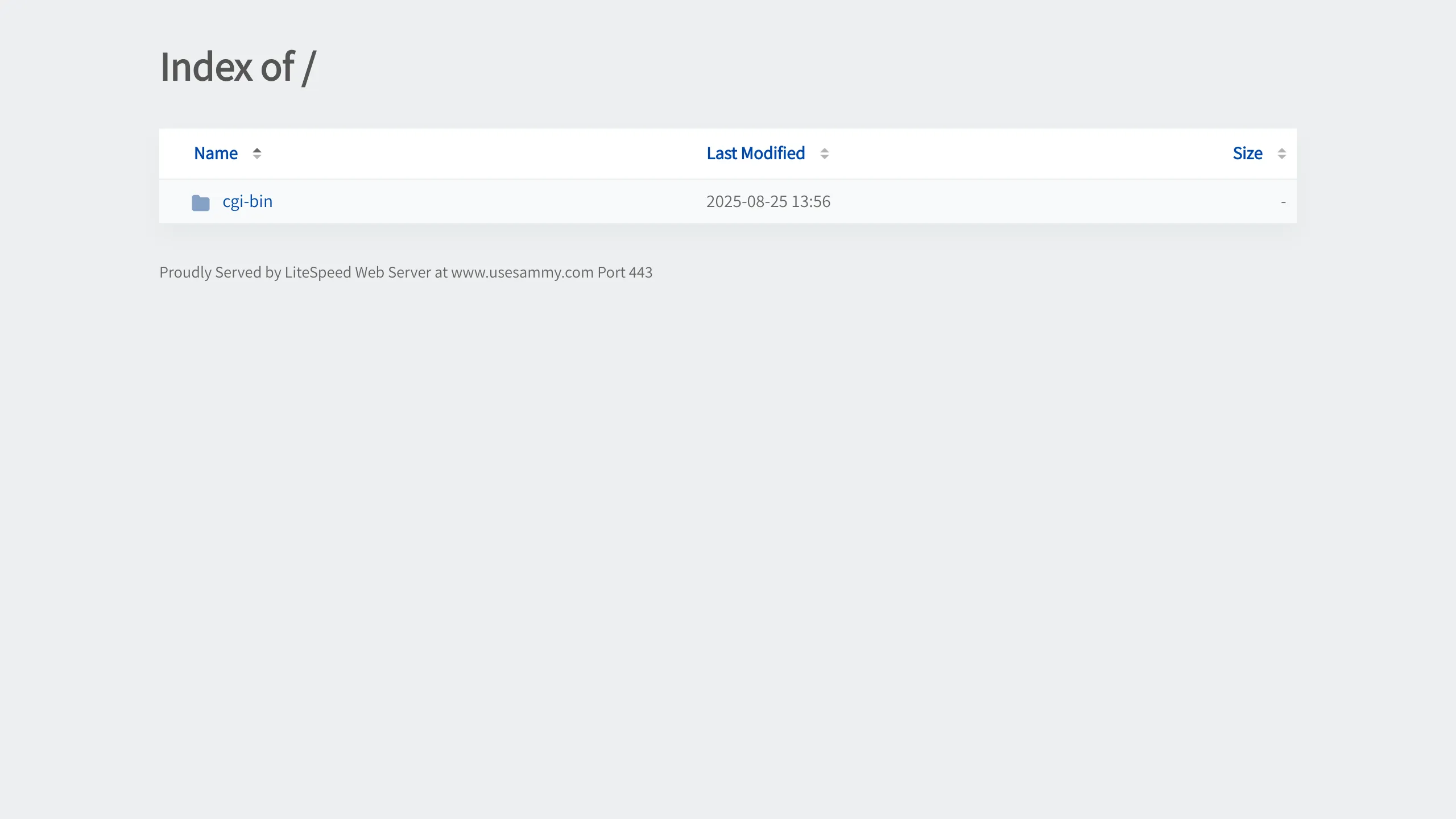
Minimalist table-based directory listing layout featuring sortable headers for Name, Last Modified, and Size on a plain gray background.
Overview
This site is a functional directory index page served by a LiteSpeed Web Server, providing a clean, table-based interface for file browsing. It is an excellent reference for builders looking to clone a low-friction, utility-first data grid that prioritizes information density and readability over decorative elements.
Design System
- Color Palette & Visual Hierarchy: The design uses a minimalist, grayscale palette with a light gray background (#f8f9fa equivalent) and a white container for the table. Visibility is driven by high-contrast primary text (dark gray/black) and blue hyperlinks to signal interactivity.
- Typography: Features a clean, sans-serif typeface. The hierarchy is simple: a bold
<h1>header for context ("Index of /"), followed by specialized table headers in a smaller weight, and standard body text for file metadata. - Page Structure: The layout follows a linear vertical flow: title header at the top, followed by a centered/boxed data table, and a small
<address>footer at the bottom containing server metadata. - Reusable Components: The core reusable component is the sortable data table (
#table-list). It features dedicated columns for Name, Last Modified, and Size, complete with SVG icons (like thefolder-fill.svg) to visually categorize rows. - Interactivity: The table columns are interactive, containing anchor tags designed for sorting. Hover states on row links indicate navigate-ability, and the HTML suggests
data-sortattributes are used for client-side or server-side reordering logic. - Responsive Behavior: The layout is inherently fluid due to its table-based structure, allowing it to adapt to container widths, though it maintains a wide, readable margin on desktop views.
Use Cases
- Who should clone this pattern: Developers building file managers, administrative dashboards, or internal documentation mirrors where utility and speed are paramount.
- Effective Remixes: This pattern can be effectively remixed into a "Downloads" portal for software versions, a simple asset management tool for creative teams, or a lightweight logs viewer.
- Practical Remix Directions: To modernize this, builders can swap the plain blue links for brand-specific primary colors, add a search filter input above the table, and replace the basic table container with a soft-shadowed card component.
- Suggested Clone Scope: A quick section clone of the
#table-listcomponent is recommended for those needing a pre-structured data grid without the overhead of a complex UI framework.
Related Inspirations
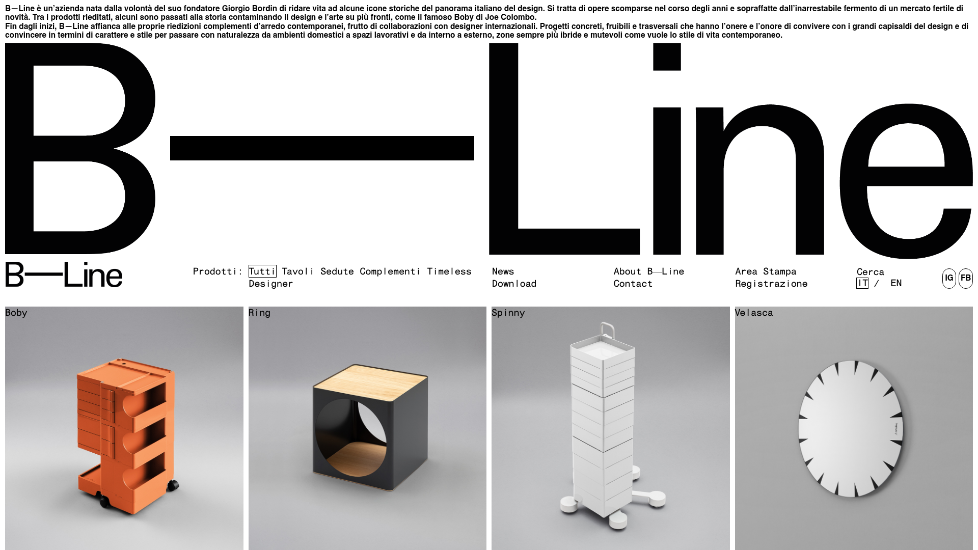
B-Line Minimalist Design Catalog
A high-contrast grid layout featuring an oversized typographic brand header, a text-based navigation menu, and a uniform product gallery using square image tiles.
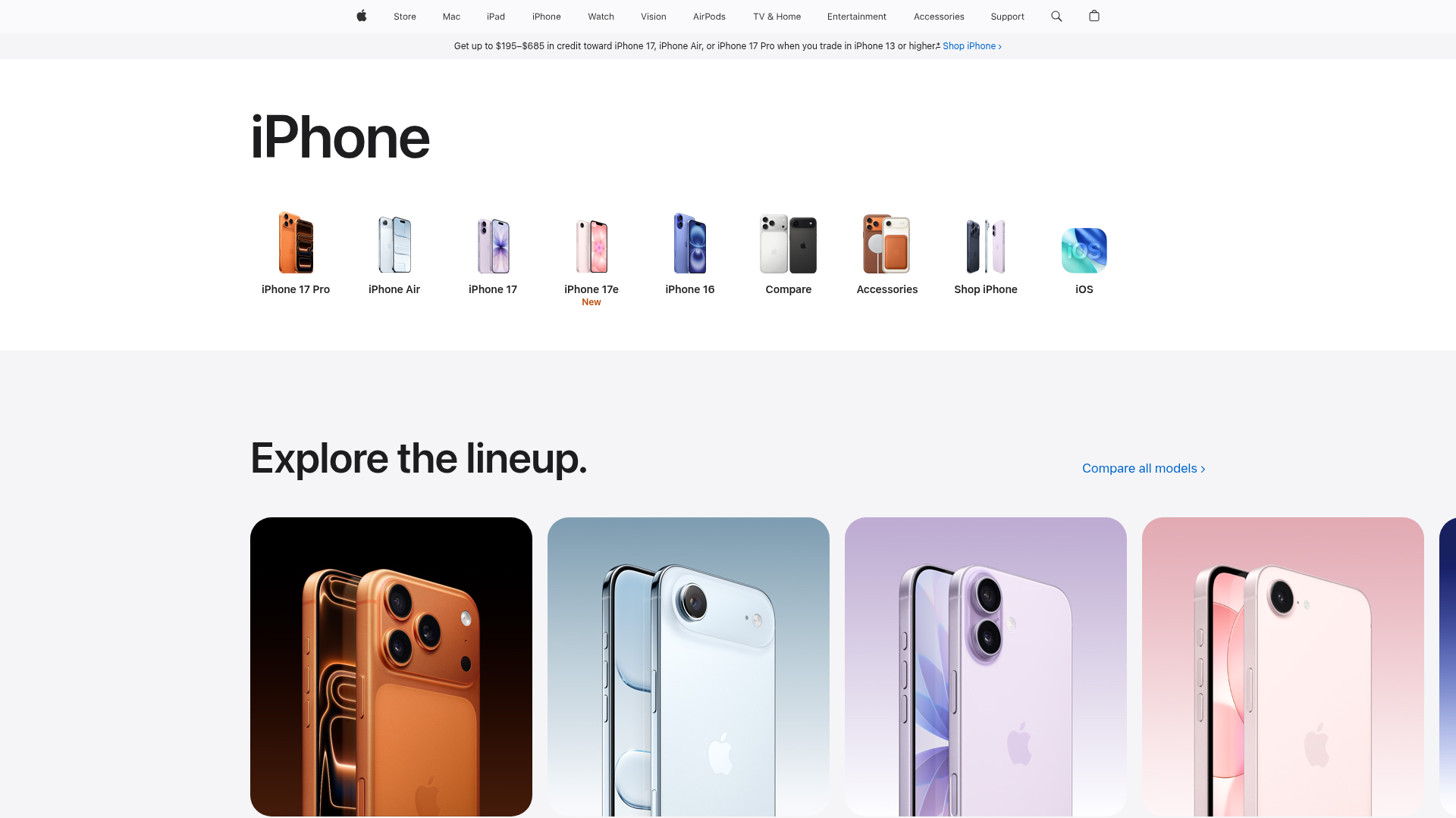
Apple iPhone Product Catalog Page
A high-end e-commerce layout featuring a horizontal icon-based navigation menu and a clean, responsive card grid for showcasing product lineups.

Isla Beauty Skincare E-commerce Store
A clean Shopify-based storefront featuring a split-hero landing page, a step-by-step product system carousel, and a split-screen testimonial section with localized product image sidebars.
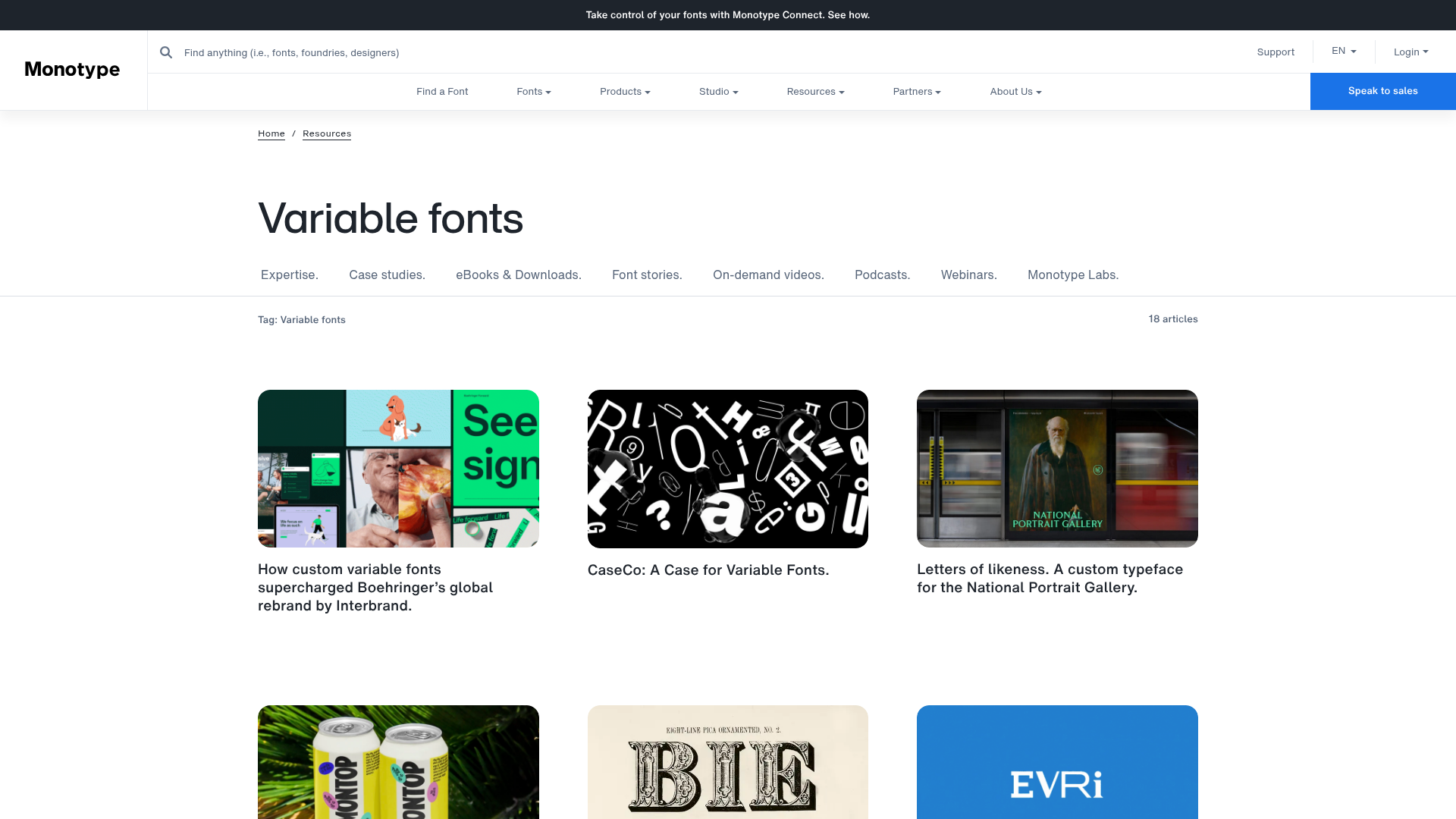
Monotype Variable Fonts Resource Gallery
A clean masonry grid layout featuring content cards with hover-state overlays, category filtering, and responsive image scaling for a media-rich resource center.
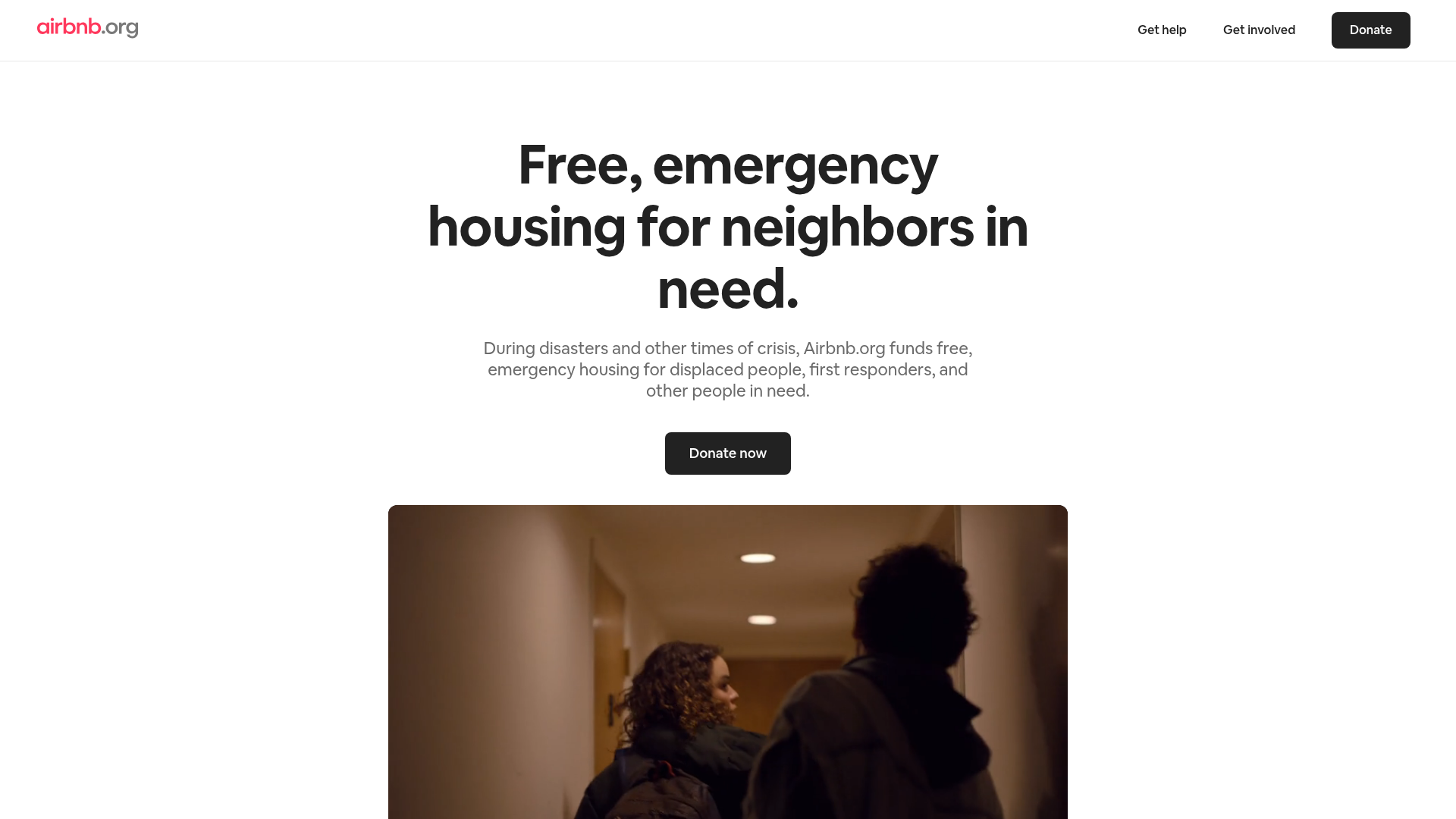
Airbnb.org Relief Housing Landing Page
A clean nonprofit landing page featuring a minimalist logo header, high-contrast CTA buttons, centered typography hero section, and an embedded video container.
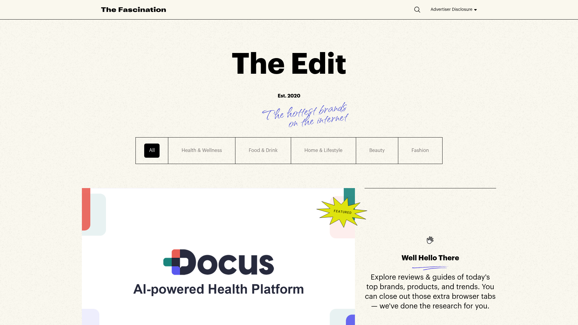
The Fascination Editorial Product Hub
A refined content marketplace layout featuring a minimalist bento-style grid, custom category filters, and modern hovering card interactions for brand reviews.
