Carrot Sustainability Dashboard Landing Page
A minimalist SaaS layout featuring an animated typography hero, clean card-based feature grids, vertical split-screen marketing sections, and a structured testimonial component.
Overview
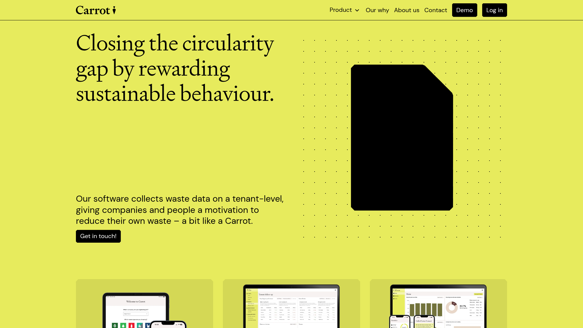
Carrot is a sustainability SaaS landing page that utilizes a high-contrast, minimalist design to communicate data-driven environmental solutions. It is an excellent clone reference for its sophisticated use of typography, asymmetrical grid layouts, and a "flat" modern aesthetic that prioritizes readability and brand identity.
Design System
- Color Palette & Visual Hierarchy: The site uses a bold "acid green" primary background color paired with high-contrast black (
#000000) for text and UI elements. Hierarchy is established through size rather than color variability, utilizing thick horizontal rules (<hr>) to clearly demarcate sections. - Typography: The system features a distinct high-contrast serif for large headings (
Heading.xl) to provide a premium, editorial feel, while sans-serif fonts are used for functional interface elements and body text. Words in the hero section are wrapped in spans for individual entrance animations. - Page Structure: The flow begins with a typography-heavy hero, followed by a three-column feature card grid. Below this, vertical split-screen marketing sections use a 50/50 balance between imagery and benefit-driven copy, concluding with a specialized testimonial block and a logo marquee for social proof.
- Reusable Components:
- Iconic Buttons: High-radius (pill-shaped) black buttons with white text.
- Feature Cards: Clean white cards with inset imagery and bordered containers.
- Comparison Block: A data-driven testimonial component showcasing "Before" and "After" metrics with color-coded status indicators.
- Progressive CTA: A bottom-weighted call-to-action utilizing animated typography to re-engage users.
- Motion Patterns: The HTML reveals word-level span triggers (
data-ui="word"), suggesting scroll-synced entrance animations or sequential fade-ins. Hover states on buttons and cards are subtle, maintaining the static-yet-premium aesthetic. - Implementation Clues: Built using
Next.jsandReact, withSanity CMSfor content management. It uses a CSS-in-JS utility system (indicated bycss-prefixed classes) and a robustdata-uiattribute naming convention for consistent component styling across the site.
Use Cases
- Who should clone this: SaaS startups in the ESG, GreenTech, or data analytics space looking for a design that feels editorial and professional rather than "generic tech."
- Remix Directions: Swap the aggressive acid green for a more neutral tone (like off-white or deep navy) to adapt the layout for fintech or legal tech. The "Before/After" metric block is highly versatile and can be repurposed for any performance-based tool.
- Suggested Scope: Start by cloning the Hero and the Split-Screen marketing sections. These provide the strongest visual impact and establish a unique layout rhythm that can be scaled into a full-page site or used as a standalone product landing page.
Related Inspirations
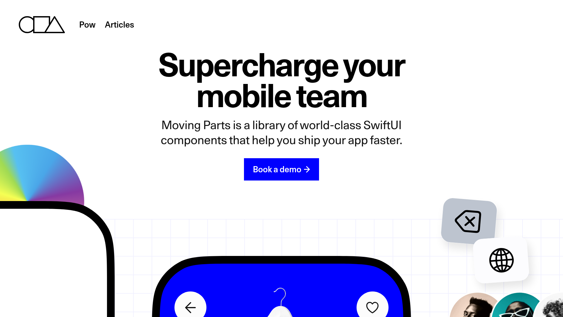
Moving Parts SwiftUI Component Library
A high-performance landing page featuring a interactive code comparison toggle, animated mobile UI previews, and a clean minimalist aesthetic for developer tools.
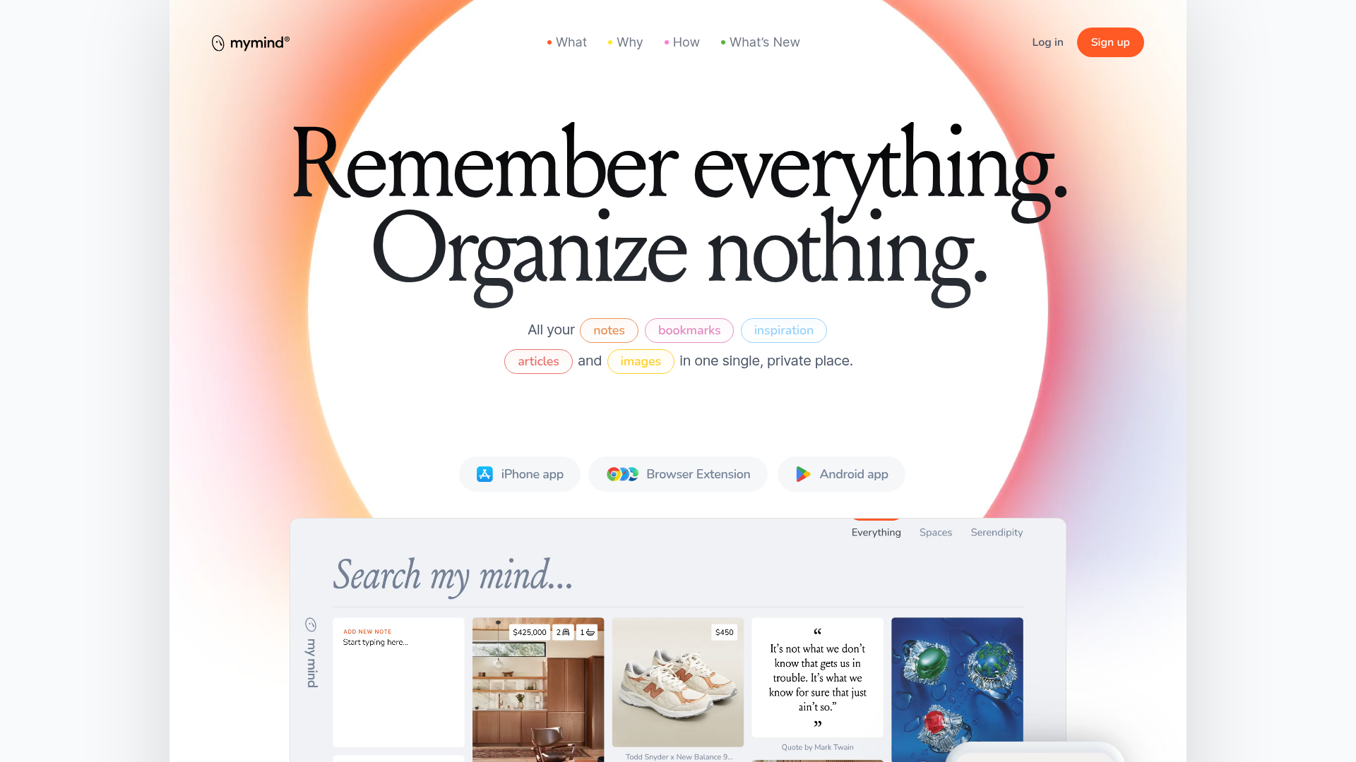
Mymind AI Tool Landing Page
A minimalist SaaS landing page featuring a soft-gradient hero section, custom pill-shaped text badges, and a dynamic bento-style search result preview grid.
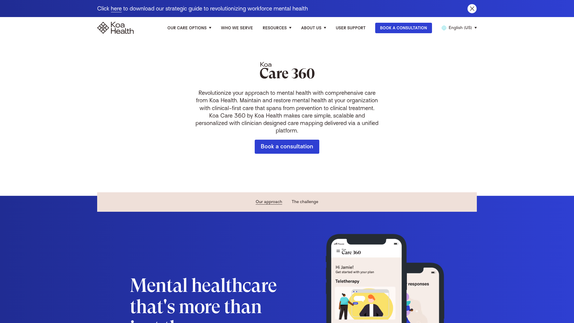
Koa Health Mental Care Landing Page
A clean healthcare landing page featuring a centered hero section, scroll-based fade-in animations, overlapping mobile mockups, and a multi-column feature grid with accent borders.
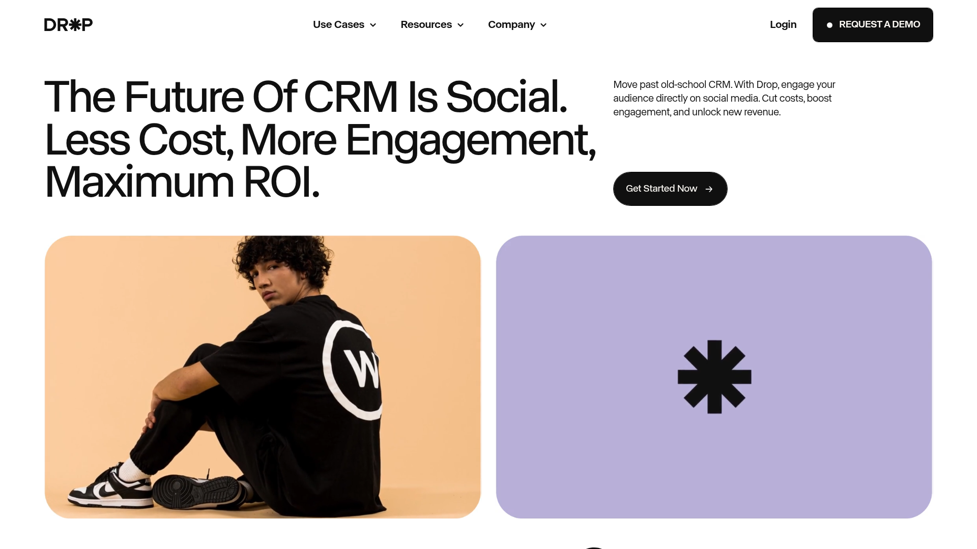
Drop Social CRM Landing Page
A modern SaaS landing page featuring a minimalist large-typography hero section, rounded bento-style image containers, and a clean navigation bar with a CTA.
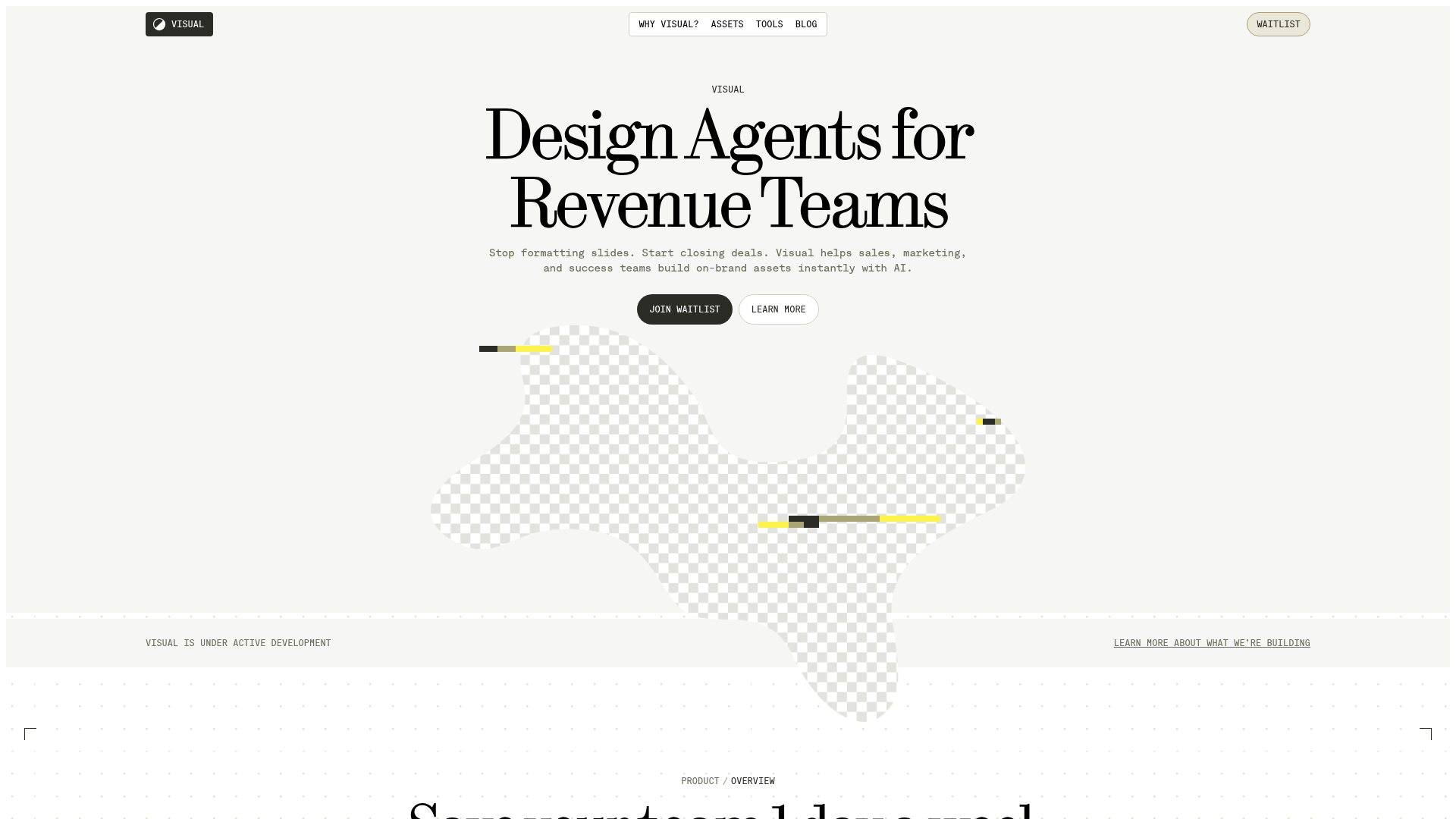
Visual AI Landing Page Templates
A high-end SaaS layout featuring a serif-heavy typography system, bento-style product showcase grids, accordion-style feature blocks, and minimalist wireframe UI components.
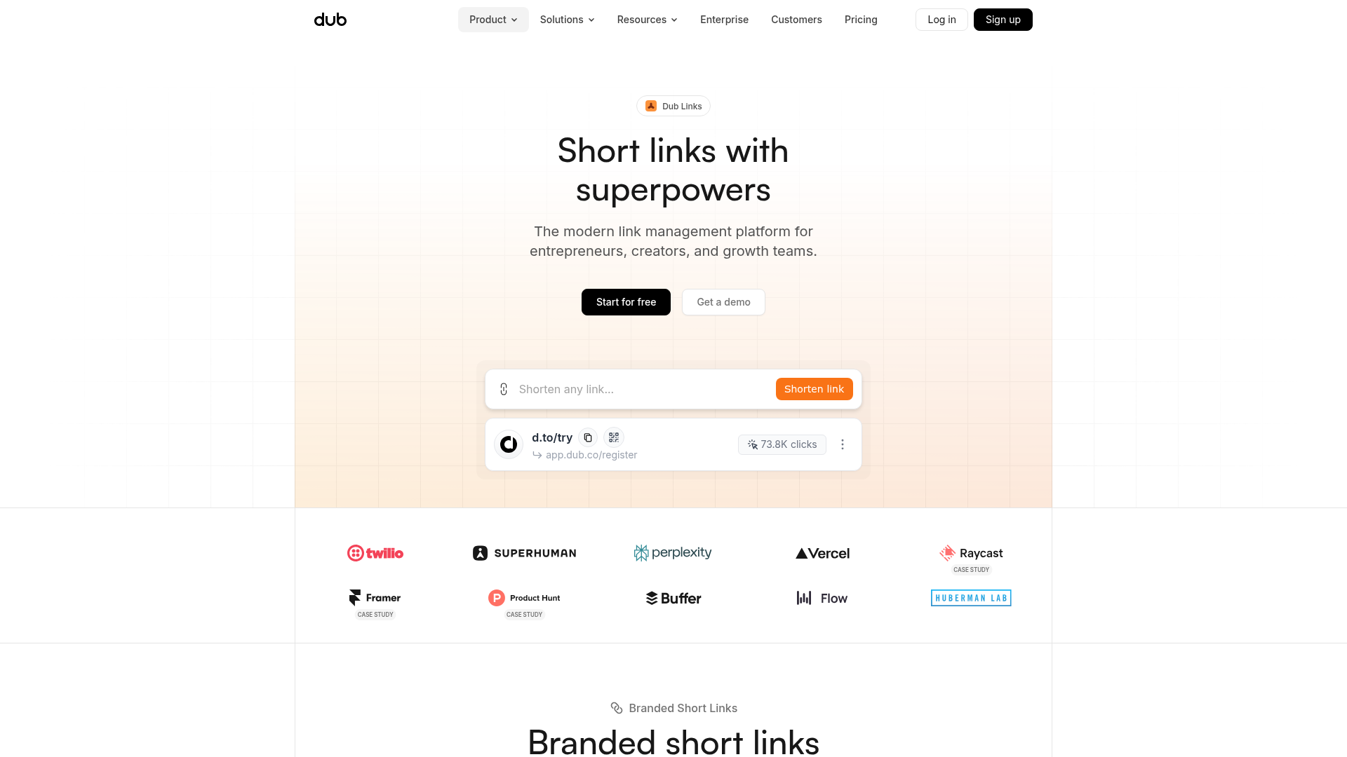
Dub.sh Link Management Landing Page
A clean SaaS landing page featuring a centralized link shortener input, bento-style product features, and a logo marquee for high-profile integrations.
