Studio Emmerer Architectural Portfolio Landing
Minimalist grid-based portfolio featuring a clean typography-heavy introduction and a structured project documentation table with searchable data columns.
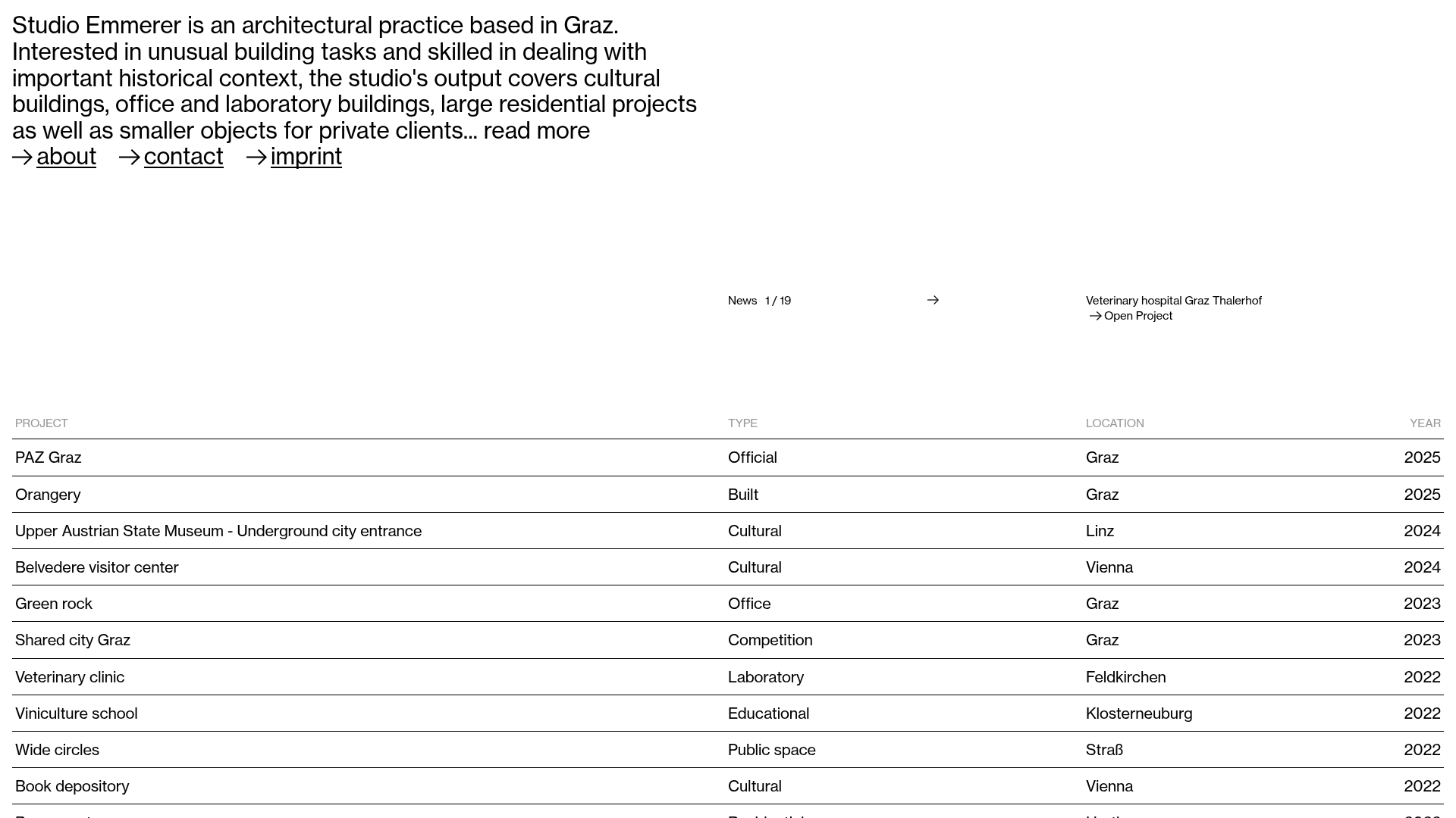
Overview
Studio Emmerer is a minimalist architectural portfolio that prioritizes typographic clarity and structured data over heavy imagery for its landing page. It serves as an excellent reference for professionals looking to display a deep catalog of work through a clean, information-dense table system rather than a traditional grid of images.
Design System
- Color Palette & Visual Hierarchy: The site uses a high-contrast binary palette of pure black text on a white background. Hierarchy is established through font weight and line spacing, with a clear horizontal division using thin rules (0.5px - 1px) to separate project entries.
- Typography System: The system relies on a clean, modern sans-serif (resembling Helvetica or Inter). The introduction uses a large display size with tight line height for impact, while the project table uses a smaller, monospaced-adjacent functional size for readability. Links are distinguished by a preceding arrow (
→) and underlines on hover. - Page Structure & Section Flow: The flow starts with an impactful multi-line studio description and navigation links. A secondary "News" ticker provides a sense of current activity, followed by a primary project index table featuring columns for Project Name, Type, Location, and Year.
- Reusable Components:
- Typography Hero: A flexible block for introductory text with integrated call-to-action links.
- The Data Table: A highly structured project list component that is easy to map to a CMS or JSON array.
- Arrow-indicated Links: A consistent UI pattern for internal navigation and external project links.
- Interaction Patterns: The design uses simple hover states on table rows (often involving subtle background shifts or underlines) to indicate interactivity. A distinctive "Open Project" flyout or arrow appear to guide the user to detailed subpages.
- Implementation Clues: Based on the HTML structure, the site uses semantic list elements (
<ul>,<li>) and<a>tags for navigation, suggesting a focus on accessibility and basic structural SEO. The layout logic follows a standard flexbox or CSS grid container for the table headers.
Use Cases
- Who should clone this: Architects, photographers, developers, and researchers with large archives of work who want a "data-first" presentation style.
- Effective Remixes: This pattern is perfect for agency "Project Archive" pages, scientific publication repositories, or even a personal resume/CV site.
- Practical Remix Directions: Swap the monochrome palette for a brand-specific primary color; add a "Category" filter or search bar to the project table to manage larger datasets; or integrate a thumbnail preview that appears on hover over a table row.
- Suggested Clone Scope: The project index table is the most valuable component to clone for those needing a functional list view. Minimalists may want to clone the full-page layout to capture the tension between the large intro text and the precise data list below.
Related Inspirations

Baubauwerk Minimal Agency Portfolio Homepage
A clean studio site featuring a centered text hero, scatter-plot filterable project gallery, and full-bleed image sections for case studies.
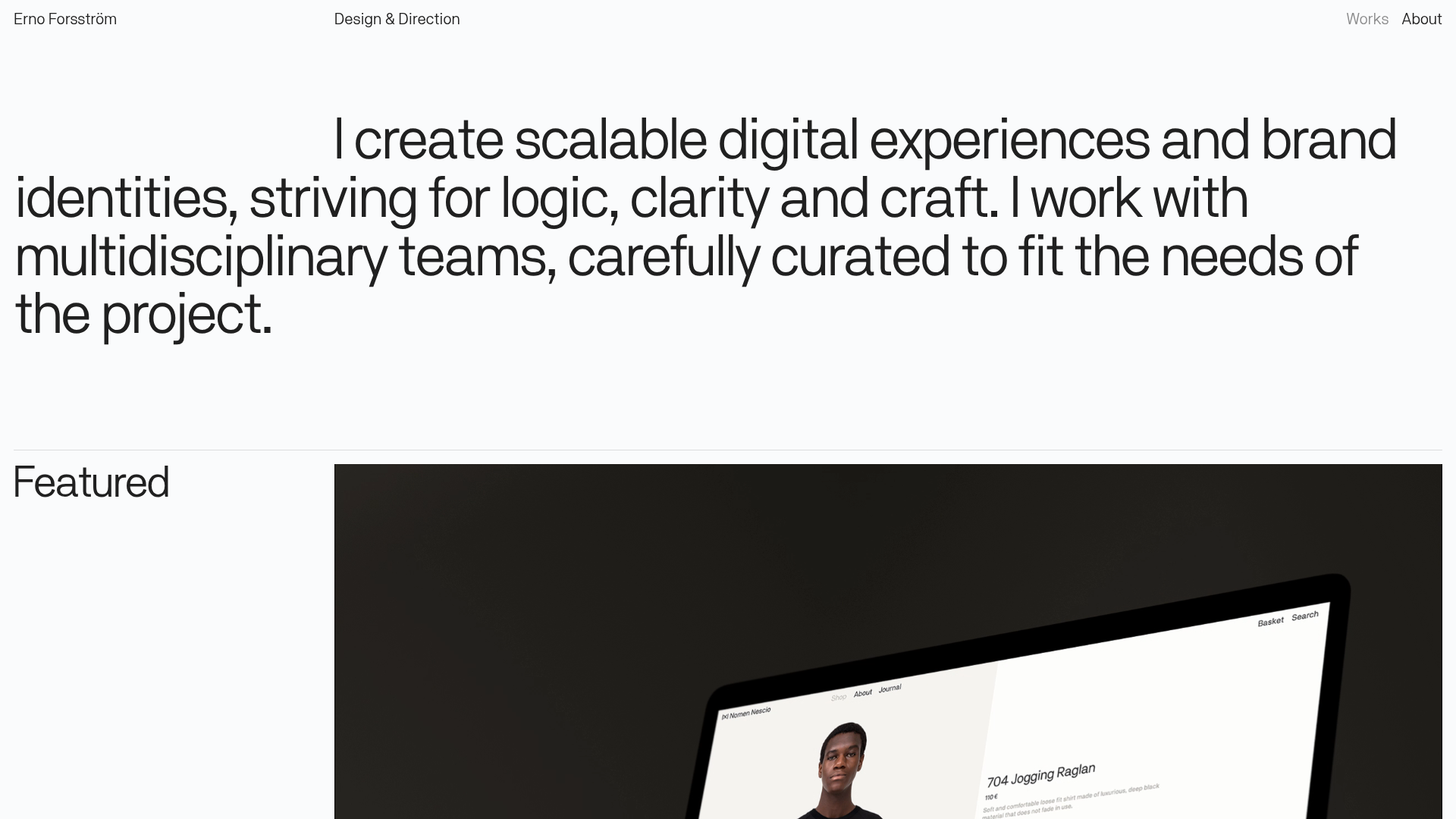
Erno Works Minimalist Design Portfolio
A clean, typography-focused portfolio featuring a sticky grid layout, large editorial headers, and integrated video project thumbnails for dynamic case study previews.
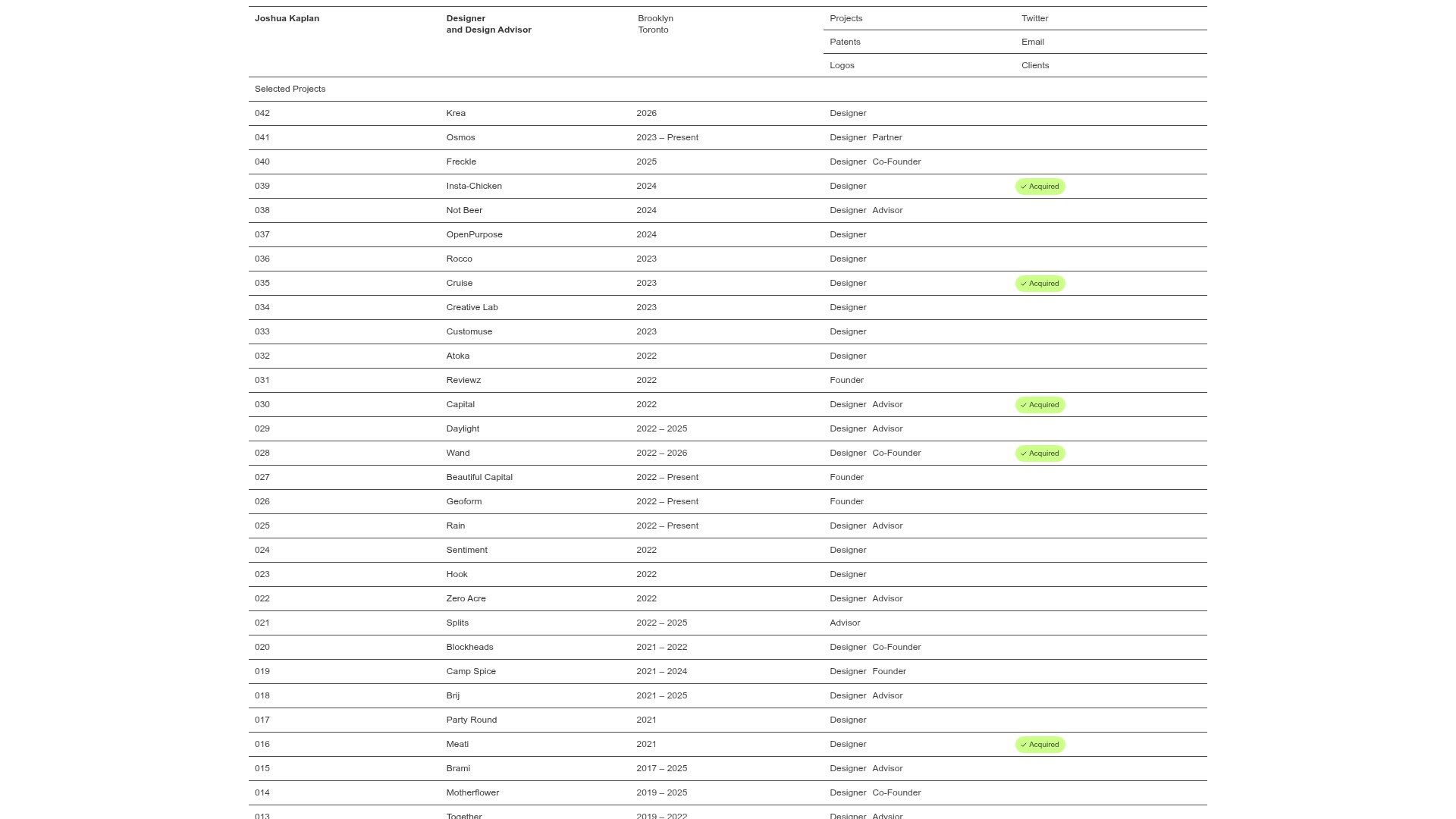
Joshua Kaplan Portfolio Index
A minimalist, text-only portfolio layout featuring an expansive tabular list of projects with horizontal rule separators and clean typography.
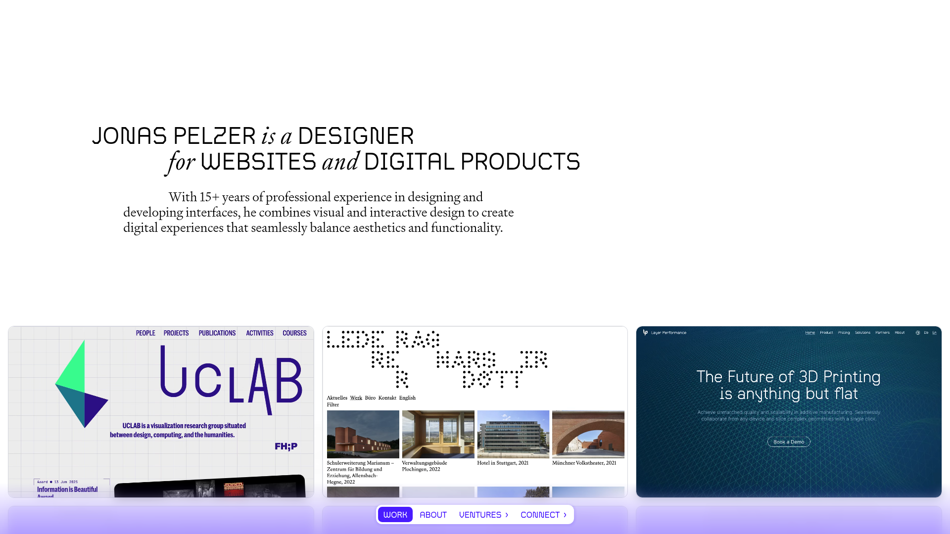
Jonas Pelzer Portfolio Showcase
A minimalist design portfolio featuring a large typography hero, a staggered video project grid, and a sticky tab-based navigation bar for content switching.
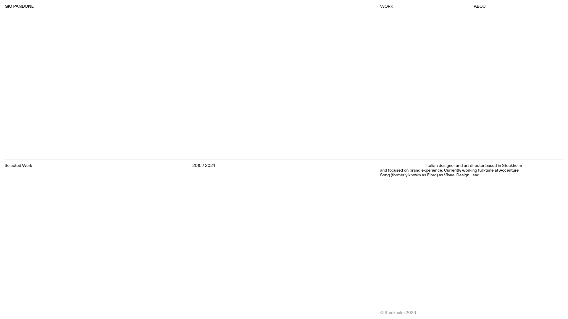
Gio Pandone Minimalist Portfolio Template
A clean, grid-based designer portfolio featuring a sticky minimalist navigation, scroll-triggered entrance animations, and a responsive 12-column work gallery with embedded video previews.
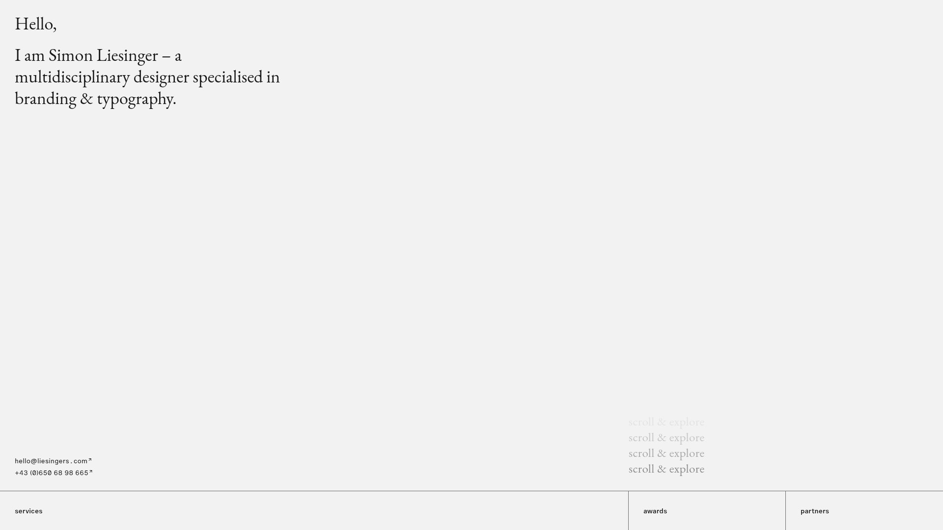
Minimalist Typography Portfolio and Services Grid
A clean, serif-heavy layout featuring an A-Frame 3D hero animation, tiered service lists, and a modular multi-column text structure for design manifestos.
