A-WARE Health Shop Landing Page
An e-commerce layout featuring a high-impact typography hero, a tabbed bento-style product showcase, and a clean accordion-based filtering system for goal-oriented shopping.
Overview
A-WARE is a premium health and nutrition e-commerce landing page that expertly balances high-impact branding with a structured shopping experience. It serves as a strong reference for builders looking to combine lifestyle photography with a goal-oriented product discovery interface, particularly through its heavy use of bento-style grids and accordion-based product filtering.
Design System
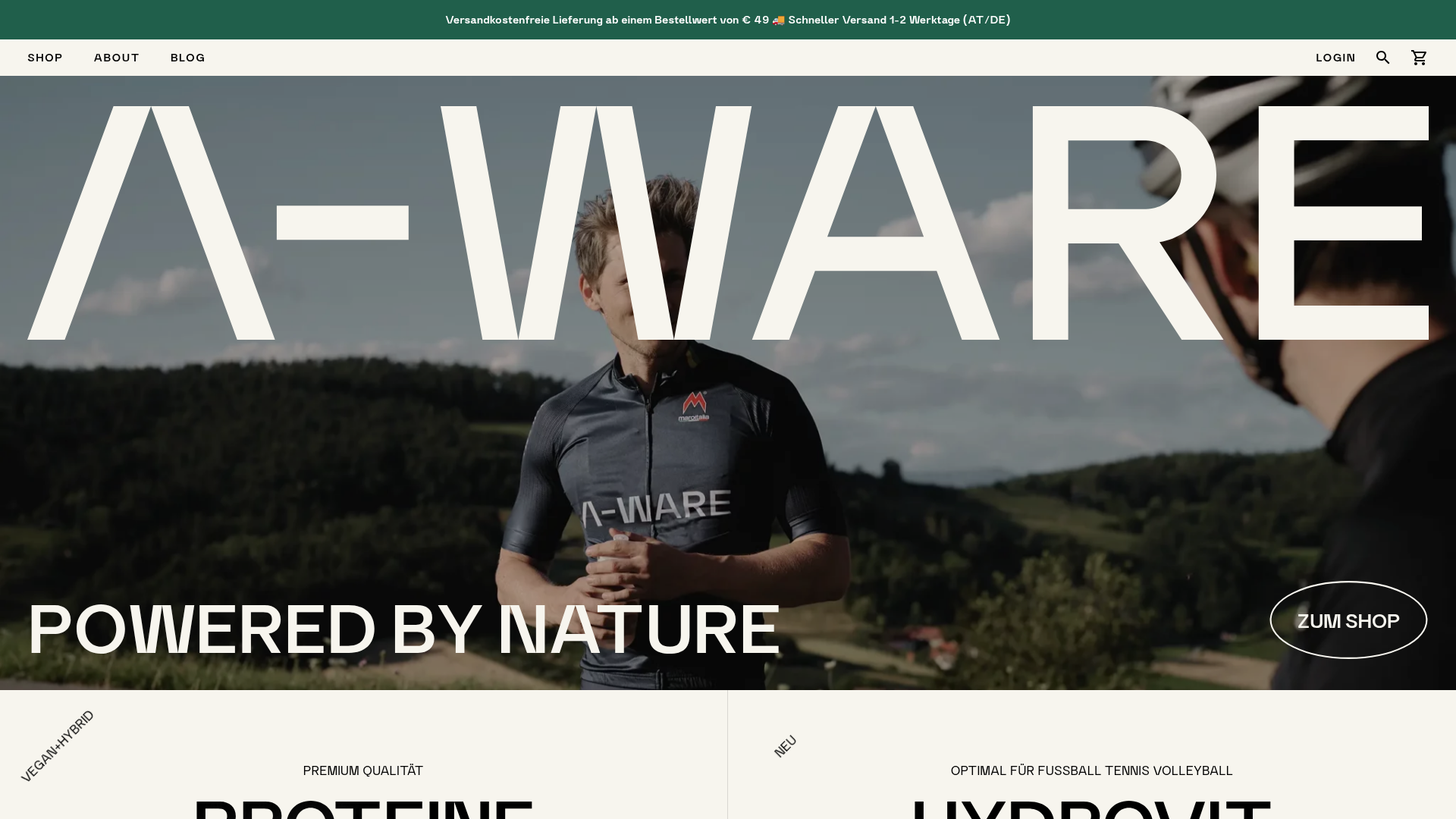
- Color Palette & Visual Hierarchy: The site uses a sophisticated, "nature-forward" palette. A deep forest green (
#1a4731approx.) is used for utility bars, while the main body utilizes off-white and sand-toned backgrounds to provide warmth. High-contrast white typography overlays dark imagery, creating a luxury athletic feel. - Typography: The system relies on a bold, high-contrast sans-serif for headings (e.g., "POWERED BY NATURE"). Massive, oversized lettering serves as a background texture in the hero section. Supporting text uses a clean, accessible sans-serif, often in all-caps for overlines and labels to establish hierarchy.
- Page Structure:
- Announcement Bar: Green bar with shipping info.
- High-Impact Hero: Full-width image with oversized text and a circular outline CTA.
- Tabbed Bento Grid: A
categories-splitsection where users toggle between product categories (VEGAN+HYBRID vs NEU). - Featured Product Sliders: Swiper-based carousels for specific collections (Geschmackspulver).
- Goal-Oriented Accordions: An
aw-dark-surfacesection using large vertical accordions to filter products by benefit (e.g., Muscle Growth, Weight Loss). - Editorial Blog Grid: A masonry-style layout for content.
- Reusable Components:
- Circular Outlined Buttons: Minimalist but high-impact shop buttons.
- Product Teaser Cards: Features a top-aligned thumbnail, bulleted feature list, and a direct 'Add to Cart' button.
- Tabbed Category Switcher: A clean layout for swapping high-level product groups without reloading the page.
- Interactions: Based on the HTML and layout, the site utilizes Swiper.js for product carousels and smooth transition accordions (
transition-duration: 600ms) for internal product exploration. Hover states on cards typically involve subtle image scaling or button color shifts. - Implementation Clues: The HTML reveals a WordPress building block structure (WooCommerce integration), utilizing
swiper-containerfor sliders andm--prefix utility classes for modifiers (e.g.,m--compact,m--active).
Use Cases
- Who should clone this: Developers building high-end supplement brands, organic skincare lines, or boutique fitness equipment stores that need to balance "storytelling" with product density.
- Effective Remixes:
- Luxury Apparel: Swap the supplement jugs for high-resolution fashion photography in the bento grid.
- Service Providers: Adapt the "Goal-Oriented Accordions" to showcase different service tiers (e.g., "Basic Consultation" vs "Premium Strategy").
- Remix Directions: Replace the nature-inspired green/sand palette with a tech-focused dark mode (neon accents) for a SaaS landing page while keeping the large-scale typography hero.
- Clone Scope: The "Goal-Oriented Accordion" section is the most unique pattern and can be cloned independently as a landing page bottom-of-funnel conversion tool. For a full-page clone, the hero + tabbed bento grid provides a complete, modern e-commerce homepage skeleton.
Related Inspirations

Context Gallery High-End Furniture Landing Page
A minimal editorial layout featuring a multi-column product carousel, designer biographies with image-text pairings, and a magazine-style content grid for curated design stories.

Glein Minimalistic Bento Grid eCommerce
A clean, modular layout using a bento-style responsive grid of text teasers and large-scale product imagery for lookbooks and collection browsing.

Isla Beauty Skincare E-commerce Store
A clean Shopify-based storefront featuring a split-hero landing page, a step-by-step product system carousel, and a split-screen testimonial section with localized product image sidebars.

Stojo Collapsible E-commerce Storefront
A Shopify layout featuring a prominent discount modal, mosaic grid hero sections, and clean product cards with integrated color swatches and quick-buy functionality.

Basic.Space E-commerce Gallery Clone
A minimalist product marketplace featuring a clean sticky navigation bar, nested flyout menus, and a horizontally scrollable product carousel with hover-state image switching.

Ashley & Co Lifestyle E-commerce
An elegant Shopify-based storefront featuring a split-screen animated hero, horizontal ticker-tape collection carousel, and dynamic mega-menus with scent-specific color switching and image previews.
