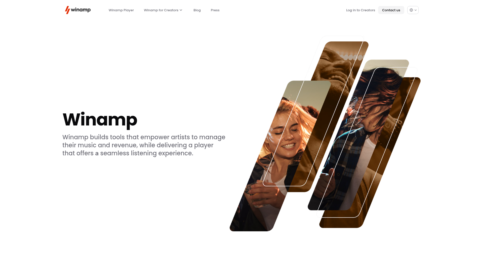
Winamp Modern Media Landing Page
A minimalist hero section featuring a split-screen layout with an offset diagonal image gallery, clean typography, and a sticky navigation menu.
Overview
This landing page is a masterclass in modern minimalist design, featuring a striking hero section that utilizes a distinctive diagonal, pill-shaped image gallery. It serves as a strong clone reference for its effective use of white space, clean typography, and a layout that balances high-impact visuals with concise messaging.
Design System
- Color Palette & Visual Hierarchy: The design employs a high-contrast monochromatic base (pure white background, deep black text) with warm, sepia-toned photography. The hierarchy is clear: a bold H1 title anchored by a medium-weight supporting paragraph and a centered, dynamic image composition that draws the eye diagonally across the screen.
- Typography: The system relies on a clean, geometric sans-serif (Poppins as indicated by the HTML). Headings are heavy and large-scale, while body copy uses a lighter weight with generous line height for maximum readability.
- Page Structure: The layout follows a split-screen logic on desktop. The left side hosts the primary value proposition and call-to-action area, while the right side features an offset grid of four rounded-rectangle (pill) images. The HTML reveals a "Main" container with
scroll-snap-type: y mandatory, suggesting a full-screen vertical scrolling experience. - Reusable Components:
- Sticky Header: A slim, transparent navigation bar with text links and a ghost-style "Contact us" button.
- Diagonal Gallery: A unique grid of transformed image containers with varying vertical offsets.
- App Store Links: Clean, standardized badge components for iOS and Android integration.
- Interaction & Motion: The presence of
will-change: transformandopacitystyles in the HTML suggests subtle fade-ins or translates on scroll. The gallery items appear to be layered, offering an excellent opportunity for parallax effects during remixing. - Implementation Clues: The site is built using Framer (evidenced by
data-framer-hydrateand class names), which implies a highly componentized structure where layout is managed via flexbox and absolute positioning for the overlapping gallery elements.
Use Cases
- Who should clone this: Startups looking for a high-end, "lifestyle" feel, mobile app developers requiring a clean showcase, or creators wanting a sophisticated personal brand site.
- Effective Remixes: This pattern works exceptionally well for software-as-a-service (SaaS) products where product screenshots can be placed inside the pill-shaped frames, or for portfolio sites where the diagonal layout breaks the traditional grid monotony.
- Practical Directions:
- Style Swap: Change the sepia image filters to vibrant gradients or modern flat illustrations to shift from "artistic" to "tech-forward."
- Architecture: Adapt the diagonal section as a mid-page feature block rather than a full hero section.
- Interactive Remix: Add hover states to the pill images that expand them or reveal specific feature text.
- Clone Scope: A quick clone of the hero section alone provides a complete, high-value layout. A full-page clone is ideal for those wanting to maintain the scroll-snapping narrative flow.
Related Inspirations
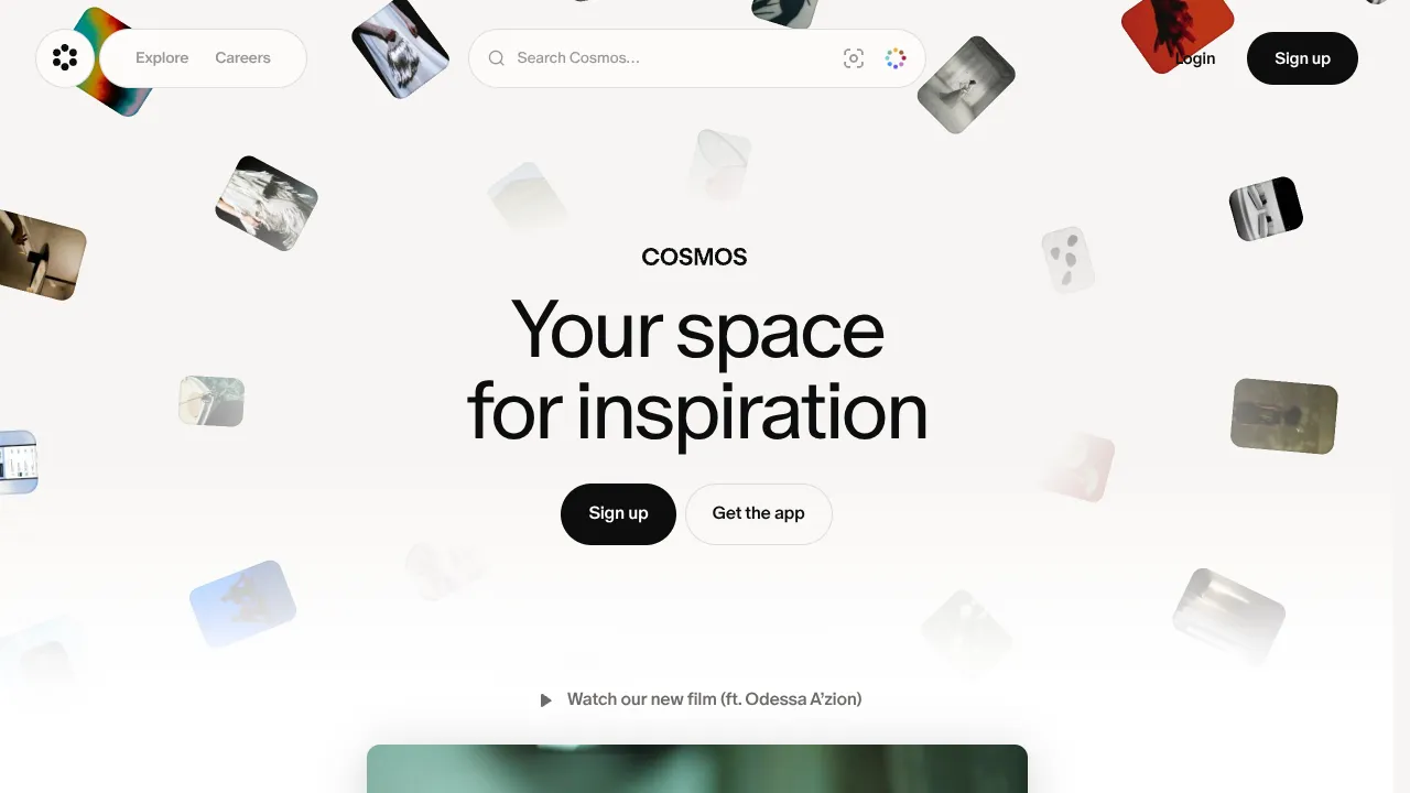
Cosmos Visual Inspiration Landing Page
Features a floating image hero with canvas animations, a centered search bar integration, and multi-column scroll reveals for showcasing visual assets.

Finn Pet Supplements Landing Page
An e-commerce landing page featuring high-contrast typography, a sticky brand logo banner, parallax scroll effects on product headers, and a clean product grid.
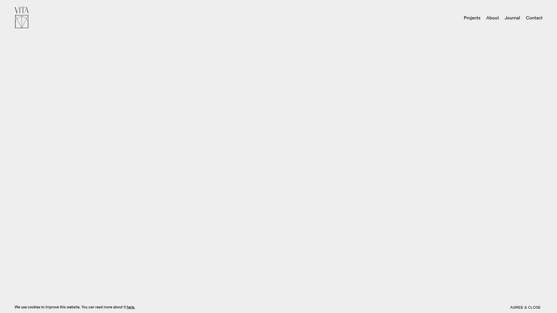
Vita Architecture Portfolio Landing Page
A minimalist, high-end architecture portfolio featuring a custom canvas-based image gallery, split-text animations, and a project slider with dynamic image masks.
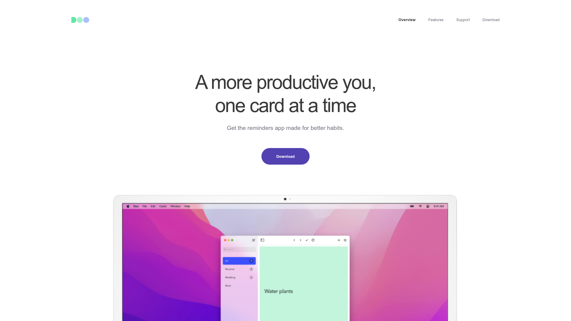
Doo App Minimalist Product Landing Page
A clean, centered product showcase featuring a parallax hero image, icon-based feature checklists, horizontal gesture illustrations, and stacked section layouts with ample whitespace.
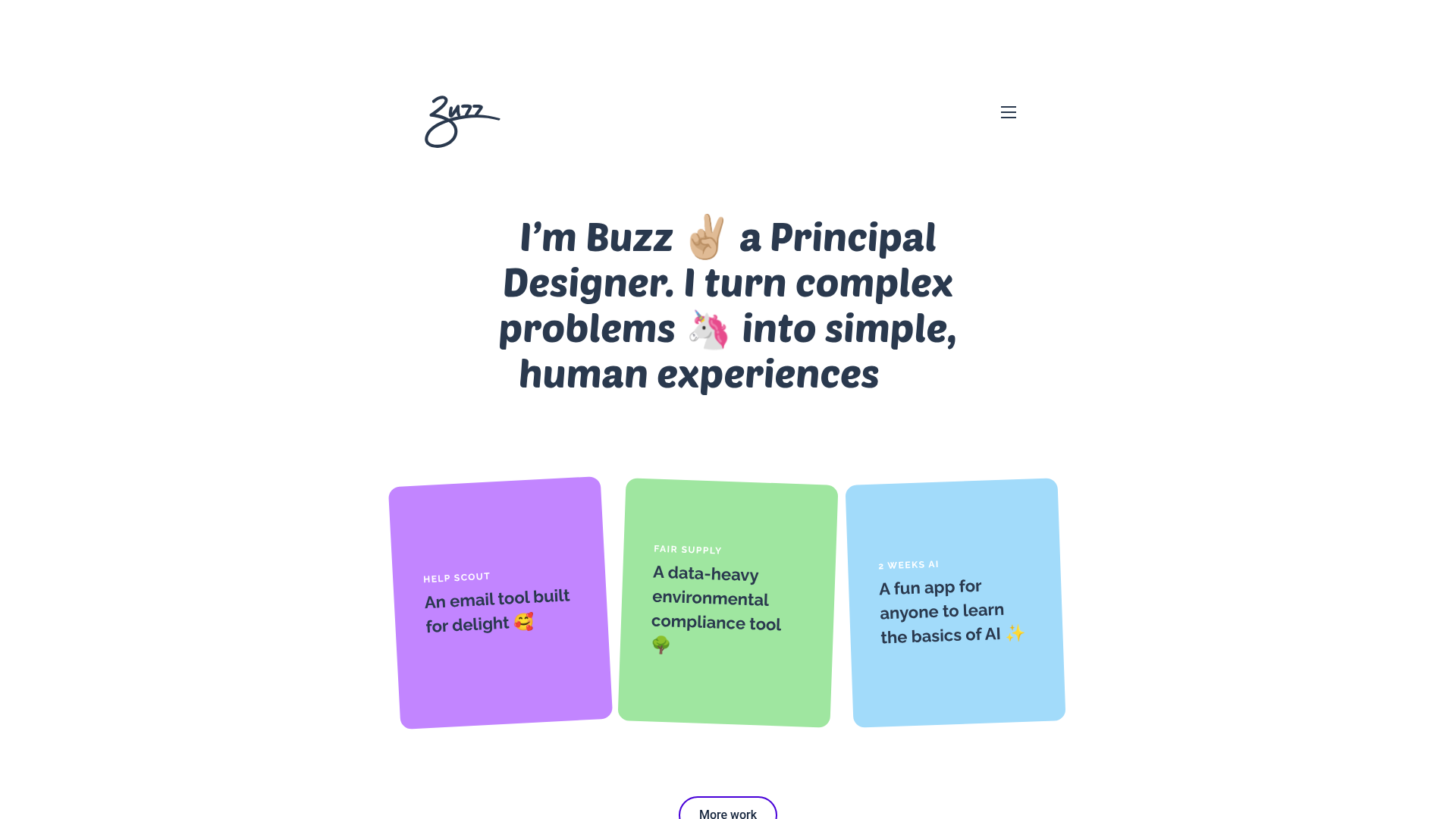
Buzz Usborne Designer Portfolio Landing
A minimalist portfolio layout featuring a large typography-driven hero section with animated emojis and a responsive grid of colorful, card-based project previews.
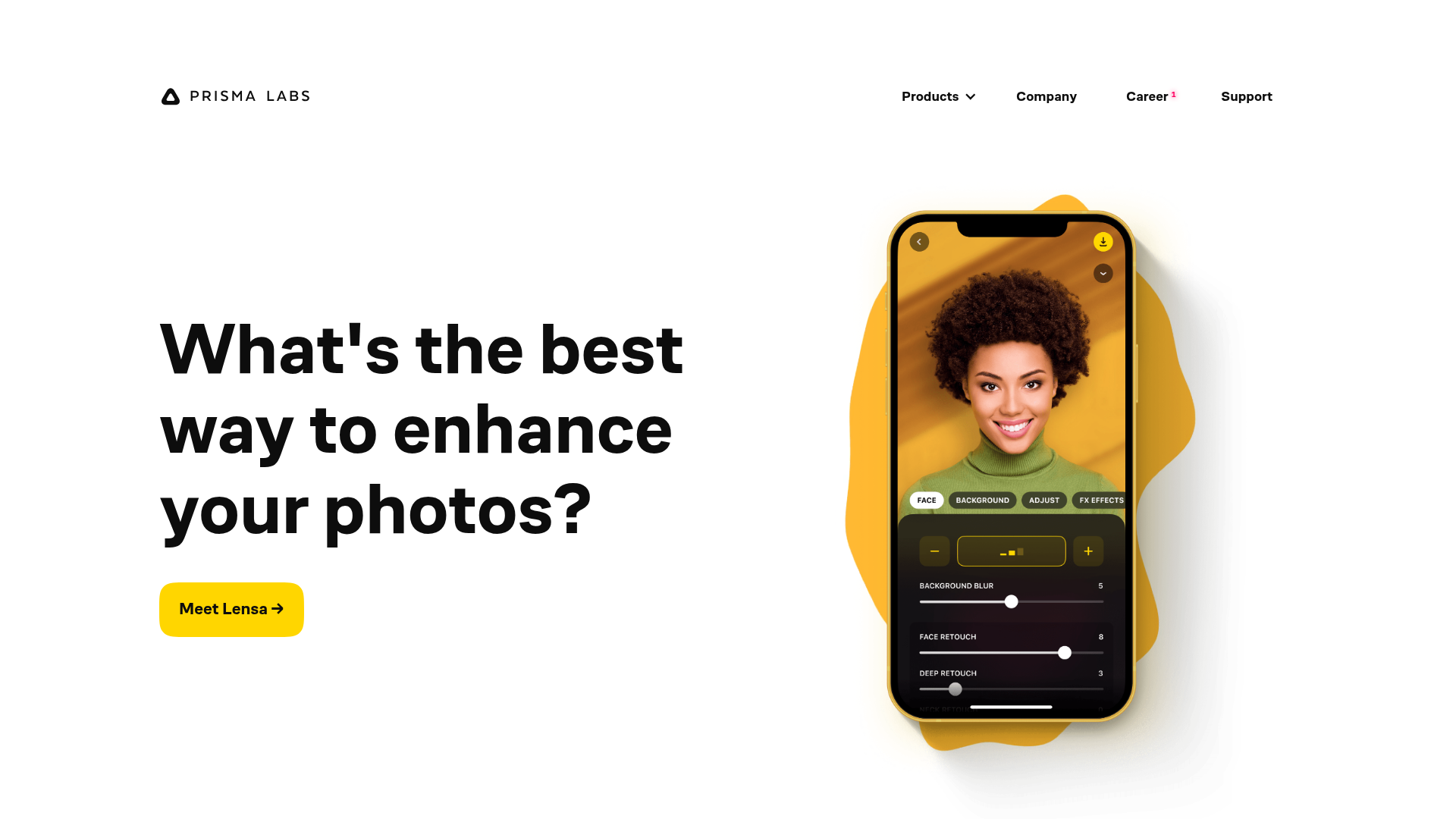
Prisma Labs App Showcase Landing
A clean SaaS landing page layout featuring large typography, magnetic hover buttons, and high-fidelity mobile app mockups with animated video blob backgrounds.
