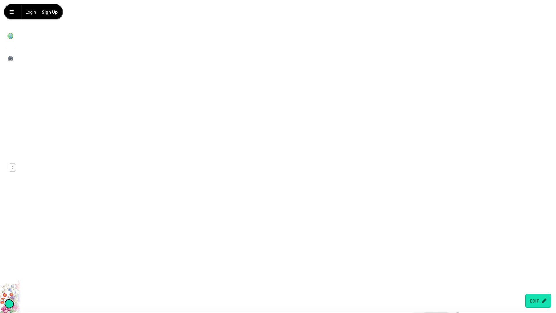
MMM.page Design Portfolio Editor
A minimalist, drag-and-drop landing page layout featuring a floating navigation bar, hidden sidebar menu, and a prominent bottom-right edit toggle.
Overview
MMM.page is a highly customizable, drag-and-drop website builder that prioritizes a "digital paper" aesthetic over rigid grid systems. This design is a premier reference for builders creating creative portfolios, mood boards, or interactive landing pages that require free-form element positioning and a playful, tactile atmosphere.
Design System
- Color Palette & Visual Hierarchy: The interface uses a neutral white background (
#FFFFFF) to let user content shine. UI elements use high-contrast blacks for navigation and accessibility, while specific action items like the "Edit" toggle use a vibrant mint green (#25D3B2). - Typography System: The design employs a mix of serif and sans-serif fonts to distinguish between creative content and UI control. Headlines use Playfair Display and Calistoga for a sophisticated, magazine-like feel, while functional text utilizes Lato or Patrick Hand SC for a hand-drawn, approachable vibe.
- Page Structure & Section Flow: The layout is non-linear but follows a general vertical scroll. It begins with a minimalist hero area focusing on abstract 3D shapes and a centered logo, followed by a scattered grid of "window-style" preview cards for community sites, and ends with skewed, overlapping social buttons.
- Reusable Components:
- Floating Status Bar: A pill-shaped top-left nav for Login/Sign Up.
- Iconized Sidebar: Collapsed vertical icons (Globe, House) for navigation.
- Image Cards: Featured with
4px 4px 0pxsolid black drop shadows and2pxborders, creating a "sticker" or window effect. - Rich Buttons: High-radius buttons with bold background colors (e.g., Purple for Explore, Mint for Sign Up).
- Interaction & Motion Patterns: Elements utilize a
grow-on-hoverclass, creating a subtle scaling effect when users interact with images or links. The bottom-rightEDITbutton serves as a persistent floating action button (FAB) that toggles the editor state. - Implementation Clues: The HTML reveals a "freeform" container style that uses CSS variables (e.g.,
--x,--y,--rotation) to absolute-position every block, allowing for the characteristic "messy" and layered layout.
Use Cases
- Who should clone this: Artists, designers, and creative agencies looking for a portfolio that feels less like a corporate template and more like a physical scrapbook.
- Effective Remixes: Link-in-bio tools can adapt the overlapping button style; educational landing pages can reuse the "sticker" card aesthetic to make information feel more digestible and fun.
- Practical Directions:
- IA Adaptation: Replace the abstract 3D shapes with product screenshots or personal photography.
- Style Swap: Change the high-contrast black borders to soft pastels or glassmorphism effects for a more modern "SaaS" aesthetic while keeping the freeform positioning.
- Suggested Clone Scope: A quick section clone of the "sticker-style" grid and the floating edit FAB is highly effective for any site needing localized interactivity without a full-page redesign.
Related Inspirations
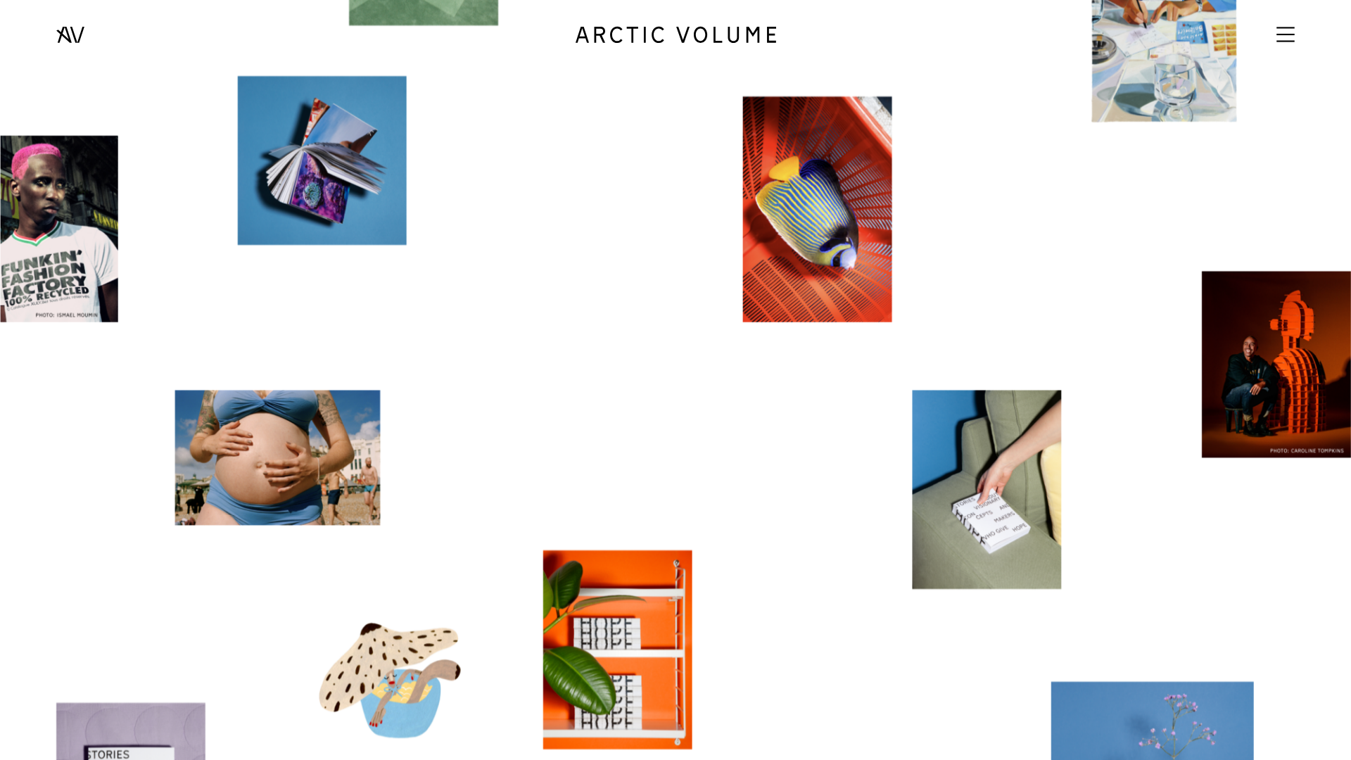
Arctic Volume Creative Portfolio Showcase
A minimalist gallery layout featuring a dynamic floating image canvas hero, smooth transitions, and a clean typography-focused editorial blog footer.
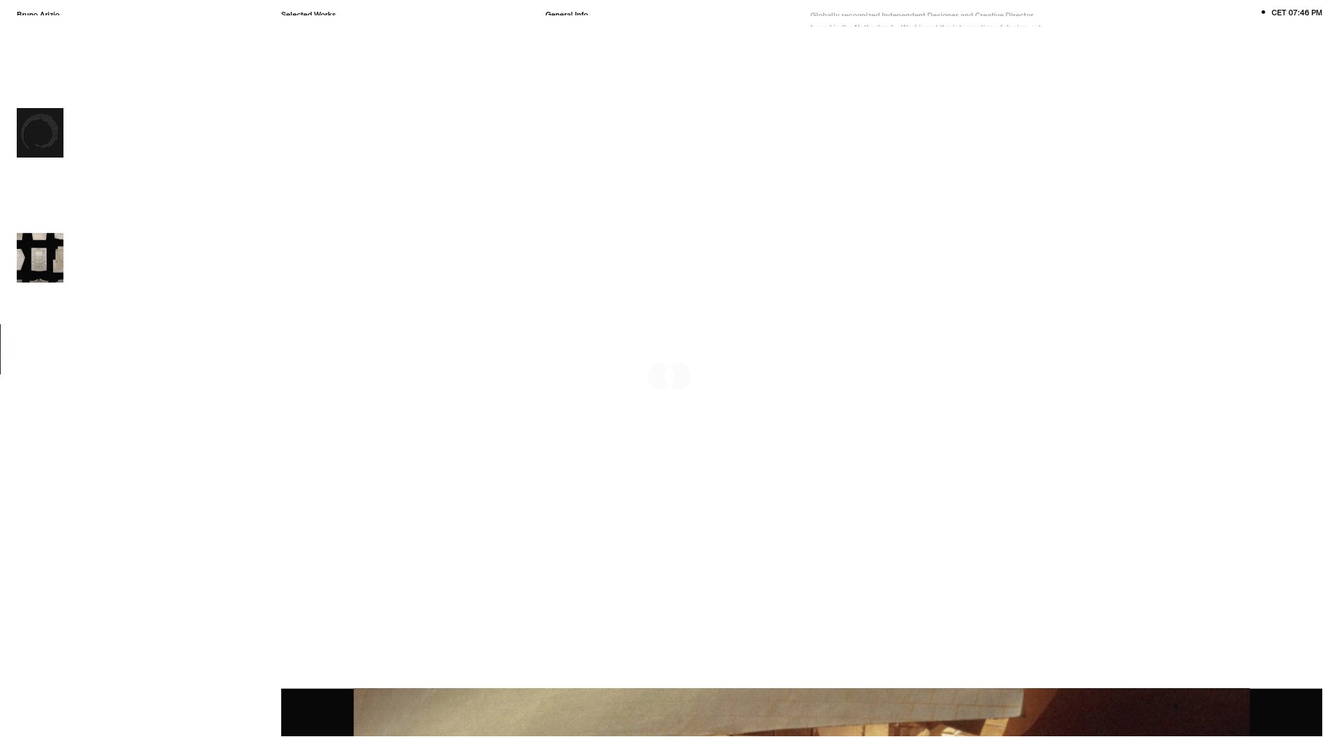
Bruno Arizio Designer Portfolio Website
A minimalist creative director portfolio featuring a clean typographic layout, side-aligned image previews, and high-contrast spacing patterns suitable for luxury or design showcases.
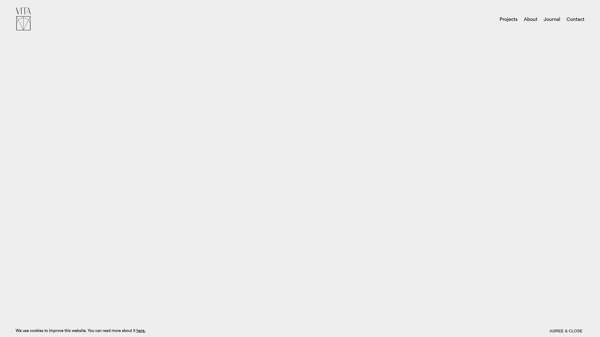
Vita Architecture Portfolio Landing Page
A minimalist, high-end architecture portfolio featuring a custom canvas-based image gallery, split-text animations, and a project slider with dynamic image masks.
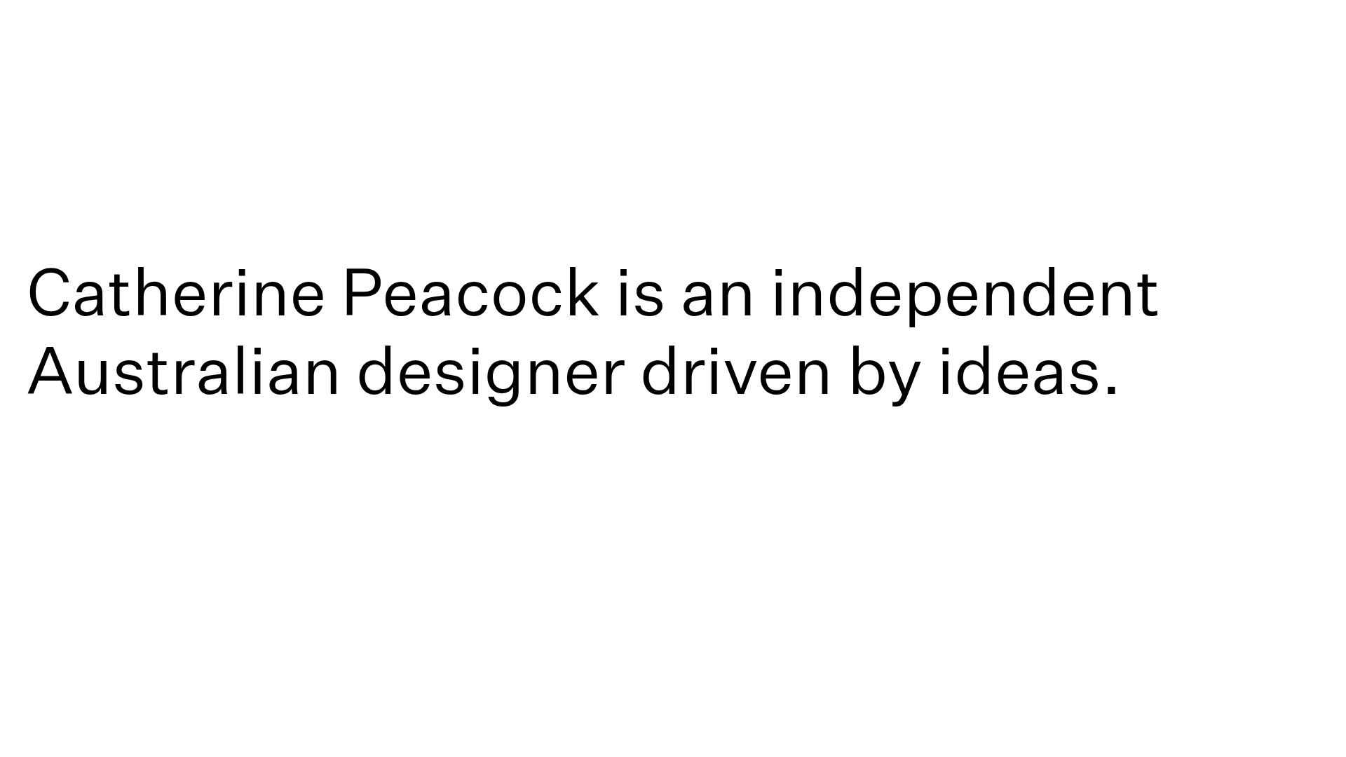
Catherine Peacock Designer Portfolio Home
A minimalist portfolio layout featuring a vertically stacked masonry project grid, sticky navigation with animated icons, and offset typography.
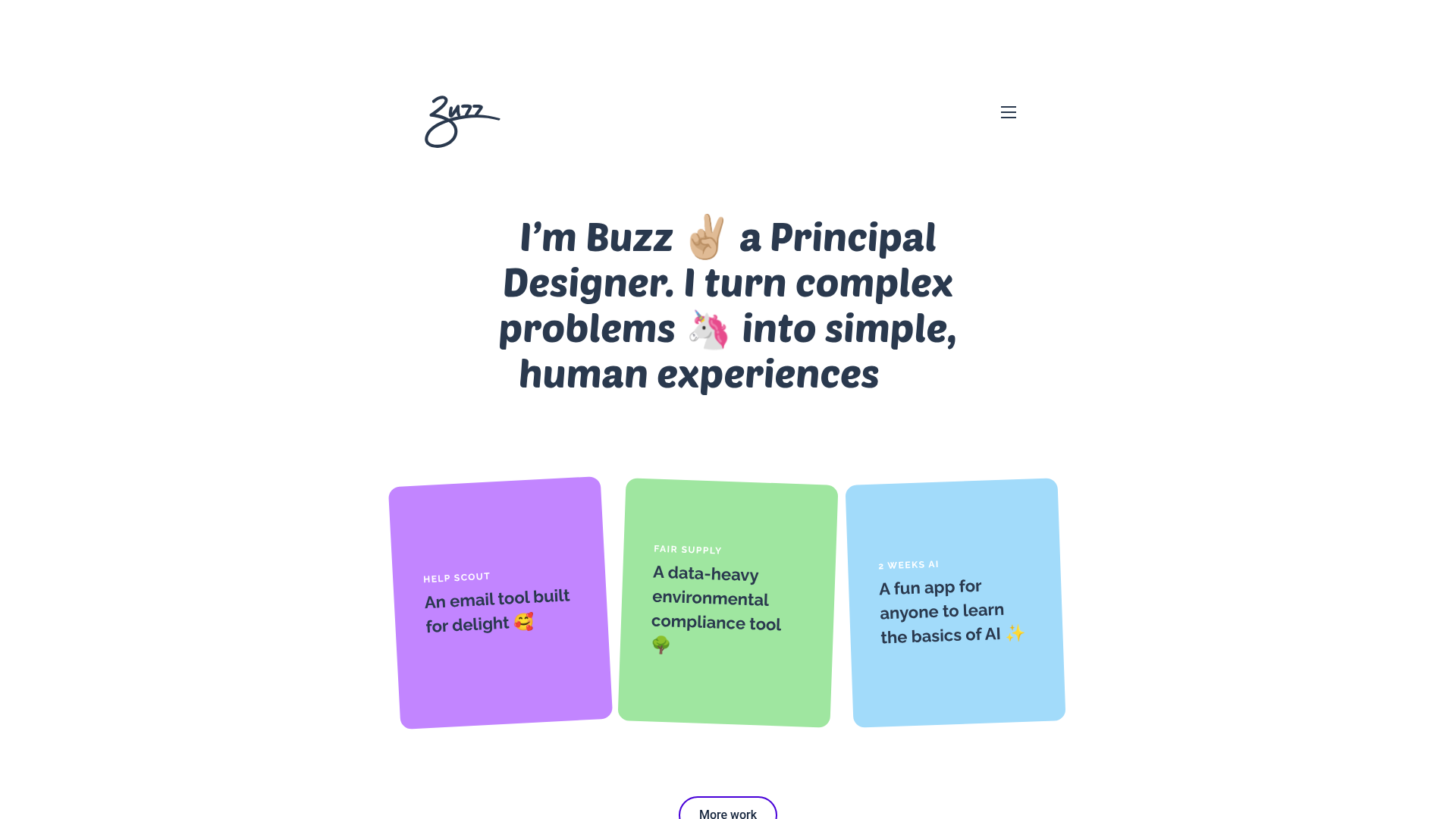
Buzz Usborne Designer Portfolio Landing
A minimalist portfolio layout featuring a large typography-driven hero section with animated emojis and a responsive grid of colorful, card-based project previews.
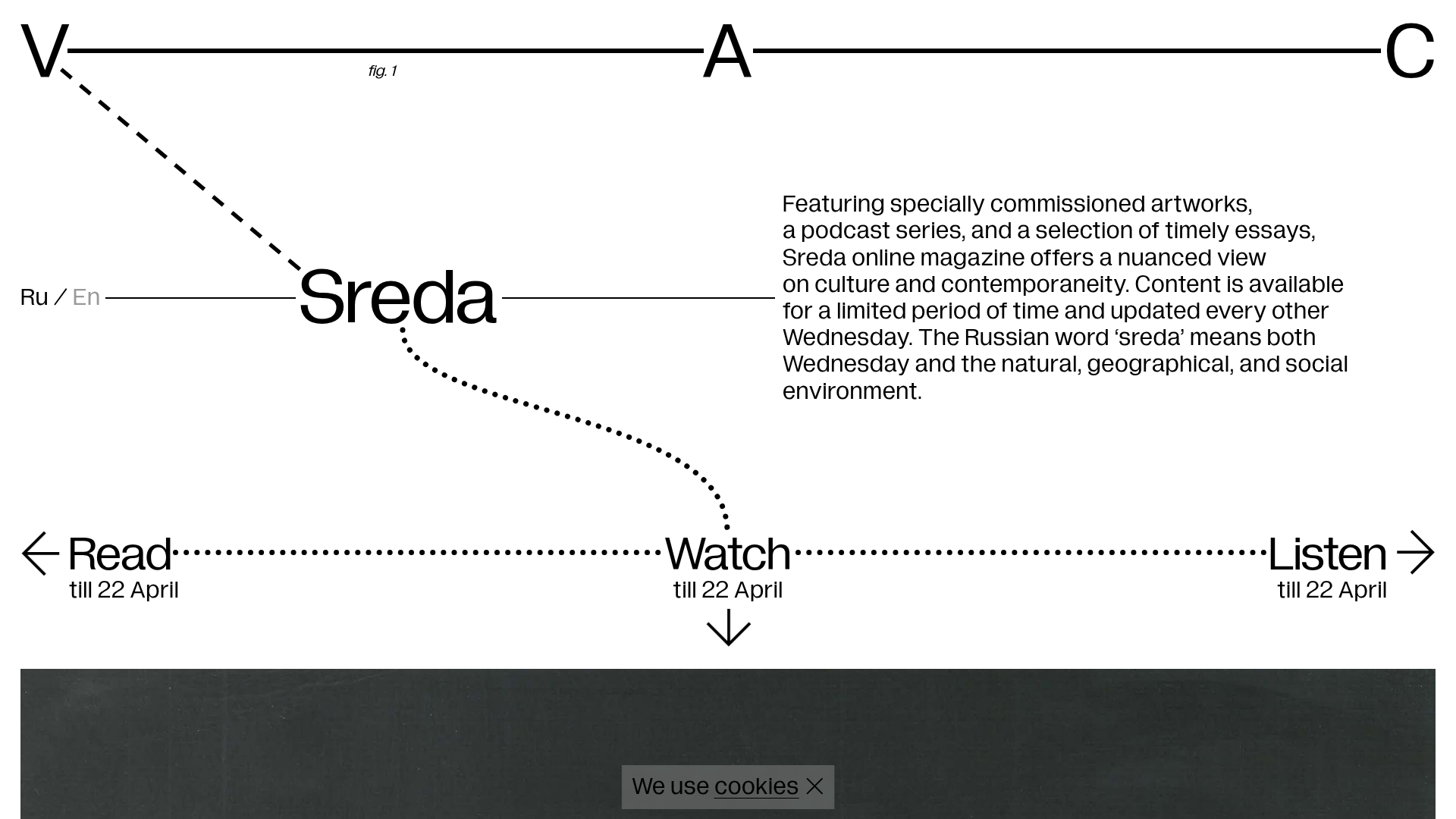
V–A–C Sreda Online Magazine Hub
Minimalist art magazine layout featuring a conceptual typographic header, interactive vertical navigation for mixed media content, and a clean grid for high-resolution archival imagery.
