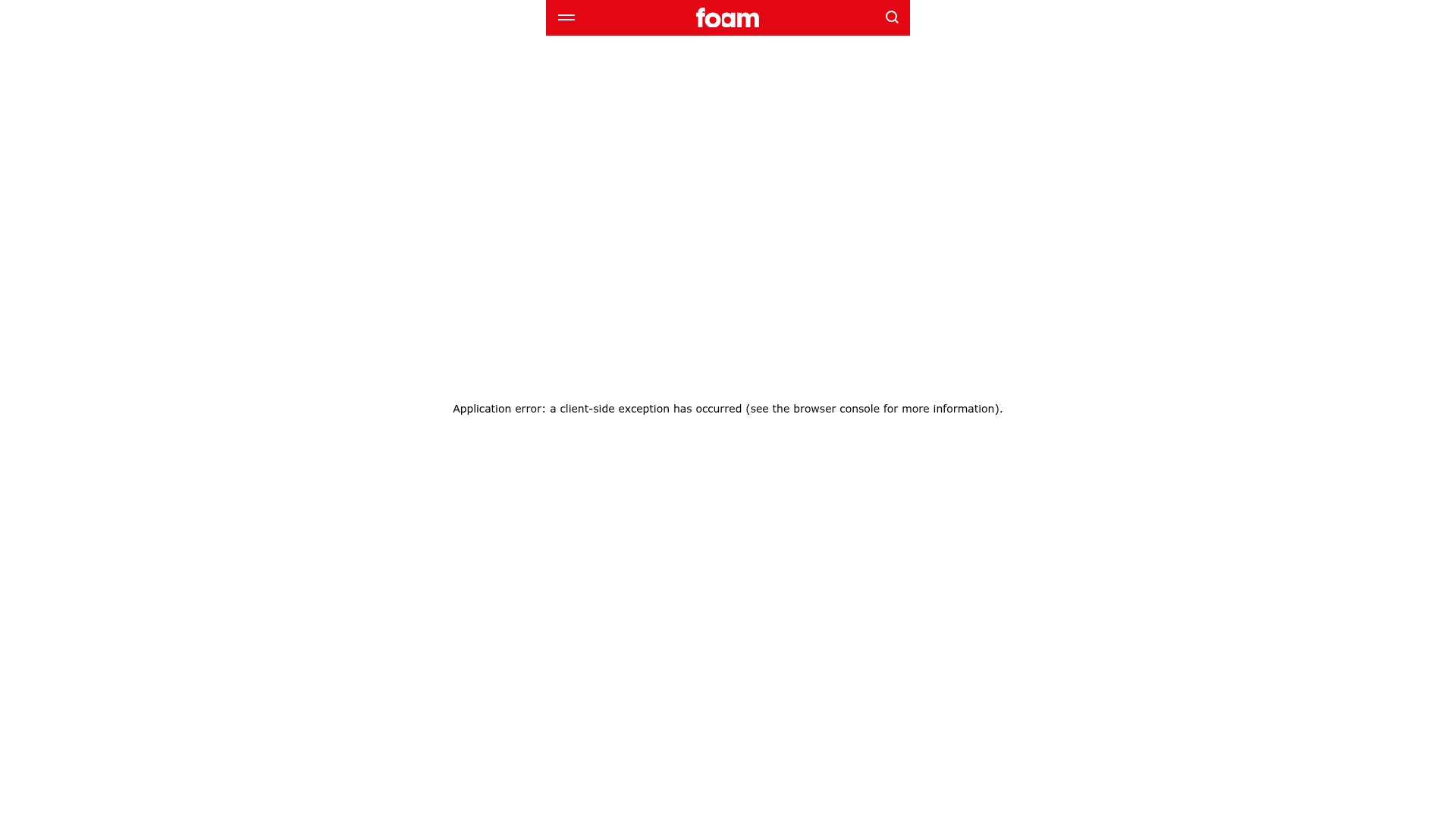
Foam Talent Site Application Error
An empty state layout featuring a branded sticky header with a red background, logo placement, and search functionality above a minimalist error container.
Overview
This UI pattern features a high-impact, branded navigation bar integrated with a minimalist error state or empty state layout. It serves as a strong reference for developers looking to build robust error boundary pages or maintenance states that preserve brand identity through a sticky header even when core content fails to load.
Design System
- Color Palette & Visual Hierarchy: The primary brand color is a bold red (
#e30613or similar), used as a flood background for the header to draw immediate attention. The body uses a high-contrast white background and dark text for maximum readability. - Typography System: The design employs a clean sans-serif stack (
system-ui, "Segoe UI", Roboto). The error message uses a subtle, centered 14px font size with a 400 weight, creating a neutral tone that contrasts with the heavy brand presence in the header. - Page Structure: The layout follows a vertical flow starting with a sticky, full-width header (3-column layout: menu, logo center, search) followed by a flexbox-centered container that occupies
100vhto vertically and horizontally align the status message. - Reusable Components:
- Branded Sticky Header: A versatile navigation bar featuring a hamburger menu icon, a centered brand logo, and a magnification search icon.
- Error Boundary Container: A standard flex container set to
display: flex; flex-direction: column; align-items: center; justify-content: center;for centered messaging.
- Responsive Behavior: The HTML indicates the use of
100vhand flex properties, ensuring the message remains centered regardless of screen size, while the header elements (icons and logo) are spaced appropriately for touch targets. - Implementation Clues: The project is built using Next.js (indicated by
# __nextandnext-route-announcer) with styled-components (indicated bysc-class prefixes). It utilizes a focus-lock mechanism for accessibility during state transitions.
Use Cases
- Who should clone this: Developers needing a standard, accessible template for 404 pages, 500 internal server error pages, or maintenance mode screens.
- Product Remixing: This layout is ideal for any brand-forward web application where maintaining navigation access is critical even during downtime.
- Remix Directions: Swap the red header background for a brand-specific primary color; replace the static error text with an animated 404 graphic or a "Return to Home" call-to-action button; adapt the central container to include social media links or a support contact form.
- Suggested Scope: A specific component clone of the sticky header and the vertically centered messaging container is recommended over a full-site clone.
Related Inspirations
Parker Studio Minimalist Design Portfolio
A high-end creative portfolio featuring a full-screen video slideshow hero, masonry-style project grid, draggable news carousel, and modular layout with clean typography.
Minimalissimo Design Gallery and Portfolio
A clean magazine-style layout featuring horizontal scroll sections for featured portraits, an balanced article grid, and a bottom-anchored floating navigation bar with integrated search.
Egstad Minimalist Design Portfolio
A refined Nuxt.js portfolio featuring bold variable typography, interactive canvas elements, and a clean grid-based layout for showcasing design work.
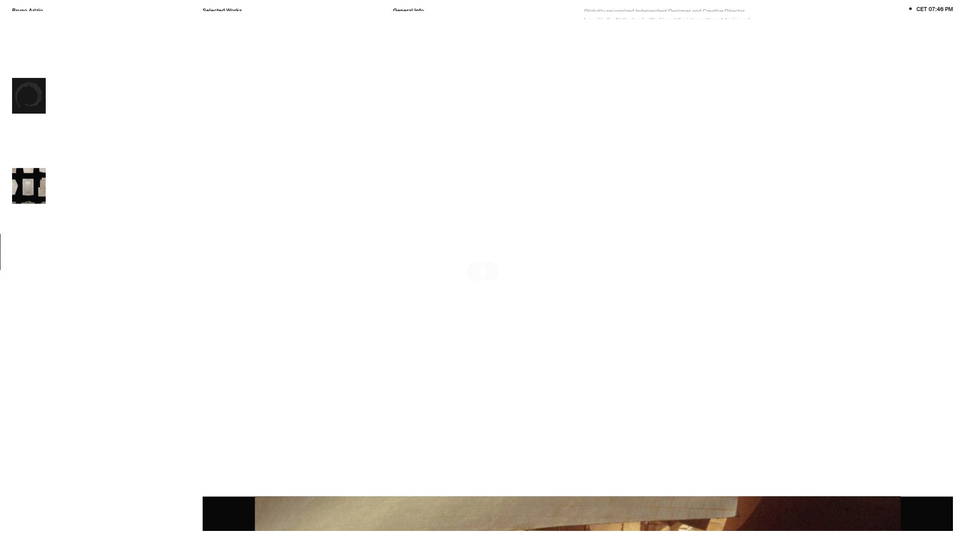
Bruno Arizio Designer Portfolio Website
A minimalist creative director portfolio featuring a clean typographic layout, side-aligned image previews, and high-contrast spacing patterns suitable for luxury or design showcases.

Christopher Doyle Agency Portfolio Layout
A minimalist, typography-led portfolio featuring a wide-margin grid system, smooth fade-in animations, and simple image-focused project cards.
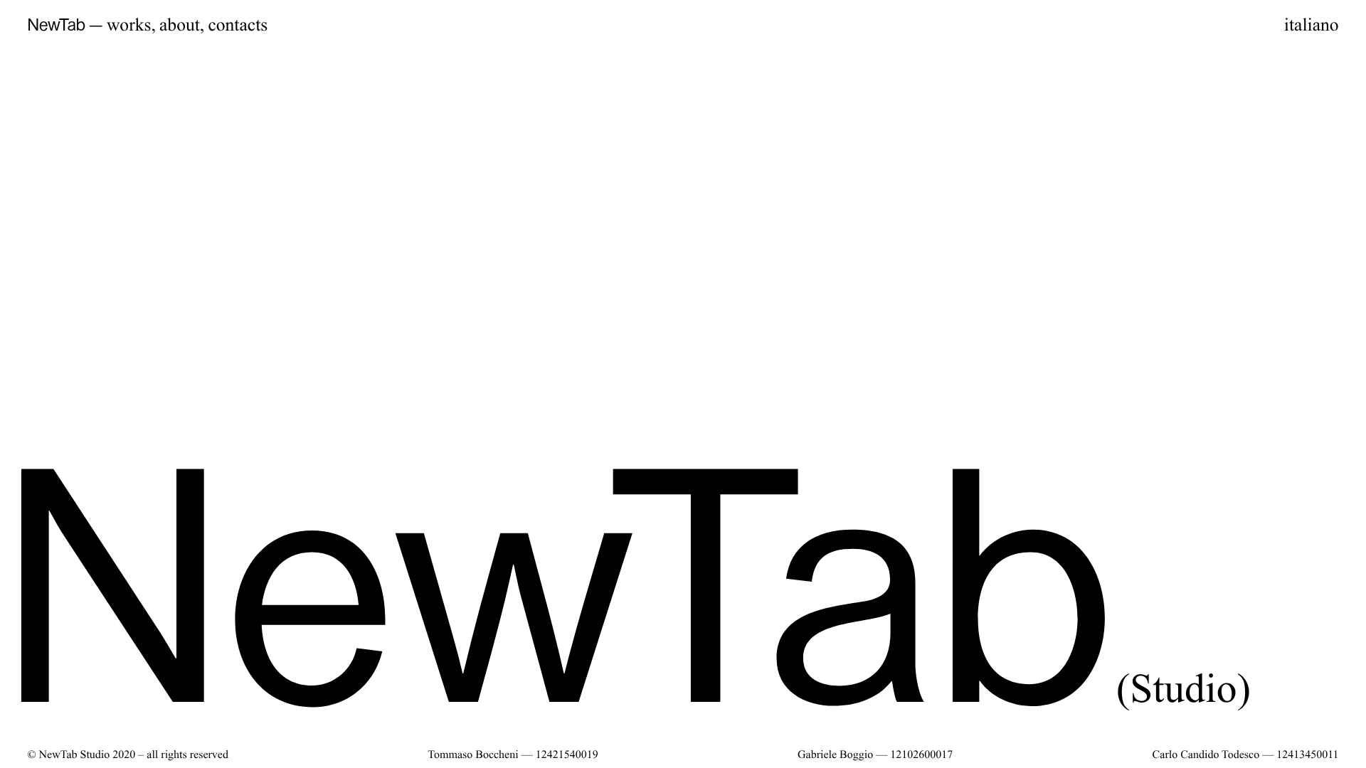
NewTab Studio Minimalist Portfolio Landing Page
A clean, typography-focused landing page featuring an oversized SVG/canvas hero title, a top-aligned navigation bar, and a minimalist footer layout.
