F. Miller Skincare Minimalist E-commerce
A high-end retail layout featuring an ultra-minimalist grid, responsive hero image components with overlay text, and a numbered index section for clear collection navigation.
Overview
This high-end skincare website is a masterclass in minimalist luxury e-commerce, utilizing a sophisticated grid system and a muted, nature-inspired palette. It serves as a strong reference for builders looking to create a premium brand experience through clean whitespace, asymmetrical layouts, and subtle, high-quality interaction patterns.
Design System
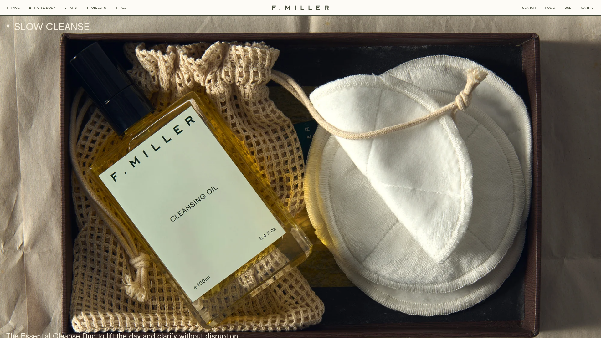
- Color Palette & Visual Hierarchy: The palette is dominated by an 'off-white' (#f1f4e3) background paired with a deep 'dark-green' (#3f4535). Hierarchy is established through high-contrast blocking (e.g., dark green sections for featured collections) and consistent border weights (1px strokes) that define the grid without clutter.
- Typography: A clean, sans-serif typography system featuring a headers-in-caps style for labels (e.g., "FACE", "INDEX") and a legible serif/slab for body descriptions. Font sizes range from a tiny 10px in the navigation/utility bars to a bold 30px for section headings.
- Page Structure: The layout follows a modular flow: a sticky utility header, a full-width immersive hero banner with text overlays, followed by a product grid alternating with lifestyle editorial blocks, and an innovative "INDEX" footer for site-wide navigation.
- Reusable Components:
- Grid Cards: Product cards feature thin 1px borders, star ratings, and price ranges with a clean hover state.
- Numbered Index: A 4-column categorical footer that uses large numerals for clear wayfinding.
- Promo Banner: A thin, sticky bottom-bar for shipping announcements and discounts.
- Interactions & Motion: The HTML indicates the use of
ripple-hover-effecton images, adding a liquid-like tactile feel to product selection. Slide-out cart drawers and mobile navigation menus maintain the minimalist aesthetic without full-page reloads. - Responsive Behavior: The design transitions from a multi-column desktop grid to a single-column stack on mobile, notably swapping aspect ratios for hero images (16:9 on desktop to 2:3 on mobile) to maintain visual impact on vertical screens.
- Implementation Clues: Built on Shopify, the frontend utilizes utility-first CSS classes (e.g.,
u-flex,u-grid-cols-4,u-p-x-20) and custom Vue.js components for interactive elements like price ranges and image effects.
Use Cases
- Who should clone this: Designers and developers building for niche luxury brands, apothecary-style retail, or high-fashion editorial shops that prioritize brand story over aggressive sales tactics.
- Product Remixes: This layout is ideal for artisanal home goods, sustainable clothing, or high-end jewelry where product details and aesthetic photography are the primary selling points.
- Remix Directions:
- Brand Swap: Replace the core dark green and off-white with monochromatic black/white for a more edgy, tech-wear aesthetic.
- Info Architecture: Reuse the "INDEX" section as a primary landing page component rather than a footer to create a "Table of Contents" shopping experience.
- Focused Clone: Developers should prioritize cloning the modular "Content Section" blocks which allow for flexible image/text positioning within a consistent grid.
Related Inspirations

Context Gallery High-End Furniture Landing Page
A minimal editorial layout featuring a multi-column product carousel, designer biographies with image-text pairings, and a magazine-style content grid for curated design stories.

Glein Minimalistic Bento Grid eCommerce
A clean, modular layout using a bento-style responsive grid of text teasers and large-scale product imagery for lookbooks and collection browsing.

Isla Beauty Skincare E-commerce Store
A clean Shopify-based storefront featuring a split-hero landing page, a step-by-step product system carousel, and a split-screen testimonial section with localized product image sidebars.

Stojo Collapsible E-commerce Storefront
A Shopify layout featuring a prominent discount modal, mosaic grid hero sections, and clean product cards with integrated color swatches and quick-buy functionality.

Basic.Space E-commerce Gallery Clone
A minimalist product marketplace featuring a clean sticky navigation bar, nested flyout menus, and a horizontally scrollable product carousel with hover-state image switching.

Ashley & Co Lifestyle E-commerce
An elegant Shopify-based storefront featuring a split-screen animated hero, horizontal ticker-tape collection carousel, and dynamic mega-menus with scent-specific color switching and image previews.
