Minimalist Designer Portfolio with Narrative Layout
A refined typography-focused site featuring an asymmetrical hero section, a vertical timeline resumé, integrated case study videos, and a clean contact card component.
Overview
This portfolio is a masterclass in asymmetrical, typography-driven layout that prioritizes narrative over traditional grid structures. It is a strong reference for designers or writers who want to showcase professional experience alongside full-width visual artifacts without the website feeling cluttered or repetitive.
Design System
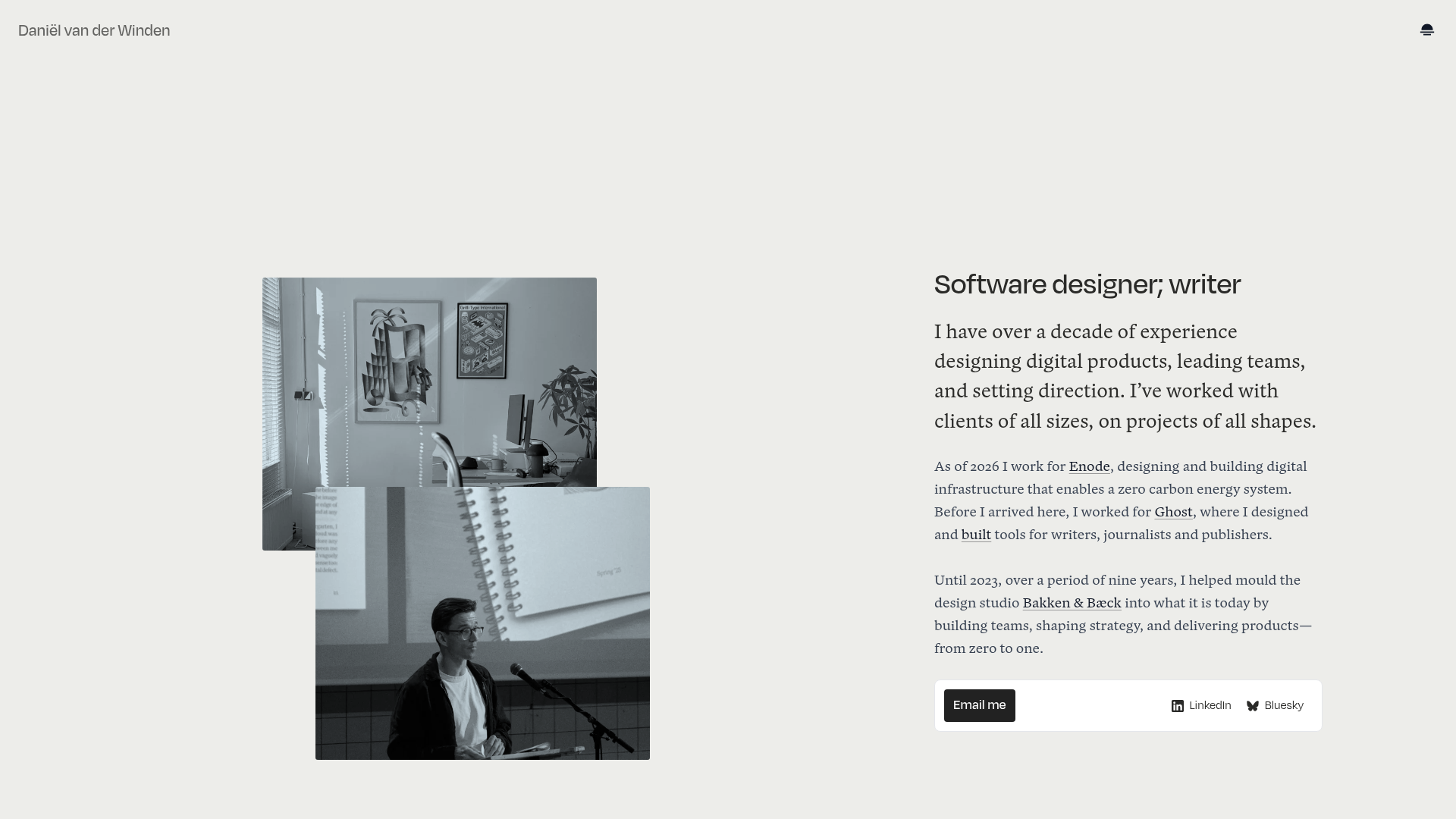
- Color Palette & Visual Hierarchy: A high-contrast, professional palette using a light grey background (
bg-blueclass with hex approximation#EDEDED) and deep blacks for text. It uses subtle borders (border-gray-950/5) to separate resumé items. Visual hierarchy is established through extreme variations in font weight and size rather than color. - Typography System: The site uses a sophisticated mix of Serif and Sans-Serif. Body text uses a readable serif for long-form narrative. The "Software designer; writer" subheader and CTA buttons use a modern, bold sans-serif. Dates and categories in the resumé use small caps or subdued sans-serif for secondary emphasis.
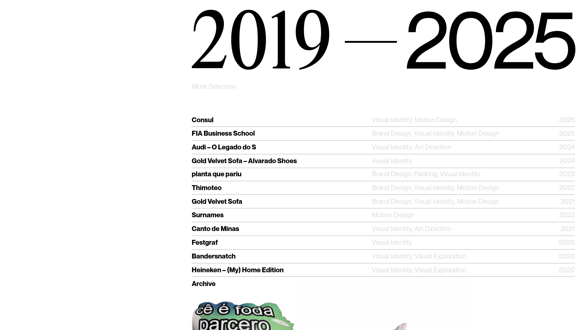
- Page Structure & Flow: The layout is heavily weighted to the right, with a large gutter on the left used for overlapping floating imagery. The flow moves from a high-level introduction to a detailed vertical resumé, followed by specific project case studies that combine video loops with block quotes.
- Reusable Components:
- The Floating Contact Card: A rounded-corner white card at the end of the intro section containing a primary CTA button and social links.
- The Narrative Resumé: A
<ul>based list with amd:w-1/4date column andmd:w-3/4content column, ideal for high-density information. - Video Case Study Blocks: Full-width or partial-width
<video>elements with accompanying<figcaption>for clean, motion-based project showcasing.
- Interaction & Motion: The design uses
autoplaymuted video loops to create a living portfolio. Hover states on links and buttons are subtle, often involving a shift in text color or background weight. - Implementation Clues: The HTML reveals the use of Tailwind CSS (
flex,max-w-lg,prose,space-y-10) for layout and typography management. The structure relies onfigureandfigcaptionelements for semantically correct media handling.
Use Cases
- Who should clone this: Senior product designers, creative directors, and editorial writers who need to balance a long professional history with high-quality visual work.
- Effective Remixes: This pattern works perfectly for "Zero-to-One" product launches where storytelling is more important than a feature matrix. It can be adapted into a digital magazine index or a studio about page.
- Remix Directions: Swap the serif body text for a mono font to target a developer audience, or replace the overlapping hero images with a single 3D interactive element while keeping the asymmetrical text column.
- Suggested Clone Scope: The Resumé section and the Contact Card are the most versatile components for a quick section-based clone. The entire page structure is recommended for the full "narrative-first" experience.
Related Inspirations
Gustavo Faria Minimalist Portfolio Index
A clean, list-based portfolio layout featuring hover-triggered image previews, a sticky sidebar with biography, and a typography-driven project archive.
Neutra VDL Minimal Archive Layout
A refined museum site featuring a typography-focused overlay menu, sticky multi-column content sections, and an interactive image gallery with asset metadata details.
Bruno Arizio Designer Portfolio Website
A minimalist creative director portfolio featuring a clean typographic layout, side-aligned image previews, and high-contrast spacing patterns suitable for luxury or design showcases.
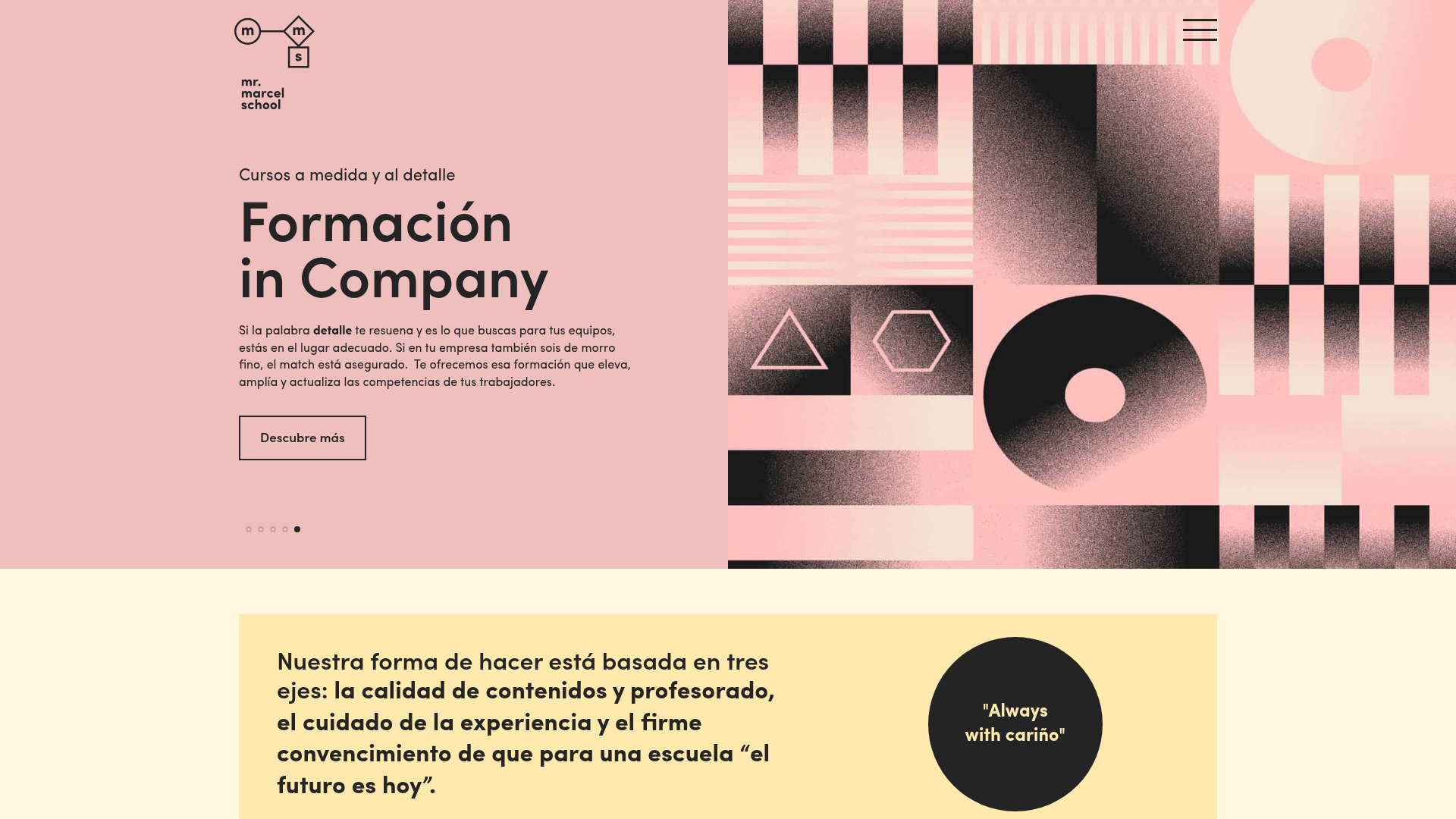
Mr. Marcel School Design Portfolio
A creative education site featuring artistic geometric headers, card-based course layouts, slider-driven testimonial sections, and a structured calendar for academic scheduling.
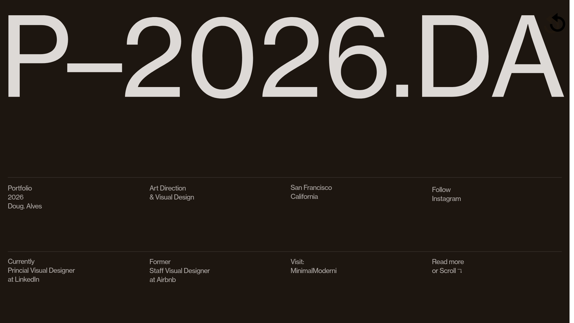
Doug Alves Visual Design Portfolio
A minimalist, high-contrast design portfolio featuring oversized typography, a sticky four-column grid footer, and a vertical scroll-triggered slide-show for project showcases.
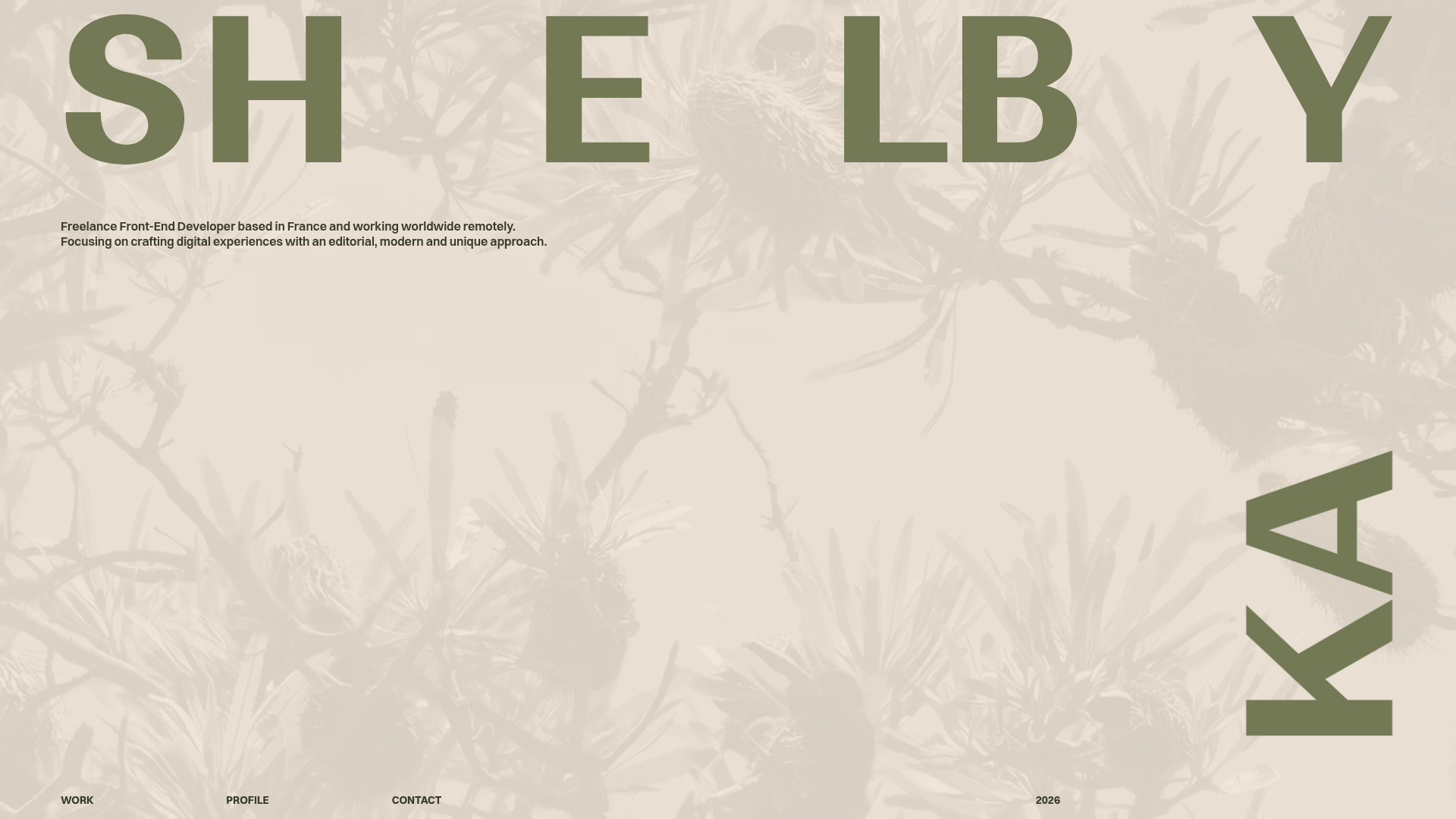
Shelby Kay Portfolio Hero and Masonry Grid
A minimalist developer portfolio featuring an oversized typography hero with parallax video background and a dense, high-frequency image/video project masonry grid.
