Sketch Design Tool Landing Page
A refined marketing layout featuring a soft gradient hero, modern bento grid sections with video embeds, a testimonial carousel, and an auto-scrolling customer logo marquee.
Overview
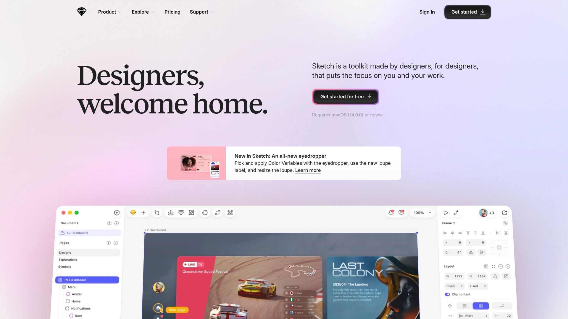
This is the flagship landing page for Sketch, a vector-based design tool. It is a premier reference for high-end SaaS marketing because it masterfully balances soft, artistic aesthetic elements with a high-density 'bento box' grid to showcase product features through silent video loops.
Design System
- Color Palette & Visual Hierarchy: The design uses a sophisticated light mode palette with a soft pastel gradient background (pink to purple). Primary actions use a high-contrast dark charcoal color (
#1d1d1f) to draw the eye, while secondary accents utilize a subtle 'glow' effect around CTA buttons. - Typography: The page features a mix of a clean sans-serif for UI/navigation and a bold, high-contrast serif typeface for the hero H1 header ("Designers, welcome home."). This contrast establishes a premium, creative character.
- Page Structure: The flow transitions from a minimal hero section into a dynamic feature announcement card, followed by a large-scale product canvas visualization. Below the fold, it employs organized grid-based sections ("Design", "Prototype", "Collaborate") using varying card widths (1x1 and 2x1 bento styles).
- Reusable Components: Notable components include the sticky navigation bar that updates based on scroll position, the 'bento' grid cards with embedded video previews (
mave-clip), and the testimonial slider that uses large avatars and distinct attribution styling. - Interaction & Motion: The site uses scroll-triggered entrance animations (
entrance--fadeDown,entrance--zoom) and auto-playing silent video loops to demonstrate the software in action without user interaction. The testimonial section utilizes a slider pattern for non-linear content consumption. - Implementation Clues: The HTML reveals a native-feeling grid layout system (12-column grid mentioned in
grid-layout__col) and the use of the Swiper library for carousels. It utilizes semantic<section>tags to separate the feature blocks by use-case.
Use Cases
- Who should clone this: Creative tool developers, high-end SaaS companies, or portfolio owners looking for a premium, clean aesthetic that prioritizes visual demonstration over heavy text.
- Effective Remixes: This layout is perfect for productivity apps or complex developer tools. One could remix the 'bento' grid to host code snippets or dashboard previews instead of design canvas videos.
- Remix Directions: Builders can swap the serif font for a monospace typeface to pivot toward a technical audience, or change the hero gradient to a solid dark background for a 'Dark Mode' Pro-tier product feel. The 'sticker' CTA section at the bottom is highly reusable for any lead-capture goal.
- Clone Scope: For a fast implementation, builders should prioritize cloning the hero section and a single 'bento' feature section. A full-page clone is recommended for those wanting to maintain a cohesive, high-polish brand narrative.
Related Inspirations
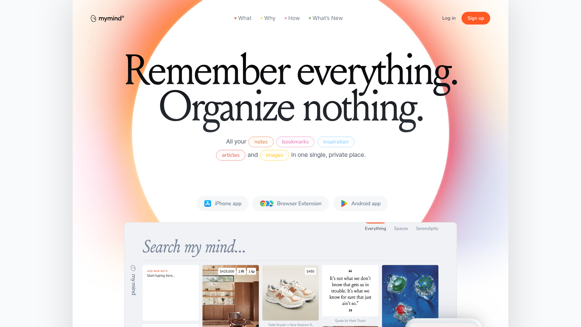
Mymind AI Tool Landing Page
A minimalist SaaS landing page featuring a soft-gradient hero section, custom pill-shaped text badges, and a dynamic bento-style search result preview grid.
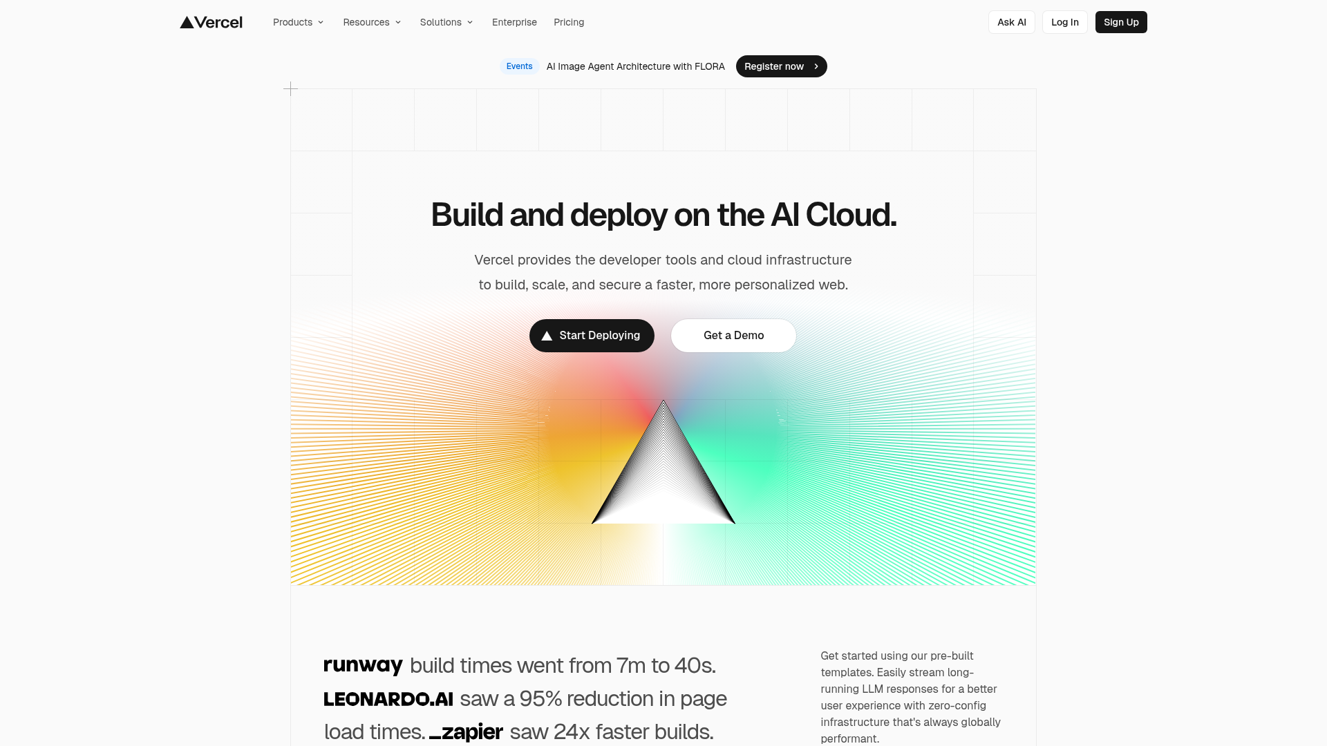
Vercel AI Cloud Landing Page
A modern landing page featuring a minimalist dark-themed navbar, a grid-overlay hero section with radial color gradients, and high-contrast typography for customer success stories.
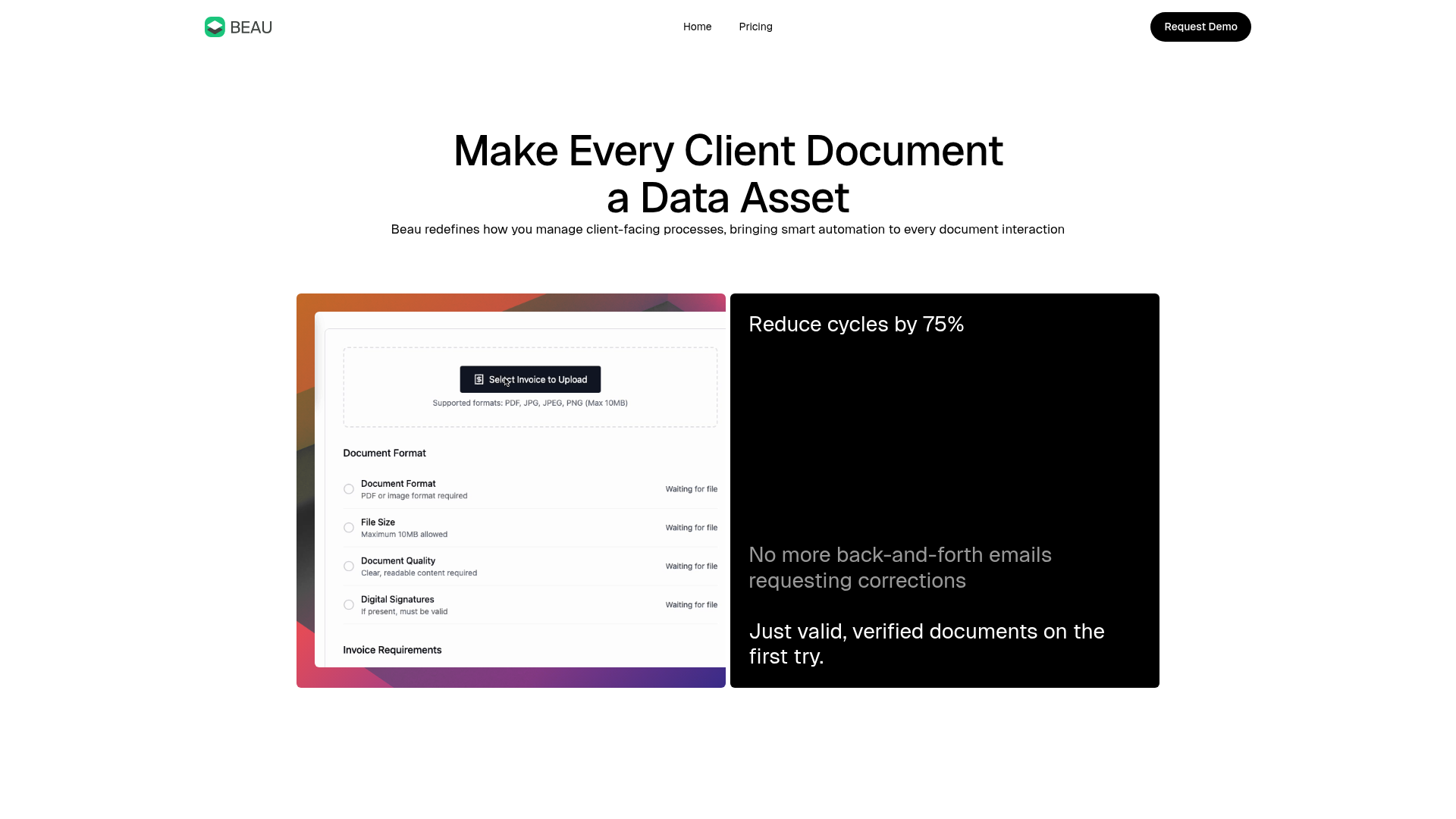
Beau Document Automation Landing Page
A modern software landing page featuring a bento-grid layout, split-screen hero assets with animated checkmarks, a step-by-step process guide, and a clean two-tier pricing table.
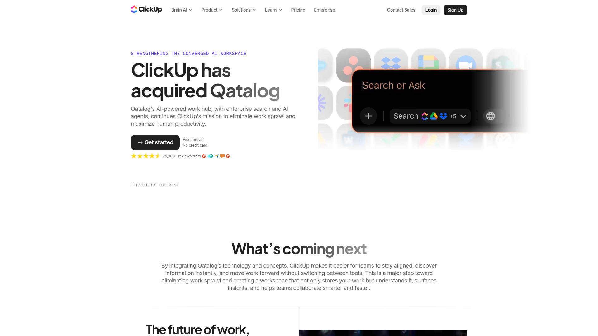
ClickUp Acquisition Hero Landing Page
Features a modern dark-themed hero section with a search UI graphic, bento-style feature grid, and a high-contrast CTA section with decorative gradients.
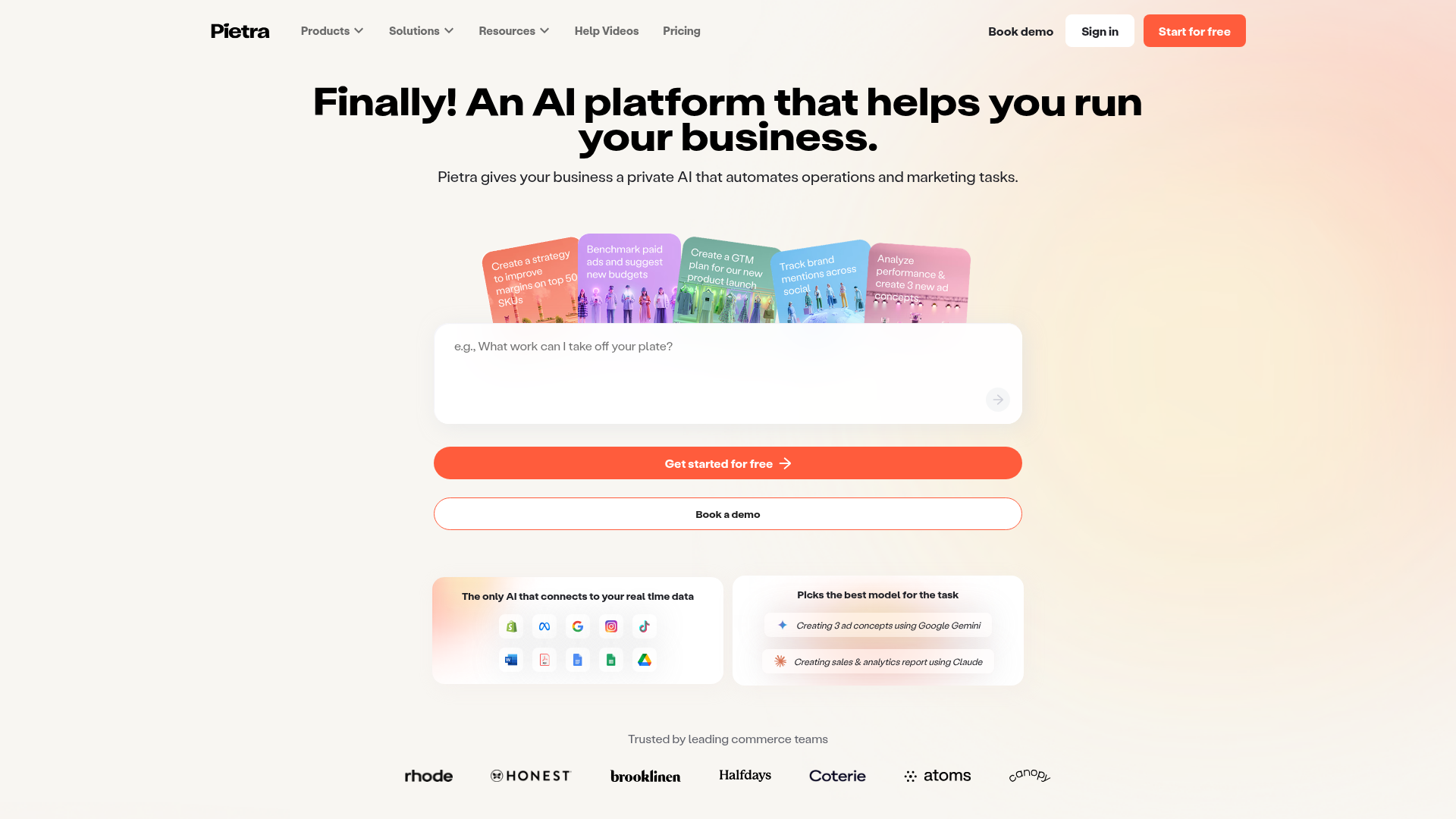
Pietra AI Platform Landing Page
A commerce-focused landing page featuring a centralized AI input hero, colorful floating value-prop cards, a bento-style integration showcase, and tabbed feature sections with side-by-side comparisons.
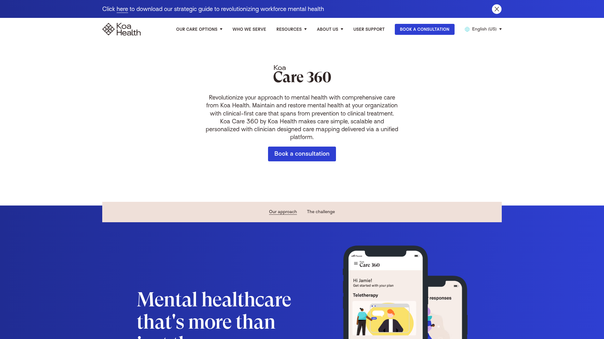
Koa Health Mental Care Landing Page
A clean healthcare landing page featuring a centered hero section, scroll-based fade-in animations, overlapping mobile mockups, and a multi-column feature grid with accent borders.
