Moffitt Moffitt Portfolio with Animated Hero
A high-end design agency site featuring a split-screen project carousel with vertical transitions, a swiper project feed, and an elegant hidden slide-out navigation menu.
Overview
This portfolio for Moffitt Moffitt is a sophisticated brand-led showcase featuring a cinematic project carousel with split-screen vertical animations. It serves as an excellent reference for creators needing to balance high-impact visual storytelling with a clean, functional UI, making it ideal for studios, agencies, and luxury brands.
Design System
- Color Palette & Visual Hierarchy: The site uses a minimalist "Ink and Paper" aesthetic, primarily featuring charcoal grays, stark whites, and desaturated backgrounds. Hierarchy is established through large-scale serif and sans-serif typography, with primary focus given to full-screen imagery while functional UI (like pagination and menu toggles) remains subtly anchored at the edges.
- Typography System: The system employs a contrast between a bold, clean sans-serif (used for headers and navigation) and a more traditional serif for narrative body text. There is a clear emphasis on large heading scales (e.g.,
h1in the carousel) and a consistentbody-text-smallutility for meta-data like phone numbers and email addresses. - Page Structure: The layout flows from a full-height animated hero carousel into a structured content grid. Significant vertical space is allocated between sections to provide "breathing room," moving from the hero into a text-based agency manifesto, and finally into a horizontal swiper-based project feed.
- Reusable Components:
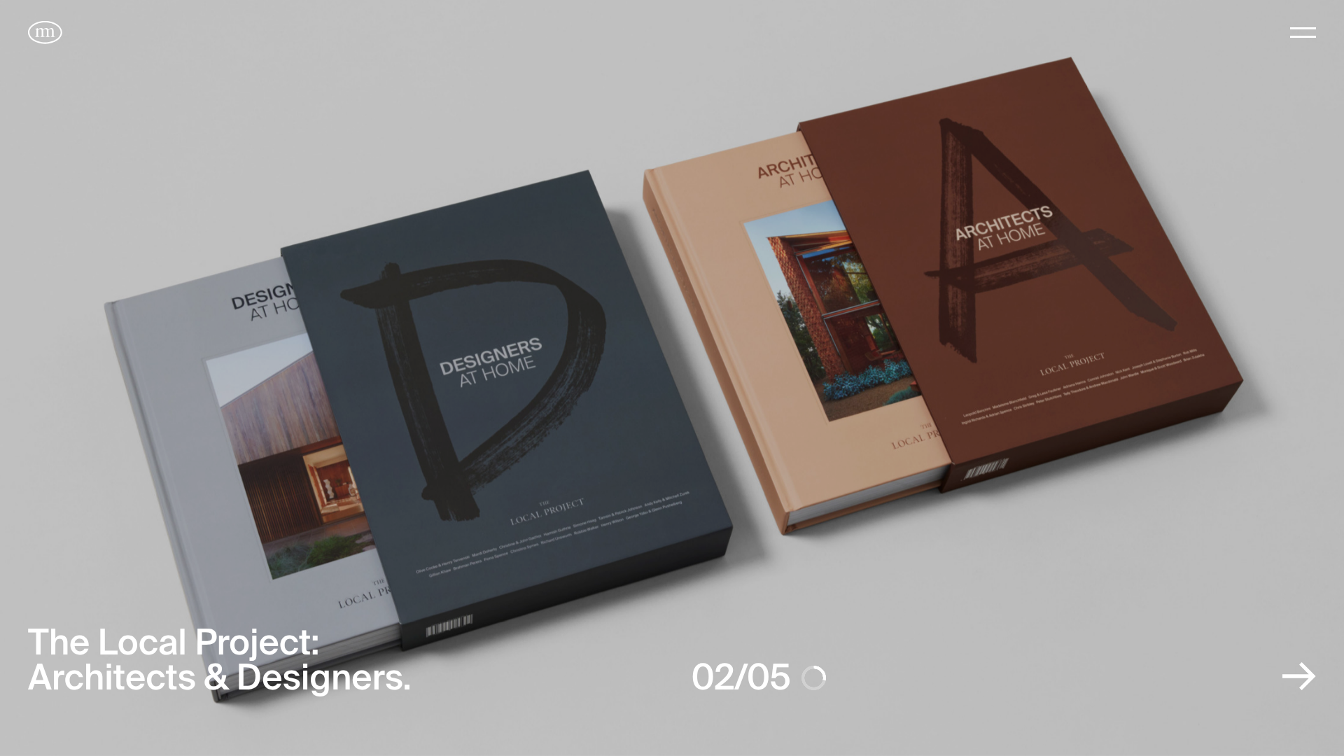
- The Split Carousel Slide: A complex component using
image-container leftandimage-container rightwith complementary verticaltransformvalues (one sliding up, one down). - Slide-out Navigation: A clean, full-screen overlay (
slideout-panel --menu) that organizes contact info into columns and uses simplebtn-linkhover effects. - Article Cards: Modular swiper slides using
aspectholderfor consistent media sizing and absolute-positionedcategorytags.
- The Split Carousel Slide: A complex component using
- Interaction & Motion: The site relies on staggered entrance animations (indicated by
--staggerCSS variables in the HTML). The carousel includes a circular progress indicator (clock) alongside a numerical counter (02/05). Hover states on buttons use a "text-swap" transition where the label shifts vertically. - Implementation Clues: The HTML uses a modular
data-widgetarchitecture (e.g.,data-widget="project-carousel",data-widget="feed-swiper"), suggesting a custom JavaScript controller manages specialized behaviors like the Swiper.js integration and custom page transitions.
Use Cases
- Who should clone this pattern: Creative agencies, independent architects, or high-fashion brands that have high-quality photography and need a website that feels as curated as a printed monograph.
- Remix Directions:
- Quick Clone: Reuse the "Home Feed" swiper section to add a horizontal blog or news reel to an existing site.
- Deep Clone: Adapt the split-screen vertical carousel for a product launch page where one side shows the product while the other shows lifestyle context.
- Stylistic Shift: Replace the muted grays with vibrant neon gradients for a digital-first tech portfolio while maintaining the rigid typography grid.
- Practical Remix: The hero carousel is the most distinct asset; it can be remixed as a stand-alone landing page. For a more standard layout, the footer's clean column-based contact grid is easily extractable for any corporate or professional services site.
Related Inspirations
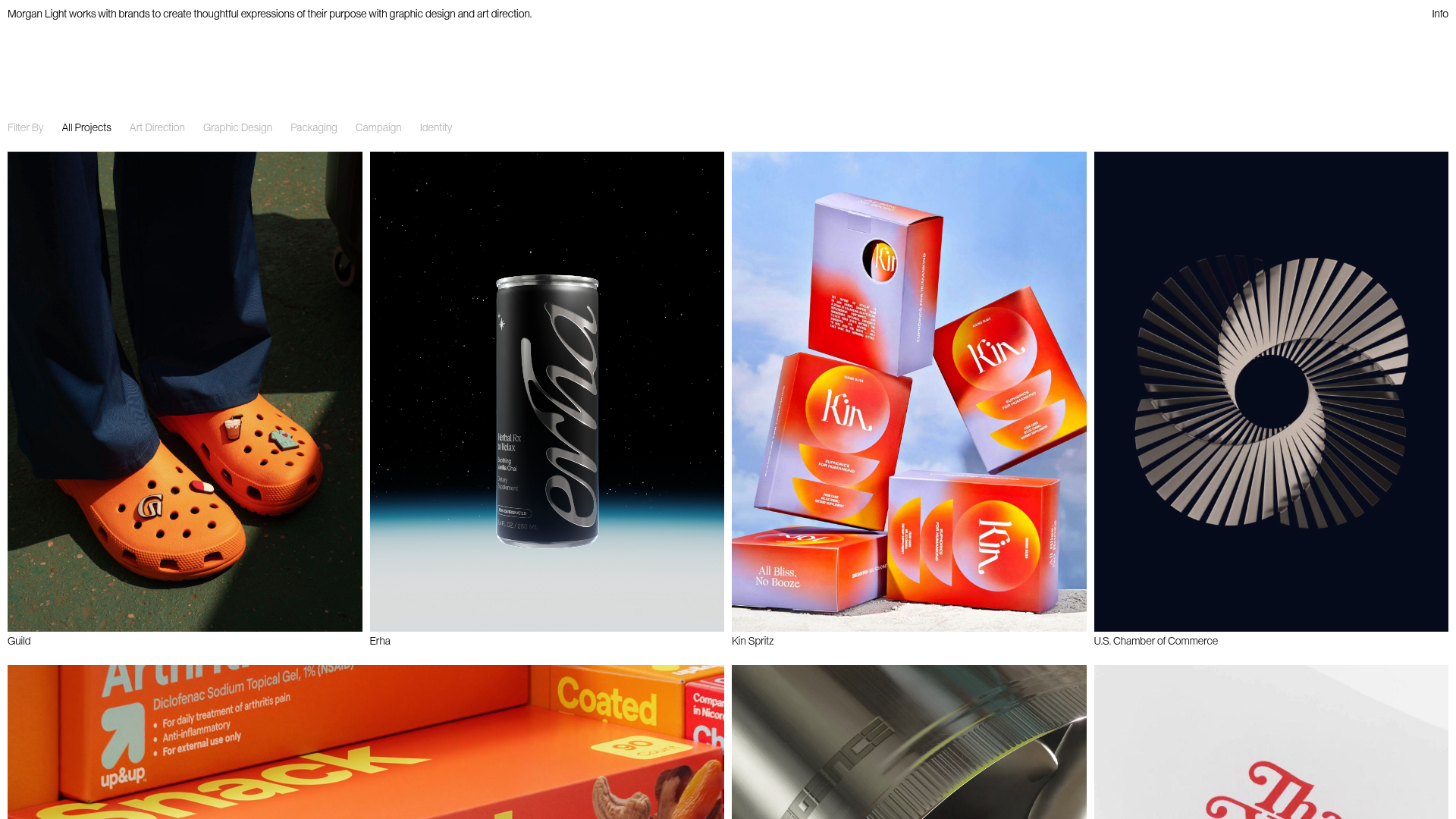
Morgan Light Design Portfolio Grid
A minimalist portfolio layout featuring a multi-column masonry-style grid with categorised project filters, image-based hover states, and smooth slide-based navigation.
Studio Otto Multi-Column Portfolio Grid
A minimalist, five-column project showcase featuring infinite-scroll vertical columns, interactive image masks, and contextual description text blocks.
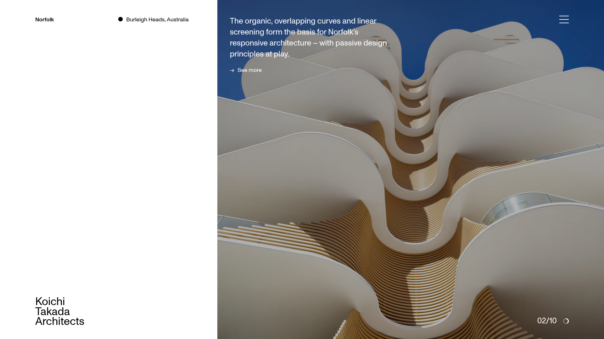
Koichi Takada Architects Portfolio Home
A high-end architectural portfolio featuring a split-screen layout with an interactive project slider, sticky typography, and smooth transition animations.

Christopher Doyle Agency Portfolio Layout
A minimalist, typography-led portfolio featuring a wide-margin grid system, smooth fade-in animations, and simple image-focused project cards.

Clase Agency Branding Portfolio
A minimalist design agency portfolio featuring a typographic hero section, full-width image articles, sticky title bars, and integrated scrolling text marquees for a clean editorial layout.
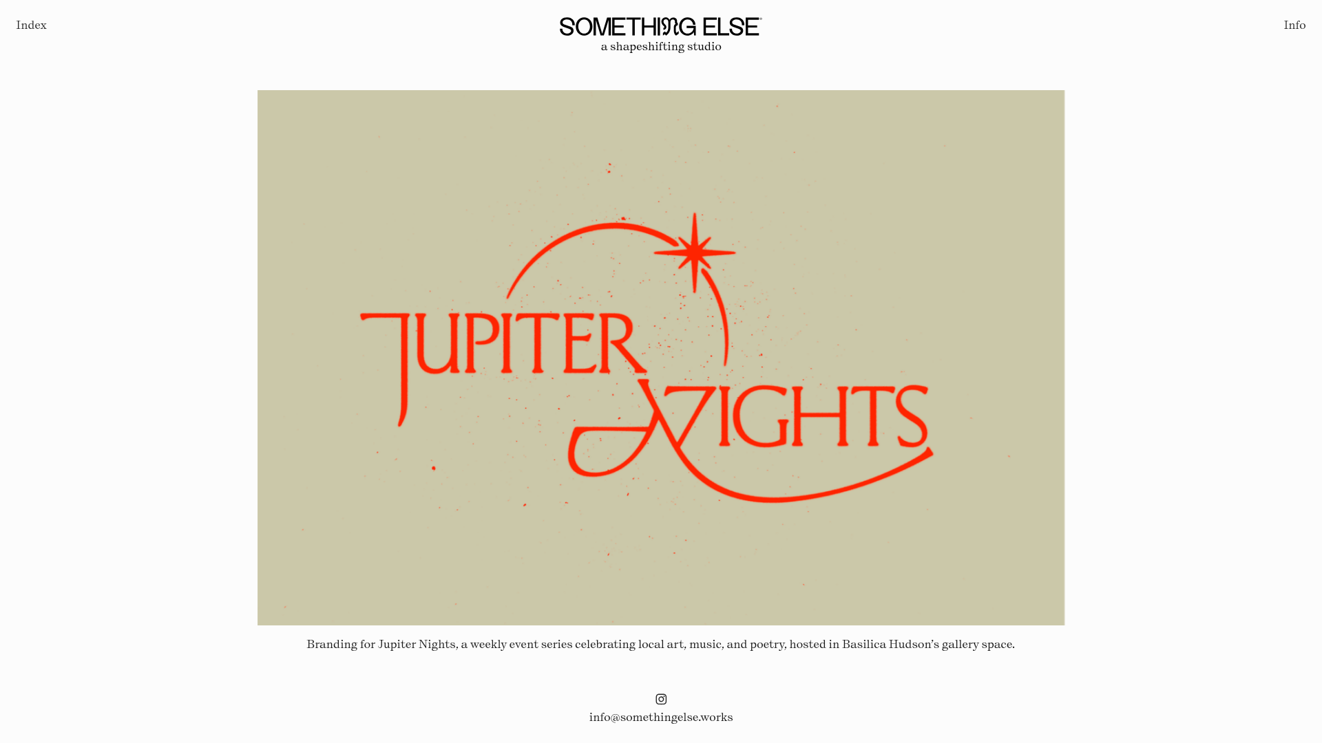
Something Else Portfolio Slideshow
A minimalist design studio portfolio featuring a full-width image and video slideshow with large-scale typography, sticky navigation, and centered captions.
