Minimalist Design Engineer Portfolio Layout
A clean, text-driven bio page featuring a single-column layout, subtle typography treatments, and a utility-based footer with social links and clipboard functionality.
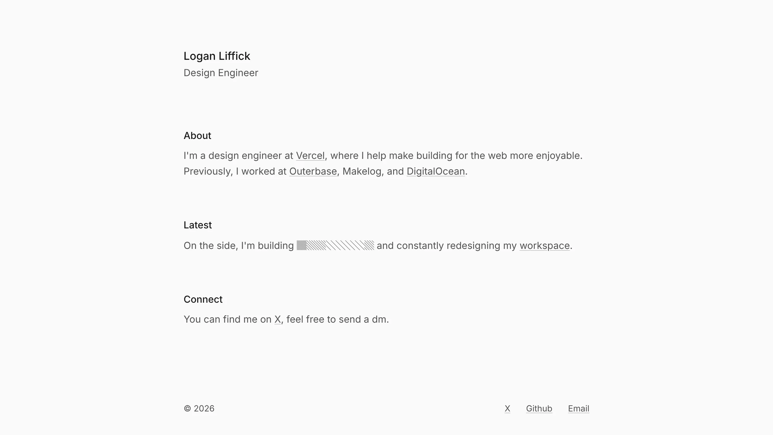
Overview
This is a minimalist, single-column personal landing page designed for professionals who prioritize clarity and content over visual flair. It serves as an excellent reference for a high-signal, low-noise bio page, demonstrating how to use ample whitespace and measured typography to establish authority.
Design System
- Color Palette & Visual Hierarchy: The site uses a high-contrast monochromatic scheme. A neutral off-white background paired with black text creates a paper-like feel. Hierarchy is established through font weight and shade variations (using classes like
text-base-softfor secondary information). - Typography: The system relies on a clean sans-serif stack. Headers use a medium weight (
text-lg font-medium), while body text remains balanced with subtle underlines on links. A monospace font is used specifically for "hidden" or technical data points (e.g., the ASCII-style block for building updates). - Page Structure: The layout follows a linear vertical flow: Header (Name/Title) → Content Sections (About, Latest, Connect) → Utility Footer. This "standard document" flow makes it highly accessible and mobile-friendly.
- Reusable Components:
- Text Links: Standardized link styling with
decoration-current/30and smooth hover transitions. - Utility Footer: A split-row footer containing a copyright stamp and a navigation cluster.
- Clipboard Button: An email link wrapped in a relative container with a hidden "Copied to clipboard" tooltip (
reveal-xs) that triggers via state.
- Text Links: Standardized link styling with
- Interaction & Motion: The design utilizes subtle transitions (0.8s duration) and blur effects for tooltips. Links feature a color transition on the underline rather than the text itself, minimizing visual jarring during hover.
- Implementation Clues: The HTML confirms the use of Tailwind CSS for styling (
flex,max-w-2xl,gap-2). The naming conventions for colors (e.g.,bg-base-1000/50) suggest a custom-themed design system structure.
Use Cases
- Who should clone this: Individual contributors, design engineers, or researchers looking for a "digital business card" that emphasizes work history and current projects without needing a full-scale portfolio.
- Remix Directions:
- Brand Adaptation: Swap the monochromatic scale for a brand-specific accent color (e.g., replacing neutral underlines with a signature brand hue).
- Content Pivot: Adapt the "Latest" section into a live stream of recent blog posts or a mini-changelog for a solo-developer product.
- Functional Reuse: Extract the clipboard utility for contact sections in larger sites to reduce friction for recruiters or leads.
- Suggested Clone Scope: A full-page clone is ideal for its simplicity, though the responsive typography and link-hover system are the most valuable individual units for reuse.
Related Inspirations

Baubauwerk Minimal Agency Portfolio Homepage
A clean studio site featuring a centered text hero, scatter-plot filterable project gallery, and full-bleed image sections for case studies.
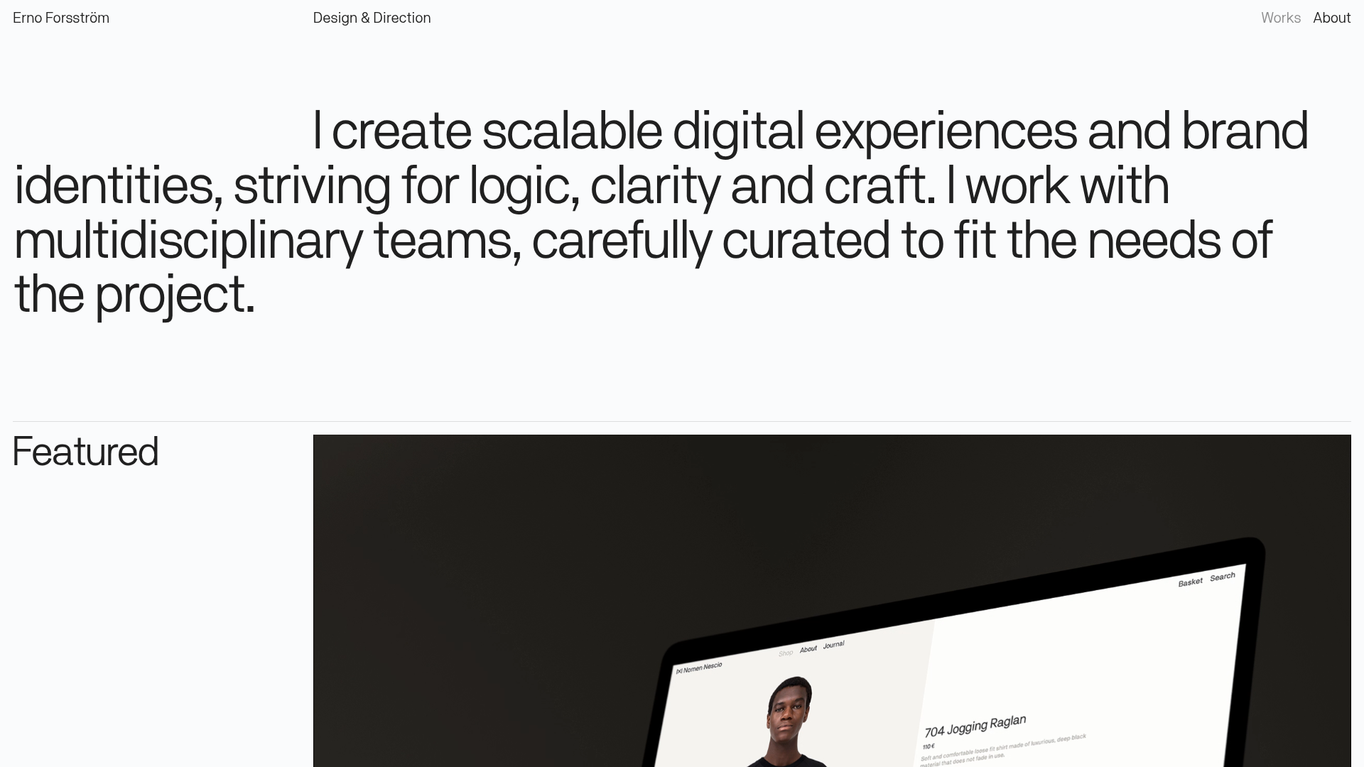
Erno Works Minimalist Design Portfolio
A clean, typography-focused portfolio featuring a sticky grid layout, large editorial headers, and integrated video project thumbnails for dynamic case study previews.
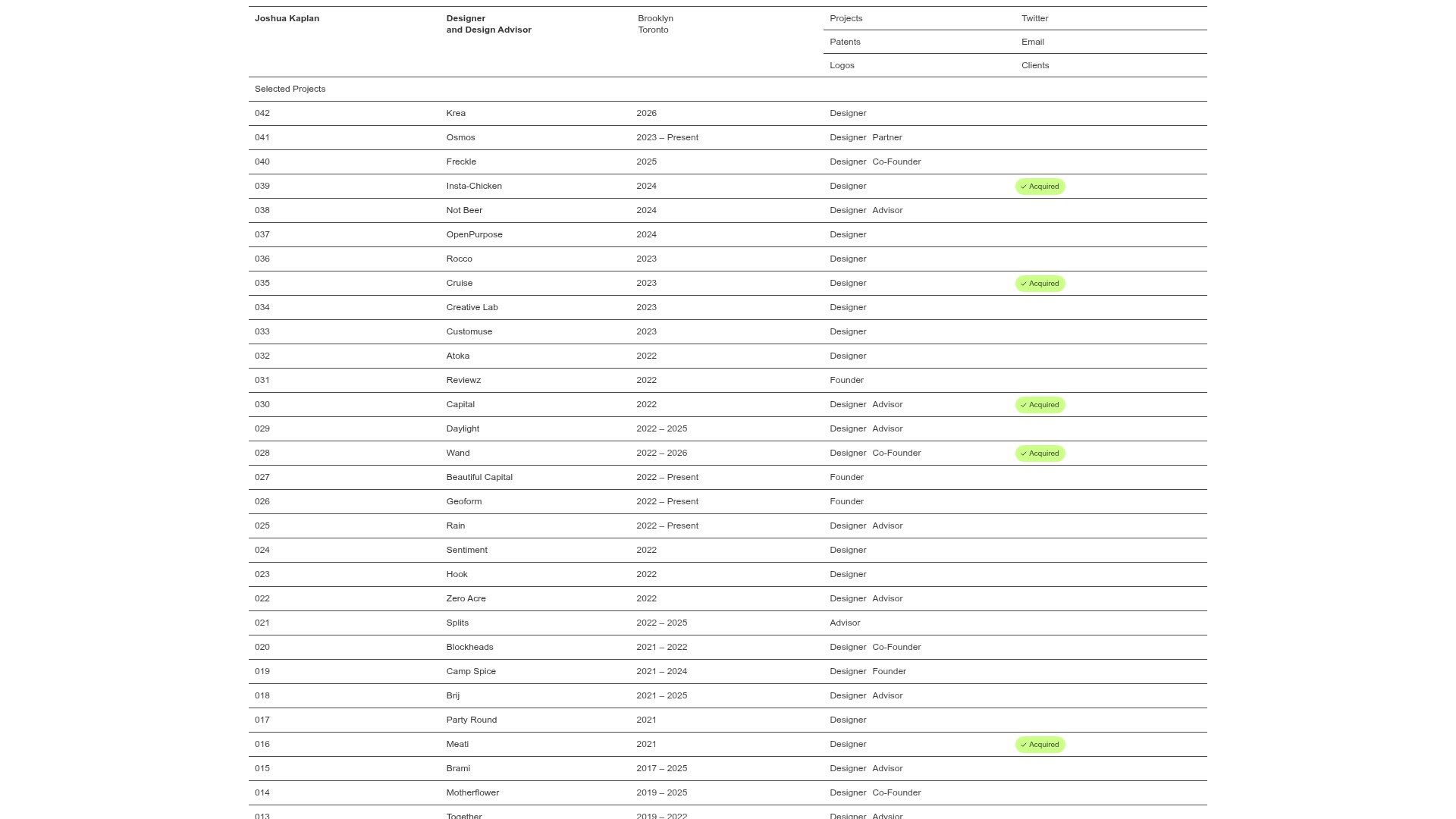
Joshua Kaplan Portfolio Index
A minimalist, text-only portfolio layout featuring an expansive tabular list of projects with horizontal rule separators and clean typography.
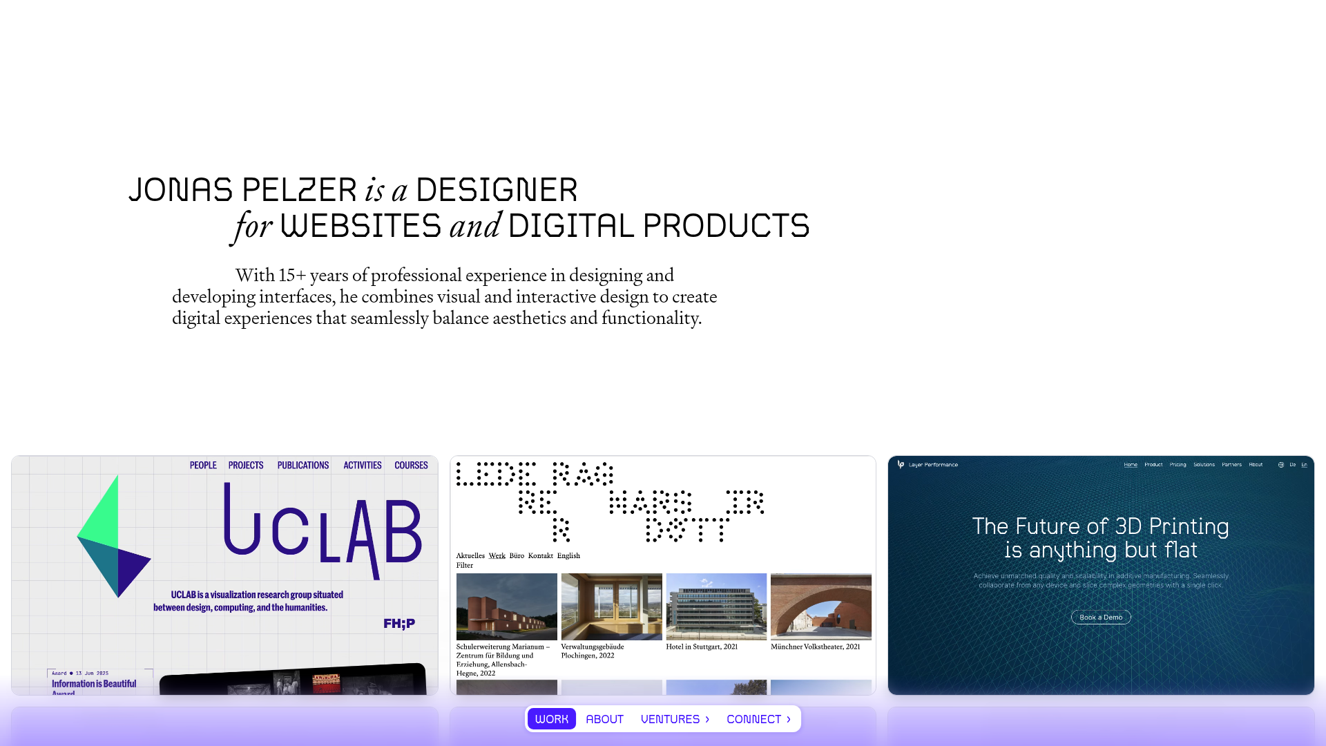
Jonas Pelzer Portfolio Showcase
A minimalist design portfolio featuring a large typography hero, a staggered video project grid, and a sticky tab-based navigation bar for content switching.
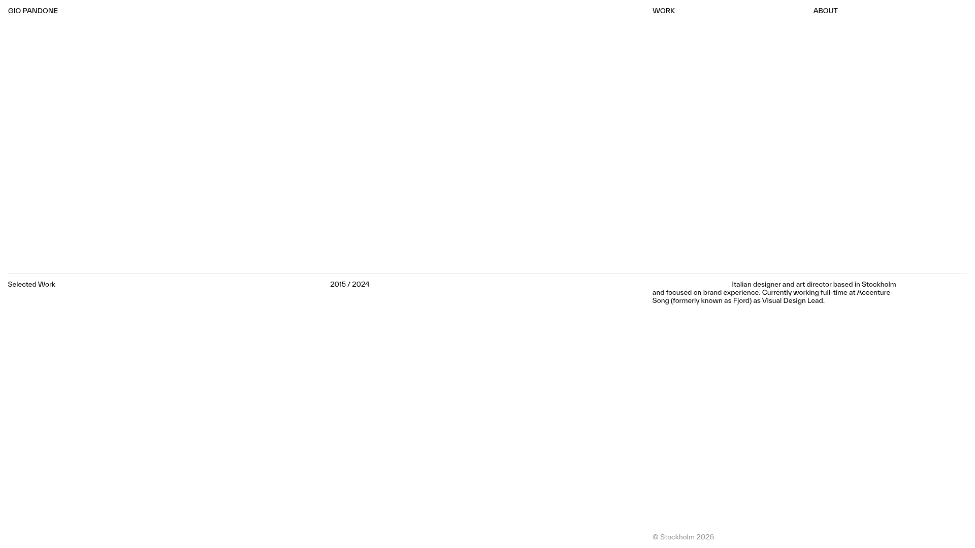
Gio Pandone Minimalist Portfolio Template
A clean, grid-based designer portfolio featuring a sticky minimalist navigation, scroll-triggered entrance animations, and a responsive 12-column work gallery with embedded video previews.
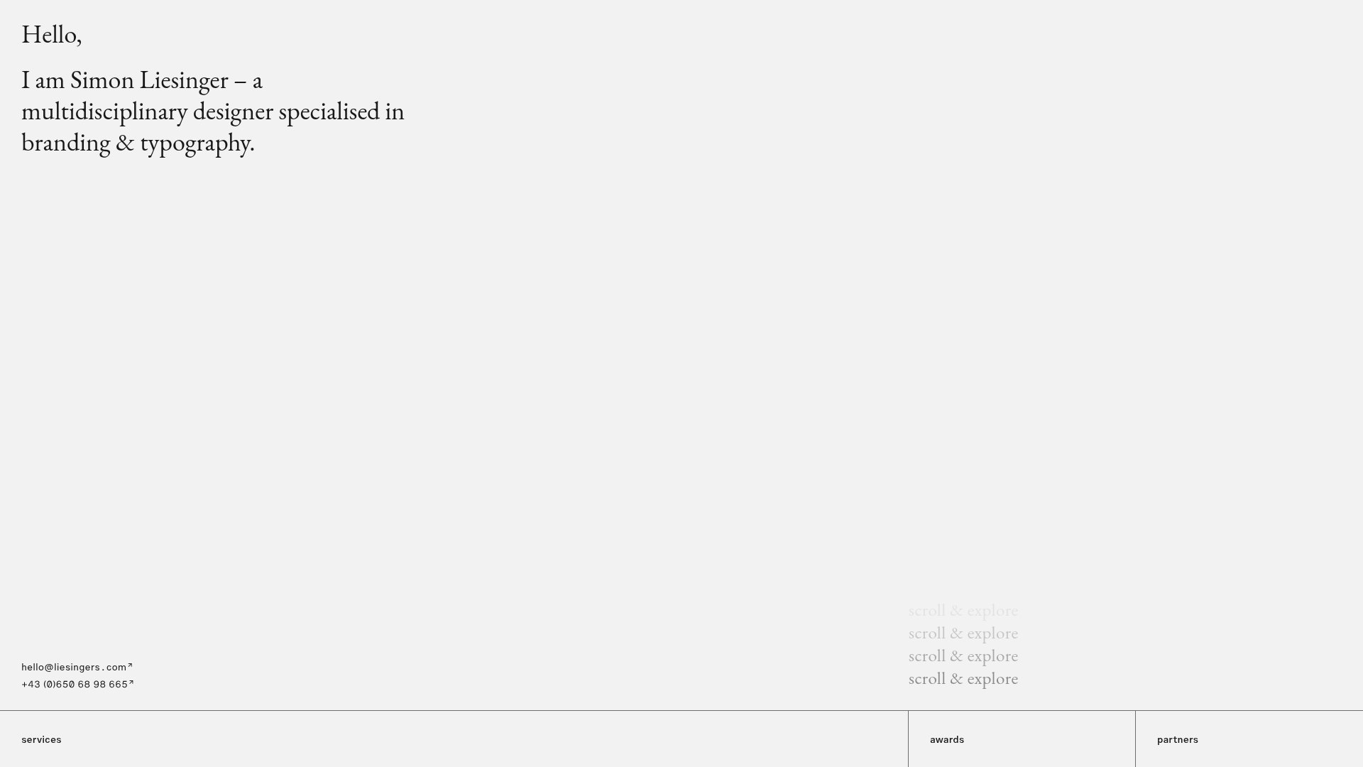
Minimalist Typography Portfolio and Services Grid
A clean, serif-heavy layout featuring an A-Frame 3D hero animation, tiered service lists, and a modular multi-column text structure for design manifestos.
