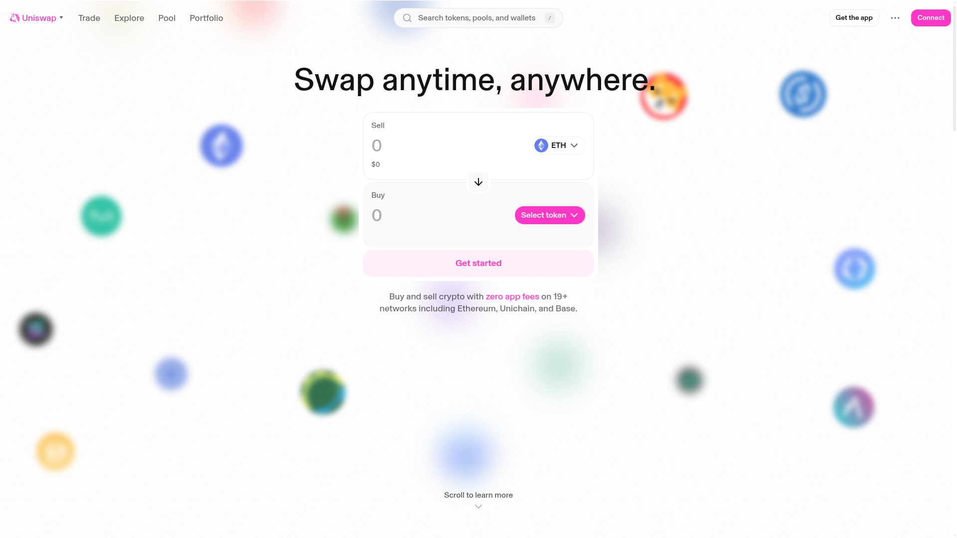
Uniswap Crypto Swap Interface
Minimalist DEX landing page featuring a centered swap widget, blurred background token icons, and a clean navigation header.
Overview
Uniswap’s landing page is a masterclass in minimalist Web3 utility, focusing the user's attention entirely on a centralized swap widget. It serves as an excellent clone reference for developers building decentralized exchanges (DEX), fintech apps, or any platform requiring a high-conversion, single-purpose interface. The design successfully balances a clean, professional white aesthetic with playful, blurred background elements to create depth without distraction.
Design System
- Color Palette & Visual Hierarchy: The primary palette is high-contrast white and light gray, using a vibrant magenta/pink (
#FF00C1) as the primary action color. Hierarchy is established through size and depth; the main swap card is elevated with subtle borders and shadows, while the background consists of out-of-focus, multi-colored token icons that reinforce the "crypto" theme without cluttering the UI. - Typography System: The site utilizes a clean sans-serif typeface (likely Inter or a similar modern grotesque). It uses a bold, large-scale headline for the value proposition ("Swap anytime, anywhere.") and secondary, smaller gray text for subtext and metadata to maintain a clean information architecture.
- Page Structure: The layout is centered and symmetrical. It begins with a sticky navigation header containing a search bar and app links, followed by the hero section featuring the swap interface, and concludes with a simple scroll prompt. The swap widget itself is split into two distinct input fields (Sell/Buy) separated by a directional arrow icon.
- Reusable Components:
- The Swap Card: A two-part input field with token selectors and amount inputs.
- Interactive Buttons: The "Select token" button and "Get started" call-to-action utilize heavy saturation to draw focus.
- Nav Header: A comprehensive navigation bar with integrated search and wallet connection triggers.
- Interaction & Motion: The design implies a layered depth. The background tokens appear to be part of a subtle parallax or floating animation system. Functional components like the "Select token" dropdown and the chevron scroll indicator suggest smooth transitions and hover states.
- Implementation Clues: The HTML structure indicates a modern React or Next.js build, using utility-first styling for layout management. The use of SVGs for icons and centralized container divs suggests a responsive-first approach where the central card maintains a fixed maximum width on desktop.
Use Cases
- Who should clone this pattern: Web3 developers building token swappers, bridge interfaces, or liquidity pool dashboards who want a proven, user-friendly layout.
- Effective Remixes: This pattern works well beyond crypto for currency converters, loan calculators, or simple e-commerce checkout flows where the user needs to convert one value (X) into another (Y).
- Practical Remix Directions: Builders can swap the magenta brand color for their own primary hue and replace the blurred background token icons with product-specific imagery (e.g., blurred travel photos for a currency converter). The information architecture can be adapted by expanding the "Portfolio" or "Explore" sections if the site requires more content density.
- Suggested Clone Scope: A quick section clone of the navigation bar and the central swap widget provides 80% of the value. A full-page clone is recommended for projects seeking a complete, high-trust landing page for a dApp.
Related Inspirations
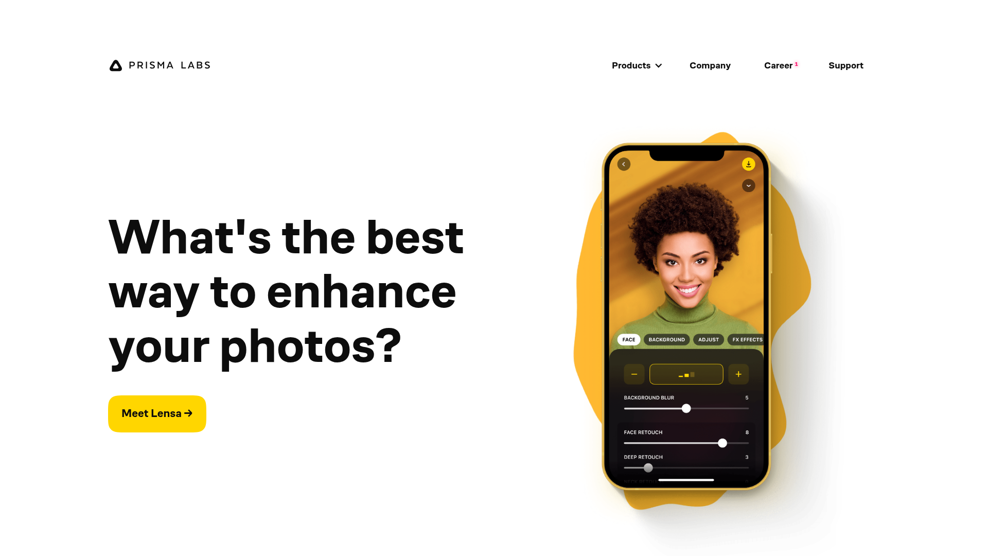
Prisma Labs App Showcase Landing
A clean SaaS landing page layout featuring large typography, magnetic hover buttons, and high-fidelity mobile app mockups with animated video blob backgrounds.
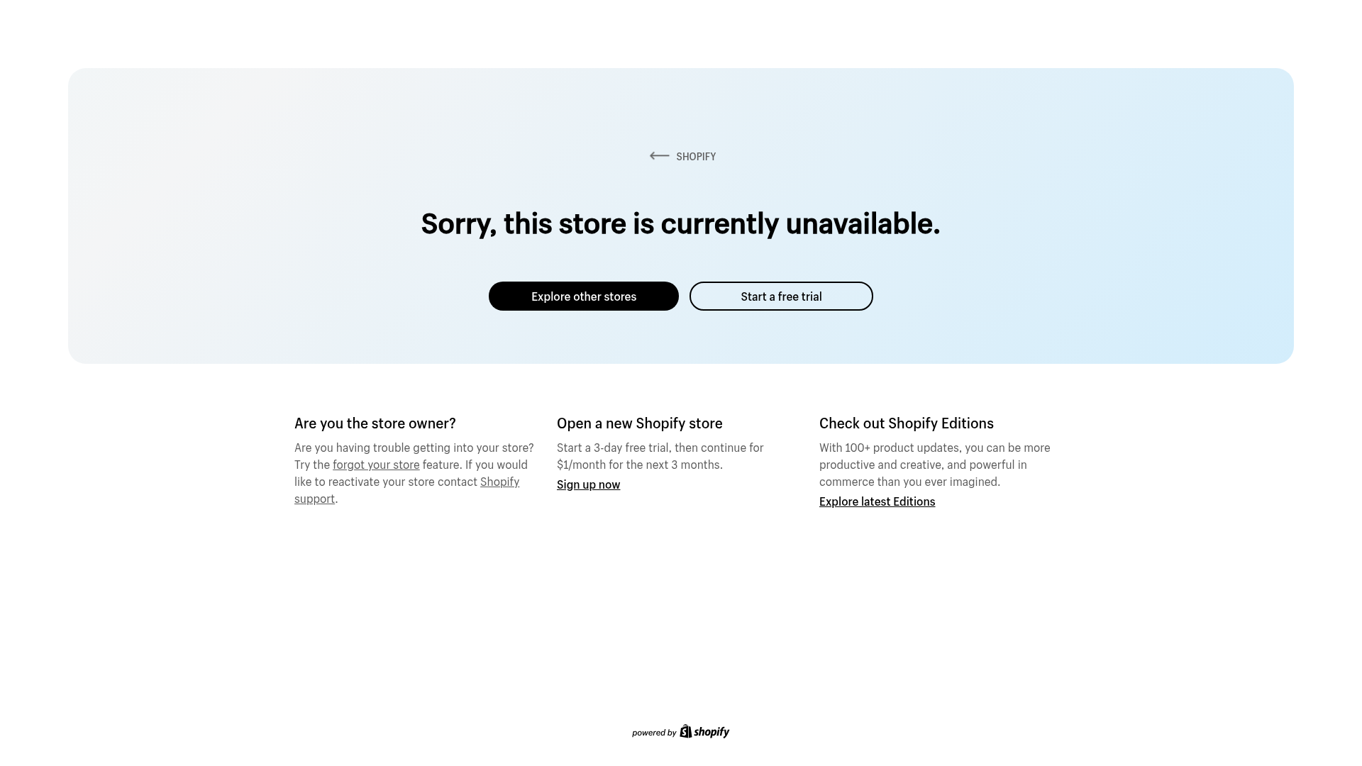
Shopify Unavailable Store Landing Page
A clean, centered error page layout featuring a hero card with rounded corners, primary/secondary action buttons, and a three-column information grid for support and CTAs.
LoveFrom Minimalist Animated Wordmark Landing
A minimalist landing page featuring a center-aligned animated wordmark, a hidden info panel, and a decorative bear animation overlay.
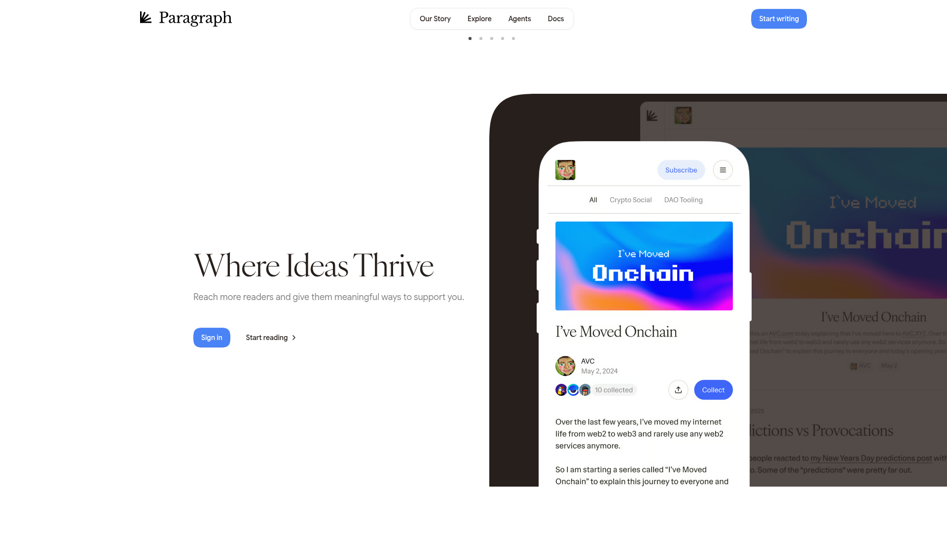
Paragraph Web3 Publishing Landing Page
Minimalist Web3 platform layout featuring a split-hero design with text-based calls to action and a mobile viewport mockup for content preview.
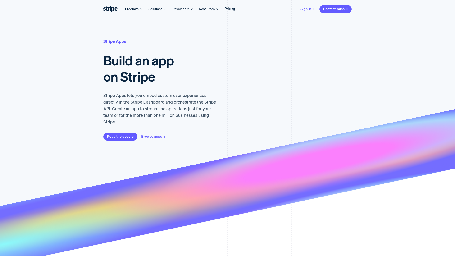
Stripe Apps Developer Portal Landing
A developer-focused landing page featuring a geometric animated gradient hero, multi-column feature sections, carousel components with code editors, and testimonial sliders.
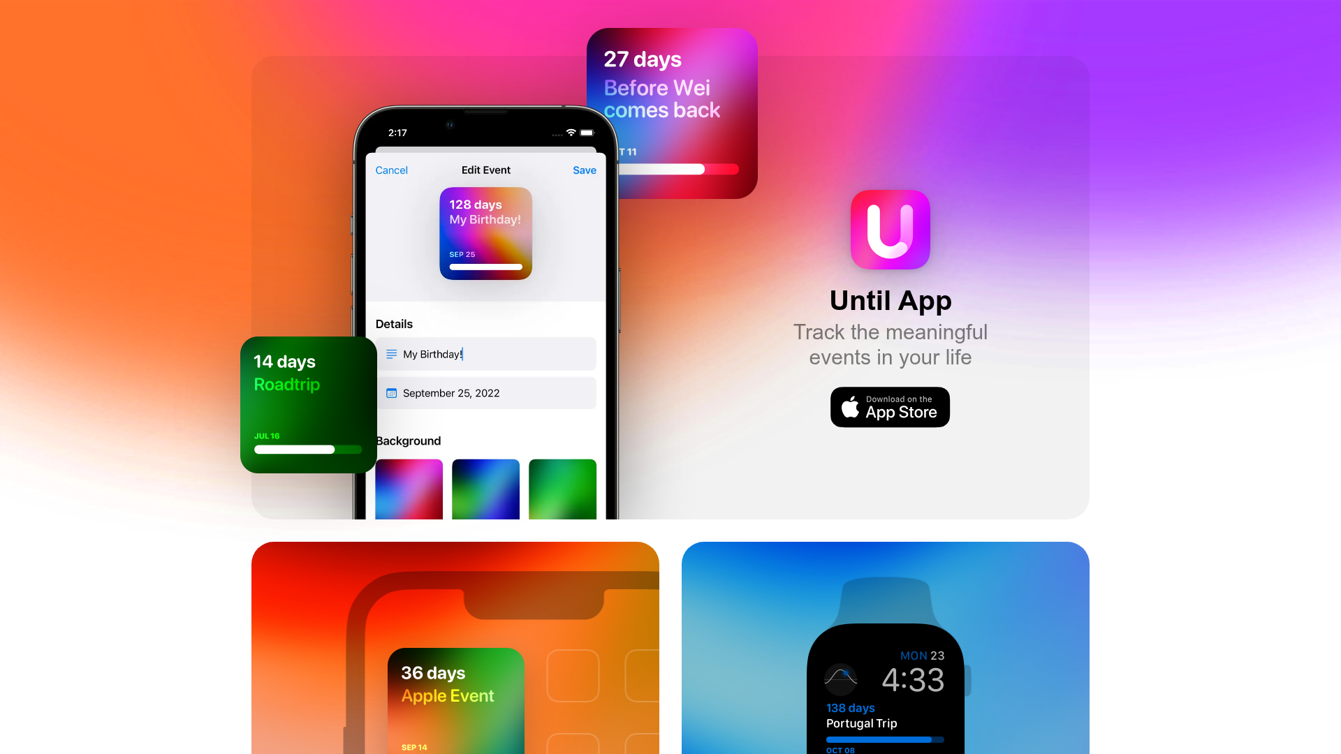
Until App Product Landing Page
A vibrant app landing page featuring a glassmorphism card layout, floating UI components, high-contrast colorful gradients, and a two-column widget section with device overlays.
