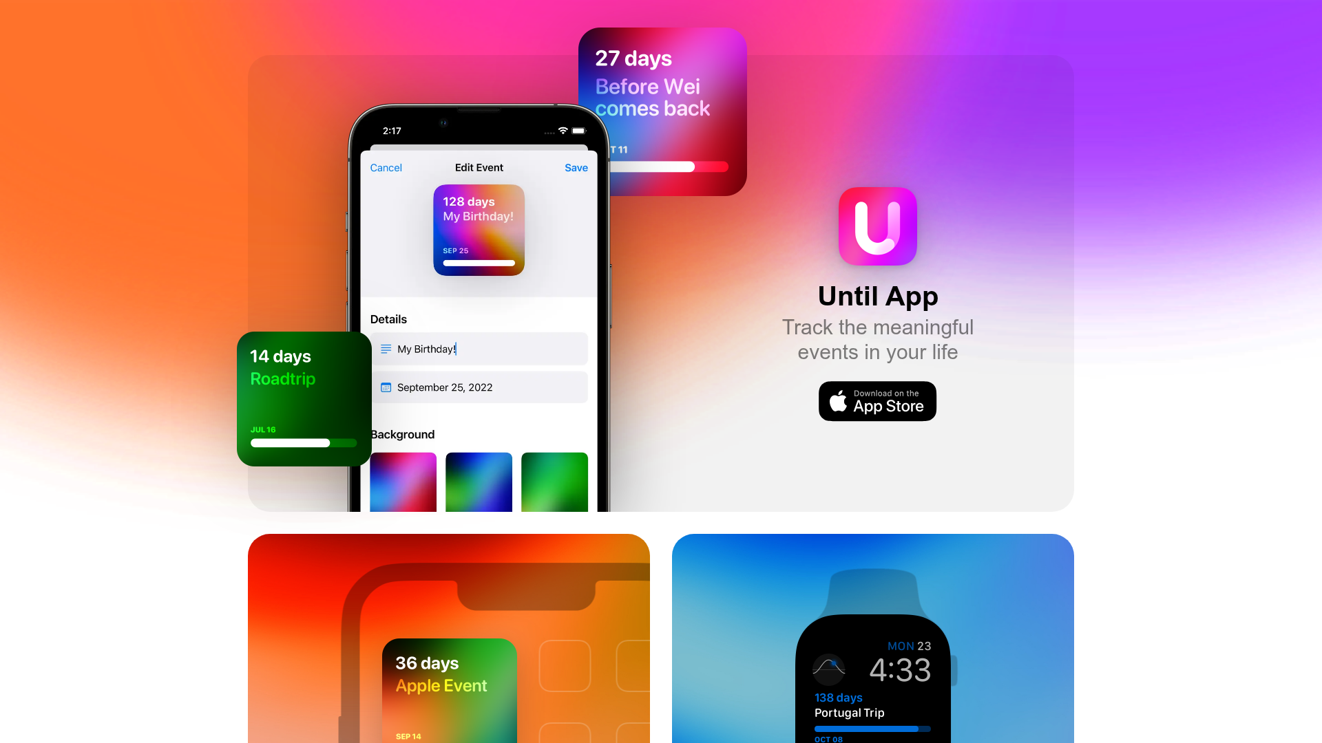
Until App Product Landing Page
A vibrant app landing page featuring a glassmorphism card layout, floating UI components, high-contrast colorful gradients, and a two-column widget section with device overlays.
Overview
Until App’s landing page is a masterclass in modern, iOS-inspired aesthetics, utilizing a glassmorphism card layout and floating UI elements to showcase product functionality. It is an excellent clone reference for developers looking to implement high-vibrancy gradients, layered device mockups, and a minimalist single-page structure.
Design System
- Color Palette & Visual Hierarchy: The design centers on a high-contrast, multi-color gradient background (pinks, oranges, and purples). Visual hierarchy is established through depth; the central white glassmorphism card sits atop the background, while floating "widget" images (e.g., the roadtrip and birthday cards) use drop shadows to appear on a separate Z-axis.
- Typography: The typography system is clean and sans-serif, mimicking Apple's SF Pro aesthetic. The title
Until Appuses a bold weight and large scale, while secondary labels (e.g., "iOS Widget") use a smaller, medium-weight gray font for metadata. - Page Structure & Flow: The layout follows a top-down modular stack: a hero card containing the main app screenshot and call-to-action (CTA), followed by a two-column grid (
WidgetSection_section__mzOlu) showcasing cross-platform compatibility (iPhone and Apple Watch), an "About Me" section with a memoji avatar, and a simple text-based footer. - Reusable Components: The
AppCardis the primary reusable unit—a rounded container with internal padding and flexbox alignment for the icon and text. TheWidgetCardis another key component, featuring an image overlay (phone-overlay.png) on top of a colored gradient background to simulate a product environment. - Interaction & Implementation: Based on the HTML class names (e.g.,
Layout_container__S4aNf), the site is built with Next.js using CSS Modules. The implementation relies on intrinsic image scaling and absolute positioning to create the "floating" effect for UI components like the roadtrip card. - Responsive Behavior: The layout transitions from a wide-card desktop view into a vertical stack. Sub-sections like the
WidgetSectionuse a flexible grid that can easily collapse from two columns to one on smaller viewports.
Use Cases
- Who Should Clone This: Mobile app developers launching a single-purpose utility or lifestyle app who need a high-quality "social proof" landing page quickly.
- Effective Remixes: This pattern works perfectly for digital portfolios, SaaS tool snippets, or browser extension landing pages. The "About Me" section can be easily swapped for a "Testimonials" or "Pricing" block.
- Remix Directions: Builders can swap the vibrant background
gradient.pngfor a more muted corporate palette while keeping the glassmorphism card structure. The device overlays (iPhone/Watch) can be replaced with iPad or desktop browser frames for web-based products. - Clone Scope: A full-page clone is ideal for a fast launch, but cloning the
WidgetCardstructure alone is highly valuable for anyone needing to display product snapshots inside stylized device frames.
Related Inspirations
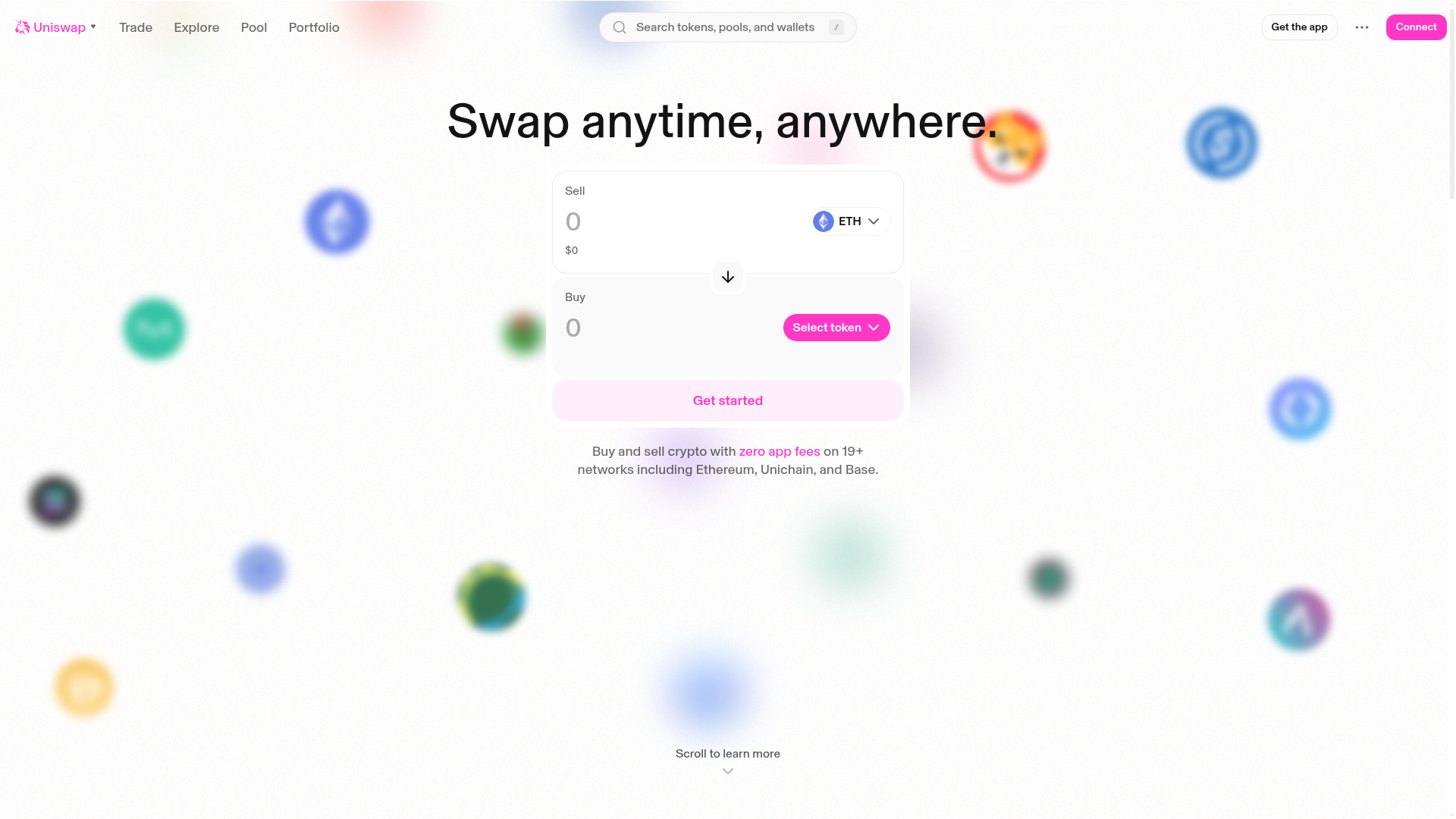
Uniswap Crypto Swap Interface
Minimalist DEX landing page featuring a centered swap widget, blurred background token icons, and a clean navigation header.
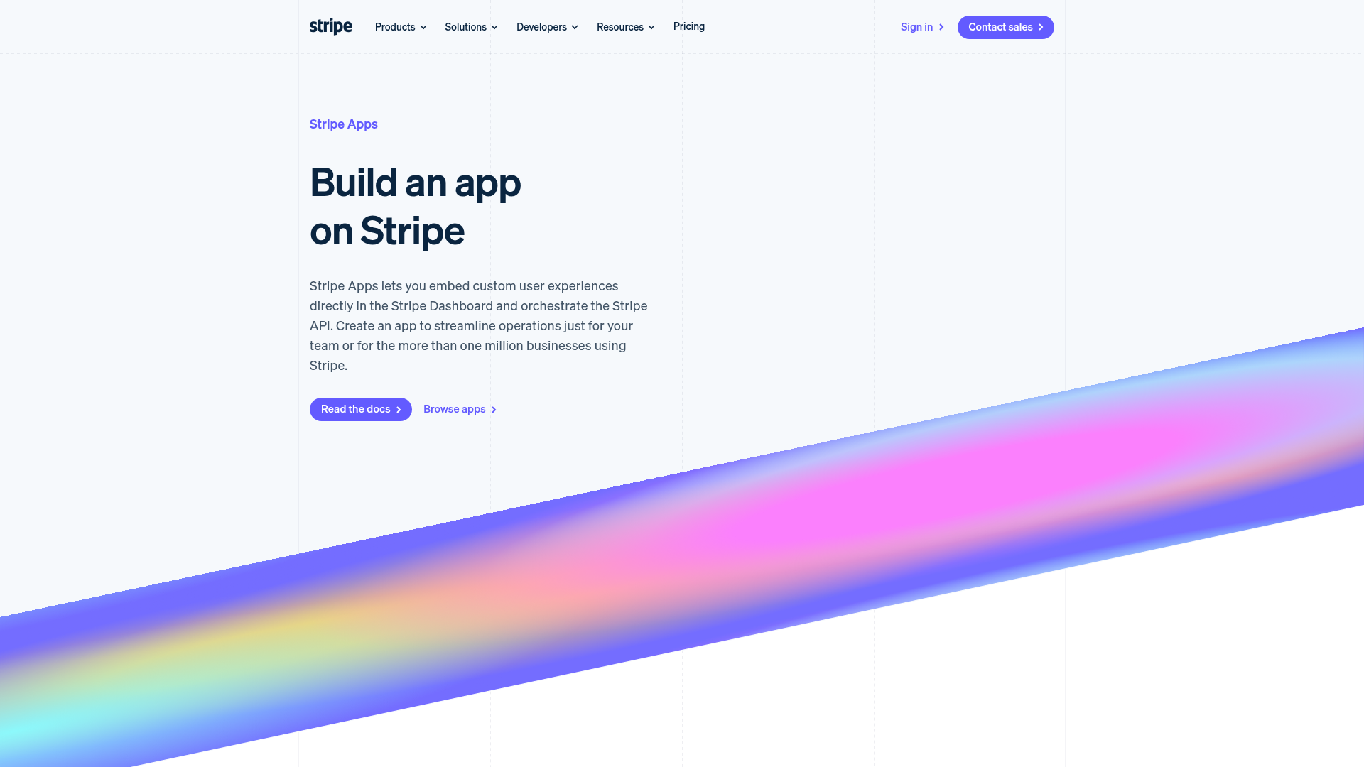
Stripe Apps Developer Portal Landing
A developer-focused landing page featuring a geometric animated gradient hero, multi-column feature sections, carousel components with code editors, and testimonial sliders.
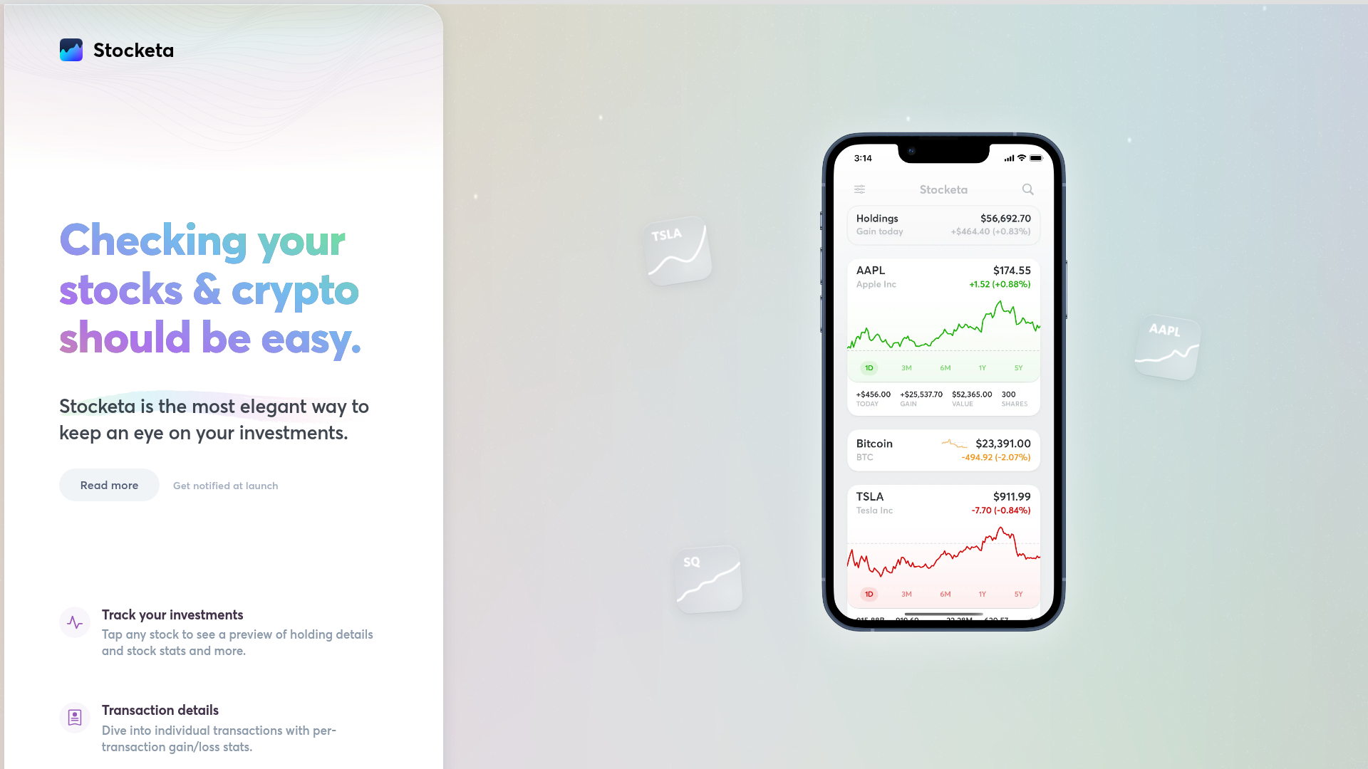
Stocketa Portfolio Tracker Landing Page
A split-screen landing page featuring a text-gradient hero, a sticky mobile app frame with parallax floating elements, and a feature grid with custom icons.
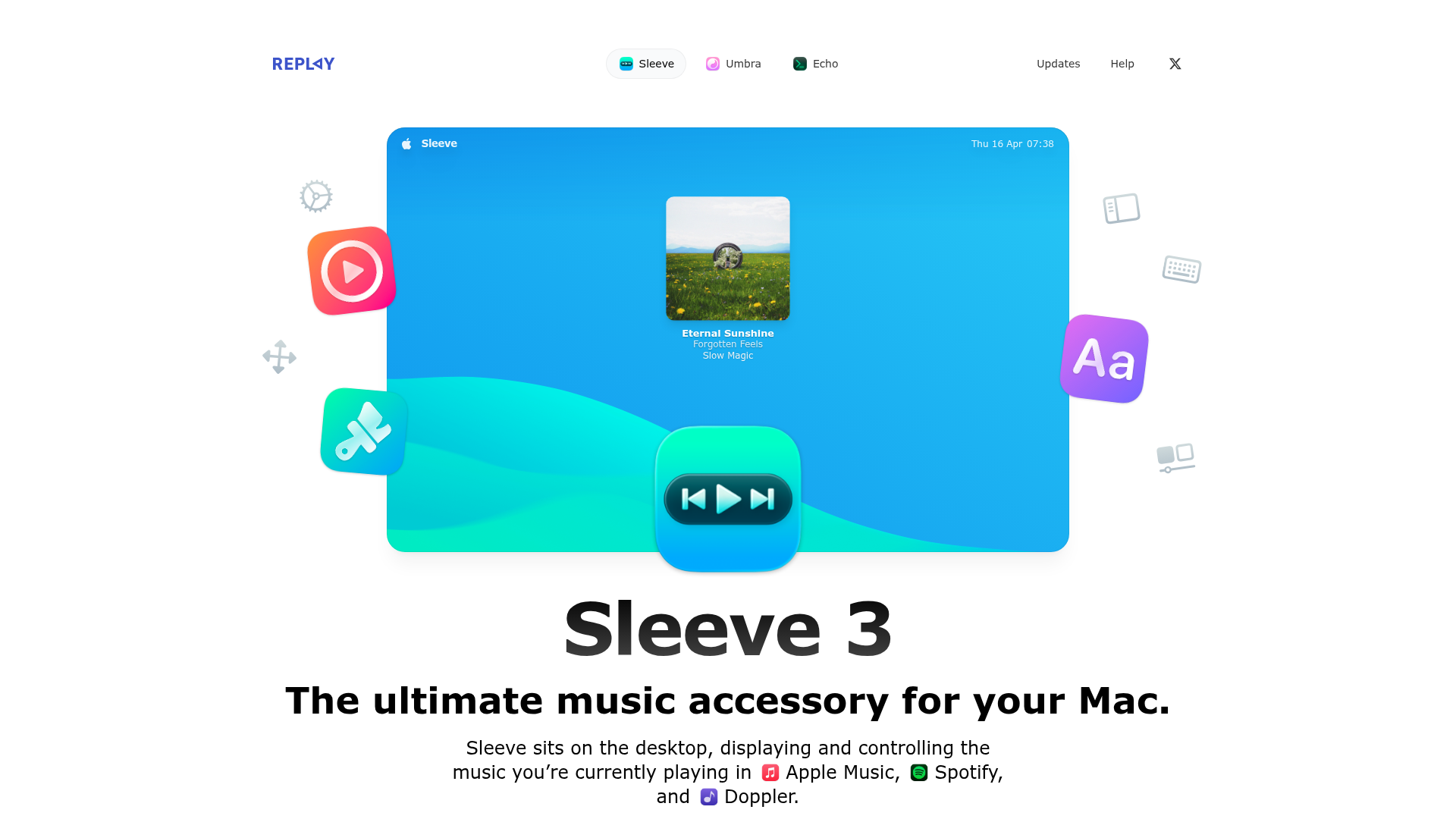
Sleeve 3 Software Landing Page
A clean product landing page featuring a centered hero section with floating decorative icons, soft gradients, and integrated app integration badges.
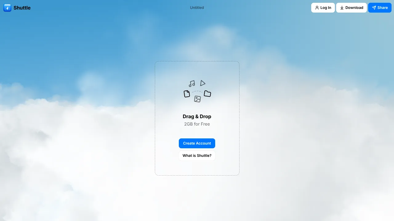
Shuttle Cloud File Transfer Landing
A minimalist file sharing interface featuring a full-screen Three.js animated cloud sky background, translucent glassmorphism UI center-card, and drag-and-drop interaction zones.
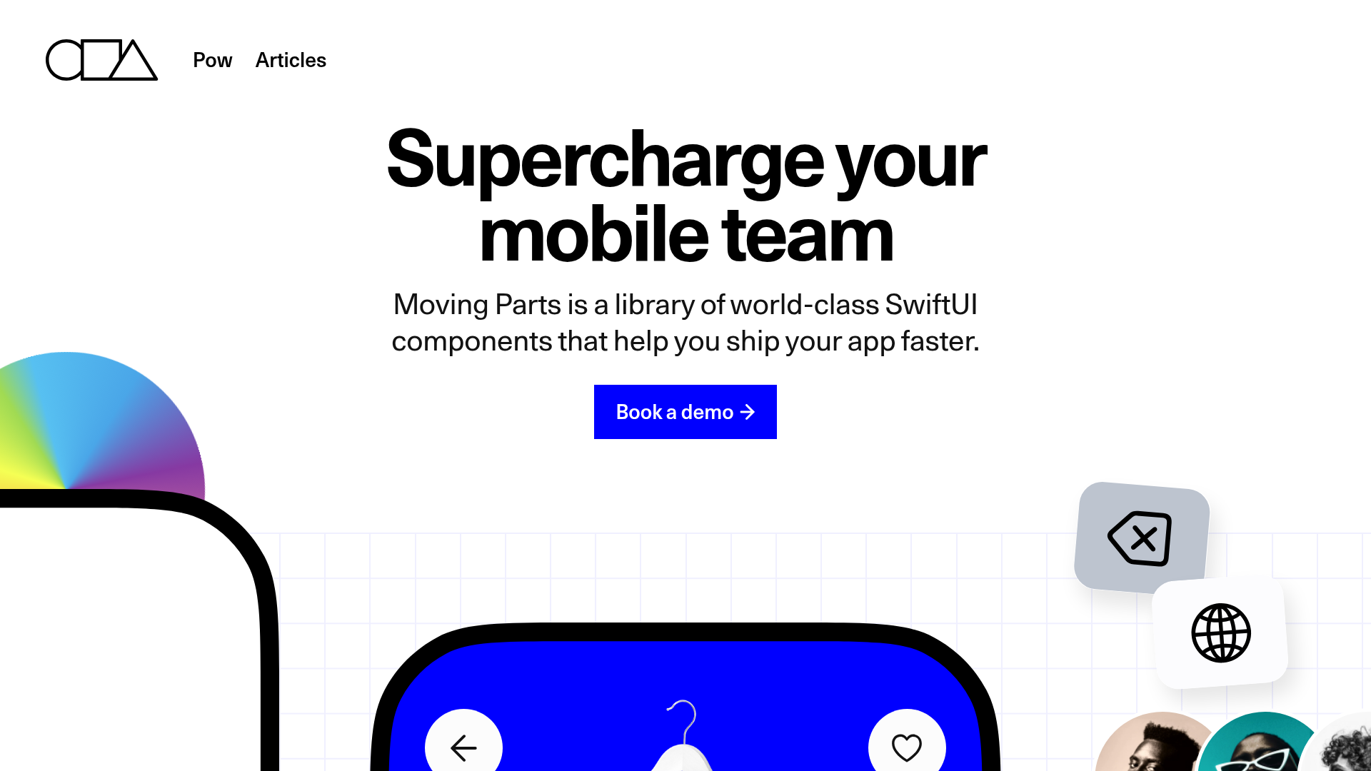
Moving Parts SwiftUI Component Library
A high-performance landing page featuring a interactive code comparison toggle, animated mobile UI previews, and a clean minimalist aesthetic for developer tools.
