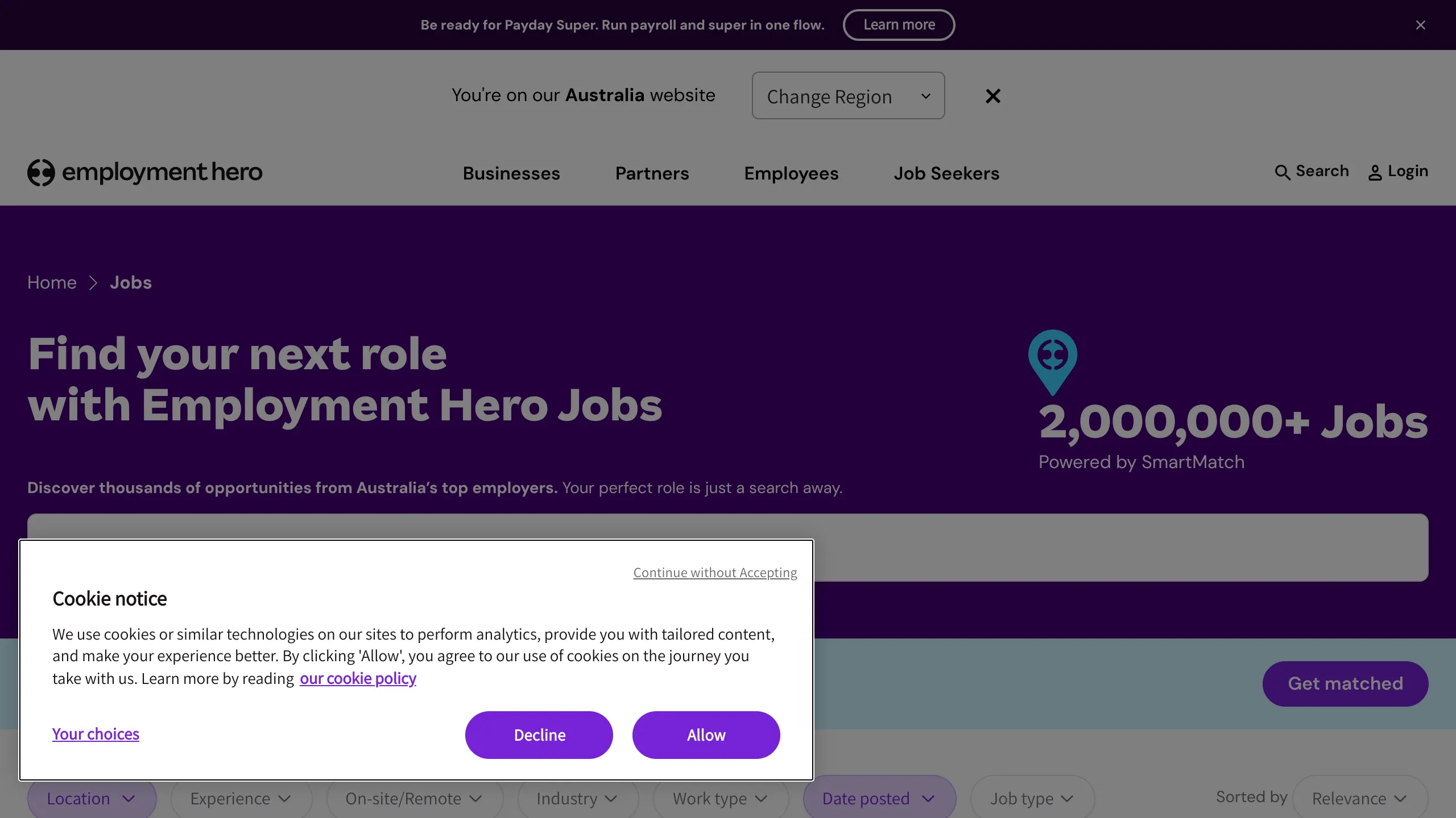
Employment Hero Jobs Board Landing
A job search portal featuring a dark-themed hero with a tiered filtering system, location selector, and a robust mega-menu with icon-based navigation categories.
Overview
This landing page is a high-performance job board portal that combines a dense, multi-functional navigation system with a streamlined search interface. It serves as an excellent reference for builders creating marketplace aggregators or recruitment platforms that need to balance deep site architecture with a simple user-facing entry point.
Design System
- Color Palette & Visual Hierarchy: The site uses a sophisticated deep purple (
#2e008bor similar) for the hero section, creating a sense of authority and modernity. This is contrasted with a clean white and light gray background for the search and filtering area. Accent colors include vibrant violet for primary buttons and a soft teal for the "Get matched" call-to-action. - Typography: The system relies on a bold, geometric sans-serif for headings (e.g., "Find your next role") with a smaller, high-readability sans-serif for UI labels and descriptions. Hierarchy is maintained through heavy weight variations (700-800) for primary titles and uppercase tracking for category labels like "HIRING" or "PAYROLL".
- Page Structure: The layout flow begins with a global notification banner, followed by a region-selection utility bar, a fixed mega-menu header, and finally a high-contrast hero section containing the primary search input and a secondary filtering row.
- Reusable Components:
- Mega-Menu: A highly structured navigation system featuring icon-based categories, sub-menu descriptions, and "Featured" or "Learn" sidebars.
- Tiered Search Bar: A large, unified search input paired with a secondary row of specific dropdown filters (Location, Experience, Industry, Work type).
- Cookie Consent Modal: A well-designed overlay with clear primary/secondary actions.
- Interaction Patterns: The navigation utilizes hover-triggered mega-menus with smooth state changes. Dropdown filters use chevron indicators and hover states to denote interactivity. The layout includes a "sticky" headers logic to keep navigation accessible.
- Responsive Behavior: The HTML reveals a
hide-on-desktopandonly-show-on-desktoputility system. On mobile, the multi-column mega-menu collapses into a standard hamburger menu, and the horizontal filter bar likely transforms into a scrollable list or a full-screen filter modal.
Use Cases
- Who should clone this: Developers building job boards, real estate listings, or complex SaaS marketing sites that require a robust information architecture behind a simple search interface.
- Effectively remixable for: Talent marketplaces, localized service directories, or educational course aggregators.
- Practical remix directions: Swap the deep purple hero for a brand-specific gradient, or repurpose the mega-menu structure for an e-commerce site with many categories. The informational footer within the sub-menus (e.g., "See Pricing") is a great pattern to reuse for conversion-focused navigation.
- Suggested clone scope: The hero section search and filter bar is a target for a "quick section clone," while the full mega-menu and utility header system are better suited for a full-page architectural clone.
Related Inspirations
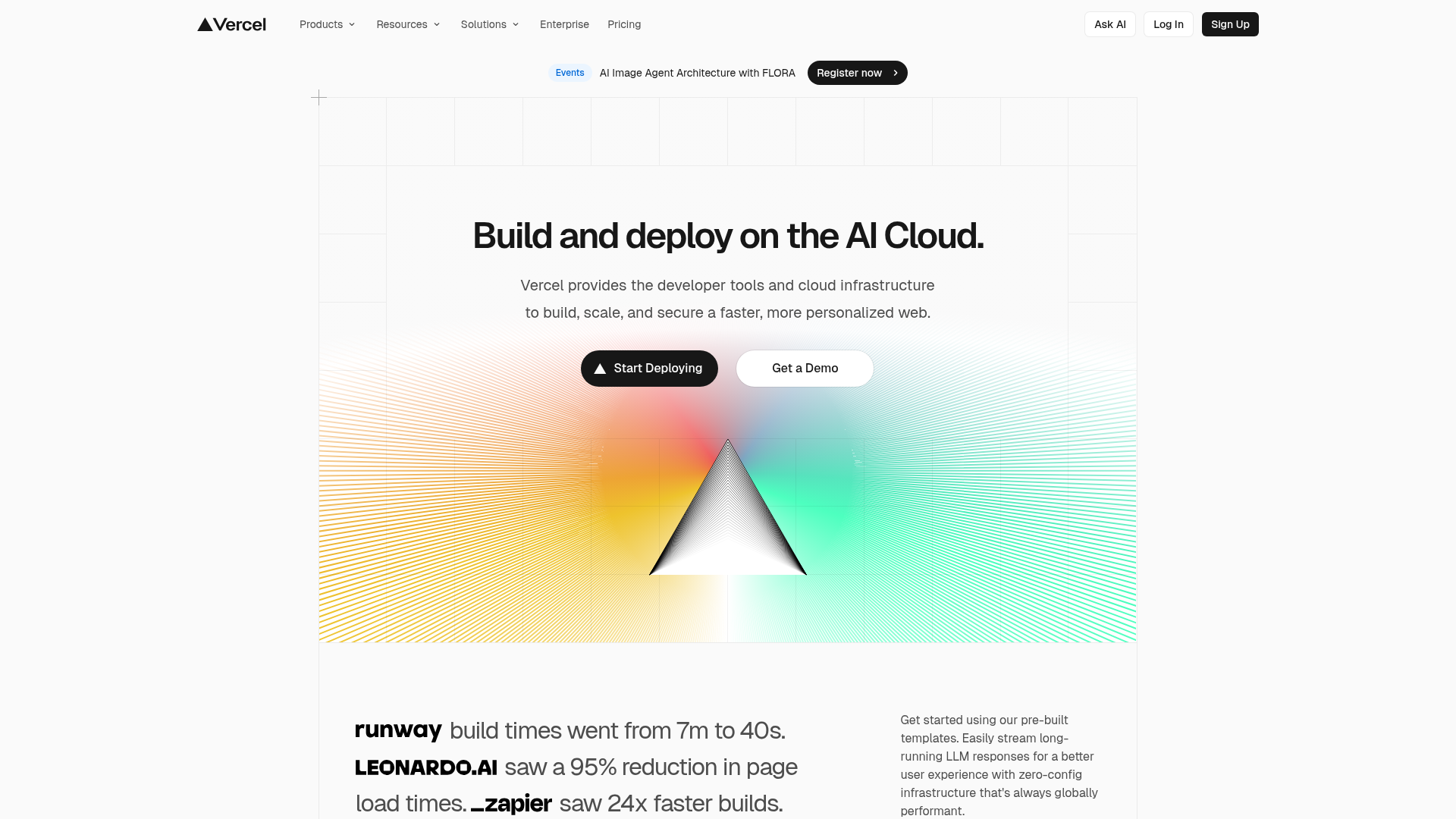
Vercel AI Cloud Landing Page
A modern landing page featuring a minimalist dark-themed navbar, a grid-overlay hero section with radial color gradients, and high-contrast typography for customer success stories.
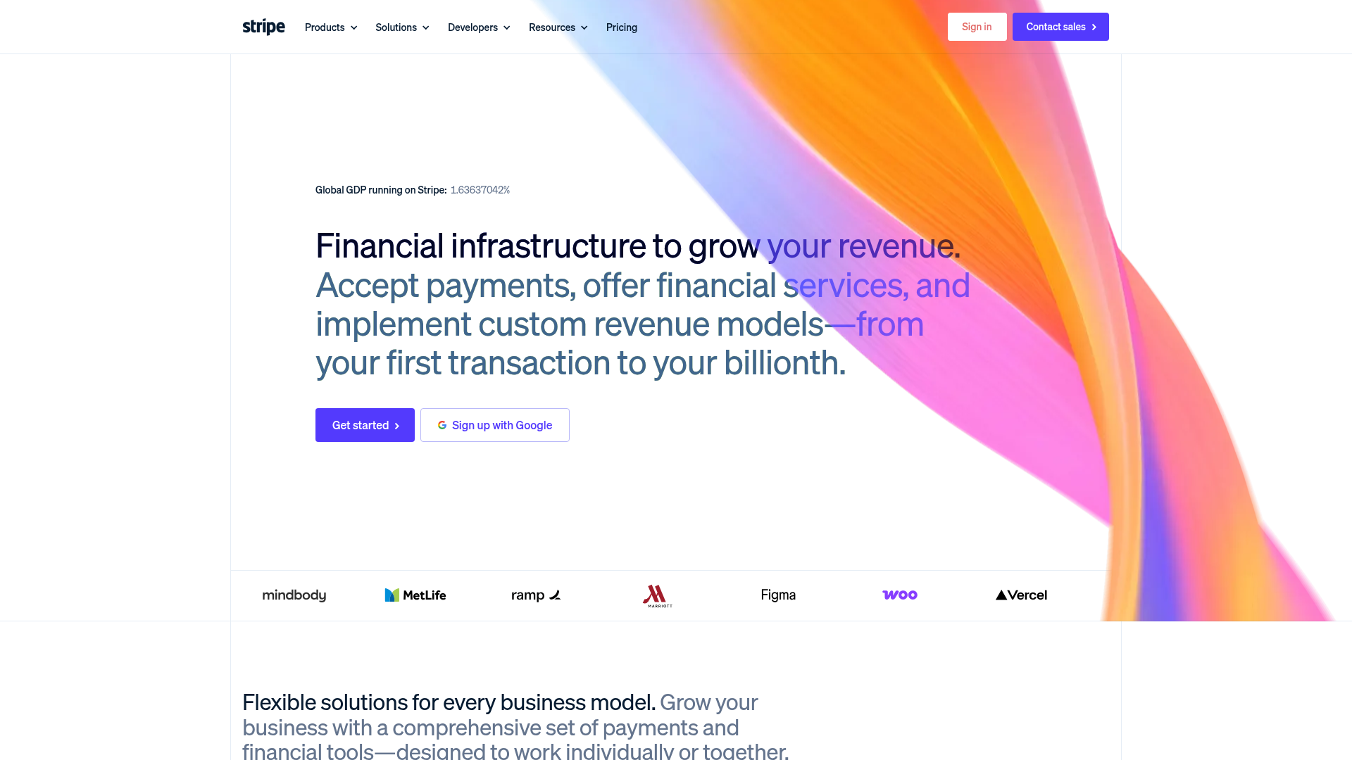
Stripe Modern SaaS Landing Page
A high-conversion landing page featuring a complex mesh-gradient hero, sticky navigation, and a horizontal logo wall for brand social proof.
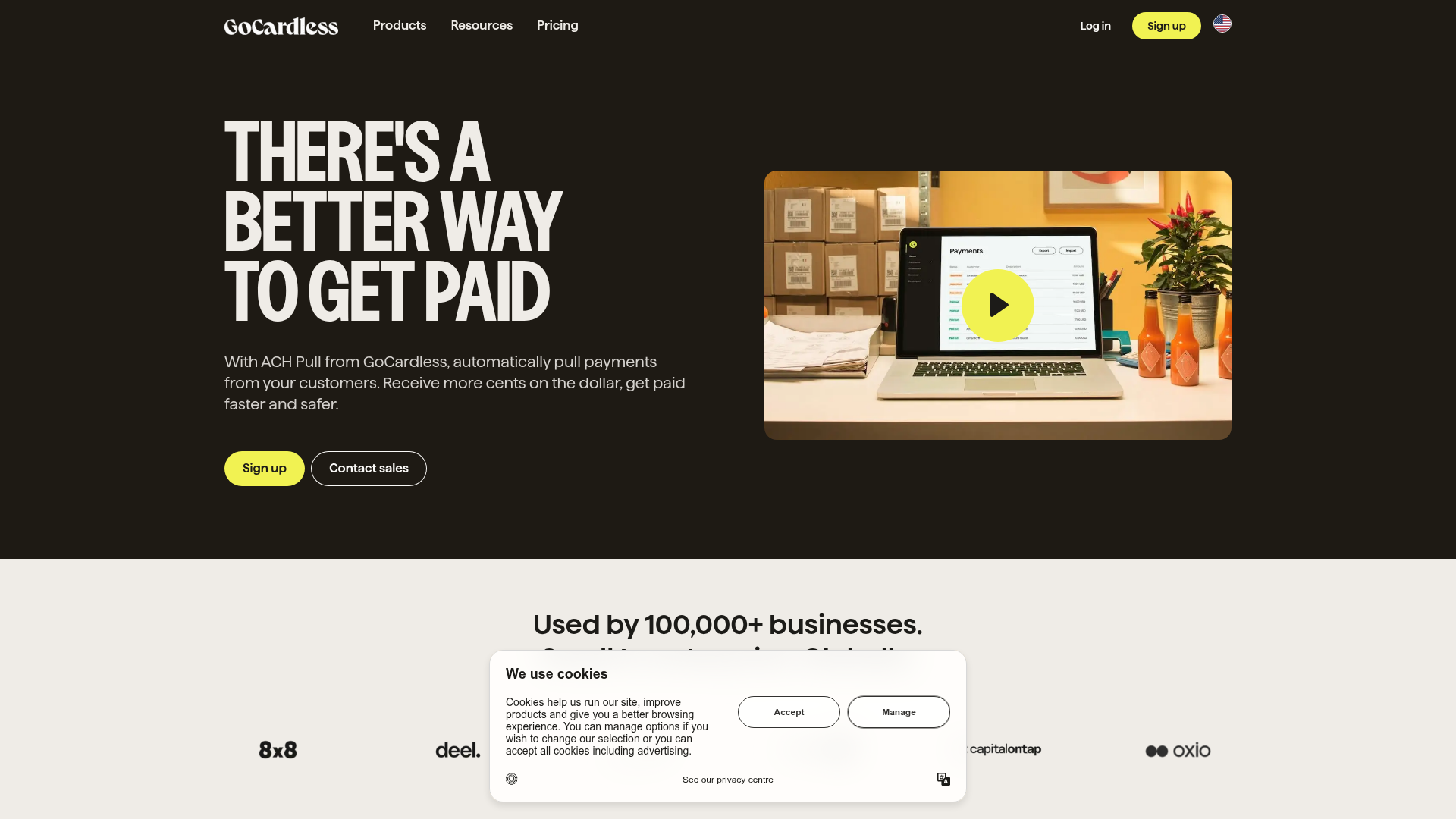
GoCardless Payments Platform Landing Page
A dark-themed fintech landing page featuring a split-screen video hero, bento-style feature cards, a horizontal logo slider, and step-by-step accordion guides.
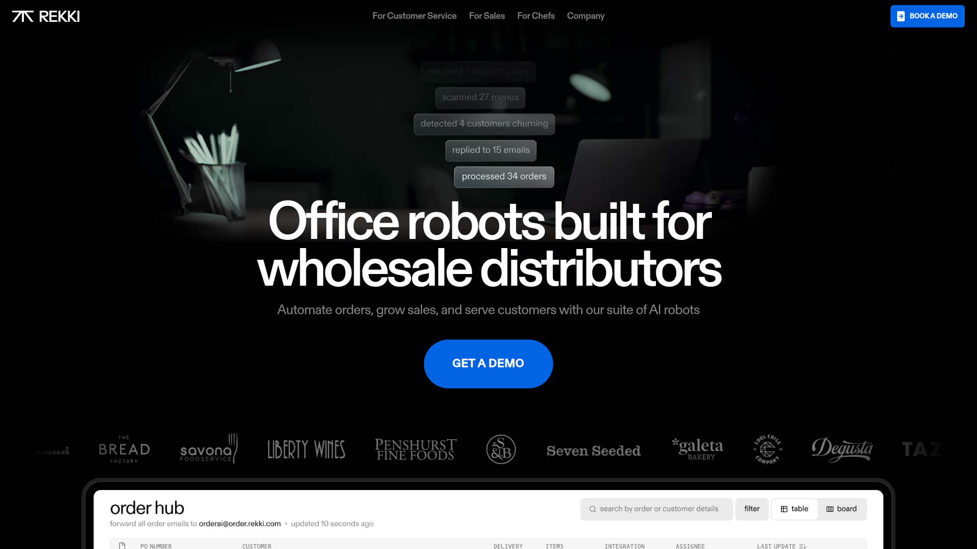
REKKI AI Automation SaaS Landing Page
A high-impact dark-mode landing page featuring a floating label hero section, marquee brand logos, an interactive dashboard UI preview, and card-based testimonial grids.
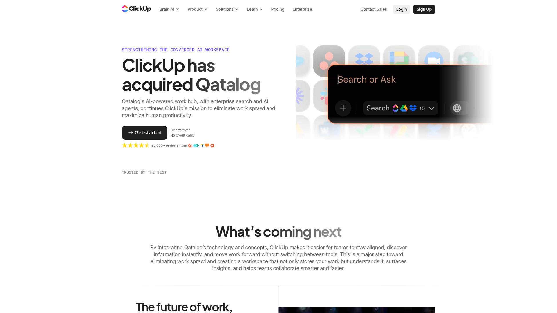
ClickUp Acquisition Hero Landing Page
Features a modern dark-themed hero section with a search UI graphic, bento-style feature grid, and a high-contrast CTA section with decorative gradients.
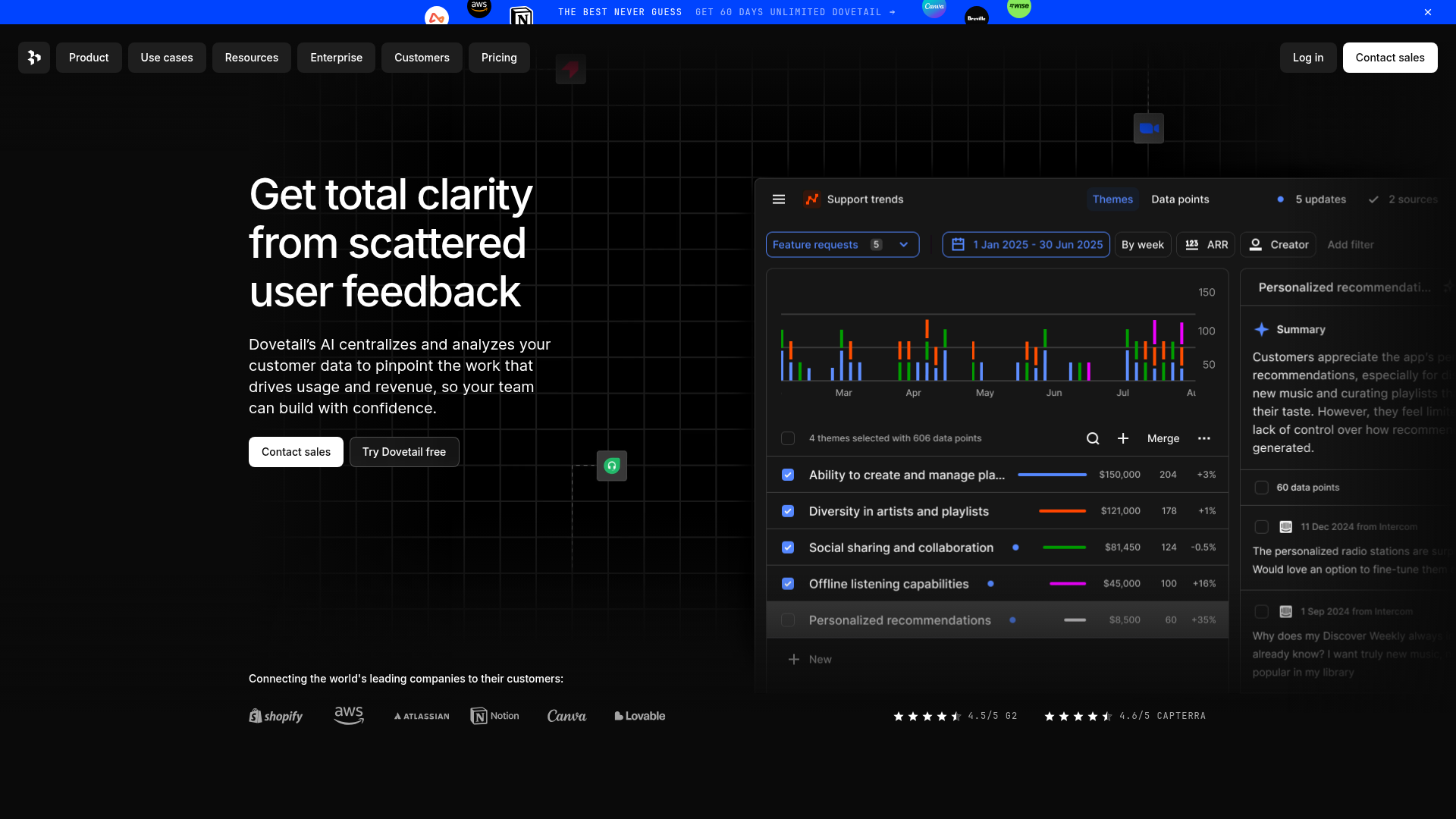
Dovetail AI SaaS Landing Page
A dark-themed landing page featuring a grid-pattern hero, layered product dashboard previews, feature walkthroughs with sticky scrolling, and integrated logo carousels.
