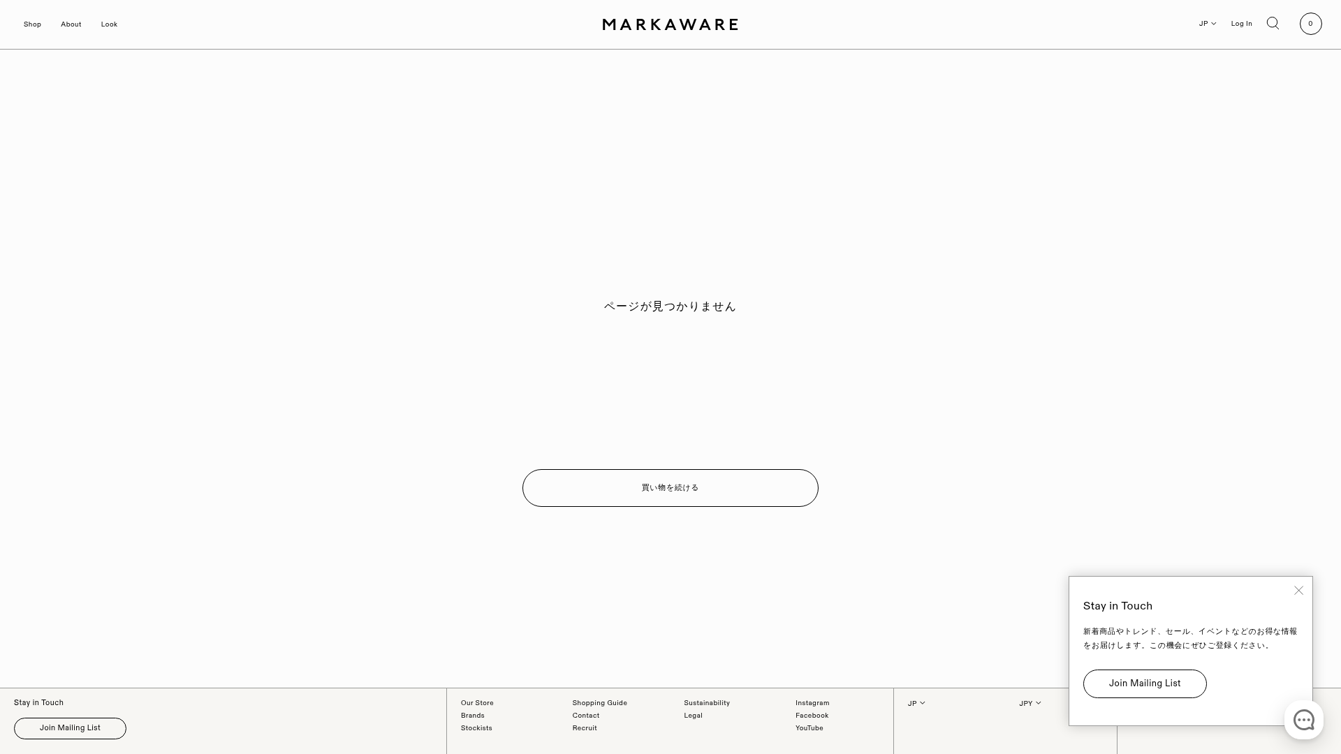
Markaware Minimalist E-commerce Error Page
A clean, minimalist 404 error page layout featuring a centered call-to-action button, consistent branding, and an integrated bottom-right newsletter popup.
Overview
This is a minimalist landing page implementation of a 404 error state from the Japanese fashion brand Markaware. It serves as an excellent clone reference for e-commerce developers who want to maintain high-brand equity through ultra-clean layouts, functional empty states, and subtle localized UI elements.
Design System
- Color Palette & Visual Hierarchy: The design is monochromatic, utilizing a near-white background (#F9F9F8) with deep black text (#000000). Visual hierarchy is extremely flat; the main error message and CTA are centered in high whitespace to draw immediate attention without visual noise.
- Typography System: The site uses a clean sans-serif stack. Headers use a light or regular weight with generous letter spacing to convey premium branding. The logo "MARKAWARE" acts as the primary visual anchor in the header.
- Page Structure & Section Flow:
- Global Header: Symmetrical layout with navigation links at the far left/right and the logo centered.
- Main Content (Trunk): Vertically centered text section with a primary CTA.
- Global Footer: Multi-column layout containing store info, guides, sustainability links, and social redirects.
- Persistent Overlay: A newsletter popup ("Stay in Touch") anchored to the bottom right.
- Reusable Components:
- Secondary Button: Large, pill-shaped (rounded) button with an thin black border and no fill, which transitions on hover.
- Newsletter Popup: A floating card with a close icon and distinct call-to-action.
- Micro-Nav: Small, utility-focused links for language (JP/EN) and login found in the top-right utility bar.
- Implementation Clues: The HTML reveals a Shopify-based structure using a
site-wrapperclass and definedshopify-sections. This indicates a modular approach where header, main content, and footer are discrete, swappable components.
Use Cases
- Who should clone this pattern: Minimalist luxury brands, boutique fashion labels, or design agencies looking for a sophisticated way to handle broken links without losing the user's focus.
- What products can remix it effectively: Portfolio sites, architectural firms, or premium SaaS landing pages that value whitespace over high-density information.
- Practical remix directions: Swap the Japanese text for localized copy, replace the pill-shaped buttons with sharp-cornered variants for a more "brutalist" look, or adapt the centered error trunk into a "Coming Soon" placeholder.
- Suggested clone scope: A quick section clone of the centered 404 trunk and the modular footer is highly effective for any minimalist e-commerce theme project.
Related Inspirations

Isla Beauty Skincare E-commerce Store
A clean Shopify-based storefront featuring a split-hero landing page, a step-by-step product system carousel, and a split-screen testimonial section with localized product image sidebars.
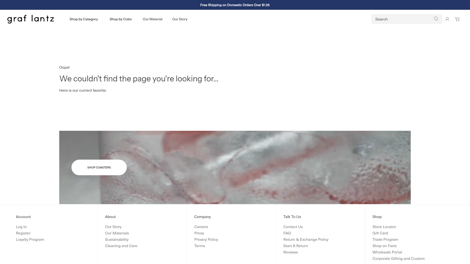
Graf Lantz Minimalist E-commerce 404
A clean Shopify-based error page featuring a full-width video hero with a CTA button, a detailed multi-column footer, and a sophisticated slide-out cart drawer.
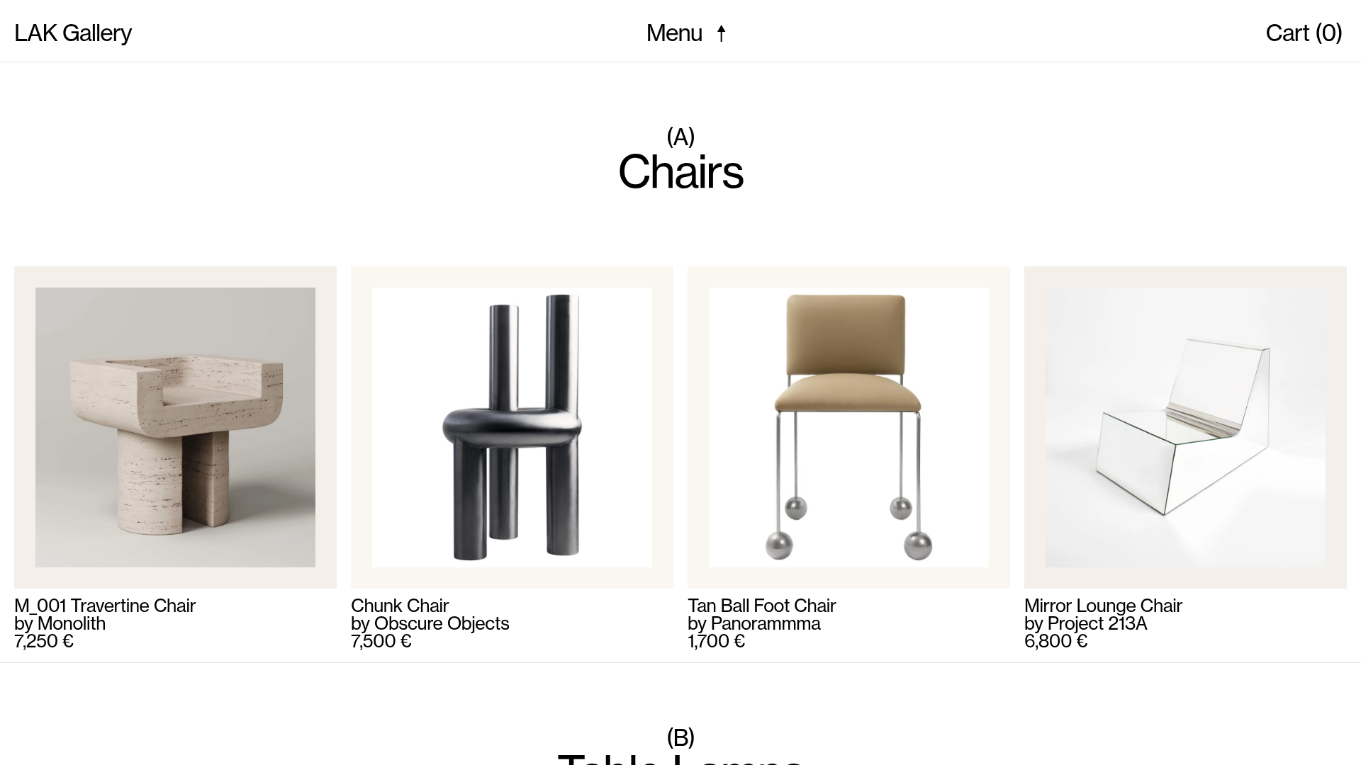
LAK Gallery Minimalist E-commerce Showcase
A clean collectible design shop featuring an alphabetical grid layout, category-driven horizontal scrolls, and high-contrast typography for luxury product catalogs.
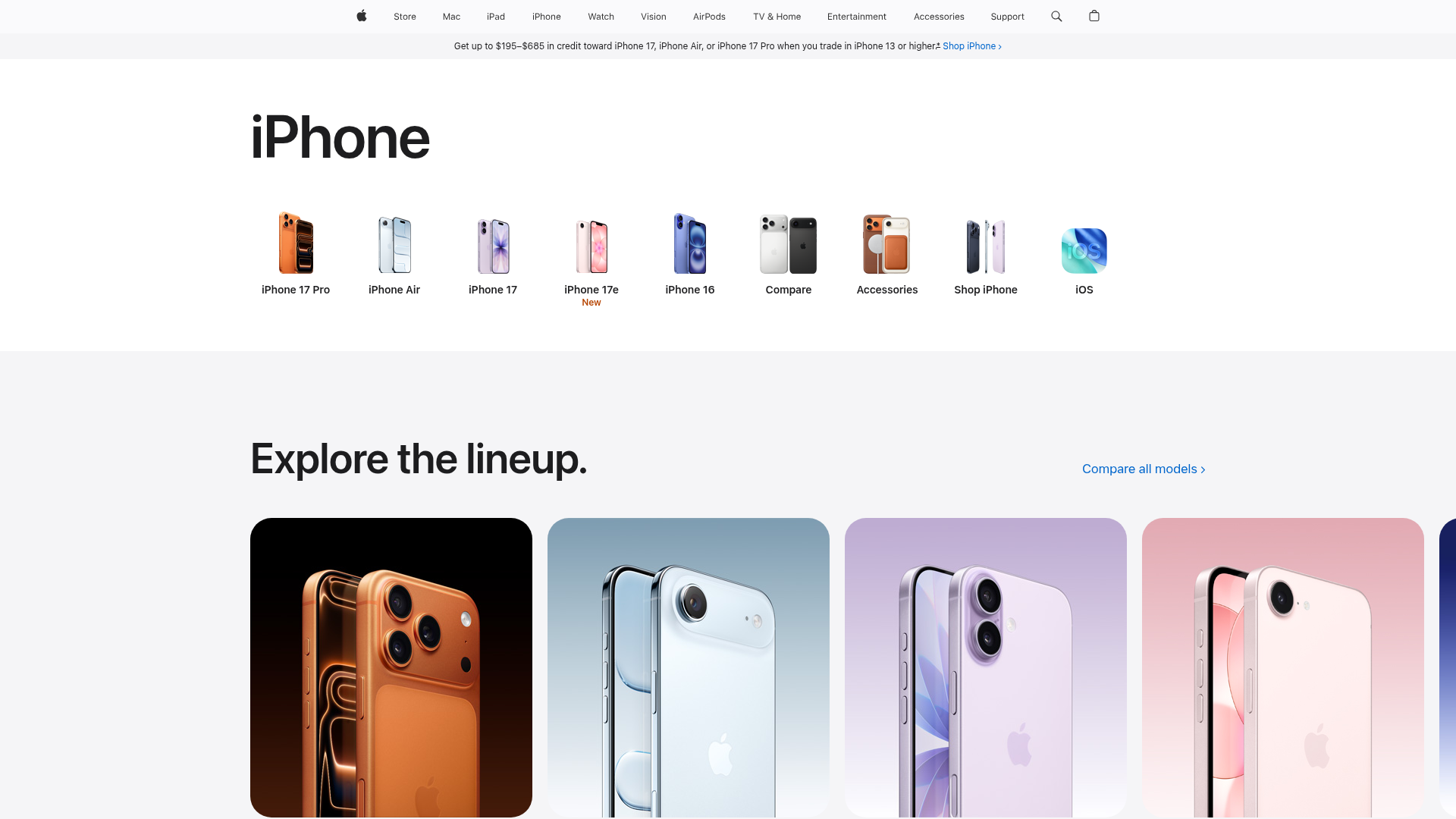
Apple iPhone Product Showcase Landing Page
Minimalist tech storefront featuring a clean icon-based navigation menu, horizontal device lineup cards, and high-quality hero imagery for hardware product marketing.

Context Gallery High-End Furniture Landing Page
A minimal editorial layout featuring a multi-column product carousel, designer biographies with image-text pairings, and a magazine-style content grid for curated design stories.

Glein Minimalistic Bento Grid eCommerce
A clean, modular layout using a bento-style responsive grid of text teasers and large-scale product imagery for lookbooks and collection browsing.
