Chronicle AI Presentation Landing Page
A high-end SaaS layout featuring an animated slide-deck hero, sticky navigation with mega-menus, a bento-style feature grid, and an interactive before-and-after image slider.
Overview
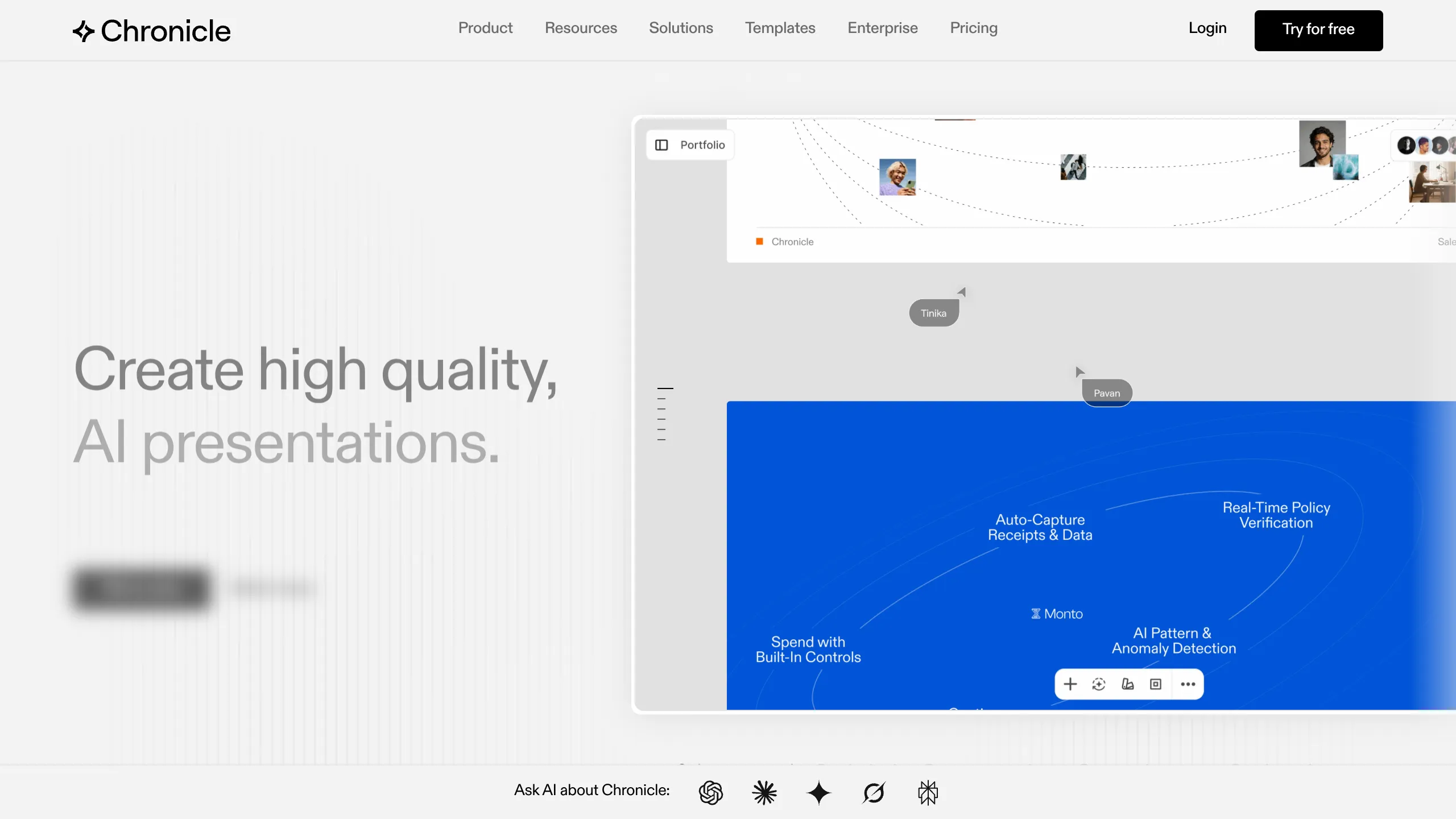
Chronicle is a high-end SaaS landing page designed for an AI-powered presentation tool. It serves as an excellent clone reference because it successfully merges a minimalist, professional aesthetic with complex interactive elements like slide transitions and image comparisons. Builders should look to this for its sophisticated layout that communicates 'enterprise-ready' while maintaining creative appeal.
Design System
- Color Palette & Visual Hierarchy: The site uses a high-contrast foundation of pure white and deep black (
#000000), punctuated by high-saturation electric blue (#0055FF) used in the hero slide deck and call-to-action buttons. Visual hierarchy is established through massive headline typography and generous whitespace that separates the feature 'bento' grid from text-heavy value propositions. - Typography: The typography relies on a clean, geometric sans-serif (Inter-like). Headings use a bold weight (
t--h2,t--h3) with large sizes for the hero (h1), while body copy uses relaxed line-heights and slightly muted opacity for sub-captions to reduce visual cognitive load. - Structure & Flow:
- Sticky Header: Contains a complex mega-menu and high-visibility 'Try for free' CTA.
- Hero Section: Features a left-aligned headline with a massive right-aligned interactive mock-up containing animated slide previews.
- Logo Cloud: A scrolling rotator featuring high-profile tech logos (OpenAI, Apple, Notion).
- Timed Feature Slides: A section with vertical progress bars (
musefeatures_progressTrack) that sync with changing UI screenshots. - Bento Grid: A layout showcasing core feature cards with subtle border separators.
- Before/After Slider: A functional interactive comparison between 'standard' slides and 'Chronicle' slides.
- Footer: A 3-column deep-link footer with social icons and policy info.
- Components to Clone First:
- The Image Comparison Slider: The
before-after-slideris a high-impact component for visual product differentiation. - Animated Buttons: Buttons in the
hero_ctause a double-layer span transition where text slides up on hover. - The Navigation Mega-menu: A robust
header_navstructure capable of handling multi-level resource links.
- The Image Comparison Slider: The
- Implementation Details: The HTML suggests a Next.js framework (
_next/image) combined with Swiper.js (swiper-wrapper) for the horizontal carousels and GSAP or Lottie for the cursor-tracking animations seen in the hero.
Use Cases
- Who should clone this pattern: Founders of creative tools, AI productivity apps, or B2B SaaS platforms that need to showcase a high-quality visual output vs. a low-quality traditional alternative.
- Effective Remixes:
- Portfolio Sites: Use the hero slide-deck structure to showcase a design portfolio.
- E-learning Platforms: Adapt the timed feature slides and mega-menu to handle extensive course catalogs.
- Remix Directions: Swap the monochromatic scheme for a warmer brand palette, or replace the slide deck hero with a video demonstration while keeping the sticky progress-bar navigation.
- Clone Scope: A full-page clone is ideal for those needing a complete marketing site with a deep information architecture. For simple landing pages, cloning the 'Bento Grid' and the 'Before/After Comparison' section provides the highest immediate value.
Related Inspirations
Moving Parts SwiftUI Component Library
A high-performance landing page featuring a interactive code comparison toggle, animated mobile UI previews, and a clean minimalist aesthetic for developer tools.

Slite SaaS Knowledge Base Landing Page
A clean SaaS hero section with a conversational headline, secondary call-to-action buttons, and a structured software interface preview featuring user testimonials.
Attio AI CRM Landing Page
A clean SaaS landing page featuring a tiered navigation bar, a centered hero section with twin CTAs, and a detailed interactive dashboard preview.

Koa Health Mental Care Landing Page
A clean healthcare landing page featuring a centered hero section, scroll-based fade-in animations, overlapping mobile mockups, and a multi-column feature grid with accent borders.
Balsa Software Documentation Landing Page
A clean document-centric layout featuring a centered hero section, high-contrast callout boxes, and a nested dashboard UI preview for collaborative tool showcases.
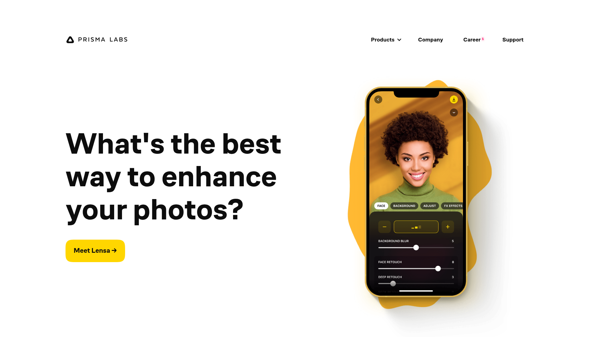
Prisma Labs App Showcase Landing
A clean SaaS landing page layout featuring large typography, magnetic hover buttons, and high-fidelity mobile app mockups with animated video blob backgrounds.
