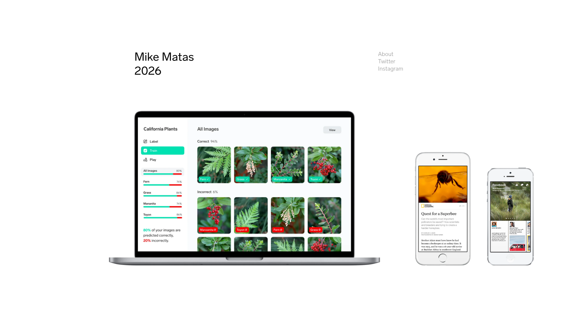
Mike Matas Portfolio Minimalist Showcase
A clean, minimalist grid layout featuring centered text links, high-resolution device mockups, and large-scale product imagery for a professional design portfolio.
Overview
This minimalist portfolio showcases high-impact product design work through a horizontal, timeline-based grid layout. It is an excellent reference for cloning due to its sophisticated use of whitespace, realistic device mockups, and a unique navigation system that balances historical context with visual case studies.
Design System
- Color Palette & Visual Hierarchy: The design uses a high-contrast monochromatic base (pure white background with black text) to ensure that the vibrant, multi-colored product imagery remains the focal point. Hierarchy is established through scale; the designer's name and large device mockups dominate the screen, while navigation links are subdued at
0.4opacity. - Typography: The system uses a clean, modern sans-serif. Titles (e.g., "Mike Matas", "Lobe") use a medium weight with generous letter spacing, while metadata (dates, roles) uses a smaller scale to maintain a clean aesthetic. Navigational items are set at a base size of approximately
20px. - Page Structure: The layout is built on a CSS grid (
grid-template-columnsandgrid-template-rows) that centers content within a fixed-width container (1000pxto1620px). The flow is strictly horizontal, treating each project as a full-height slide that includes a text column for team/credits and a large-scale visual column. - Reusable Components:
- Device Mockup Wrapper: A flexible container for
.webpimages that can adapt to different aspect ratios (laptop vs. mobile). - Metadata Column: A vertical list component for project roles and team members.
- Subtle Navigation: A fixed-position header containing secondary links (Twitter, Instagram) with hover states.
- Device Mockup Wrapper: A flexible container for
- Interaction & Motion: The site utilizes Next.js with localized opacity transitions (
opacity: 1to0). High-fidelity elements like the cursor-followingcursor_rootsuggest a custom interactive pointer. Project images use a scale and blur transition (filter: blur(0px); transform: scale(1)) to reveal content. - Implementation Clues: Built with Next.js, utilizing CSS Modules for scoped styling (e.g.,
grid_grid__arx8a). It uses a specific grid-based layout engine to handle various viewport sizes, likely relying on JavaScript for the horizontal scroll management.
Use Cases
- Who should clone this: Individual designers, creative directors, or small agencies with a high-quality visual output that speaks for itself.
- Effective Remixes: This pattern works perfectly for "Year in Review" pages, product release timelines, or digital archives where chronological sequence matters.
- Practical Remix Directions: Swap the minimalist white background for a dark mode aesthetic, or replace the project team list with technical specifications for an engineering-focused portfolio.
- Suggested Clone Scope: A full-page clone is recommended to maintain the specific horizontal scroll logic, but the metadata/text column component and the responsive grid system can be extracted for use in standard vertical layouts.
Related Inspirations

Baubauwerk Minimal Agency Portfolio Homepage
A clean studio site featuring a centered text hero, scatter-plot filterable project gallery, and full-bleed image sections for case studies.
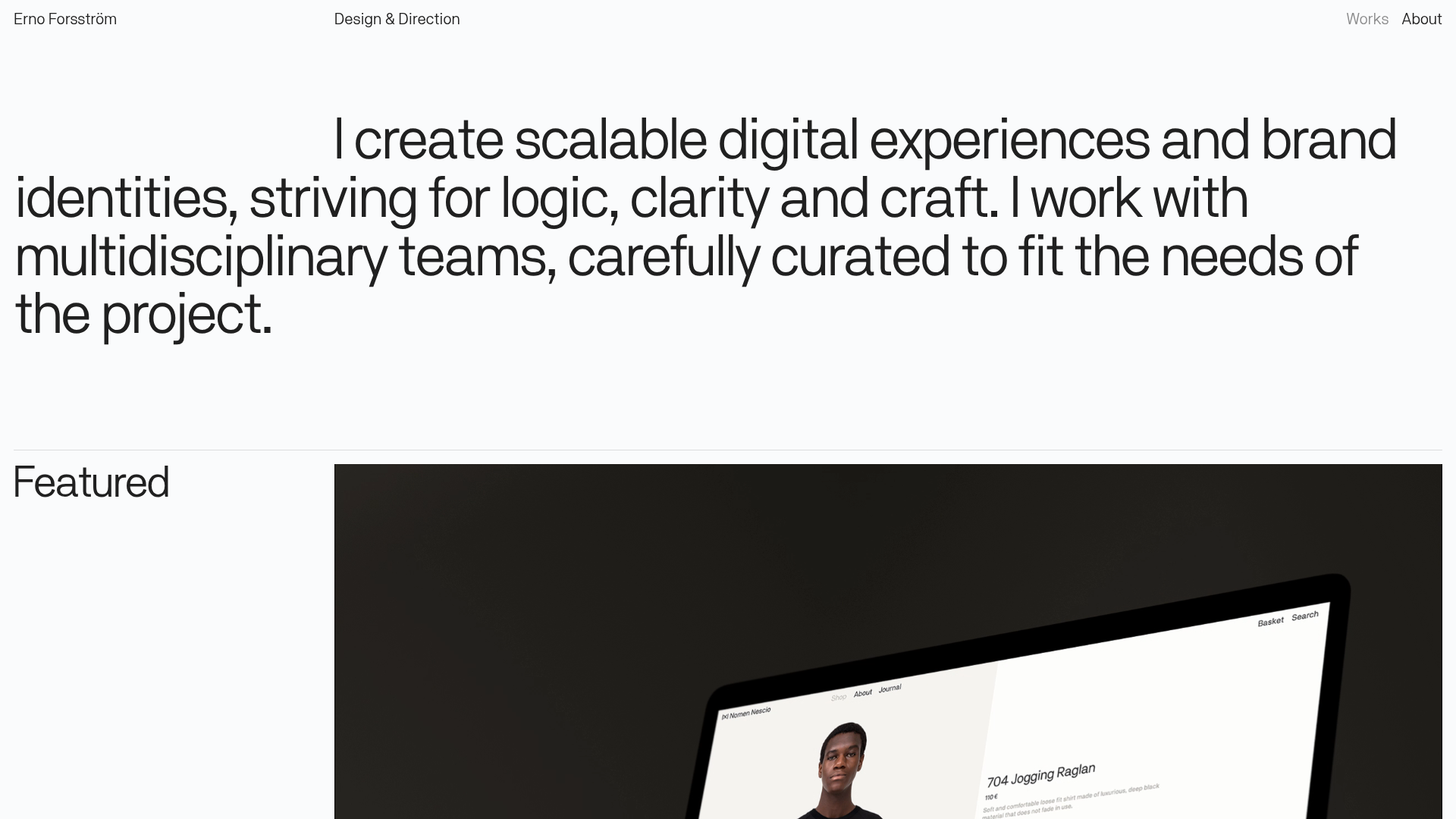
Erno Works Minimalist Design Portfolio
A clean, typography-focused portfolio featuring a sticky grid layout, large editorial headers, and integrated video project thumbnails for dynamic case study previews.
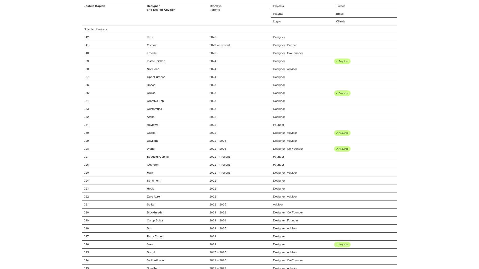
Joshua Kaplan Portfolio Index
A minimalist, text-only portfolio layout featuring an expansive tabular list of projects with horizontal rule separators and clean typography.
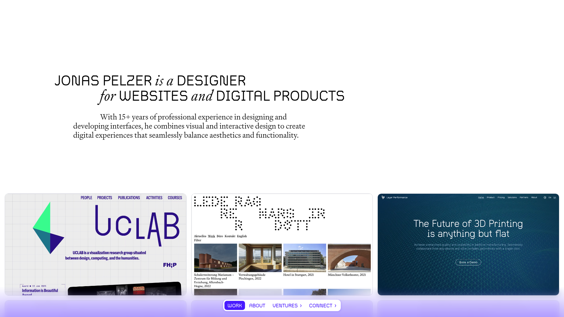
Jonas Pelzer Portfolio Showcase
A minimalist design portfolio featuring a large typography hero, a staggered video project grid, and a sticky tab-based navigation bar for content switching.
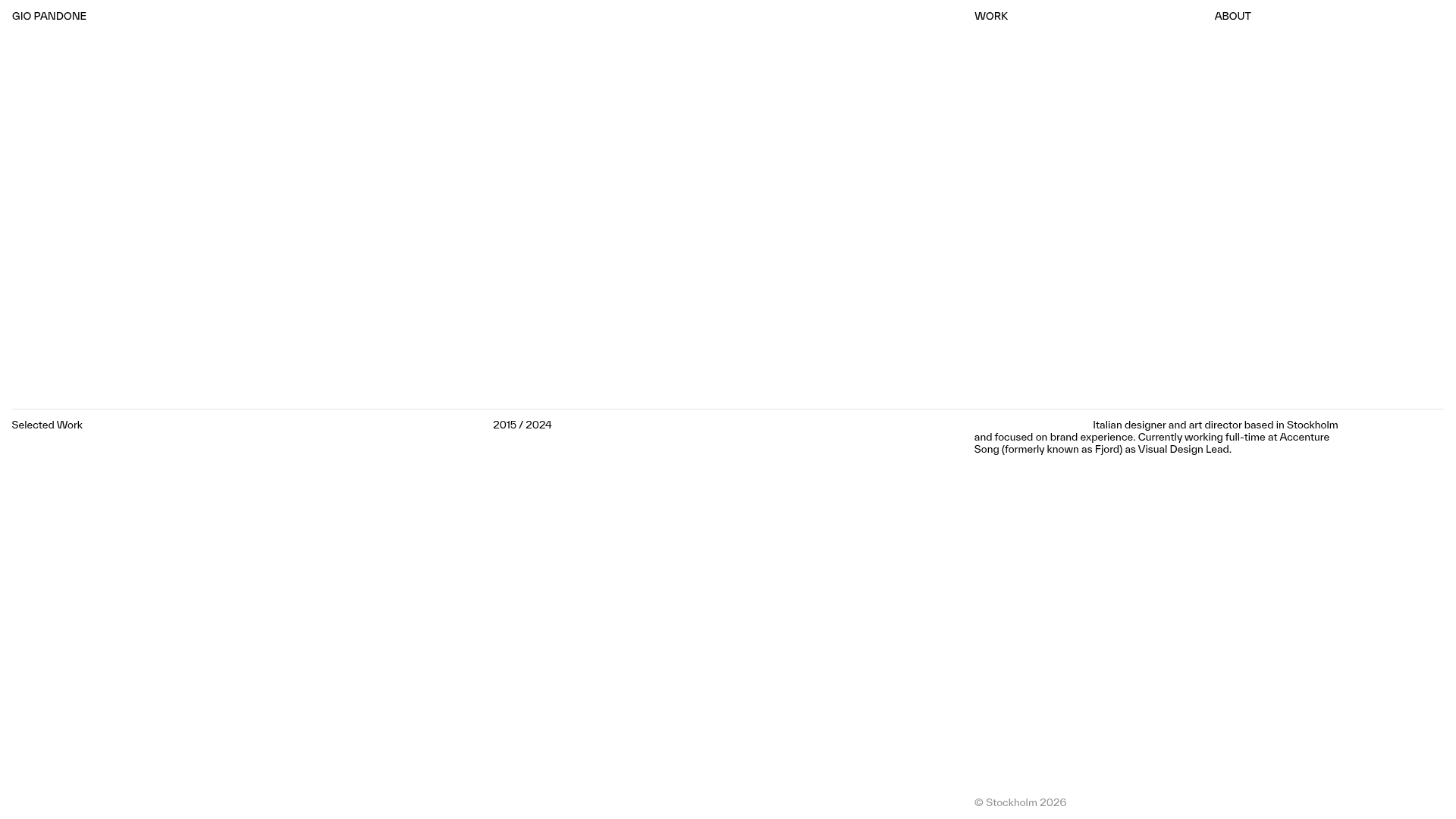
Gio Pandone Minimalist Portfolio Template
A clean, grid-based designer portfolio featuring a sticky minimalist navigation, scroll-triggered entrance animations, and a responsive 12-column work gallery with embedded video previews.
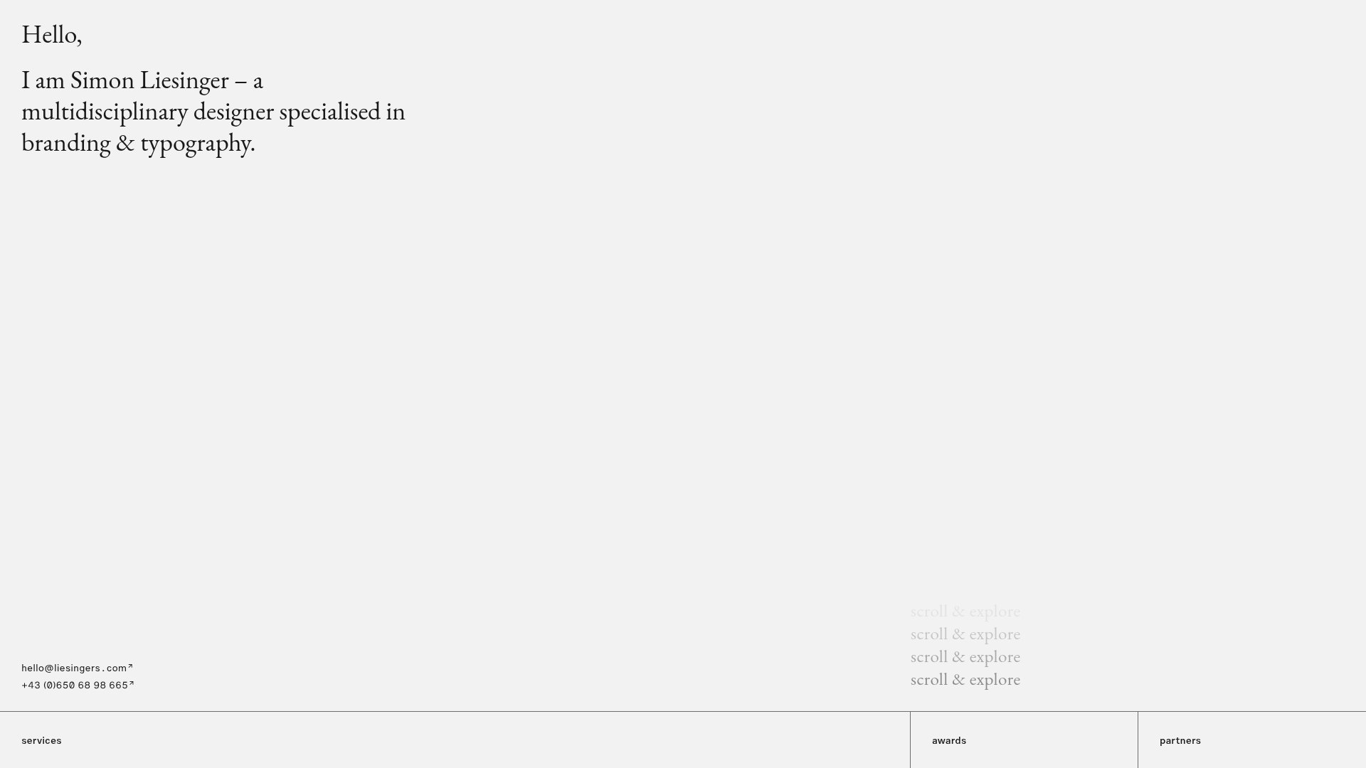
Minimalist Typography Portfolio and Services Grid
A clean, serif-heavy layout featuring an A-Frame 3D hero animation, tiered service lists, and a modular multi-column text structure for design manifestos.
