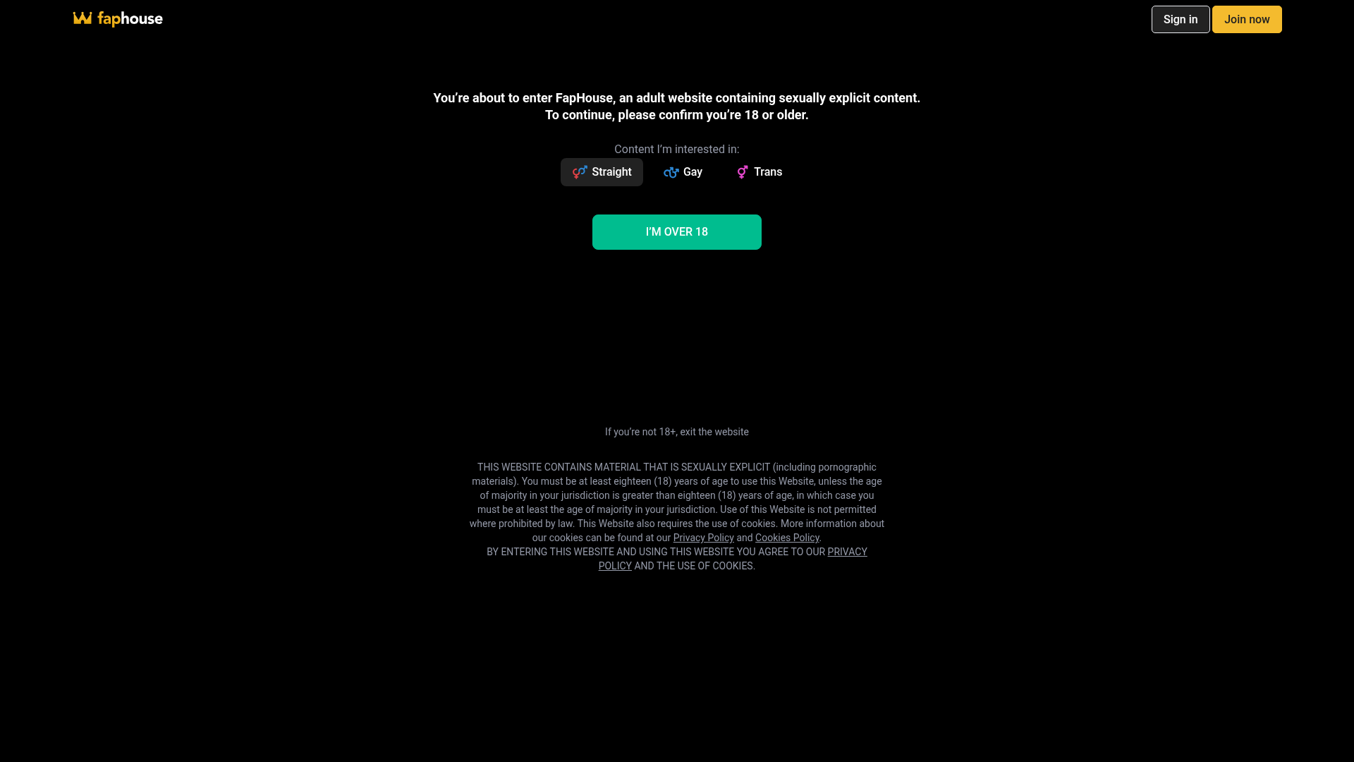
FapHouse Age Verification and Grid Portal
A dark-themed media portal featuring a modal age gate, a comprehensive sticky multi-level navigation bar, and a responsive grid layout of image categories.
Overview
This website is a high-traffic adult media portal featuring a critical age-verification gate followed by a dense, category-driven content grid. It serves as a strong reference for complex navigation systems and tiered layout structures that manage large datasets across various user orientations.
Design System
- Color Palette & Visual Hierarchy: The interface utilizes a 'Dark Mode' default with a pitch-black background (#000000) to make media thumbnails pop. High-contrast accents includes a signature gold/yellow for calls-to-action (Join Now) and a vibrant teal (#00C29A) for primary interaction buttons like the 'I'M OVER 18' confirmation.
- Typography: A clean, sans-serif font system is used throughout. Hierarchy is established through weight and color: white for primary titles, light gray for secondary metadata (video counts), and bold caps for situational emphasis in the age gate.
- Page Structure: The site employs a sticky multi-level header housing a logo, search bar, language/appearance toggles, and user actions. Below the header, a responsive CSS grid (
.grid) displays content categories as uniform cards with image fills and bottom-aligned text. - Reusable Components:
- Age Gate Modal: A centered layout with orientation selectors (Straight, Gay, Trans) and a primary confirmation button.
- Tiered Nav Bar: A multi-row sticky header that separates global utilities (search, settings) from content browsing (Videos, VR, Store).
- Thumb Category Cards: Standardized blocks (
.thumb-category-v2) with image wrappers and overlaid counters.
- Interaction & Responsive Behavior: The header includes complex dropdowns (e.g.,
.language-picker__list) and orientation toggles. The grid layout is fluid, likely shifting from 2 columns on mobile to 4+ on desktop. Buttons use a_translucentor_outlinemodifier to maintain a premium, non-cluttered look. - Implementation Clues: The HTML reveals a custom class-based utility system (e.g.,
g-navbar__col,btn-outline_gold) and data attributes (data-el) used for state management and orientation switching.
Use Cases
- Who should clone this: Developers building media-heavy platforms, adult-oriented sites, or gated subscription services that require strict orientation-based filtering.
- Effective Remixes: The multi-level sticky navigation is a masterclass in organizing 10+ distinct categories without overwhelming the user. The age gate pattern can be adapted for any regulated content (alcohol, gambling, specialized forums).
- Remix Directions: Swap the dark theme for a 'light' professional palette to adapt the grid for a stock photo site or an e-commerce directory. The 'Orientation' toggle can be remixed into a 'Department' or 'Project' switcher.
- Clone Scope: A full-page clone is recommended to capture the sophisticated interplay between the sticky header and the underlying content grid. For a quicker build, focus on the
.g-navbarstructure and the.thumb-category-v2card patterns.
Related Inspirations
Goodfit E-commerce Puzzle Landing Page
A dark-themed Shopify storefront featuring a bold serif hero, scrolling marquee, tabbed product grids, and asymmetrical rich text blocks with image-led storytelling.
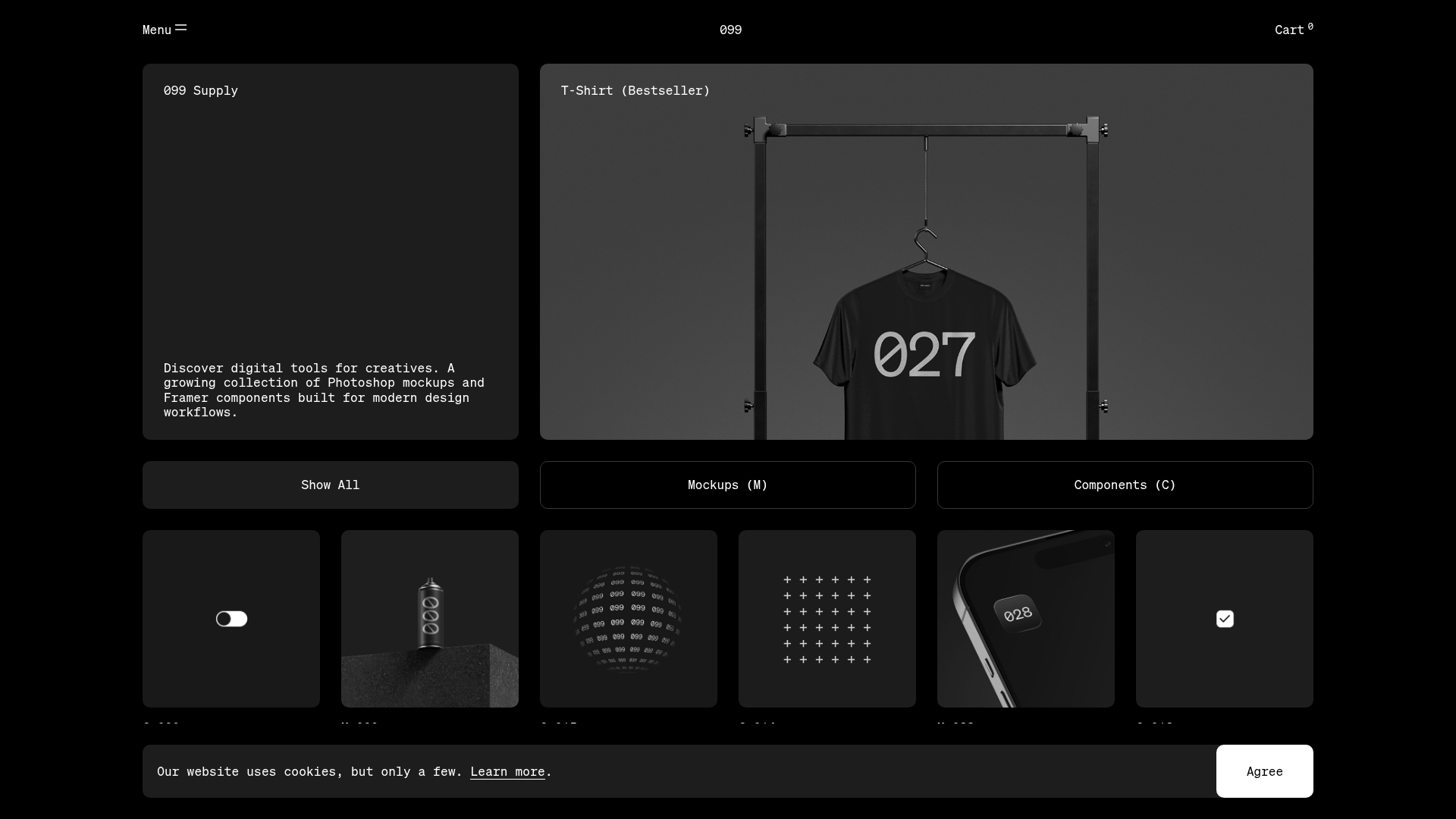
099 Supply Minimalist Bento Asset Gallery
A dark-themed asset store featuring a bento grid layout, video-on-hover card interactions, and category filters for digital products and Photoshop mockups.

Context Gallery High-End Furniture Landing Page
A minimal editorial layout featuring a multi-column product carousel, designer biographies with image-text pairings, and a magazine-style content grid for curated design stories.

Glein Minimalistic Bento Grid eCommerce
A clean, modular layout using a bento-style responsive grid of text teasers and large-scale product imagery for lookbooks and collection browsing.

Niklas Rosén Designer Portfolio Index
A minimalist, responsive grid-based portfolio index featuring a clean 16-column layout, typographic list components, and a custom dark mode transition.

Isla Beauty Skincare E-commerce Store
A clean Shopify-based storefront featuring a split-hero landing page, a step-by-step product system carousel, and a split-screen testimonial section with localized product image sidebars.
