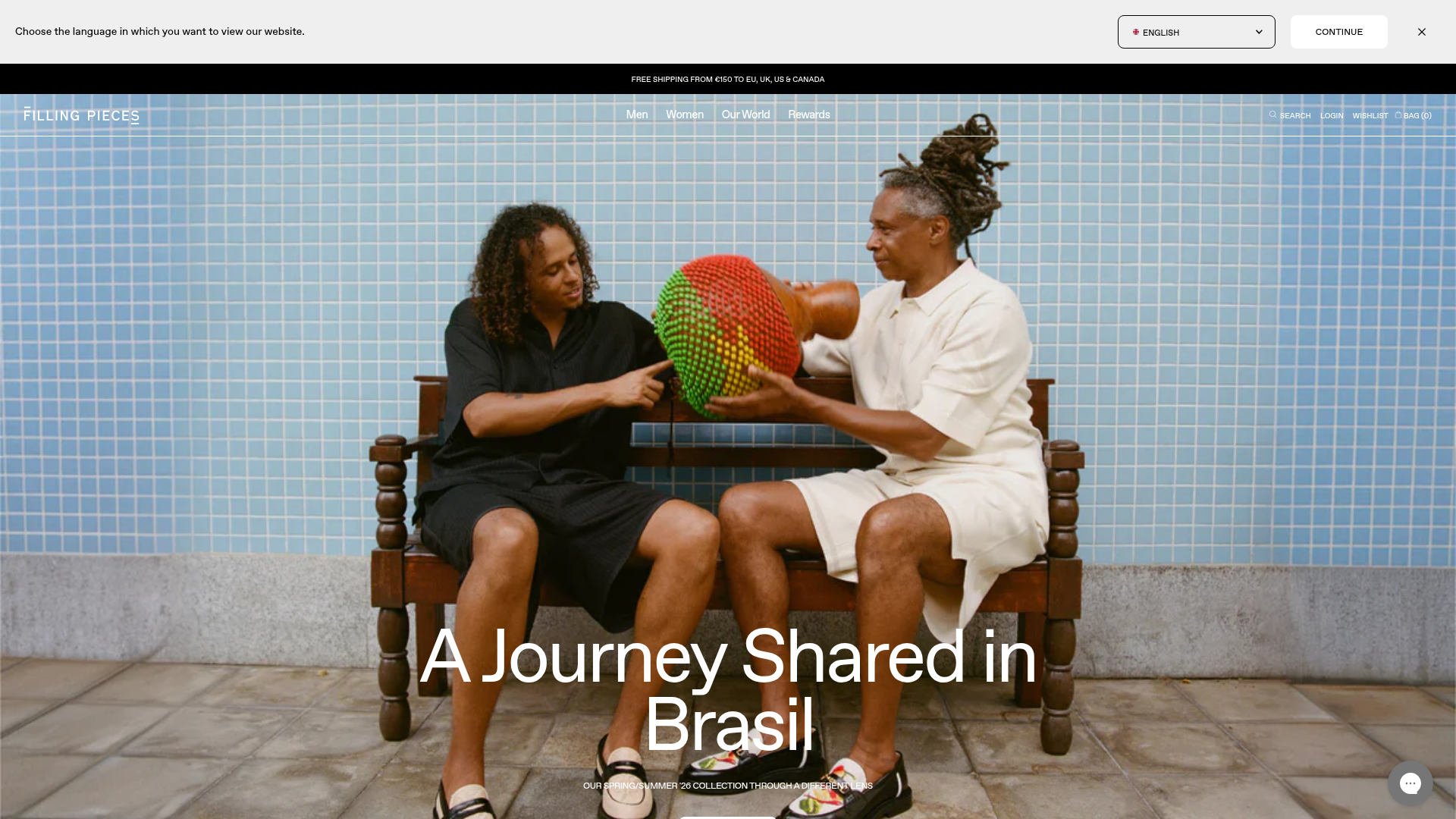
Filling Pieces E-commerce Storefront
A minimalist Shopify-based fashion storefront featuring a full-width hero section, sticky multi-navigation bars, and a clean product slider with hover-based image transitions.
Overview
This Filling Pieces e-commerce storefront is a high-end, minimalist Shopify implementation designed for modern fashion brands. It balances large-scale editorial imagery with a highly functional, compact navigation system, making it an excellent reference for cloning professional-grade product discovery and filtering patterns.
Design System
- Color Palette & Visual Hierarchy: The site uses a neutral foundation of white and light grey (
#EFEFEF) to ensure product photography remains the focus. High contrast is achieved through sharp black borders and typography, with a distinct black announcement bar at the top to highlight logistics like free shipping. - Typography: The design utilizes a customized sans-serif (identified as "favorit" in the HTML) with a modular scale. It features bold, oversized headings (e.g.,
text-5xltotext-8x1) for hero sections and tight, uppercase small-caps for utility elements like buttons and product labels. - Page Structure: The flow begins with a language/localization modal, followed by a multi-layered header (announcement bar, primary navigation, and sub-navigation). The main content transitions from a full-bleed hero image to a horizontal product slider with categorized "tabs."
- Reusable Components:
- Sticky Nav-Bar: A clean, multi-layered navigation system with integrated search and wishlist icons.
- Product Cards: Featuring dual-state hover effects where the image transitions to an alternate angle, plus integrated "Quick Add" and "Wishlist" buttons that appear on hover.
- Drawer-based Cart: A sliding "Bag" component that includes a dynamic subtotal and a shipping progress bar to encourage higher order values.
- Interaction & Motion: The site uses smooth
transition-all duration-500patterns for UI elements. Product sliders are built usingkeen-slider, providing a horizontal touch-swipe feel even on desktop. Hover states use anease-in-out-quadtransition to alternate product images seamlessly. - Responsive Behavior: The mobile experience focuses on the "Bag" and "Menu" being easily accessible via thumb-friendly buttons. Product cards maintain a consistent aspect ratio (125.0%) across both mobile and desktop via CSS variables.
Use Cases
- Who should clone this: Developers building boutique fashion, luxury streetwear, or curated accessories brands that rely on high-quality visual storytelling.
- Effective remixes: This layout works well for any product with a heavy emphasis on photography, such as premium home goods or high-end electronics.
- Remix directions: Swap the minimalist white/black theme for a warm earth-tone palette; replace the horizontal slider with a Masonry grid for collections; or adapt the sticky sub-navigation for dense technical product specifications.
- Clone scope: Start by cloning the Cart Drawer and the Hover Transition Product Cards, as these provide the most immediate "premium" feel to a standard e-commerce site. The full-page clone is ideal for a brand launch with limited SKUs where every product needs an editorial treatment.
Related Inspirations
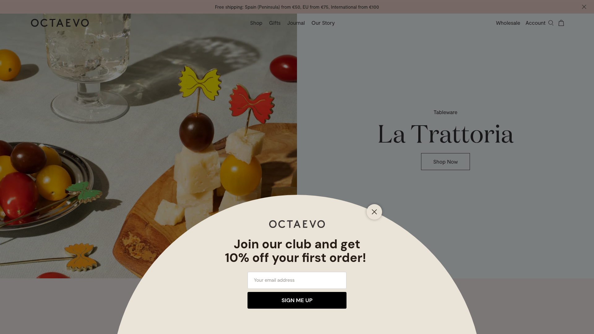
Octaevo Mediterranean Design E-commerce Store
A refined Shopify layout featuring split-screen hero banners, horizontal product carousels with hover-state image swapping, and a centered circular newsletter overlay.

Context Gallery High-End Furniture Landing Page
A minimal editorial layout featuring a multi-column product carousel, designer biographies with image-text pairings, and a magazine-style content grid for curated design stories.

Glein Minimalistic Bento Grid eCommerce
A clean, modular layout using a bento-style responsive grid of text teasers and large-scale product imagery for lookbooks and collection browsing.

Isla Beauty Skincare E-commerce Store
A clean Shopify-based storefront featuring a split-hero landing page, a step-by-step product system carousel, and a split-screen testimonial section with localized product image sidebars.

Stojo Collapsible E-commerce Storefront
A Shopify layout featuring a prominent discount modal, mosaic grid hero sections, and clean product cards with integrated color swatches and quick-buy functionality.

Basic.Space E-commerce Gallery Clone
A minimalist product marketplace featuring a clean sticky navigation bar, nested flyout menus, and a horizontally scrollable product carousel with hover-state image switching.
