Octaevo Mediterranean Design E-commerce Store
A refined Shopify layout featuring split-screen hero banners, horizontal product carousels with hover-state image swapping, and a centered circular newsletter overlay.
Overview
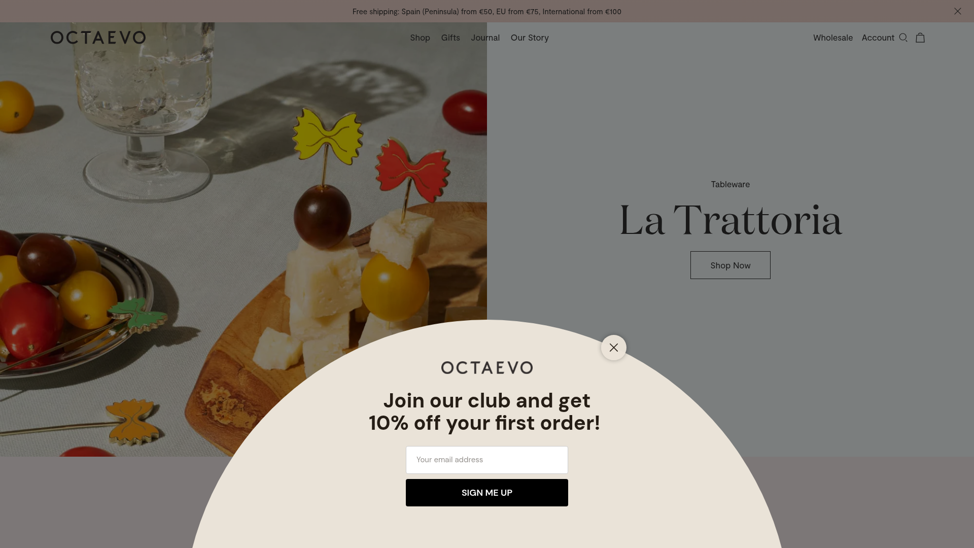
Octaevo is a high-end Mediterranean design shop that balances vibrant photography with a minimalist, airy e-commerce interface. It serves as a strong clone reference for its sophisticated use of split-screen hero layouts and seamless product carousels that prioritize visual storytelling over dense text.
Design System
- Color Palette & Visual Hierarchy: The site uses a shifting pastel backplate strategy. Each section (e.g.,
#f7fcfc,#f8eeee,#eef1e3) acts as a soft container for products, creating a distinct rhythmic transition as the user scrolls. Hierarchy is established through bold, serif display headings contrasted against clean sans-serif metadata. - Typography System: A high-contrast serif typeface (likely a variant of Caslon or Bodoni) is used for decorative collection titles like "La Trattoria." A neutral, wide-set sans-serif handles navigation and utility text, ensuring readability in small sizes like the promo bar.
- Page Structure & Flow: The site follows a alternating pattern: Split-screen CTA section (Image Left/Text Right) → Horizontal Product Carousel → Split-screen CTA section (Image Right/Text Left). This keeps the user engaged without visual fatigue.
- Reusable Components:
- Split-Screen CTAs: Perfect for high-conversion entry points with large hit areas.
- Circular Newsletter Overlay: A unique centered popup (
join our club) that breaks the standard rectangular grid. - Hover-State Product Cards: Visible in the HTML as
.collection-product__image-figure--hover, these swap a clean product shot for a lifestyle shot on mouse-over.
- Interaction & Motion: The site utilizes
animate-on-scrollclasses to fade in content. Product carousels (built with Swiper.js) include a custom progress-bar style scrollbar at the bottom rather than traditional arrows. - Implementation Clues: Built on Shopify, the frontend relies heavily on the Swiper.js library for both the promo bar and product feeds, and uses a standard BEM (Block Element Modifier) class naming convention (e.g.,
mini-cart__inner).
Use Cases
- Who should clone this pattern: Boutique brands in the home decor, stationary, or artisanal food spaces that have high-quality lifestyle photography.
- Effective Remixes: Travel agencies could use the split-screen CTAs for destination highlights; luxury fashion brands could adapt the horizontal carousels for lookbooks.
- Practical Remix Directions: Swap the pastel background palette for a dark mode/high-contrast aesthetic for tech or luxury goods. Adapt the circular popup into a 'Limited Edition' alert or countdown timer.
- Suggested Clone Scope: A quick section clone of the split-screen image/text blocks and the product carousel is highly effective for landing pages. A full-page clone is best for creators wanting a complete, polished Shopify architectural feel.
Related Inspirations
Filling Pieces E-commerce Storefront
A minimalist Shopify-based fashion storefront featuring a full-width hero section, sticky multi-navigation bars, and a clean product slider with hover-based image transitions.

Context Gallery High-End Furniture Landing Page
A minimal editorial layout featuring a multi-column product carousel, designer biographies with image-text pairings, and a magazine-style content grid for curated design stories.

Glein Minimalistic Bento Grid eCommerce
A clean, modular layout using a bento-style responsive grid of text teasers and large-scale product imagery for lookbooks and collection browsing.

Isla Beauty Skincare E-commerce Store
A clean Shopify-based storefront featuring a split-hero landing page, a step-by-step product system carousel, and a split-screen testimonial section with localized product image sidebars.

Stojo Collapsible E-commerce Storefront
A Shopify layout featuring a prominent discount modal, mosaic grid hero sections, and clean product cards with integrated color swatches and quick-buy functionality.

Basic.Space E-commerce Gallery Clone
A minimalist product marketplace featuring a clean sticky navigation bar, nested flyout menus, and a horizontally scrollable product carousel with hover-state image switching.
