Houseplant E-commerce Landing Page
A refined lifestyle store layout featuring a modular split-screen hero section, multi-step age verification gating, and category-focused navigational cards.
Overview
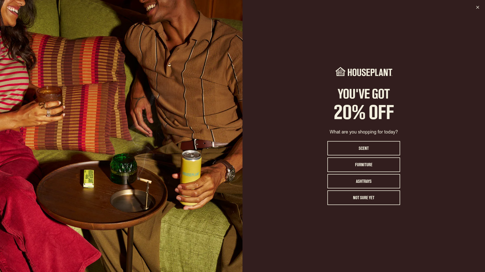
This Houseplant e-commerce landing page is a premium lifestyle store that blends high-quality product photography with a sophisticated, modular grid. It is an excellent reference for builders wanting to combine brand storytelling with a high-conversion transactional flow, featuring an elegant split-screen aesthetic and effective interstitial gating.
Design System
- Color Palette & Visual Hierarchy: The palette uses deep, earthy tones—primarily a rich dark chocolate (
#2D1F1E) background for modal overlays and off-white (#F4F1E0) for text. High-contrast accent colors like 'Moss' green and 'Safety' orange are used sparingly for product badges and variety swatches to draw attention without breaking the premium feel. - Typography: The system utilizes a bold, condensed sans-serif for primary headlines and CTA buttons, emphasizing a mid-century modern aesthetic. Product titles and body copy use a clean, wider sans-serif for readability. A clear hierarchy is established by oversized percentage values in promotions and numbered lists in navigational sections.
- Page Structure & Section Flow: The layout follows a logical progression: age verification/interstitial gate, full-bleed hero carousel, a "New In" horizontal product scavenger, alternating split-tout sections for brand storytelling, and a "Three-Up" category navigation grid with numbered indices.
- Reusable Components:
- Split-Tout Section: A 50/50 balance between high-res lifestyle imagery and text-based CTAs.
- Quick-Add Product Cards: Standardized squares containing image-switch hovers, color swatches with tooltips, and integrated price/pre-order buttons.
- Side-Cart (The Bag): A slide-out drawer featuring cross-sell opportunities for low-cost accessories at the bottom.
- Interactions & Motion: Hover effects on product cards swap the studio shot for a lifestyle shot. Button states utilize subtle transitions, and the split-screen sections feature fade-in animations as the user scrolls into view.
- Responsive/Mobile Behavior: The HTML reveals specific
hide-mobileandhide-desktopclasses. For mobile, the split-tout sections stack vertically, and the header image aspect ratios shift from horizontal to square (100% padding-bottom) for better thumb-reach and visibility. - Implementation Clues: Built on Shopify, the code utilizes
lazyloadedimagery with multiple data-widths for responsive performance and a modularshopify-sectionarchitecture for easy layout reconfiguration.
Use Cases
- Who should clone this pattern: Boutique e-commerce brands, high-end furniture designers, or lifestyle wellness companies looking for a "gallery-first" shopping experience.
- Effective Remixes: CBD or alcohol brands can reuse the robust age-gating and geo-gate logic. High-ticket artisans can remix the "Split-Tout" sections to explain craftsmanship while keeping the transactional elements nearby.
- Practical Remix Directions: Swap the dark chocolate background for a minimalist slate or cream theme; replace the bold condensed headers with elegant serif typography for a luxury fashion context.
- Suggested Clone Scope: Start by cloning the Product Card with Swatches for a quick upgrade to an existing store, or the Three-Up Category Section to improve homepage navigation. A full-page clone is best for a complete brand relaunch.
Related Inspirations

Context Gallery High-End Furniture Landing Page
A minimal editorial layout featuring a multi-column product carousel, designer biographies with image-text pairings, and a magazine-style content grid for curated design stories.

Glein Minimalistic Bento Grid eCommerce
A clean, modular layout using a bento-style responsive grid of text teasers and large-scale product imagery for lookbooks and collection browsing.

Isla Beauty Skincare E-commerce Store
A clean Shopify-based storefront featuring a split-hero landing page, a step-by-step product system carousel, and a split-screen testimonial section with localized product image sidebars.

Stojo Collapsible E-commerce Storefront
A Shopify layout featuring a prominent discount modal, mosaic grid hero sections, and clean product cards with integrated color swatches and quick-buy functionality.

Basic.Space E-commerce Gallery Clone
A minimalist product marketplace featuring a clean sticky navigation bar, nested flyout menus, and a horizontally scrollable product carousel with hover-state image switching.

Ashley & Co Lifestyle E-commerce
An elegant Shopify-based storefront featuring a split-screen animated hero, horizontal ticker-tape collection carousel, and dynamic mega-menus with scent-specific color switching and image previews.
